DxChart<T> Class
A control that visualizes bound data as graphs: bar, area, line, and others.
Namespace: DevExpress.Blazor
Assembly: DevExpress.Blazor.v26.1.dll
Declaration
public class DxChart<T> :
    DxChart,
    IModelProvider<ChartArgumentAxisModel>,
    IModelProvider<ChartValueAxisModel>,
    IModelProvider<ChartZoomAndPanSettingsModel>,
    IModelProvider<ChartScrollBarSettingsModel>,
    IModelProvider<ChartPaneModel>,
    IModelProvider<ChartCommonSeriesBaseModel>,
    IModelProvider<CrosshairModel>,
    IModelProvider<ChartAnnotationModel>,
    IComponentContainer<IXYChartSeriesModel>
Type Parameters
| Name | Description |
|---|---|
| T | The data item type. |
Remarks
The DevExpress Chart component (<DxChart>) allows you to create Line, Area, Bar, Bubble, and other chart types for Blazor applications.
Add a Chart to a Project
Follow the steps below to add the Chart component to an application:
- Create a Blazor Server or Blazor WebAssembly application.
- Add the
<DxChart>…</DxChart>markup to a.razorfile. - Bind the component to data.
- Configure the component: add series and axes, specify a legend, titles, tooltips, and so on (see the sections below).
API Reference
Refer to the following list for the component API reference: DxChart Members.
Static Render Mode Specifics
Blazor Charts support static render mode to display data as static images. To use other features, enable interactivity on a Razor page, and allow chart components to execute scripts and display data.
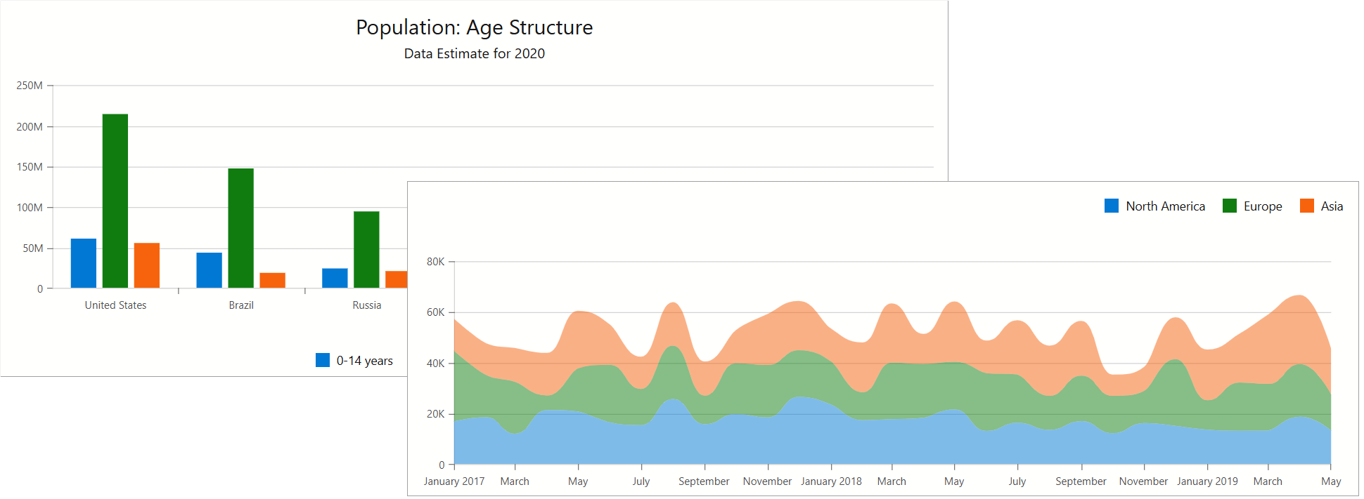
Bind to Data
Use the Data property to specify an IEnumerable<T> data source and series ArgumentField and ValueField properties to specify data source fields that contain arguments and values for chart points. For a sample data source, refer to our GitHub repository.
Note
The Chart supports bound mode only.
@inject ISalesInfoDataProvider Sales

<DxChart Data="chartsData">
    <DxChartLineSeries Name="North America"
                       ArgumentField="si => new DateTime(si.Date.Year, si.Date.Month, 1)"
                       ValueField="si => si.Amount"
                       Filter='si => si.Region == "North America" ' />
    <DxChartLineSeries Name="Europe"
                       ArgumentField="si => new DateTime(si.Date.Year, si.Date.Month, 1)"
                       ValueField="si => si.Amount"
                       Filter='si => si.Region == "Europe"' />
    @* ... *@
</DxChart>

@code {
    IEnumerable<SaleInfo> chartsData;
    protected override async Task OnInitializedAsync() {
        chartsData = await Sales.GetSalesAsync();
    }
}
The chart may update itself automatically or on-demand, as listed below. Regardless of update cause, you can handle the Rendered event to track the moment when the chart rendering is finished and the component is completely loaded.
- Data-related updates: If the data source collection implements the INotifyCollectionChanged interface, the Chart is updated automatically each time the collection changes. Call the RefreshData method to reload data and redraw the component on-demand.
- Layout-related updates: The Chart redraws itself when a user resizes the component’s root container. Set the RedrawOnResize property to
falseto disable this behavior. To re-render the Chart area on-demand, call the RedrawAsync method.
For additional information, refer to the following article: Bind Blazor Charts to Data.
Note
When you bind a chart to DateTime values and set the Kind property to Utc, the component converts dates (for example, when it displays axis labels). This occurs because DxChart is rendered on the client. To avoid such conversion, make sure your DateTime objects have their Kind properties set to Local or Unspecified.
You can also adjust the time difference to display dates correctly. The following code snippet demonstrates a possible solution:
public WeatherForecast[] GetForecast() {
    var localZone = TimeZoneInfo.Local;
    var localOffset = localZone.GetUtcOffset(DateTime.UtcNow);
    var cur = DateTime.UtcNow.Add(localOffset);

    var utcDates = new List<DateTime> { cur };
    var dates = new List<DateTime>();
    foreach (var utcDate in utcDates)
        dates.Add(new DateTime(utcDate.Ticks));
    // ...
}
Series
A chart series is a collection of related data points. You can specify common settings for all chart series, or add series to the component’s markup and configure series-specific settings individually. Refer to the following topic for additional information about available series types: Series Types in Blazor Charts.
If you have several series, place them at the same chart hierarchy level. Note that DxChart renders series based on their order in the chart’s markup. If you need to change the rendering order, place the series in the corresponding positions in the markup.
Common Settings
Use the DxChartCommonSeries object to specify common settings for all chart series.
Use the SeriesType property to create a common XY series (for example, line, bar, or area). To generate series that require specific settings in addition to ArgumentField and ValueField (for example, bubble or stock series), use the SeriesTemplate property.
The following code snippet uses a drop-down menu to change the series type dynamically:

<label><b>Series Type:</b></label>
<DxComboBox Data="Enum.GetValues<ChartSeriesType>()"
            @bind-Value="@CurrentSeriesType" />

<DxChart Data="@SalesData">
    <DxChartTitle Text="Sales amount, $" />
    <DxChartCommonSeries SummaryMethod="Enumerable.Sum"
                         NameField="@((SaleInfo s) => s.Date.Year)"
                         ArgumentField="@((SaleInfo s) => s.City)"
                         ValueField="@((SaleInfo s) => s.Amount)"
                         SeriesType="@CurrentSeriesType">
    </DxChartCommonSeries>
    @* ... *@
</DxChart>

@code {
    ChartSeriesType CurrentSeriesType = ChartSeriesType.Line;

    IEnumerable<SaleInfo> SalesData;
    protected override async Task OnInitializedAsync() {
        SalesData = await Sales.GetSalesAsync();
    }
}
The table below lists common settings for chart series:
| Property Name | Description |
|---|---|
| ArgumentField ValueField |
Specify data source fields that store arguments and values for series points. |
| NameField | Specifies a data source field used to group data by series. |
| PaneField | Specifies which data source field contains pane names for chart series. |
| Filter | Specifies a filter that is applied to data source objects. |
| SeriesType | Specifies the series type for XY series. |
| SeriesTemplate | Specifies a series template. |
| SummaryMethod | Specifies the method that calculates summaries for points with the same argument value. |
DxChart<T> can contain only one DxChartCommonSeries object. To visualize data with multiple series types, use the DxChartCommonSeries.SeriesTemplate property or add individual series to the chart markup.
Note
Individual series settings have priority over common series settings.
Type-Specific Settings
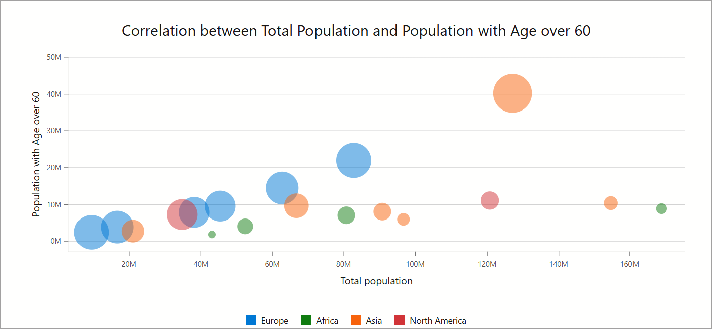
Type-specific series have their own settings. For example, bubble series display chart data as points with different sizes called “bubbles”. To specify a data source field that defines bubble sizes, use the DxChartBubbleSeries.SizeField property. You can also use MinBubbleSize and MaxBubbleSize properties to specify diameters of the biggest and smallest “bubbles” in the series.
@using System.Text.RegularExpressions
@using System.Drawing;
@* ... *@
@inject IPopulationCorrelationDataProvider PopulationCorrelation
<DxChart @ref="@chart"
         Data="@chartsData"
         Width="100%"
         Height="500px">
    <DxChartTitle Text="Correlation between Total Population and Population with Age over 60" />

    <DxChartBubbleSeries Name="Europe"
                         T="PopulationCorrelationDataPoint"
                         TArgument="double"
                         TValue="double"
                         TSize="double"
                         ArgumentField="pc => pc.TotalPopulation"
                         ValueField="pc => pc.Older60Population"
                         SizeField="pc => pc.Older60Population / pc.TotalPopulation"
                         Filter='pc => pc.Region == "Europe"' />
    <DxChartBubbleSeries Name="Africa"
                         T="PopulationCorrelationDataPoint"
                         TArgument="double"
                         TValue="double"
                         TSize="double"
                         ArgumentField="pc => pc.TotalPopulation"
                         ValueField="pc => pc.Older60Population"
                         SizeField="pc => pc.Older60Population / pc.TotalPopulation"
                         Filter='pc => pc.Region == "Africa"' />
    <DxChartBubbleSeries Name="Asia"
                         T="PopulationCorrelationDataPoint"
                         TArgument="double"
                         TValue="double"
                         TSize="double"
                         ArgumentField="pc => pc.TotalPopulation"
                         ValueField="pc => pc.Older60Population"
                         SizeField="pc => pc.Older60Population / pc.TotalPopulation"
                         Filter='pc => pc.Region == "Asia"' />
    <DxChartBubbleSeries Name="North America"
                         T="PopulationCorrelationDataPoint"
                         TArgument="double"
                         TValue="double"
                         TSize="double"
                         ArgumentField="pc => pc.TotalPopulation"
                         ValueField="pc => pc.Older60Population"
                         SizeField="pc => pc.Older60Population / pc.TotalPopulation"
                         Filter='pc => pc.Region == "North America"' />


    <DxChartLegend Position="RelativePosition.Outside"
                   VerticalAlignment="VerticalEdge.Bottom"
                   HorizontalAlignment="HorizontalAlignment.Center"
                   Orientation="Orientation.Horizontal" />

    <DxChartArgumentAxis>
        <DxChartAxisTitle Text="Total population" />
        <DxChartAxisLabel Format='ChartElementFormat.FromLdmlString("#0M")' />
    </DxChartArgumentAxis>

    <DxChartValueAxis EndOnTick="false" SideMarginsEnabled="false">
        <DxChartAxisTitle Text="Population with Age over 60" />
        <DxChartAxisLabel Format='ChartElementFormat.FromLdmlString("#0M")' />
        <DxChartAxisRange StartValue = "-3" EndValue = "50"/>
    </DxChartValueAxis>
@* ... *@
</DxChart>
@* ... *@
@code {
    IEnumerable<PopulationCorrelationDataPoint> chartsData;
    DxChartBase chart;

    async void ExportChart(ChartExportFormat format) {
        await chart?.ExportAsync("BubbleChart", format);
    }
    protected override async Task OnInitializedAsync() {
        chartsData = await PopulationCorrelation.GetData();
    }
}
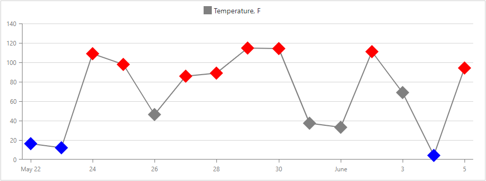
For line series, you can use the DxChartSeriesPoint component to customize the point’s color, size, symbol, and visibility. These settings apply to all points in a series. To override individual point settings, handle the chart’s CustomizeSeriesPoint event.
@inject WeatherForecastService ForecastService

<DxChart Data="@ChartData" CustomizeSeriesPoint="@PreparePointColor">
    <DxChartLineSeries SummaryMethod="@(i => (int)i.Average())"
                       Color="@System.Drawing.Color.Gray"
                       ValueField="@((WeatherForecast i) => i.TemperatureF)"
                       ArgumentField="@(i => i.Date.Date)"
                       Name="Temperature, F">
        <DxChartSeriesPoint Symbol="ChartPointSymbol.Polygon" Color="@System.Drawing.Color.Gray" Size="25" />
    </DxChartLineSeries>
</DxChart>

@code {
    WeatherForecast[] ChartData;

    protected override async Task OnInitializedAsync() {
        ChartData = await ForecastService.GetForecastAsync();
    }

    protected void PreparePointColor(ChartSeriesPointCustomizationSettings pointSettings) {
        double value = (double)pointSettings.Point.Value;
        if (value > 75)
            pointSettings.PointAppearance.Color = System.Drawing.Color.Red;
        else if (value < 25)
            pointSettings.PointAppearance.Color = System.Drawing.Color.Blue;
    }
}
For the line series and constant line you can specify the dash style. For example, make the line dashed, dotted, or apply one of the predefined patterns.
The following example defines a dashed line series:
<DxChart Data="@SalesData">
    <DxChartLineSeries Name="Total Sales"
                       ArgumentField="@((SaleInfo s) => s.City)"
                       ValueField="@((SaleInfo s) => s.Amount)"
                       SummaryMethod="Enumerable.Sum"
                       DashStyle="ChartDashStyle.Dash">
    </DxChartLineSeries>
</DxChart>
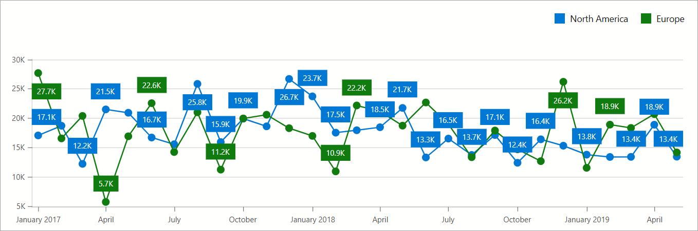
Series Labels
Add a DxChartSeriesLabel object to series markup to configure labels for series data points. To display series labels, set the DxChartSeriesLabel.Visible property to true:
<DxChart Data="forecasts">
    <DxChartLineSeries ArgumentField="@((WeatherForecast v) => v.Date)"
                       ValueField="@((WeatherForecast v) => v.TemperatureC)">
        <DxChartSeriesLabel Visible="true" />
    </DxChartLineSeries>
    <DxChartLegend Visible="false"></DxChartLegend>
</DxChart>
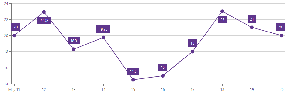
All settings apply to all labels in the series. To override individual label settings, handle the chart’s CustomizeSeriesPoint event and use the event argument’s PointLabel property.
For additional information on how to configure series labels, refer to the following topic: Labels in Blazor Charts.
Error Bars
Error bars indicate measurement precision or uncertainty. They display a possible value range next to a series point. Error bars can display fixed values or percentages, statistical function values, or error values obtained from data source fields.
Refer to the DxChartSeriesValueErrorBar class description for additional information and an example.
Axes
Primary X and Y axes are automatically created based on the data type of the first series. The DxChartArgumentAxis class defines the X-axis, and the DxChartValueAxis class defines the Y-axis. The Visible property specifies an axis visibility. The DxChartAxisTitle object specifies the axis title.
Axis labels are displayed on the chart’s X-axis. The <DxChart> uses smart label management to ensure that labels do not overlap. The Format property specifies the axis label’s format.
If the data range or format is series-specific, each series can use its own Y-axis. The number of Y-axes in a chart is not limited.
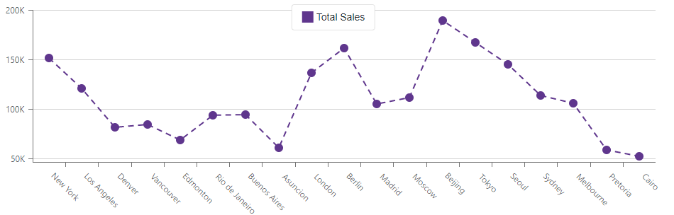
<DxChart Data="@SalesData">
    <DxChartTitle Text="Sales amount" />
    <DxChartLegend Position="RelativePosition.Outside" />
    <DxChartValueAxis>
        <DxChartAxisLabel Format="ChartElementFormat.Percent()"></DxChartAxisLabel>
        <DxChartAxisTitle Text="Amount"></DxChartAxisTitle>
    </DxChartValueAxis>
    <DxChartValueAxis Name="TotalAxis" Alignment="ChartAxisAlignment.Far">
        <DxChartAxisTitle Text="Total Amount"></DxChartAxisTitle>
    </DxChartValueAxis>
    <DxChartArgumentAxis>
        <DxChartAxisTitle Text="Cities"></DxChartAxisTitle>
    </DxChartArgumentAxis>
    @* ... *@
</DxChart>
Refer to the following topic for additional information about axes and their visual elements: Axes in Blazor Charts.
Axis Labels
Use the DxChartAxisLabel component to show and configure labels for axis ticks. To specify axis label visibility, use the DxChartAxisLabel.Visible property.
DxChart allows you to specify how to arrange axis labels. When they overlap, use the Overlap property to rearrange such labels. Based on the Overlap property value, specify the RotationAngle or StaggeringSpacing property.
The following example uses the drop-down menu to rearrange overlapping axis labels.
<DxChart Data="@GetData()" Width="100%">
    <DxChartTitle Text="Population by Country 2023" />
    <DxChartLegend Visible="false"/>
    <DxChartLineSeries ArgumentField="@((DataPoint s) => s.Country)"
                       ValueField="@((DataPoint s) => s.Value)"/>
    @* ... *@
    <DxChartArgumentAxis>
        <DxChartAxisLabel Overlap="@CurrentOverlapMode"
                          WordWrap="ChartWordWrap.None"/>
    </DxChartArgumentAxis>
</DxChart>

@code {
    ChartAxisLabelOverlap CurrentOverlapMode = ChartAxisLabelOverlap.Stagger;
    List<DataPoint> GetData() {
        var result = new List<DataPoint>(14);
        // ...
        return result;
    }
    public class DataPoint {
        public string Country { get; set; }
        public int Value { get; set; }
        public DataPoint(string country, int value) {
            Country = country;
            Value = value;
        }
    }
}
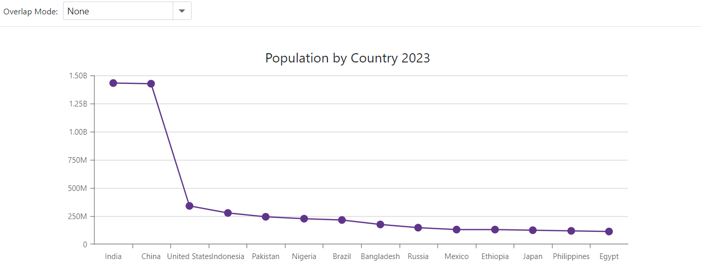
For additional information about axis labels, refer to the following section: Labels - Axis Labels.
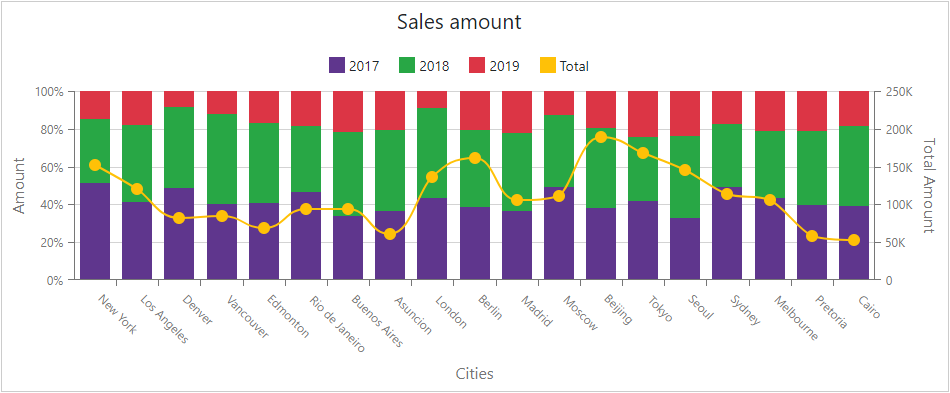
Legend
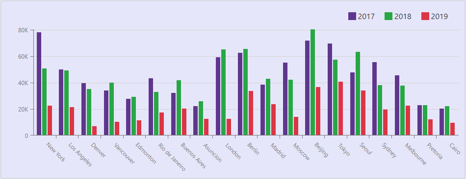
A chart’s legend lists all chart series. The DxChartLegend component implements the chart legend. Use the Visible property to specify the legend’s visibility and the Position property to specify the legend’s position. The chart obtains a legend item’s text from a series Name property.
Enable the AllowToggleSeries property to display checkboxes that toggle the visibility of individual series.
<DxChart Data="@SalesData">
    <DxChartLegend AllowToggleSeries="true"
                   Orientation="Orientation.Vertical"
                   HorizontalAlignment="HorizontalAlignment.Right">
        <DxChartTitle Text="Years">
            <DxChartSubTitle Text="(2017-2019)"></DxChartSubTitle>
        </DxChartTitle>
    </DxChartLegend>
    <DxChartBarSeries Name="2017" ... />
    <DxChartBarSeries Name="2018" ... />
    <DxChartLineSeries Name="2019" ... />
        <DxChartSeriesLegendItem IconCssClass="oi oi-flag">
            <TextTemplate>Last year</TextTemplate>
        </DxChartSeriesLegendItem>
    </DxChartLineSeries>
</DxChart>
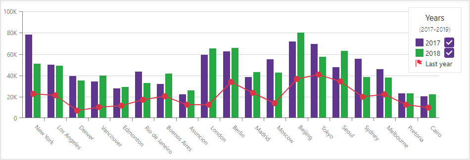
Refer to the following section for additional information about legend: Descriptive Elements - Legend.
Titles and Subtitles
The <DxChart> component can display titles (DxChartTitle) and subtitles (DxChartSubTitle) for the chart component and legend.
<DxChart Data="@SalesData">
   <DxChartTitle Text="Sales amount">
       <DxChartSubTitle Text="by cities"></DxChartSubTitle>
   </DxChartTitle>
    <DxChartLegend AllowToggleSeries="true"
                   Orientation="Orientation.Vertical"
                   HorizontalAlignment="HorizontalAlignment.Right">
        <DxChartTitle Text="Years">
            <DxChartSubTitle Text="(2017-2019)"></DxChartSubTitle>
        </DxChartTitle>
    </DxChartLegend>
</DxChart>
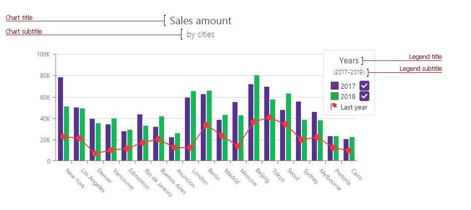
Refer to the following section for additional information about titles: Descriptive Elements - Titles and Subtitles.
Annotations
Annotations are comments that contain information about chart content. The DxChart<T> component supports text and image annotations. You can anchor annotations to chart elements (series points or axes) or position annotations based on pixel coordinates.
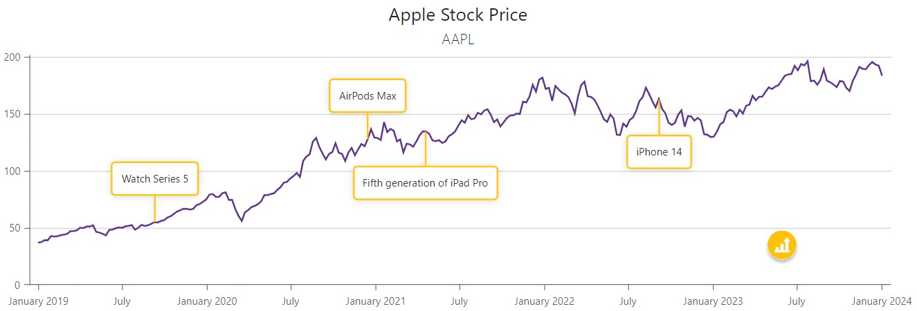
Refer to the following section for additional information about annotations: Annotations in Blazor Charts.
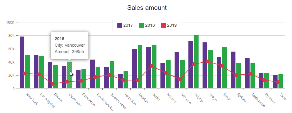
Tooltips
The Chart can display tooltips when the mouse pointer is above a chart series. Use the DxChartTooltip element to specify tooltip templates.
The Tooltip class contains the following properties:
- Enabled - Specifies whether tooltips are enabled. Set this property to
trueto display tooltips. - Position - Specifies the tooltip position.
<DxChart Data="@SalesData"
         CssClass="mw-1100">
    <DxChartTitle Text="Sales amount" />

    <DxChartTooltip Enabled="true" Position="RelativePosition.Outside">
        <div class="tooltip-content">
            <div class="tooltip-title">@context.Point.SeriesName</div>
            <div>City: @context.Point.Argument</div>
            <div>Amount: @context.Point.Value</div>
        </div>
    </DxChartTooltip>

    <DxChartBarSeries Name="2017"
                      Filter="@((SaleInfo s) => s.Date.Year == 2017)"
                      SummaryMethod="Enumerable.Sum"
                      ArgumentField="@(s => s.City)"
                      ValueField="@(s => s.Amount)" />
    <DxChartBarSeries Name="2018"
                      Filter="@((SaleInfo s) => s.Date.Year == 2018)"
                      SummaryMethod="Enumerable.Sum"
                      ArgumentField="@(s => s.City)"
                      ValueField="@(s => s.Amount)" />
    <DxChartLineSeries Name="2019"
                       Filter="@((SaleInfo s) => s.Date.Year == 2019)"
                       SummaryMethod="Enumerable.Sum"
                       ArgumentField="@(s => s.City)"
                       ValueField="@(s => s.Amount)" />
</DxChart>
Refer to the following section for additional information about titles: Descriptive Elements - Tooltips.
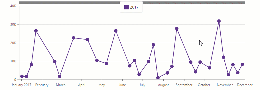
Zoom and Pan
Users can zoom and pan the chart with the mouse wheel or touch gestures. To enable zoom/pan, add a DxChartZoomAndPanSettings object and specify its ArgumentAxisZoomAndPanMode and ValueAxisZoomAndPanMode properties.
You can also add a scrollbar that allows users to pan the chart along the argument axis. To do this, add a DxChartScrollBarSettings object and set its ArgumentAxisScrollBarVisible property to true. Use the ArgumentAxisScrollBarPosition property to specify the scrollbar’s position.
@using Chart.Data

<DxChart Data="@SalesData">
    <DxChartLineSeries Name="2017"
                       Filter="@((SaleInfo s) => s.Date.Year == 2017)"
                       ArgumentField="@(s => s.Date)"
                       ValueField="@(s => s.Amount)">
        <DxChartAggregationSettings Enabled="true" Method="ChartAggregationMethod.Sum" />
    </DxChartLineSeries>
    <DxChartZoomAndPanSettings ArgumentAxisZoomAndPanMode="ChartAxisZoomAndPanMode.Both"
                               ValueAxisZoomAndPanMode="ChartAxisZoomAndPanMode.Pan" />
    <DxChartScrollBarSettings ArgumentAxisScrollBarVisible="true"
                              ArgumentAxisScrollBarPosition="ChartScrollBarPosition.Top" />
</DxChart>

@code {
    IEnumerable<SaleInfo> SalesData;

    protected override async Task OnInitializedAsync() {
        SalesData = await Sales.GetSalesAsync();
    }
}
Refer to the following topic for additional information about zoom and examples: Zoom in Blazor Chart.
Data Aggregation
The <DxChart> component can use aggregate methods to group data and decrease the number of visible points. This feature allows you to optimize chart performance.
Data aggregation is available for the X-axis. The chart splits the X-axis into intervals, aggregates data for each interval and shows the result values as series points. When users zoom the chart, it re-aggregates data.
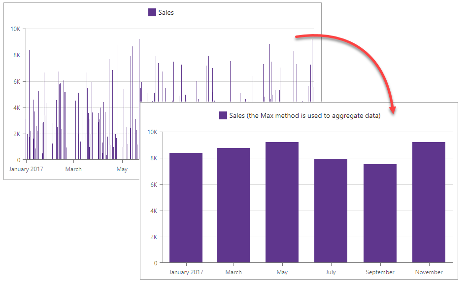
To enable aggregation, add a DxChartAggregationSettings object to the markup and set its Enabled property to true. To specify an aggregation method, use the Method property (the default method is Auto).
<DxChart T="BargainDataPoint"
Data="@UsdJpyData"
@key="@Params.ThemeName"
CssClass="chart-container">
<DxChartLegend Position="RelativePosition.Inside"
VerticalAlignment="VerticalEdge.Top"
HorizontalAlignment="HorizontalAlignment.Right" />
<DxChartLineSeries T="BargainDataPoint"
TArgument="DateTime"
TValue="double"
ArgumentField="i => i.DateTimeStamp"
ValueField="i => i.Price"
Name="USDJPY">
<DxChartSeriesPoint Visible="false" />
<DxChartAggregationSettings Enabled="true"
Method="ChartAggregationMethod.Average" />
</DxChartLineSeries>
<DxChartArgumentAxis>
<DxChartAxisRange StartValue="new DateTime(2020, 01, 01)"
EndValue="new DateTime(2021, 01, 29)" />
</DxChartArgumentAxis>
<DxChartZoomAndPanSettings ArgumentAxisZoomAndPanMode="ChartAxisZoomAndPanMode.Both" />
<DxChartScrollBarSettings ArgumentAxisScrollBarVisible="true"
ArgumentAxisScrollBarPosition="ChartScrollBarPosition.Bottom" />
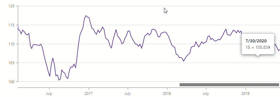
<DxChartTooltip Enabled="true" Position="RelativePosition.Outside">
<div class="tooltip-content">
<div class="tooltip-title">@(((DateTime)context.Point.Argument).ToString("d"))</div>
<div>1$ = @(context.Point.Value)¥</div>
</div>
</DxChartTooltip>
</DxChart>
@code {
IEnumerable<BargainDataPoint> UsdJpyData;
@inject ICurrencyExchangeDataProvider UsdJpyDataProvider
protected override async Task OnInitializedAsync() {
UsdJpyData = await UsdJpyDataProvider.GetDataAsync();
}
}
Note
You can also use summary methods to optimize chart performance.
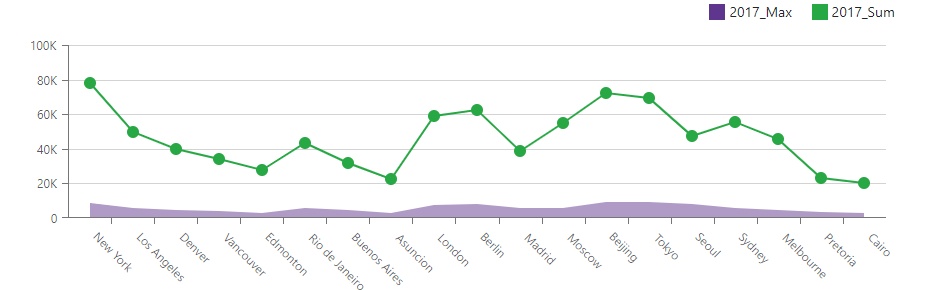
Data Summaries
The Chart component can use a summary method to group data. This method calculates summaries for points with the same argument value, and the chart shows the resulting values as series points. This feature allows you to decrease the number of visible points and to optimize chart performance.
Note that the chart calculates summaries when it loads data and does not re-calculate them when users zoom the chart.
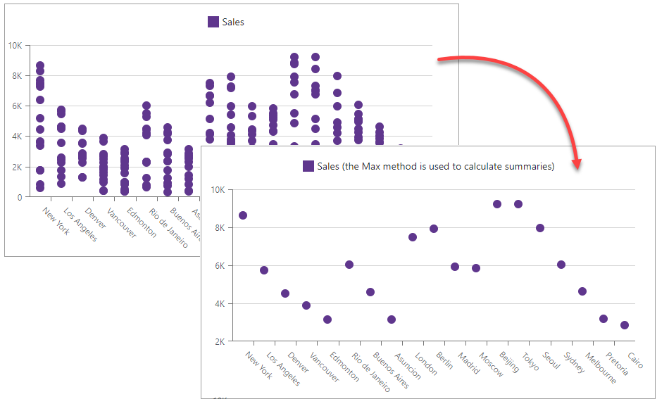
You can specify a common summary method for all chart series (DxChartCommonSeries.SummaryMethod) or an individual method for each series (DxChartSeries.SummaryMethod).
@using Chart.Data

<DxChart Data="@SalesData">
    <DxChartAreaSeries Name="2017_Max"
                        Filter="@((SaleInfo s) => s.Date.Year == 2017)"
                        ArgumentField="@(s => s.City)"
                        ValueField="@(s => s.Amount)"
                        SummaryMethod="Enumerable.Max" />
    <DxChartLineSeries Name="2017_Sum"
                        Filter="@((SaleInfo s) => s.Date.Year == 2017)"
                        ArgumentField="@(s => s.City)"
                        ValueField="@(s => s.Amount)"
                        SummaryMethod="Enumerable.Sum" />
    <DxChartLegend Position="RelativePosition.Outside" HorizontalAlignment="HorizontalAlignment.Right" />
</DxChart>

@code {
    IEnumerable<SaleInfo> SalesData;

    protected override async Task OnInitializedAsync() {
        SalesData = await Sales.GetSalesAsync();
    }
}
Note
You can also use aggregation methods to optimize chart performance.
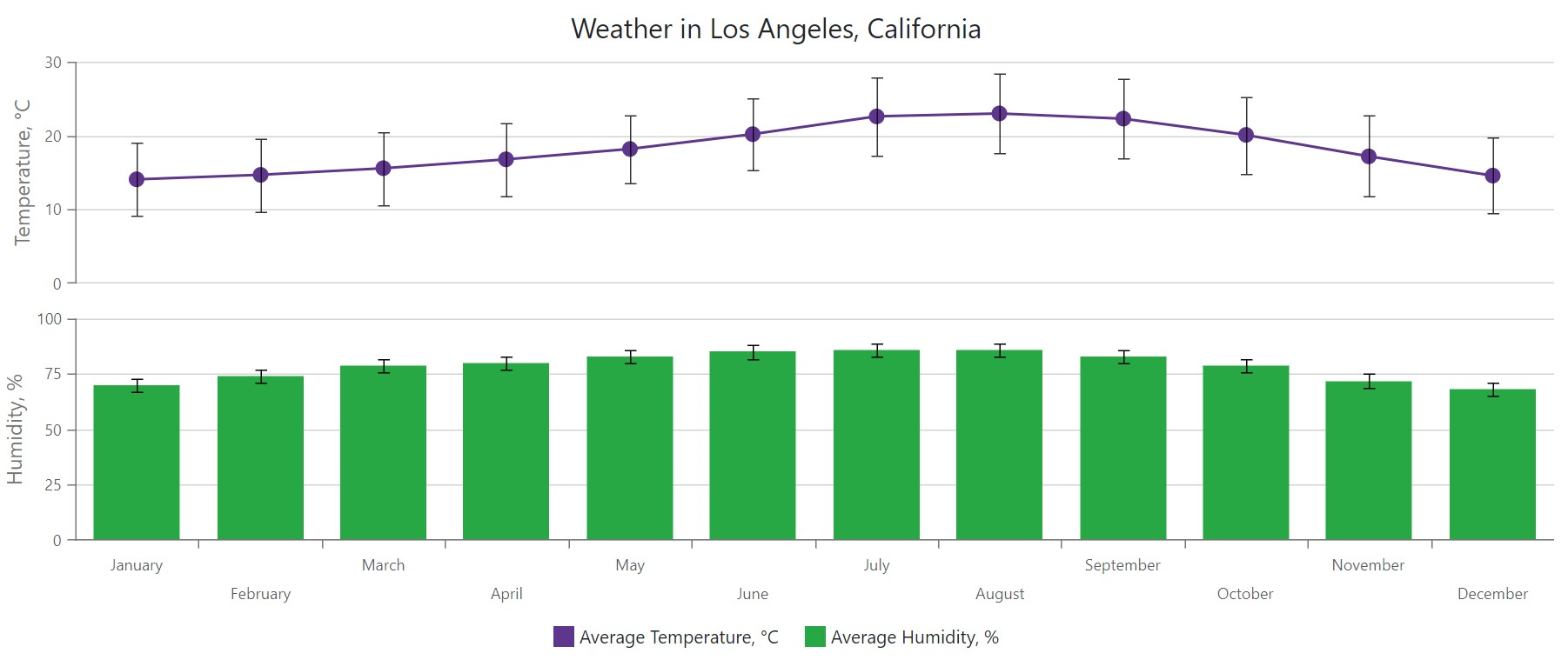
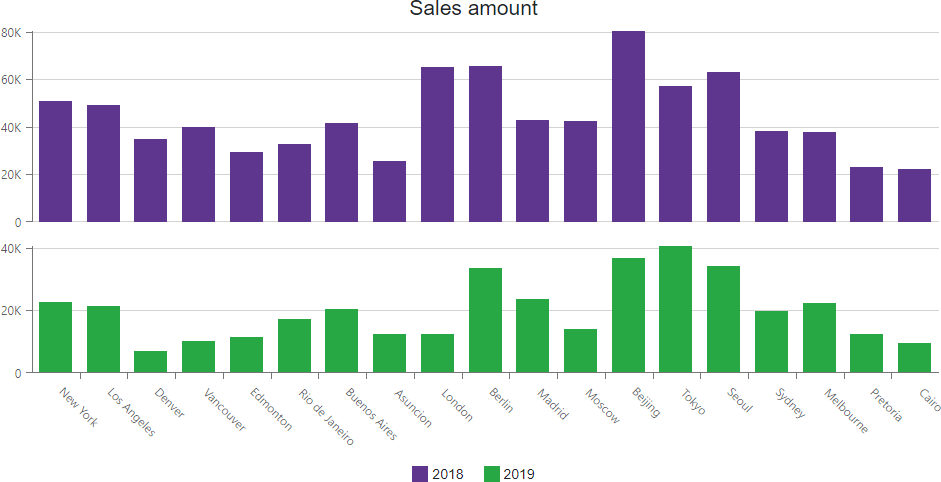
Multiple Panes
The <DxChart> component allows you to create charts with multiple panes under each other. A pane (DxChartPane) can display one or more series and can share its argument axis with other panes. To specify the pane where a series is displayed, use the series Pane property. You can also use the DefaultPane property to specify the pane that displays all axes and series with unspecified Pane property.
You can specify the pane Height in pixels or percentages.
<DxChart Data="@SalesData" Height="500px">
    <DxChartTitle Text="Sales amount" />
    <DxChartLegend Position="RelativePosition.Outside" VerticalAlignment="VerticalEdge.Bottom" />
    <DxChartPane Name="Pane1" Height="60%" />
    <DxChartPane Name="Pane2" />
    <DxChartBarSeries Name="2018"
                      Filter="@((SaleInfo s) => s.Date.Year == 2018)"
                      SummaryMethod="Enumerable.Sum"
                      Pane="Pane1"
                      ArgumentField="@(s => s.City)"
                      ValueField="@(s => s.Amount)" />
    <DxChartBarSeries Name="2019"
                      Filter="@((SaleInfo s) => s.Date.Year == 2019)"
                      SummaryMethod="Enumerable.Sum"
                      Pane="Pane2"
                      ArgumentField="@(s => s.City)"
                      ValueField="@(s => s.Amount)" />
</DxChart>
Selection and Hover
The <DxChart> component allows you to select series and points. To enable series and point selection at the chart level, specify the chart’s SeriesSelectionMode and PointSelectionMode properties. You can choose between the following modes: None, Single, and Multiple.
Charts highlight entire pie and line- and area-based series when a user hovers over them. Use the series HoverMode property to specify highlighted series elements.
Use the HoverMode property to specify series points to highlight on hover. This property exists on the point level for line- and area-based series, and on the series level for other series types. Refer to the following enumeration description for additional information about available options: ChartSeriesPointHoverMode. Point behavior is the same as the series-level setting if HoverMode is None.
For additional information on selection and hover in <DxChart> refer to the following topic: User Interaction Options in Blazor Charts.
Size
Use the chart’s Width and Height properties to change the component’s size. You can also use the RedrawOnResize property to specify whether to redraw the chart when its container size changes.
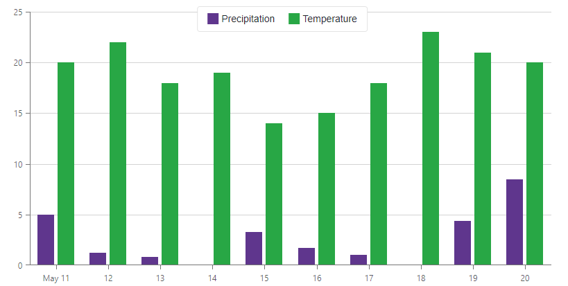
<DxChart Data="@forecasts"
         Width="800px"
         Height="400px">
    <DxChartBarSeries ArgumentField="@((WeatherForecast i) => i.Date)"
                      ValueField="@((WeatherForecast i) => i.Precipitation)"
                      Name="Precipitation">
    </DxChartBarSeries>
    <DxChartBarSeries ArgumentField="@((WeatherForecast i) => i.Date)"
                      ValueField="@((WeatherForecast i) => i.TemperatureC)"
                      Name="Temperature">
    </DxChartBarSeries>
</DxChart>
Appearance Customization
Use the chart’s CssClass property to customize the chart’s appearance. The following snippet changes the chart’s background color and font size:
<DxChart Data="@SalesData" CssClass="my-style">
    <DxChartCommonSeries NameField="@((SaleInfo s) => s.Date.Year)"
                         ArgumentField="@(s => s.City)"
                         ValueField="@(s => s.Amount)"
                         SummaryMethod="Enumerable.Sum"
                         SeriesType="BarSeriesType.Value">
    </DxChartCommonSeries>
    <DxChartLegend Position="RelativePosition.Outside" HorizontalAlignment="HorizontalAlignment.Right" />
</DxChart>
You can also apply CSS styles to chart elements:
For additional information, refer to the following help topic: CSS Classes.
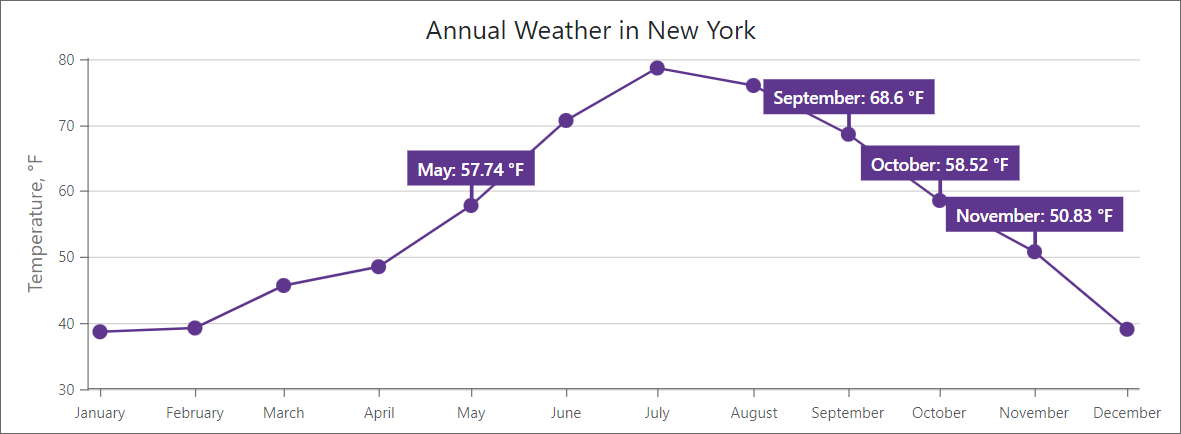
Font Customization
Use the DxChartFont object to customize fonts for DxChartAxisTitle, DxChartAxisLabel, DxChartSeriesLabel, or DxChartConstantLineLabel.
The following properties are available:
The following code snippet customizes font settings of a series label:
<DxChart Data="@WeatherForecasts"
         CustomizeSeriesPoint="@PreparePointLabel"
         Width="100%">
    <DxChartTitle Text="Annual Weather in New York" />
    <DxChartLineSeries SummaryMethod="@(i => i.Average())"
                       ValueField="@((DetailedWeatherSummary i) => i.AverageTemperatureF)"
                       ArgumentField="@(i => new DateTime(2000, i.Date.Month, 1))"
                       Name="Temperature, F"
                       Filter="@((DetailedWeatherSummary  i) => i.City == "NEW YORK")">
        <DxChartSeriesLabel Position="RelativePosition.Outside"
                            FormatPattern="{argument:MMMM}: {value:#.##} °F">
            <DxChartSeriesLabelConnector Visible="true"
                                         Width="3" />
            <DxChartFont Size="14" Weight="600" />
        </DxChartSeriesLabel>
    </DxChartLineSeries>
    <DxChartLegend Visible="false" />
    <DxChartValueAxis>
        <DxChartAxisTitle Text="Temperature, °F" />
    </DxChartValueAxis>
    <DxChartArgumentAxis>
        <DxChartAxisLabel Format="ChartElementFormat.Month" />
    </DxChartArgumentAxis>
</DxChart>

@code {
    IEnumerable<DetailedWeatherSummary> WeatherForecasts;

    protected override async Task OnInitializedAsync() {
        WeatherForecasts = await WeatherSummaryDataProvider.GetDataAsync();
    }

    protected void PreparePointLabel(ChartSeriesPointCustomizationSettings pointSettings) {
        double value = (double)pointSettings.Point.Value;
        if (value > 50 && value < 70)
            pointSettings.PointLabel.Visible = true;
    }
}
Export
Call ExportAsync method overloads to export chart data. The following code snippet uses a drop-down menu to export chart data to a file in the specified format:
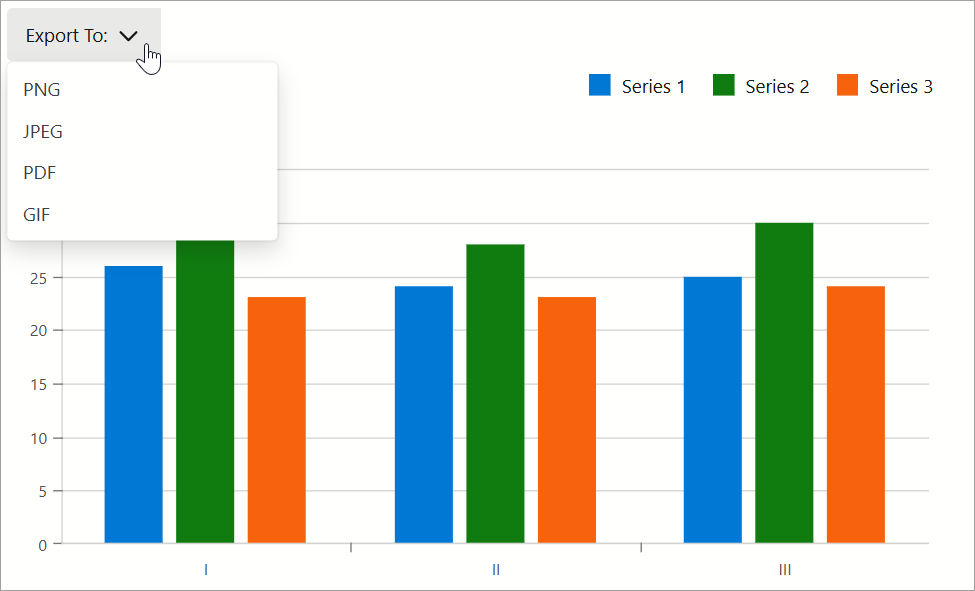
@using System.Drawing
<DxMenu ItemClick="Export">
    <Items>
        <DxMenuItem Text="Export To:">
            <Items>
                <DxMenuItem Text="PNG" />
                <DxMenuItem Text="JPEG" />
                <DxMenuItem Text="PDF" />
                <DxMenuItem Text="GIF" />
            </Items>
        </DxMenuItem>
    </Items>
</DxMenu>
<DxChart @ref="chart"
         Data="@dataPoints"
         LabelOverlap="ChartLabelOverlap.Hide"
         Width=700 Height=400>
    <DxChartBarSeries ArgumentField="@((DataPoint i) => i.Arg)"
                      ValueField="@((DataPoint i) => i.Value1)"
                      Name="Series 1" />
    <DxChartBarSeries ArgumentField="@((DataPoint i) => i.Arg)"
                      ValueField="@((DataPoint i) => i.Value2)"
                      Name="Series 2" />
    <DxChartBarSeries ArgumentField="@((DataPoint i) => i.Arg)"
                      ValueField="@((DataPoint i) => i.Value3)"
                      Name="Series 3" />
    <DxChartLegend Orientation="Orientation.Horizontal"
                   HorizontalAlignment="HorizontalAlignment.Right"
                   Position="RelativePosition.Outside" />
</DxChart>

@code {
    DxChartBase chart;
    private DataPoint[] dataPoints;
    protected override void OnInitialized() {
        dataPoints = GetDataPoints();
    }
    void Export(MenuItemClickEventArgs args) {
        ChartExportFormat format = ChartExportFormat.Png;
        Color backgroundColor = Color.White;
        int margin = 4;
        if(Enum.TryParse<ChartExportFormat>(args.ItemInfo.Text, true, out format))
            chart?.ExportAsync("Exported_Chart", format, margin, backgroundColor);
    }
}
Visualize Pivot Grid Data
You can link <DxChart> to the DxPivotGrid<T> component as follows:
- Create a method that asynchronously loads data from an IEnumerable<T> data source (Sales.Load() in this example).
- Create a DxPivotGridDataProvider<T> object based on the created method.
- Bind the Chart to the provider object. Use the ChartDataSource property.
- Bind the Pivot Grid to the provider object. Use the PivotGridDataSource property.
<DxChart Data="@(PivotGridDataProvider.ChartDataSource)">
    <DxChartCommonSeries NameField="@((IChartDataItem s) => s.SeriesName)"
                         ArgumentField="@(s => s.Argument)"
                         ValueField="@(s => s.Value)"
                         SeriesType="ChartSeriesType.Bar" />
</DxChart>

<DxPivotGrid Data="@(PivotGridDataProvider.PivotGridDataSource)">
    <DxPivotGridField Field="@nameof(SaleInfo.Region)" SortOrder="PivotGridSortOrder.Ascending"
        Area="PivotGridFieldArea.Row"></DxPivotGridField>
    <DxPivotGridField Field="@nameof(SaleInfo.Country)" Area="PivotGridFieldArea.Row"></DxPivotGridField>
    <DxPivotGridField Field="@nameof(SaleInfo.City)" Area="PivotGridFieldArea.Row"></DxPivotGridField>
    <DxPivotGridField Field="@nameof(SaleInfo.Date)" GroupInterval="PivotGridGroupInterval.Year"
        Area="PivotGridFieldArea.Column" Caption="Year"> </DxPivotGridField>
    <DxPivotGridField Field="@nameof(SaleInfo.OrderId)" Caption="Count" Area="PivotGridFieldArea.Data"
        SummaryType="PivotGridSummaryType.Count"> </DxPivotGridField>
</DxPivotGrid>

@code {
    DxPivotGridDataProvider<SaleInfo> PivotGridDataProvider = DxPivotGridDataProvider<SaleInfo>.Create(Sales.Load());
}
The Chart shows data from the Pivot Grid’s lowest expanded level. The Chart is updated when a user expands or collapses rows/columns in the Pivot Grid.

Troubleshooting
If a Blazor application throws unexpected exceptions, refer to the following help topic: Troubleshooting.