DxPolarChart<T> Class
A control that visualizes bound data as graphs in polar coordinates.
Namespace: DevExpress.Blazor
Assembly: DevExpress.Blazor.v26.1.dll
Declaration
public class DxPolarChart<T> :
    DxChartBase,
    IModelProvider<PolarChartArgumentAxisModel>,
    IModelProvider<PolarChartValueAxisModel>,
    IComponentContainer<IPolarChartSeriesModel>
Type Parameters
| Name | Description |
|---|---|
| T | The data item type. |
Remarks
The DevExpress Polar Chart for Blazor (<DxPolarChart>) allows you to visualize data within a polar coordinate system - where each point on a plane is determined by the distance from the center and the angle from a fixed direction.
Add a Chart to a Project
Follow the steps below to add the Polar Chart component to an application:
- Create a Blazor Server or Blazor WebAssembly application.
- Add the
<DxPolarChart>…</DxPolarChart>markup to a.razorfile. - Bind the component to data.
- Configure the component: create series, configure axes, add a legend, titles, tooltips, and so on (see the sections below).
API Reference
Refer to the following list for the component API reference: DxPolarChart Members.
Static Render Mode Specifics
Blazor Charts support static render mode to display data as static images. To use other features, enable interactivity on a Razor page, and allow chart components to execute scripts and display data.
Data Binding
Use the Data property to bind the Polar Chart to data. Follow the steps below to display data within the component:
- Bind the
Dataparameter to a C# field or property. - Populate this field or property with data in the OnInitialized lifecycle method.
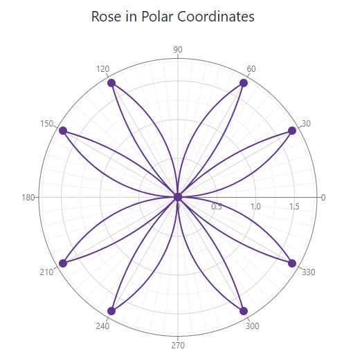
<DxPolarChart Data=@DataSource Width="100%" Height="500">
    <DxChartTitle>
        <div class="continuous-chart-title">
            Rose in Polar Coordinates
        </div>
    </DxChartTitle>
    <DxChartLegend Visible="false"/>
    <DxPolarChartArgumentAxis Inverted="true" StartAngle="90" TickInterval="30"/>
    <DxPolarChartLineSeries
        ArgumentField="@((DataPoint i) => i.X)"
        ValueField="@((DataPoint i) => i.Y)"/>
</DxPolarChart>

@code {
    IEnumerable<DataPoint> DataSource = Enumerable.Empty<DataPoint>();

    protected override void OnInitialized () {
        DataSource = ChartContinuousDataProvider.GenerateData();
    }
}
The chart may update itself automatically or on-demand, as listed below. Regardless of update cause, you can handle the Rendered event to track the moment when the chart rendering is finished and the component is completely loaded.
- Data-related updates: If the data source collection implements the INotifyCollectionChanged interface, the Chart is updated automatically each time the collection changes. Call the RefreshData method to reload data and redraw the component on-demand.
- Layout-related updates: The Chart redraws itself when a user resizes the component’s root container. Set the RedrawOnResize property to
falseto disable this behavior. To re-render the Chart area on-demand, call the RedrawAsync method.
For additional information, refer to the following article: Bind Blazor Charts to Data.
Note
When you bind a chart to DateTime values and set the Kind property to Utc, the component converts dates (for example, when it displays axis labels). This occurs because DxPolarChart is rendered on the client. To avoid such conversion, make sure your DateTime objects have their Kind properties set to Local or Unspecified.
You can also adjust the time difference to display dates correctly. The following code snippet demonstrates a possible solution:
public WeatherForecast[] GetForecast() {
    var localZone = TimeZoneInfo.Local;
    var localOffset = localZone.GetUtcOffset(DateTime.UtcNow);
    var cur = DateTime.UtcNow.Add(localOffset);

    var utcDates = new List<DateTime> { cur };
    var dates = new List<DateTime>();
    foreach (var utcDate in utcDates)
        dates.Add(new DateTime(utcDate.Ticks));
    // ...
}
Series
A series is a collection of related data points. Refer to the following topic for additional information about available series types: Series Types in Blazor Charts.
If you have several series, place them at the same chart hierarchy level. Note that DxPolarChart renders series based on their order in the markup. If you need to change the rendering order, place series in the corresponding positions in the markup.
You can specify common settings for all chart series at the component level or add series objects to the component’s markup and configure series-specific settings individually. Individual series settings have priority over common series settings.
Component Level Settings
Component-level settings apply to all series in the component. The list below contains available options:
- BarGroupPadding | BarGroupWidth
- Specify the bar series appearance.
- PointSelectionMode | SeriesSelectionMode
- Specify selection options.
- UseSpiderWeb
- Specifies whether to display the chart grid as a spider web.
- NegativesAsZeroes
- Specifies whether the Polar Chart treats negative values as zeros in stacked bar series.
Series-Level Settings
The DxPolarChartBaseSeries class contains properties that you can apply to all series types, for example, series color or visibility.
Each series also allows you to configure its own properties. For example, you can specify the pattern to render the line series (DashStyle).
The following example applies the LongDash pattern:
<DxPolarChart Data=@DataSource>
    <DxPolarChartLineSeries ArgumentField="@((DiscretePoint i) => i.Arg)"
                            ValueField="@((DiscretePoint i) => i.Day)"
                            DashStyle="ChartDashStyle.LongDash">
    </DxPolarChartLineSeries>
</DxPolarChart>
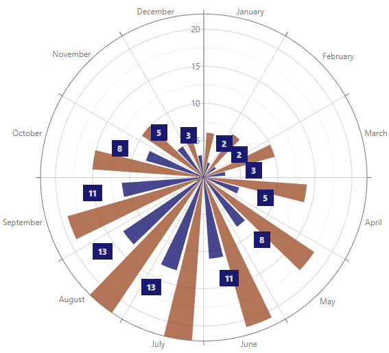
Series Labels
Add a DxChartSeriesLabel object to series markup to configure labels for series data points. To display series labels, set the DxChartSeriesLabel.Visible property to true.
You can use the MaxLabelCount property to limit the number of displayed labels. Additionally, you may use the LabelOverlap property to specify how the Polar Chart displays overlapping labels.
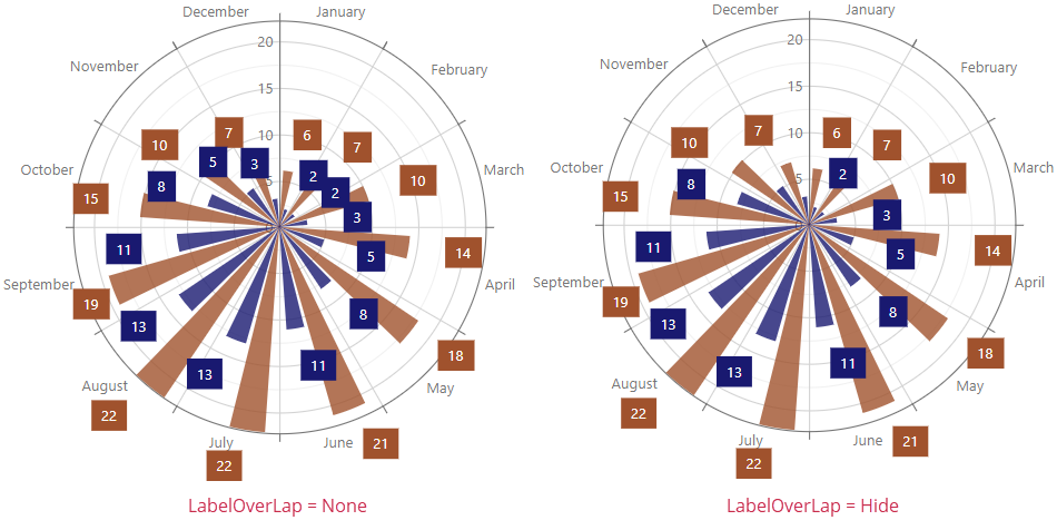
The following code snippet hides overlapping labels:
@using System.Drawing

<DxPolarChart Data=@DataSource LabelOverlap="PolarChartLabelOverlap.Hide">
    <DxPolarChartBarSeries Name="Day"
                           Color="Color.Sienna"
                           ArgumentField="@((DiscretePoint i) => i.Arg)"
                           ValueField="@((DiscretePoint i) => i.Day)">
        <DxChartSeriesLabel Visible="true" />
    </DxPolarChartBarSeries>
    <DxPolarChartBarSeries Name="Night"
                           Color="Color.MidnightBlue"
                           ArgumentField="@((DiscretePoint i) => i.Arg)"
                           ValueField="@((DiscretePoint i) => i.Night)">
        <DxChartSeriesLabel Visible="true" />
    </DxPolarChartBarSeries>
</DxPolarChart>
All settings apply to all labels in the series. To override individual label settings, handle the chart’s CustomizeSeriesPoint event and use the event argument’s PointLabel property.
For additional information on how to customize series labels, refer to the following topic: Labels in Blazor Charts.
Axes
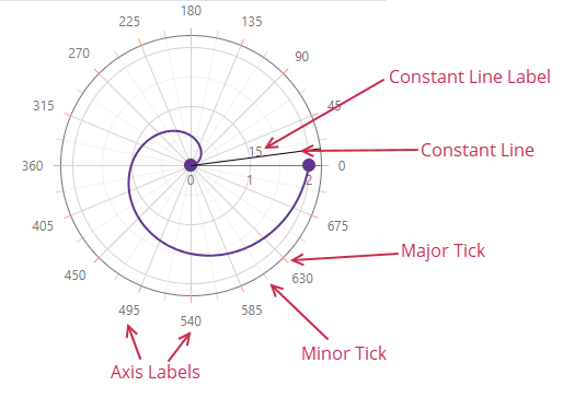
The DxPolarChartArgumentAxis class defines the argument axis. The following image demonstrates elements that are related to the argument axis:
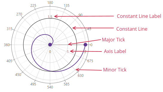
The DxPolarChartValueAxis class defines the value axis. The following image demonstrates value axis-related elements:
The Polar Chart component automatically creates its axes based on the data type of the first series in the markup. You can also use DxPolarChartArgumentAxis.ArgumentType and DxPolarChartValueAxis.ArgumentType properties to explicitly specify the axis data type.
The following code snippet casts arguments specified as strings to the DateTime type:
@using System.Drawing

<DxPolarChart Data=@DataSource>
    <DxPolarChartBarSeries Name="Day"
                           Color="Color.Sienna"
                           ArgumentField="@((DiscretePoint i) => i.Arg)"
                           ValueField="@((DiscretePoint i) => i.Day)">
    </DxPolarChartBarSeries>
    <DxPolarChartBarSeries Name="Night"
                           Color="Color.MidnightBlue"
                           ArgumentField="@((DiscretePoint i) => i.Arg)"
                           ValueField="@((DiscretePoint i) => i.Night)">
    </DxPolarChartBarSeries>
    <DxPolarChartArgumentAxis ArgumentType="ChartAxisDataType.DateTime" />
    <DxChartLegend Visible="false" />
</DxPolarChart>
Set the Visible property to false to hide an axis.
For additional information on how to configure axes and their visual elements, refer to the following topic: Axes.
Legend
The legend (DxChartLegend) lists all chart series. The Polar Chart uses the DxPolarChartBaseSeries.Name property value as a series identifier in the legend if you do not specify the DxChartSeriesLegendItem.Text property.
Use the following API members to configure the legend’s settings:
- AllowToggleSeries
- Specifies whether users can toggle series visibility.
- HorizontalAlignment | VerticalAlignment | Position
- Specify legend location.
- Orientation
- Specifies how legend items are arranged, vertically (in a column) or horizontally (in a row).
- Visible
- Specifies the legend’s visibility.
The following code snippet configures the Polar Chart’s legend:
<DxPolarChart Data=@DataSource>
    <DxChartLegend Orientation="Orientation.Vertical"
                   HorizontalAlignment="HorizontalAlignment.Right"
                   AllowToggleSeries="true" />
    <DxPolarChartBarSeries Name="Day"
                           Color="Color.Sienna"
                           ArgumentField="@((DiscretePoint i) => i.Arg)"
                           ValueField="@((DiscretePoint i) => i.Day)">
    </DxPolarChartBarSeries>
    <DxPolarChartBarSeries Name="Night"
                           Color="Color.MidnightBlue"
                           ArgumentField="@((DiscretePoint i) => i.Arg)"
                           ValueField="@((DiscretePoint i) => i.Night)">
    </DxPolarChartBarSeries>
</DxPolarChart
Refer to the following section for additional information about legend: Descriptive Elements - Legend.
Titles and Subtitles
The <DxPolarChart> component can display titles (DxChartTitle) and subtitles (DxChartSubTitle) for the chart area and legend.
The following code snippet declares these objects in the markup:
<DxPolarChart Data=@DataSource>
    <DxChartTitle Text="Average Temperature in London">
        <DxChartSubTitle Text="Degree Celsius" />
    </DxChartTitle>
    <DxChartLegend Orientation="Orientation.Vertical" HorizontalAlignment="HorizontalAlignment.Right">
        <DxChartTitle Text="Years">
            <DxChartSubTitle Text="(2020-2024)" />
        </DxChartTitle>
    </DxChartLegend>
    <DxPolarChartBarSeries Name="Day"
                           Color="Color.Sienna"
                           ArgumentField="@((DiscretePoint i) => i.Arg)"
                           ValueField="@((DiscretePoint i) => i.Day)">
    </DxPolarChartBarSeries>
    <DxPolarChartBarSeries Name="Night"
                           Color="Color.MidnightBlue"
                           ArgumentField="@((DiscretePoint i) => i.Arg)"
                           ValueField="@((DiscretePoint i) => i.Night)">
    </DxPolarChartBarSeries>
</DxPolarChart>
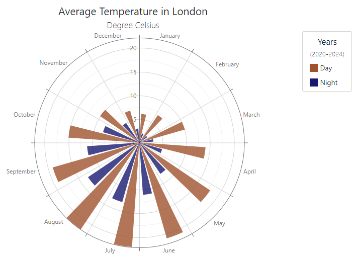
Refer to the following section for additional information about titles: Descriptive Elements - Titles and Subtitles.
Tooltips
The Polar Chart can display tooltips when the mouse pointer is above a chart series or point. Add the DxChartTooltip component to the component’s markup and set its Enabled property to true to activate tooltip functionality.
The following code snippet specifies custom content for series point tooltips:
<DxPolarChart Data=@DataSource>
    <DxChartTooltip Enabled="true">
        <div class="discrete-chart-tooltip">
            @context.Point.Value °C
        </div>
    </DxChartTooltip>
    <DxPolarChartBarSeries Name="Day"
                           Color="Color.Sienna"
                           ArgumentField="@((DiscretePoint i) => i.Arg)"
                           ValueField="@((DiscretePoint i) => i.Day)">
    </DxPolarChartBarSeries>
    <DxPolarChartBarSeries Name="Night"
                           Color="Color.MidnightBlue"
                           ArgumentField="@((DiscretePoint i) => i.Arg)"
                           ValueField="@((DiscretePoint i) => i.Night)">
    </DxPolarChartBarSeries>
</DxPolarChart>
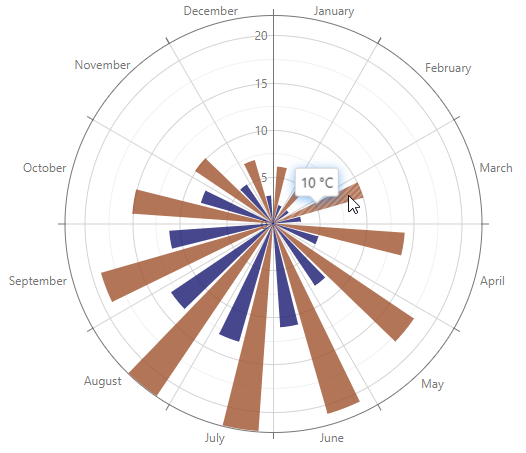
Refer to the following section for additional information about titles: Descriptive Elements - Tooltips.
Hover Series Elements
The chart highligts series elements when a mouse pointer is above the series. Use the series HoverMode property to select highlighted series elements.
The following example highlights a series and all its points when a user hovers the mouse pointer over the series:
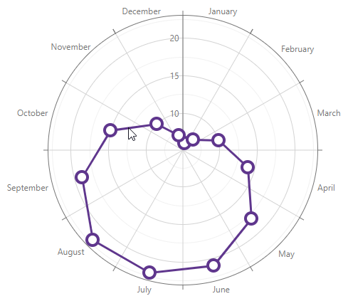
<DxPolarChart Data=@DataSource>
    <DxPolarChartLineSeries ArgumentField="@((DiscretePoint i) => i.Arg)"
                            ValueField="@((DiscretePoint i) => i.Day)"
                            HoverMode="ChartContinuousSeriesHoverMode.SeriesAndAllPoints">
    </DxPolarChartLineSeries>
</DxPolarChart>
For additional information on hover in <DxPolarChart> refer to the following topic: User Interaction Options in Blazor Charts.
Selection
Use PointSelectionMode and SeriesSelectionMode to allow users to select and deselect data points or the whole series with a click. You can specify the SelectionMode property at the series level to override component-level settings for the specific series.
Note
Since the Polar Chart component treats individual bars as points, the SeriesSelectionMode property is not applicable to bar, stacked bar, and side-by-side stacked bar series. Use the PointSelectionMode property instead.
In the following example, the Night series can be selected while the Day series is not selectable:
<DxPolarChart Data=@DataSource
              SeriesSelectionMode="ChartSelectionMode.Single">
    <DxPolarChartAreaSeries Name="Day"
                            ArgumentField="@((DiscretePoint i) => i.Arg)"
                            ValueField="@((DiscretePoint i) => i.Day)"
                            SelectionMode="ChartContinuousSeriesSelectionMode.None">
    </DxPolarChartAreaSeries>
    <DxPolarChartAreaSeries Name="Night"
                            Color="Color.MidnightBlue"
                            ArgumentField="@((DiscretePoint i) => i.Arg)"
                            ValueField="@((DiscretePoint i) => i.Night)">
    </DxPolarChartAreaSeries>
    <DxChartLegend Visible="false" />
</DxPolarChart>
For additional information on selection in <DxPolarChart> refer to the following topic: User Interaction Options in Blazor Charts.
Font Customization
Use the DxChartFont object to customize fonts for DxChartAxisTitle, DxPolarChartAxisLabel, DxChartSeriesLabel, or DxChartConstantLineLabel.
The following properties are available:
The following snippet customizes font settings of series labels:
<DxPolarChart Data=@DataSource>
    <DxPolarChartBarSeries Name="Day"
                           Color="Color.Sienna"
                           ArgumentField="@((DiscretePoint i) => i.Arg)"
                           ValueField="@((DiscretePoint i) => i.Day)">
    </DxPolarChartBarSeries>
    <DxPolarChartBarSeries Name="Night"
                           Color="Color.MidnightBlue"
                           ArgumentField="@((DiscretePoint i) => i.Arg)"
                           ValueField="@((DiscretePoint i) => i.Night)">
        <DxChartSeriesLabel Visible="true">
            <DxChartFont Weight="800" Color="lightgrey" />
        </DxChartSeriesLabel>
    </DxPolarChartBarSeries>
</DxPolarChart>
Export
Call ExportAsync method overloads to export chart data. The following code snippet uses a drop-down menu to export chart data to a file in the specified format:
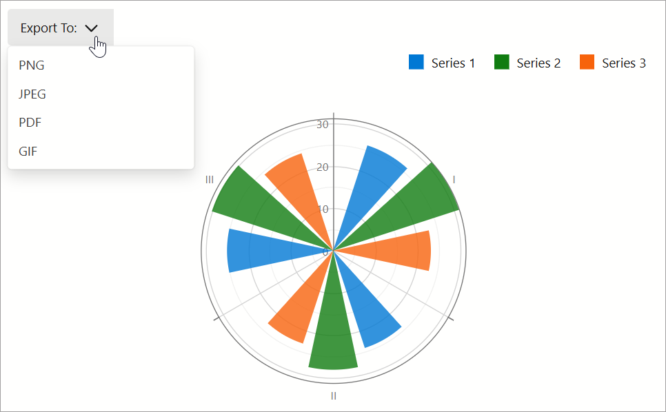
@using System.Drawing
<DxMenu ItemClick="Export">
    <Items>
        <DxMenuItem Text="Export To:">
            <Items>
                <DxMenuItem Text="PNG" />
                <DxMenuItem Text="JPEG" />
                <DxMenuItem Text="PDF" />
                <DxMenuItem Text="GIF" />
            </Items>
        </DxMenuItem>
    </Items>
</DxMenu>
<DxPolarChart @ref="chart"
              Data="@dataPoints"
              LabelOverlap="PolarChartLabelOverlap.Hide"
              Width=700 Height=400>
    <DxPolarChartBarSeries ArgumentField="@((DataPoint i) => i.Arg)"
                           ValueField="@((DataPoint i) => i.Value1)"
                           Name="Series 1" />
    <DxPolarChartBarSeries ArgumentField="@((DataPoint i) => i.Arg)"
                           ValueField="@((DataPoint i) => i.Value2)"
                           Name="Series 2" />
    <DxPolarChartBarSeries ArgumentField="@((DataPoint i) => i.Arg)"
                           ValueField="@((DataPoint i) => i.Value3)"
                           Name="Series 3" />
    <DxChartLegend Orientation="Orientation.Horizontal"
                   HorizontalAlignment="HorizontalAlignment.Right"
                   Position="RelativePosition.Outside" />
</DxPolarChart>

@code {
    DxChartBase chart;
    private DataPoint[] dataPoints;
    protected override void OnInitialized() {
        dataPoints = GetDataPoints();
    }
    void Export(MenuItemClickEventArgs args) {
        ChartExportFormat format = ChartExportFormat.Png;
        Color backgroundColor = Color.White;
        int margin = 4;
        if(Enum.TryParse<ChartExportFormat>(args.ItemInfo.Text, true, out format))
            chart?.ExportAsync("Exported_Chart", format, margin, backgroundColor);
    }
}
Troubleshooting
If a Blazor application throws unexpected exceptions, refer to the following help topic: Troubleshooting.