DxWindow Class
A non-modal window with custom content.
Namespace: DevExpress.Blazor
Assembly: DevExpress.Blazor.v26.1.dll
Declaration
public class DxWindow :
    DxComponentBase,
    IPopupEventInfo,
    IParentPopupBranchInfo,
    IPopupLayer,
    IAsyncDisposable
Remarks
The DevExpress Window for Blazor allows you to show a non-modal window with custom content. You can use it to display additional information or task progress, implement search dialogs, gather information from users, or ask for confirmation.
When the window appears, it captures input focus, but users can still interact with the rest of the page.

Add a Window to a Project
Follow the steps below to add the Window component to an application:
- Create a Blazor Server or Blazor WebAssembly application.
- Add the
<DxWindow></DxWindow>markup to a.razorfile. - Write code that manages the Window’s visibility.
- Define the Window’s content and appearance.
- Configure other options (see the sections below).
API Reference
Refer to the following list for the component API reference: DxWindow Members.
Static Render Mode Specifics
Blazor Window does not support static render mode. Enable interactivity to use the component in your application. Refer to the following topic for more details: Enable Interactive Render Mode.
Show and Close a Window
Implement two-way binding for the Visible property. Change this property value in code to show or hide the Window. The component updates this property when a user closes the Window.
<DxButton RenderStyle="ButtonRenderStyle.Secondary"
          Click="() => WindowVisible = !WindowVisible">SHOW A WINDOW</DxButton>
<DxWindow @bind-Visible=WindowVisible
          HeaderText="Header"
          BodyText="Lorem ipsum dolor sit amet, consectetur adipiscing elit. Mauris sit amet metus vel
             nisi blandit tincidunt vel efficitur purus. Nunc nec turpis tempus, accumsan orci auctor,
             imperdiet mauris. Fusce id purus magna."
          Width="max(25vw, 250px)">
</DxWindow>

@code {
    bool WindowVisible { get; set; } = false;
}
You can also call the ShowAsync and CloseAsync methods to show and close the Window asynchronously. Make sure the component has been initialized before you call the ShowAsync method. Use the IsInitialized property to check the initialization state.
To show the Window at the specified position, use the ShowAtAsync method overloads:
- ShowAtAsync(ElementReference, CancellationToken)
- Asynchronously shows the Window over the element specified by ElementReference.
- ShowAtAsync(Double, Double, CancellationToken)
- Asynchronously shows the Window at the specified coordinates.
- ShowAtAsync(Point, CancellationToken)
- Asynchronously shows the Window at the specified point.
- ShowAtAsync(String, CancellationToken)
- Asynchronously shows the Window over the element specified by a selector.
<DxButton RenderStyle="ButtonRenderStyle.Secondary"
          Click="OnShowAtPositionClick">SHOW A WINDOW</DxButton>

<DxWindow @ref=Window HeaderText="Header"
          BodyText="Lorem ipsum dolor sit amet, consectetur adipiscing elit. Mauris sit amet metus vel
             nisi blandit tincidunt vel efficitur purus. Nunc nec turpis tempus, accumsan orci auctor,
             imperdiet mauris. Fusce id purus magna."
          Width="max(25vw, 250px)"
          >
</DxWindow>

@code {
    DxWindow Window;

    async Task OnShowAtPositionClick(MouseEventArgs args) {
        await Window.ShowAtAsync(args.ClientX, args.ClientY);
    }
}
All options mentioned above allow you to open multiple Windows on a page. Users can switch between windows and interact with associated content as necessary. When a window is focused, it overlaps other visible windows.
Respond to Show and Close Actions
Handle the following events to process show and close actions:
- Showing
- Fires before the Window is displayed.
- Shown
- Fires after the Window is displayed.
- Closing
- Fires before the Window is closed.
- Closed
- Fires after the Window is closed.
User Capabilities
Users can close a Window in the following ways:
- Click the Close button. Set the ShowCloseButton to
trueto show this button. - Press Escape. You can set the CloseOnEscape property to
falseto disable this capability.
Content and Appearance
The window consists of header, body, and footer. The footer is initially hidden. You can set the ShowFooter property to true to display the footer.
Display Text
Use the HeaderText, BodyText, and FooterText properties to specify text displayed in the corresponding window elements. All predefined appearance settings apply to these elements.
<DxButton RenderStyle="ButtonRenderStyle.Secondary"
          Click="() => WindowVisible = !WindowVisible">SHOW A WINDOW</DxButton>
<DxWindow @bind-Visible="@WindowVisible"
          HeaderText="Header"
          BodyText="Lorem ipsum dolor sit amet, consectetur adipiscing elit. Mauris sit amet metus vel
             nisi blandit tincidunt vel efficitur purus. Nunc nec turpis tempus, accumsan orci auctor,
             imperdiet mauris. Fusce id purus magna."
          ShowFooter="true"
          FooterText="Footer"
          Width="max(25vw, 250px)">
</DxWindow>

@code {
    bool WindowVisible { get; set; } = false;
}

To customize appearance of Window elements, assign CSS classes to the HeaderCssClass, BodyCssClass, and FooterCssClass properties.
Display Custom Content
Use the following properties to display any UI render fragment in the Window elements: HeaderContentTemplate, BodyContentTemplate, and FooterContentTemplate. A render fragment can include formatted text, images, or another component. These templates affect the content area only.
These templates take priority over the *Text and *CssClass properties described above.
Each template has the context parameter. You can use the parameter’s CloseCallback property to implement a custom close button.
<DxButton RenderStyle="ButtonRenderStyle.Secondary"
Click="() => WindowVisible = !WindowVisible">SHOW A WINDOW</DxButton>
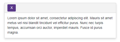
<DxWindow @bind-Visible=WindowVisible
BodyText="Lorem ipsum dolor sit amet, consectetur adipiscing elit. Mauris sit amet metus vel
nisi blandit tincidunt vel efficitur purus. Nunc nec turpis tempus, accumsan orci auctor,
imperdiet mauris. Fusce id purus magna."
Width="max(25vw, 250px)"
BodyCssClass="body-style">
<HeaderContentTemplate>
<DxButton Text="X" Click="@context.CloseCallback" />
</HeaderContentTemplate>
</DxWindow>
@code {
bool WindowVisible { get; set; } = false;
}
Customize Entire Elements
Specify HeaderTemplate, BodyTemplate, and FooterTemplate properties to define the content and appearance of Window elements. You can display any UI render fragment (for instance, formatted text, images, or another component).
These templates substitute entire render fragments of the corresponding elements. Predefined appearance settings, content alignment and paddings, and the corresponding Text, CssClass, and ContentTemplate properties have no effect.
Each template has the context parameter. You can use the parameter’s CloseCallback property to implement a custom close button.
Window Size
Use the Width and Height properties to specify the Window size in CSS units:
- Specify the absolute width/height (for instance,
Width="300px"). - Specify the relative width/height (for instance,
Width="50%"). - Make the width/height fit the content (
Width="auto").
<DxButton RenderStyle="ButtonRenderStyle.Secondary"
          Click="() => WindowVisible = !WindowVisible">SHOW A WINDOW</DxButton>
<DxWindow @bind-Visible=WindowVisible
          HeaderText="Header"
          BodyText="Lorem ipsum dolor sit amet, consectetur adipiscing elit. Mauris sit amet metus vel
             nisi blandit tincidunt vel efficitur purus. Nunc nec turpis tempus, accumsan orci auctor,
             imperdiet mauris. Fusce id purus magna."
          Width="220"
          Height="80">
</DxWindow>

@code {
    bool WindowVisible { get; set; } = false;
}
When the Window content does not fit the window’s size, this content is displayed over the window’s boundaries. Set the Scrollable property to true to show a vertical scrollbar and display all content inside the window’s boundaries.
Resize Window
Set the AllowResize property to true to allow users to resize the Window.
Handle the following events to process resize actions:
- ResizeStarted - Fires when a user starts to resize the Window.
- ResizeCompleted - Fires after the Window is resized.
<DxButton RenderStyle="ButtonRenderStyle.Secondary"
          Click="() => windowVisible = !windowVisible">SHOW A WINDOW</DxButton>
<DxWindow @bind-Visible=windowVisible
          AllowResize=true
          ResizeCompleted="OnWindowResizeCompleted"
          HeaderText="Header"
          BodyText="Lorem ipsum dolor sit amet, consectetur adipiscing elit. Mauris sit amet metus vel
             nisi blandit tincidunt vel efficitur purus. Nunc nec turpis tempus, accumsan orci auctor,
             imperdiet mauris. Fusce id purus magna."
          Width="@width"
          Height="@height">
</DxWindow>

@code {
    string width = "200px", height = "100px";
    bool windowVisible;
    void OnWindowResizeCompleted(WindowResizeCompletedEventArgs args) {
        (width, height) = ($"{args.Size.Width}px", $"{args.Size.Height}px");
    }
}
You can use the following properties to restrict changes to the component size: MinWidth, MaxWidth, MinHeight, and MaxHeight.
Window Position
You can use the following properties to set the Window’s position:
<DxButton RenderStyle="ButtonRenderStyle.Secondary"
          Click="() => WindowVisible = !WindowVisible">SHOW A WINDOW</DxButton>
<DxWindow @bind-Visible=WindowVisible
          HeaderText="Header"
          BodyText="Lorem ipsum dolor sit amet, consectetur adipiscing elit. Mauris sit amet metus vel
             nisi blandit tincidunt vel efficitur purus. Nunc nec turpis tempus, accumsan orci auctor,
             imperdiet mauris. Fusce id purus magna."
          Width="max(25vw, 250px)"
          HorizontalAlignment="HorizontalAlignment.Center"
          VerticalAlignment="VerticalAlignment.Bottom">
</DxWindow>

@code {
    bool WindowVisible { get; set; } = false;
}
Drag Window
Set the AllowDrag property to true to allow users to drag the Window to a new position.
Handle the following events to process drag actions:
- DragStarted - Fires when a user starts to drag the Window.
- DragCompleted - Fires after the Window is dragged.
<div class="d-flex justify-content-center p-3" @ref=@popupTarget>
    <DxButton RenderStyle="ButtonRenderStyle.Secondary" Click="@TogglePopupVisibilityAsync">@GetButtonText()</DxButton>
</div>
<DxWindow AllowDrag=true
          AllowDragByHeaderOnly="allowDragByHeaderOnly"
          @ref=@windowRef
          DragCompleted="OnWindowDragCompleted"
          ShowCloseButton="true"
          HeaderText="Window" BodyText="@Constants.Text"
          Width="max(25vw, 250px)"
          SizeMode="Params.SizeMode"
          @bind-Visible="windowVisible">
</DxWindow>
@code {
int? positionX, positionY;
bool windowVisible;
bool allowDragByHeaderOnly = true;
DxWindow windowRef;
ElementReference popupTarget;
async Task OnWindowDragCompleted(WindowDragCompletedEventArgs args) {
    (positionX, positionY) = (args.End.X, args.End.Y);
    await SavePositionToLocalStorageAsync(args.End);
}
string GetButtonText() => !windowVisible ? "SHOW A WINDOW" : "CLOSE A WINDOW";
}
Keyboard Navigation
When a window opens, it automatically receives focus. On mobile and tablet devices, focus moves to the window. On desktop devices, focus moves to the first interactive element in the window or to the Close button.
Users can navigate through the component’s controls with keyboard shortcuts. The component supports keyboard navigation on the client and server.
| Shortcut Keys | Description |
|---|---|
| Tab Shift + Tab |
Move focus to the next/previous interactive element inside a window. After the last/first element, focus exits to surrounding page content or to the next/previous window. |
| Esc | If CloseOnEscape is enabled, closes the window. |
Note
Keyboard support allows users to interact with application content in cases they cannot use a mouse or they rely on assistive technologies (like screen readers or switch devices). Refer to the Accessibility help topic for information on other accessibility areas that we address.
Accessibility Information
The Window component is always assigned the dialog role. This informs assistive technologies that the component is separated from the rest of the page.
Note
The Windows’s role attribute cannot be changed.
The window’s accessible name is taken from its header element through the aria-labelledby attribute. However, if you customize the header’s content area with the HeaderContentTemplate property, you must manually label the component. Pass the following ARIA attributes to the Window’s Attributes property:
- aria-labelledby – References the ID of another element (usually the visible window title) that defines the accessible name. This is the preferred method.
- aria-label – Specify a string value that is used as the accessible name. Use this when a window header element has no visible text, or when its text does not properly describe the window’s purpose.
<DxWindow @bind-Visible="WindowVisible"
          aria-labelledby="my-custom-window-header">
    <HeaderContentTemplate>
        <h2 id="my-custom-window-header">Accessible Window</h2>
    </HeaderContentTemplate>
    <BodyContentTemplate>
        @* ... *@
    </BodyContentTemplate>
</DxWindow>