DxWaitIndicator Class
A loading indicator component that can be embedded into other UI components.
Namespace: DevExpress.Blazor
Assembly: DevExpress.Blazor.v26.1.dll
Declaration
public class DxWaitIndicator :
    DxComponentBase
Remarks
The Wait Indicator component displays progress of time-consuming operations. You can embed Wait Indicator into other UI components (for example, buttons or data editors).
Add a Wait Indicator to a Project
Follow the steps below to add a Wait Indicator component to an application:
- Create a Blazor Server or Blazor WebAssembly application.
- Add component markup to a
.razorfile:<DxWaitIndicator>…</DxWaitIndicator>. - Write code that manages the Wait Indicator’s visibility.
- Configure other options (see sections below).
API Reference
Refer to the following list for the component API reference: DxWaitIndicator Members.
Static Render Mode Specifics
Blazor Wait Indicator supports static render mode.
Display a Wait Indicator
Use the Visible property to show/hide the Wait Indicator when an operation starts/finishes.
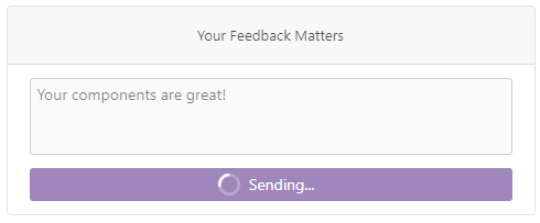
The following example imitates a lengthy operation. During this operation the Button becomes disabled and the Wait Indicator appears.
<DxButton Enabled="!isSending"
          Click="Send"
          RenderStyle="ButtonRenderStyle.Secondary">
    <div class="indicator-container">
        <DxWaitIndicator Visible="isSending" />
        <span class="message">@Message</span>
    </div>
</DxButton>

@code{
    bool isSending = false;
    string Message => isSending ? "Sending..." : "Send";
    private async Task Send() {
        isSending = true;
        await Task.Delay(3000);
        isSending = false;
    }
}

Customize Appearance
Use the CssClass property to apply custom styles to the Wait Indicator.
<DxButton Enabled="!isSending"
          Click="Send"
          RenderStyle="ButtonRenderStyle.Primary">
    <div class="indicator-container">
        <DxWaitIndicator Visible="isSending"
                         CssClass="my-indicator" />
        <span class="message">@Message</span>
    </div>
</DxButton>

@code{
    bool isSending = false;
    string Message => isSending ? "Sending..." : "Send";
    private async Task Send() {
        isSending = true;
        await Task.Delay(3000);
        isSending = false;
    }
}
You can also customize the component’s content. Use the following API members:
- AnimationType
- Specifies the animation type.
- Template
- Specifies custom content (for example, an icon) for the Wait Indicator.
- SizeMode
- Specifies the size of the component.