DxCalendar<T> Class
A monthly calendar that supports multiple date selection.
Namespace: DevExpress.Blazor
Assembly: DevExpress.Blazor.v26.1.dll
Declaration
public class DxCalendar<T> :
    DxDataEditor<T>
Type Parameters
| Name | Description |
|---|---|
| T | The data type. Supported types: DateTime and Nullable DateTime. |
Remarks
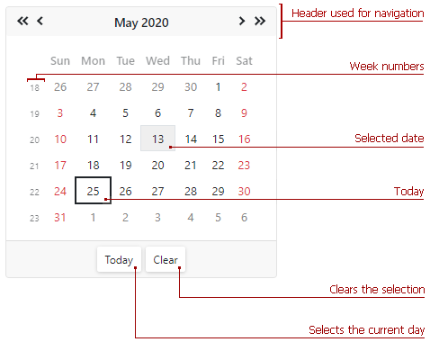
The DevExpress Calendar for Blazor (<DxCalendar>) allows users to select dates and navigate through months, years, decades, and centuries.
Add a Calendar to a Project
Follow the steps below to add the Calendar component to an application:
- Create a Blazor Server or Blazor WebAssembly application.
- Add the
<DxCalendar>…</DxCalendar>markup to a.razorfile. - Configure the component: specify a selected date, set a date range, disable dates, and so on (see the sections below).
API Reference
Refer to the following list for the component API reference: DxCalendar Members.
Static Render Mode Specifics
Blazor Calendar does not support static render mode. Enable interactivity to use the component in your application. Refer to the following topic for more details: Enable Interactive Render Mode.
Select a Date
Users can click a date to select it. The calendar’s header allows users to navigate between dates.
Use the SelectedDate property to specify a date in code or to bind the selected date to a model’s field. The calendar supports DateTime and Nullable DateTime data types.
You can use the @bind attribute to bind the SelectedDate property to a data field. Refer to Two-Way Data Binding.
<DxCalendar @bind-SelectedDate="@SelectedDate" />

@code{
    DateTime SelectedDate { get; set; } = DateTime.Now;
}
The SelectedDateChanged event occurs each time the selection changes.
You can use the ViewMode property to hide certain calendar views and implement the following scenarios:
- Disable day selection. Users can select years and months.
- Disable day and month selection. Users can select years only.
Select Multiple Dates
The DevExpress Blazor Calendar component allows users to select multiple types of dates: individual dates, continuous ranges, and combinations of both.
Set the EnableMultiSelect property to true to enable multiple date selection in the calendar. The SelectedDates collection stores all the selected dates. To handle selection changes, use the SelectedDatesChanged event.
You can use the @bind attribute to bind the SelectedDates property to a data field. Refer to the following help topic for additional information: Two-Way Data Binding.
<DxCalendar EnableMultiSelect="true"
            @bind-SelectedDates="SelectedDates" />

@code {
    IEnumerable<DateTime> SelectedDates = new List<DateTime>();

    IEnumerable<DateTime> GetSelectedDates()
    {
        DateTime baseDate = DateTime.Today;
        SelectedDates = new List<DateTime>() { baseDate.AddDays(-9), baseDate.AddDays(-5), baseDate.AddDays(-4),
                                    baseDate.AddDays(6), baseDate.AddDays(12), baseDate.AddDays(13),
                                    baseDate.AddDays(15) };
        return SelectedDates;
    }

    protected override void OnInitialized()
    {
        SelectedDates = GetSelectedDates();
    }
}
Users can navigate through dates and select them using the mouse or keyboard.
To add individual dates to the selection, select dates while pressing the Ctrl key.
To select a range of dates, select the first date, hold Shift, then select the last date.

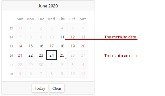
Set a Date Range
Use the MinDate and MaxDate properties to specify a range of available dates. The calendar disables dates that are out of the range and hides navigation arrows for them.
The default minimum and maximum values are System.DateTime.MinValue and System.DateTime.MaxValue.
Note
- The maximum date should be greater than the minimum date. Otherwise, an exception occurs.
- If a user types a date that is out of the range, the calendar keeps the previously selected date.
- You can set the SelectedDate and SelectedDates properties to dates outside the range.
<DxCalendar T="DateTime" MinDate="@(new DateTime(2020, 06, 11))" MaxDate="@(new DateTime(2020, 06, 25))" />
Disable Dates
Handle the CustomDisabledDate event to disable the selection of individual dates. This event is raised each time a day cell is rendered.
<DxCalendar T="DateTime" CustomDisabledDate="@OnCustomDisabledDate">
</DxCalendar>

@code {
    void OnCustomDisabledDate(CalendarCustomDisabledDateEventArgs args) {
        args.IsDisabled = args.Date < DateTime.Today.AddDays(-20) || GetDisabledDates().Exists(d => DaysEqual(d, args.Date));
    }
    bool DaysEqual(DateTime date1, DateTime date2) {
        return (date1.Year == date2.Year && date1.DayOfYear == date2.DayOfYear);
    }
    List<DateTime> GetDisabledDates() {
        DateTime baseDate = DateTime.Today;
        return new List<DateTime>() { baseDate.AddDays(-9), baseDate.AddDays(-4), baseDate.AddDays(-3), baseDate.AddDays(3), baseDate.AddDays(5), baseDate.AddDays(6), baseDate.AddDays(15) };
    }
    //...
}

Customize Day Cells
Use the calendar’s DayCellTemplate property to customize day cells.
@using Data

<DxCalendar T="DateTime">
    <DayCellTemplate>
        <a class="@GetCssClassNames(context)">@context.Day.ToString()</a>
    </DayCellTemplate>
</DxCalendar>

@code {
    CalendarData data = new CalendarData();

    string GetCssClassNames(DateTime date) {
        string result = string.Empty;

        if (data.PersonalDays.Exists(d => DaysEqual(d, date)))
            result = "font-weight-bold text-success";
        if (data.Holidays.Exists(d => DaysEqual(d, date)))
            result = "text-danger";
        if (data.BirthDates.Exists(d => DaysEqual(d, date)))
            result += "font-weight-bold text-info";

        return result;
    }
    bool DaysEqual(DateTime date1, DateTime date2) {
        return (date1.Year == date2.Year && date1.DayOfYear == date2.DayOfYear);
    }

}

Appearance
A table below lists API members you can use to customize Calendar appearance:
Member | Description |
|---|---|
Specifies the month and the year to display on the calendar. | |
Specifies the first day of a week in the calendar. | |
Specifies whether the Clear button is displayed in the calendar’s footer. | |
Specifies the first week of the year. | |
Assigns a CSS class to the Calendar’s header. |
Size Modes
Use the SizeMode property to specify Calendar size. The following code snippet applies different size modes to Calendar components.
<DxCalendar SelectedDate="@SelectedDate" SizeMode="SizeMode.Small"></DxCalendar>

<DxCalendar SelectedDate="@SelectedDate" SizeMode="SizeMode.Medium"></DxCalendar>

<DxCalendar SelectedDate="@SelectedDate" SizeMode="SizeMode.Large"></DxCalendar>

@code {
    DateTime SelectedDate { get; set; } = DateTime.Now;
}
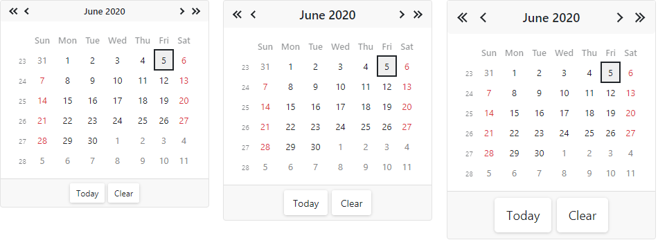
For additional information, refer to Size Modes.
Input Validation
You can add a standalone Calendar or the Form Layout component to Blazor’s standard EditForm. This form validates user input based on data annotation attributes defined in a model and reveals errors.
<EditForm Model="@model" Context="EditFormContext">
    <DataAnnotationsValidator />
    <DxFormLayout >
        <DxFormLayoutItem Caption="Date:" ColSpanMd="6" >
            <Template >
                <DxCalendar @bind-SelectedDate="@model.Date" />
            </Template>
        </DxFormLayoutItem>
        @*...*@
    </DxFormLayout>
</EditForm>

@code {
    private Model model=new Model();
}
For additional information, refer to the following help topic: Validate Input.
Keyboard Navigation
The DevExpress Blazor Calendar supports keyboard navigation. Users can navigate through root UI elements and within the month/year/decade/century view. Keyboard navigation is implemented on the client and works seamlessly in Blazor Server apps with a slow connection.
Note
Keyboard support allows users to interact with application content in cases they cannot use a mouse or they rely on assistive technologies (like screen readers or switch devices). Refer to the Accessibility help topic for information on other accessibility areas that we address.
The following shortcut keys are available:
PC/Windows Shortcuts | Mac Shortcuts | Description |
|---|---|---|
Tab | Tab | Moves focus between root navigation elements: previous/next buttons, view switcher, month/year/decade/century view, Today button, and Clear button. |
Shift + Tab | Shift + Tab | Moves focus backwards between root navigation elements. |
Left Arrow | Left Arrow | Moves focus to the previous cell. |
Right Arrow | Right Arrow | Moves focus to the next cell. |
Arrow Up | Arrow Up | Moves focus one cell up. |
Arrow Down | Arrow Down | Moves focus one cell down. |
Ctrl + Arrow Up | Ctrl + Option + Arrow Up | Navigates to a view with a wider date range: from month to year, from year to decade, and so on. |
Ctrl + Arrow Down | Ctrl + Option + Arrow Down | Navigates to a more detailed view: from decade to year, from year to month, and so on. |
Page Up | Fn + Arrow Up | Navigates from the current month/year/decade/century to the previous month/year/decade/century. |
Page Down | Fn + Arrow Down | Navigates from the current month/year/decade/century to the next month/year/decade/century. |
Shift + Page Up | Shift + Fn + Arrow Up | For the month view: Navigates to the same month and day in the previous year. |
Shift + Page Down | Shift + Fn + Arrow Down | For the month view: Navigates to the same month and day in the next year. |
Home | Fn + Arrow Left | For the month view: Moves focus to the first day of the current week. |
End | Fn + Arrow Right | For the month view: Moves focus to the last day of the current week. |
Space, Enter | Space, Enter | For the month view: Selects a date, updates the SelectedDate parameter value. |
Root Element Navigation

Month View Navigation

Year View Navigation

Decade View Navigation

Century View Navigation

Multiple Date Selection
You can use the following shortcut keys in the month view to select multiple dates.
| Shortcut Keys | Description |
|---|---|
| Ctrl + Enter/Space (Windows) Option + Enter/Space (Mac) |
Adds/removes the date to/from the current selection. |
| Shift + Arrow Left | Adds the previous date to selected dates. |
| Shift + Arrow Right | Adds the next date to selected dates. |
| Shift + Arrow Up | Extends selection one row up. |
| Shift + Arrow Down | Extends selection one row down. |
You can also select several date ranges. For example, follow the steps below to select two ranges:
- Focus the first date and press Enter/Space to select it.
- Press Shift and use Arrow keys to navigate to the last date of the first range. The first range is selected.
- Use Arrow keys to navigate to the first date of the second range. Then press the following keys to select it:
- Windows: Ctrl + Enter/Space.
- Mac: Option + Enter/Space.
- Use Arrow keys to navigate to the last date of the second range. Then press the following keys to select the second range:
- Windows: Shift + Ctrl + Enter/Space.
- Mac: Shift + Option + Enter/Space.
Read-Only State
<DxCalendar> supports a read-only state. Set the ReadOnly property to true to activate this option.
<DxCalendar T="DateTime" ReadOnly="true"/>
Troubleshooting
If a Blazor application throws unexpected exceptions, refer to the following help topic: Troubleshooting.