DxRangeSelector Class
An interactive component that visualizes data on a linear scale and allows users to select a value range.
Namespace: DevExpress.Blazor
Assembly: DevExpress.Blazor.v26.1.dll
Declaration
public class DxRangeSelector :
    ClientComponentJSInterop,
    IModelProvider<RangeSelectorChartModel>,
    IModelProvider<TitleSettingsModel>,
    IModelProvider<RangeSelectorBackgroundModel>,
    IModelProvider<RangeSelectorIndentModel>,
    IModelProvider<RangeSelectorShutterModel>,
    IModelProvider<RangeSelectorScaleModel>,
    IModelProvider<RangeSelectorSliderHandleModel>,
    IModelProvider<RangeSelectorSliderMarkerModel>
Remarks
The DevExpress Range Selector for Blazor (<DxRangeSelector>) visualizes data on a linear scale. Users can change selection by dragging sliders or moving the entire selected range.

Add a Range Selector to a Project
- Create a Blazor Server or Blazor WebAssembly application.
- Enable interactivity on a Razor page.
- Add the following markup to a
.razorfile:<DxRangeSelector>…</DxRangeSelector>. - Bind the component to data.
- Select if the component displays data as a scale or chart.
- Configure range selection options.
- Optional. Customize the component and its visual elements (see sections below).
API Reference
Refer to the following list for the component API reference: DxRangeSelector Members.
Static Render Mode Specifics
Blazor Range Selector responds to data updates and supports user interaction when you enable interactive render mode. In static render mode, Range Selector can display only static data.
Bind to Data
Use the Data property to bind the Range Selector to data. Follow the steps below to display data within the component:
- Bind the
Dataparameter to a C# field or property. - Populate this field or property with data in the OnInitialized lifecycle method.
<DxRangeSelector Data="@Data">
    <DxTitleSettings Text="Population by Country, 2023" />
    <DxRangeSelectorChart>
        <DxChartBarSeries ArgumentField="@((PopulationPoint s) => s.Country)"
                          ValueField="@((PopulationPoint s) => s.Value)" />
    </DxRangeSelectorChart>
</DxRangeSelector>

@code {
    List<PopulationPoint> Data;
    protected override void OnInitialized() {
        Data = GetData();
    }
}
You can handle the Rendered event to run custom code when component rendering is finished and the Range Selector is loaded.
Range Selection
The Range Selector displays two sliders that determine the selected range. Sliders consist of handles and markers that display selected values.
Users can change selected range in the following manner:
- Drag slider handles.
- Click outside the current range to shift selection (MoveSelectedRangeByClick).
- Use the mouse to select a new range (AllowMouseSelection).

You can also use the following options to configure the component’s behavior on range selection:
- AllowSliderSwap
- Specifies whether users can swap sliders.
- SnapSliderToTicks
- Specifies whether to dock the dropped slider to the nearest tick.
Select a Range in Code
The Range Selector allows you to select a range in code. To set a range, use one of the following options:
- Specify both SelectedRangeStartValue and SelectedRangeEndValue properties.
- Specify SelectedRangeLength and SelectedRangeStartValue / SelectedRangeEndValue properties.
- Specify the SelectedRangeLength property only. When you leave SelectedRangeStartValue and SelectedRangeEndValue properties unspecified, the Range Selector component uses the last scale value as the range’s end value.
When you leave the range unset, it matches the entire scale at the first component render.
The following code snippets specify a predefined range on the first render. Switch code tabs to see possible options.
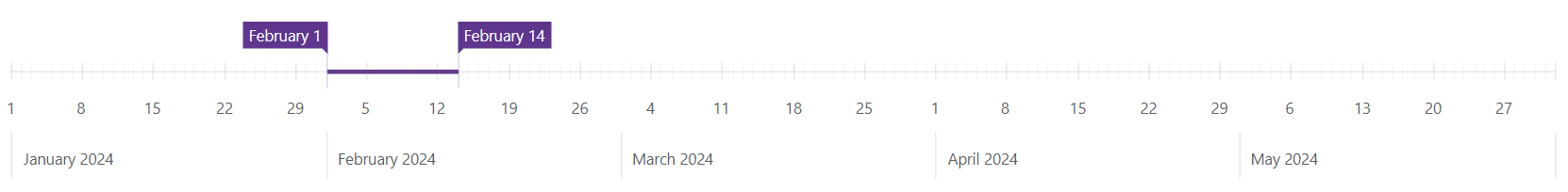
<DxRangeSelector Width="1100px"
                 Height="200px"
                 SelectedRangeStartValue="@(new DateTime(2024, 2, 1))"
                 SelectedRangeEndValue="@(new DateTime(2024, 2, 14))">
    <DxRangeSelectorScale StartValue="@(new DateTime(2024, 1, 1))"
                          EndValue="@(new DateTime(2024, 6, 1))"
                          TickInterval="ChartAxisInterval.Week"
                          MinorTickInterval="ChartAxisInterval.Day"
                          MinRange="ChartAxisInterval.Week"
                          MaxRange="ChartAxisInterval.Month"
                          ValueType="ChartAxisDataType.DateTime">
        <DxRangeSelectorScaleMarker>
            <DxRangeSelectorScaleMarkerLabel>
                <DxTextFormatSettings Type="TextFormat.MonthAndYear" />
            </DxRangeSelectorScaleMarkerLabel>
        </DxRangeSelectorScaleMarker>
    </DxRangeSelectorScale>
    <DxRangeSelectorSliderMarker>
        <DxTextFormatSettings Type="TextFormat.MonthAndDay" />
    </DxRangeSelectorSliderMarker>
</DxRangeSelector>
Limit the Range Length
Use DxRangeSelectorScale.MinRange and DxRangeSelectorScale.MaxRange properties to specify the minimum and maximum range that users can select on the scale. When a user tries to select an invalid range, the component behaves as follows:
- Changes the slider marker color (the DxRangeSelectorSliderMarker.InvalidRangeColor property).
- Docks the dropped slider to the nearest valid value (tick) within the specified range length.
Note that MinRange and MaxRange properties do not apply to discrete scales. The component also ignores these properties on the first render if you define a range in code.
The following code snippet sets the minimum range to a week and the maximum range to a month:
<DxRangeSelector Width="1100px"
                 Height="200px"
                 SelectedRangeStartValue="@(new DateTime(2024, 2, 1))"
                 SelectedRangeEndValue="@(new DateTime(2024, 2, 14))">
    <DxRangeSelectorScale StartValue="@(new DateTime(2024, 1, 1))"
                          EndValue="@(new DateTime(2024, 6, 1))"
                          TickInterval="ChartAxisInterval.Week"
                          MinorTickInterval="ChartAxisInterval.Day"
                          MinRange="ChartAxisInterval.Week"
                          MaxRange="ChartAxisInterval.Month"
                          ValueType="ChartAxisDataType.DateTime">
        <DxRangeSelectorScaleMarker>
            <DxRangeSelectorScaleMarkerLabel>
                <DxTextFormatSettings Type="TextFormat.MonthAndYear" />
            </DxRangeSelectorScaleMarkerLabel>
        </DxRangeSelectorScaleMarker>
    </DxRangeSelectorScale>
    <DxRangeSelectorSliderMarker>
        <DxTextFormatSettings Type="TextFormat.MonthAndDay" />
    </DxRangeSelectorSliderMarker>
</DxRangeSelector>
React to Selection Changes
The ValueChangeMode property switches between live or delayed range updates:
OnHandleMove: selection changes while a user moves a handle.OnHandleRelease: selection changes when a user releases a handle.
To respond to value changes, handle the ValueChanged event.
You can also use the SelectedRangeUpdateMode property to specify how the selected range should behave if new values are added to the data source.
The following code snippet sets the value change mode to OnHandleMove, obtains values of the current range in a ValueChanged event handler, and displays the number of selected days:
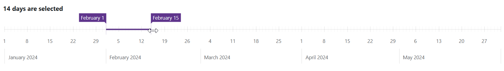
<span><b>@DaysCount days are selected</b></span>
<DxRangeSelector Width="1100px"
                 Height="200px"
                 SelectedRangeStartValue="@(new DateTime(2024, 2, 1))"
                 SelectedRangeEndValue="@(new DateTime(2024, 2, 14))"
                 ValueChanged="@OnValueChanged"
                 ValueChangeMode="RangeSelectorValueChangeMode.OnHandleMove">
    <DxRangeSelectorScale StartValue="@(new DateTime(2024, 1, 1))"
                          EndValue="@(new DateTime(2024, 6, 1))"
                          TickInterval="ChartAxisInterval.Week"
                          MinorTickInterval="ChartAxisInterval.Day"
                          MinRange="ChartAxisInterval.Week"
                          MaxRange="ChartAxisInterval.Month"
                          ValueType="ChartAxisDataType.DateTime">
        <DxRangeSelectorScaleMarker>
            <DxRangeSelectorScaleMarkerLabel>
                <DxTextFormatSettings Type="TextFormat.MonthAndYear" />
            </DxRangeSelectorScaleMarkerLabel>
        </DxRangeSelectorScaleMarker>
    </DxRangeSelectorScale>
    <DxRangeSelectorSliderMarker>
        <DxTextFormatSettings Type="TextFormat.MonthAndDay" />
    </DxRangeSelectorSliderMarker>
</DxRangeSelector>

@code {
    double DaysCount { get; set; } = 14;
    void OnValueChanged(RangeSelectorValueChangedEventArgs args) {
        var startDate = args.CurrentRange.FirstOrDefault() as DateTime?;
        var endDate = args.CurrentRange.LastOrDefault() as DateTime?;
        if (startDate != null && endDate != null)
            DaysCount = (endDate - startDate).Value.TotalDays;
    }
}
Scale
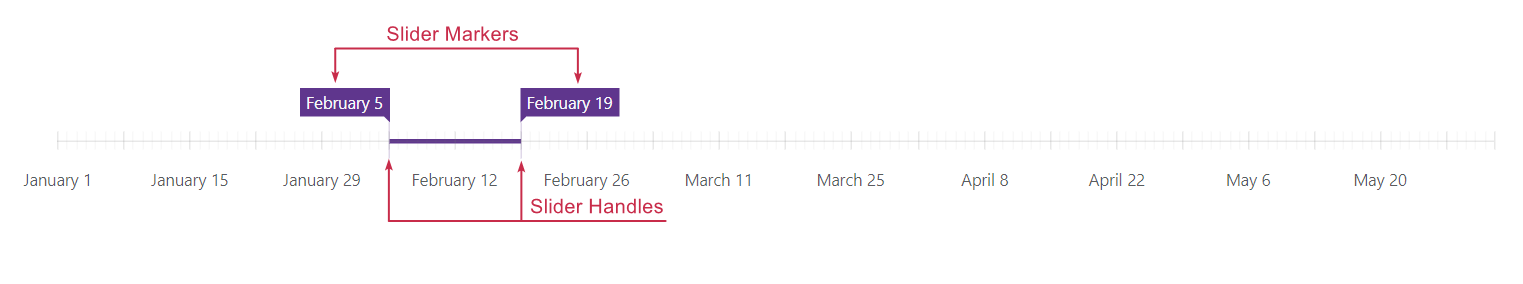
The Range Selector displays values on a linear scale. To manage the scale, add a DxRangeSelectorScale object to the component markup. You can specify DxRangeSelectorScale class properties or add nested objects to customize the scale’s visual elements.
The image below demonstrates visual elements related to the scale:
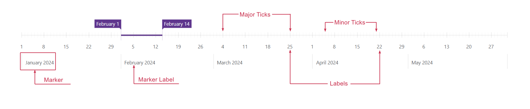
Scale Range
The Range Selector creates a scale based on the bound data source (the DxRangeSelector.Data property). Use StartValue and EndValue properties to limit the scale’s visual range.
<DxRangeSelector Width="1100px"
                 Height="200px"
                 SelectedRangeStartValue="@(new DateTime(2024, 2, 1))"
                 SelectedRangeEndValue="@(new DateTime(2024, 2, 14))">
    <DxRangeSelectorScale StartValue="@(new DateTime(2024, 1, 1))"
                          EndValue="@(new DateTime(2024, 6, 1))"
                          MinorTickInterval="ChartAxisInterval.Day"
                          TickInterval="ChartAxisInterval.Week"
                          MaxRange="ChartAxisInterval.Month"
                          MinRange="ChartAxisInterval.Week"
                          ValueType="ChartAxisDataType.DateTime">
        @* ... *@
    </DxRangeSelectorScale>
    @* ... *@
</DxRangeSelector>
Tick Intervals
The Range Selector calculates major and minor tick intervals automatically based on data source values. You can use the following properties to change intervals:
- TickInterval | MinorTickInterval
- Set custom intervals for major and minor ticks.
- MinorTickCount
- Specifies the number of minor ticks between two neighboring major ticks.
The following code snippet sets the major tick interval to a week and the minor tick interval to a day:
<DxRangeSelector Width="1100px"
                 Height="200px"
                 SelectedRangeStartValue="@(new DateTime(2024, 2, 1))"
                 SelectedRangeEndValue="@(new DateTime(2024, 2, 14))">
    <DxRangeSelectorScale StartValue="@(new DateTime(2024, 1, 1))"
                          EndValue="@(new DateTime(2024, 6, 1))"
                          MinorTickInterval="ChartAxisInterval.Day"
                          TickInterval="ChartAxisInterval.Week"
                          MaxRange="ChartAxisInterval.Month"
                          MinRange="ChartAxisInterval.Week"
                          ValueType="ChartAxisDataType.DateTime">
        @* ... *@
    </DxRangeSelectorScale>
    @* ... *@
</DxRangeSelector>
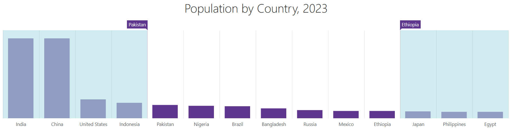
Chart
The DevExpress Blazor Range Selector component allows you to visualize data as a chart. Follow the steps below to display a chart:
- Use the DxRangeSelector.Data property to bind the component to a data source.
- Declare a DxRangeSelectorChart object.
- Add an appropriate series object to the chart markup and populate the chart with arguments and values.
DxRangeSelector
Series
The DxRangeSelectorChart component supports the same series types as the Blazor DxChart component. To create a series, choose a series type and specify its ArgumentField and ValueField properties.
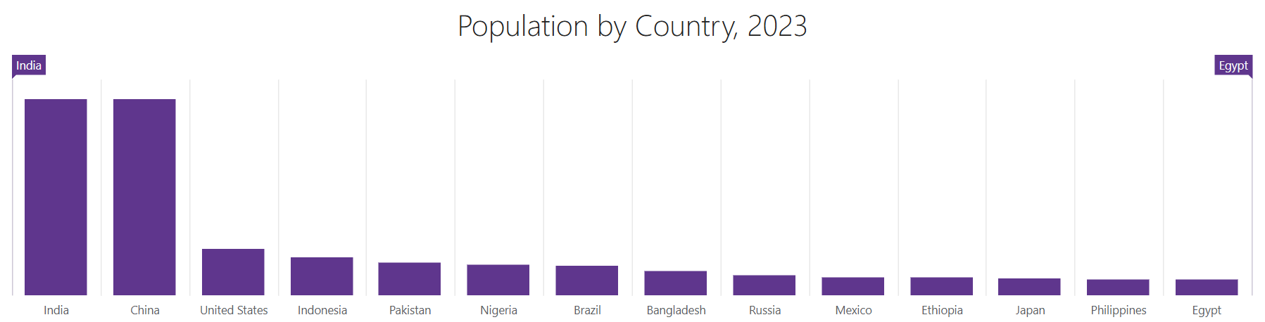
The following code snippet creates a chart with bars where each bar corresponds to a country’s population (see the image above):
<DxRangeSelector Width="700px"
                 Height="300px"
                 Data="@Data">
    <DxTitleSettings Text="Population by Country, 2023" />
    <DxRangeSelectorChart>
        <DxChartBarSeries ArgumentField="@((PopulationPoint s) => s.Country)"
                          ValueField="@((PopulationPoint s) => s.Value)" />
    </DxRangeSelectorChart>
</DxRangeSelector>

@code {
    List<PopulationPoint> Data;
    protected override void OnInitialized() {
        Data = GetData();
    }
}
Refer to the following article for additional information about available series types: Series Types in Blazor Charts.
DxRangeSelectorChart class APIs include the following series-specific options:
You can also use TopIndent and BottomIndent properties to position a series on a chart pane.
Axes
DxRangeSelectorScale and DxRangeSelectorChartValueAxis objects define axes in the Range Selector’s chart. Add these objects to the component markup to manage axes.
The value axis does not support any visual elements while the scale displays labels and markers (see the Scale section).
Axis Types
The Range Selector component supports the following axis types:
- Continious
- Displays numeric and DateTime arguments/values.
- Discrete
- Displays string arguments/values (categories).
- Logarithmic
- Displays numeric arguments/values that grow exponentially. Each axis tick value is a specified logarithm base raised to a power (10⁻², 10⁻¹, 10⁰, 10¹, 10², and so on).
Range Selector determines axis types based on the data type of the first series in the chart markup. You can use DxRangeSelectorScale.Type and DxRangeSelectorChartValueAxis.Type properties to change axis types.
You may need to cast values specified in the data source. For example, you must do it if data source stores dates or numbers as strings. Use DxRangeSelectorScale.ValueType and DxRangeSelectorChartValueAxis.ValueType properties to specify axis value types.
<DxRangeSelector Width="1200px"
                 Height="300px"
                 Data="@Data">
    <DxTitleSettings Text="Population by Country, 2023" />
    <DxRangeSelectorChart>
        <DxRangeSelectorChartValueAxis ValueType="ChartAxisDataType.Numeric" />
        <DxChartBarSeries ArgumentField="@((PopulationPoint s) => s.Country)"
                          ValueField="@((PopulationPoint s) => s.Value)" />
    </DxRangeSelectorChart>
</DxRangeSelector>

@code {
    List<PopulationPoint> Data;
    protected override void OnInitialized() {
        Data = GetData();
    }
}
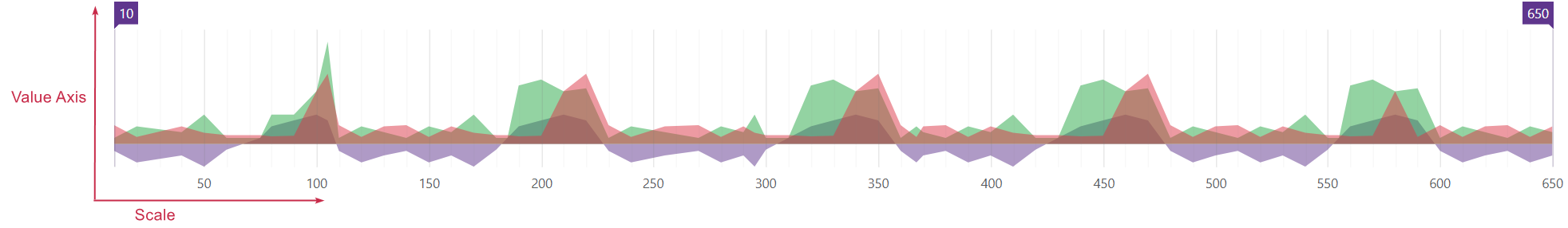
Axis Ranges
The <DxRangeSelector> component allows you to define start/min and end/max axis values. Use the following properties:
- StartValue and EndValue properties for the scale.
- MinValue and MaxValue for the value axis.

@using System.Linq.Expressions
<DxRangeSelector Width="100%"
                 Data="@Data"
                 ValueChangeMode="RangeSelectorValueChangeMode.OnHandleMove">
    <DxRangeSelectorChart>
        @CreateChartAreaSeries(s => s.Y1)
        @CreateChartAreaSeries(s => s.Y2)
        @CreateChartAreaSeries(s => s.Y3)
        <DxRangeSelectorChartValueAxis MinValue="-10"
                                       MaxValue="50" />
    </DxRangeSelectorChart>
    <DxRangeSelectorScale TickInterval="50"
                          StartValue="100"
                          EndValue="400" />
</DxRangeSelector>

@code {
    IEnumerable<RangePoint> Data = Enumerable.Empty<RangePoint>();
    protected override void OnInitialized() {
        Data = GenerateData();
    }

    private RenderFragment CreateChartAreaSeries(Expression<Func<RangePoint, double>> valueField) =>
        @<DxChartAreaSeries ArgumentField="@(s => s.Arg)"
                                ValueField="@(valueField)">
        </DxChartAreaSeries>
    ;
}
Title and Subtitle
The <DxRange Selector> component can display a title and subtitle. Add DxTitleSettings and DxSubtitleSettings objects to the component markup to configure title and subtitle settings.
The following code snippet displays and customizes the Range Selector’s title:

<DxRangeSelector Width="700px"
                 Height="300px"
                 Data="@Data">
    <DxTitleSettings Text="Population by Country, 2023" VerticalAlignment="VerticalEdge.Bottom">
        <DxFontSettings Weight="700" Opacity="0.6" />
    </DxTitleSettings>
    <DxRangeSelectorChart>
        <DxChartBarSeries ArgumentField="@((PopulationPoint s) => s.Country)"
                          ValueField="@((PopulationPoint s) => s.Value)" />
    </DxRangeSelectorChart>
</DxRangeSelector>

@code {
    List<PopulationPoint> Data;
    protected override void OnInitialized() {
        Data = GetData();
    }
}
Export and Printing
The <DxRangeSelector> component allows you to export and print its data. Call the PrintAsync() method to invoke the browser’s Print dialog.
To export component data, call the ExportToAsync(String, DataExportFormat) method. After the file is exported, the component raises the Exported event.
Call the GetSvgMarkupAsync() method to obtain the Range Selector’s SVG markup.
The following code snippet displays a custom Export to PDF button that exports component data to a PDF file. The Exported event handler displays information about the exported file:
@rendermode InteractiveServer

<DxRangeSelector Width="1000px"
                 Height="400px"
                 @ref="RangeSelector"
                 Data="@Data"
                 Exported="@OnExported"
                 ValueChangeMode="RangeSelectorValueChangeMode.OnHandleMove">
    <DxTitleSettings Text="Population by Country, 2023" />
    <DxRangeSelectorChart>
        <DxChartBarSeries ArgumentField="@((PopulationPoint s) => s.Country)"
                          ValueField="@((PopulationPoint s) => s.Value)" />
    </DxRangeSelectorChart>
</DxRangeSelector>

<DxButton Text="Export to PDF" Click="@ExportToPdf" />

@code {
    DxRangeSelector RangeSelector;
    string fileName = "RangeSelector.pdf";

    async Task ExportToPdf() {
        await RangeSelector.ExportToAsync("Range Selector", DataExportFormat.Pdf);
    }

    async Task OnExported() {
        await JSRuntime.InvokeVoidAsync("alert", $"The Range Selector is exported to the {fileName} file.");
    }

    List<PopulationPoint> Data;
    protected override void OnInitialized() {
        Data = GetData();
    }
}
Size
Use Height and Width properties to specify the size of the <DxRangeSelector> component.
<DxRangeSelector Width="800px"
                 Height="400px"
                 Data="@Data">
    @* ... *@
</DxRangeSelector>
When the container size changes at runtime, the component is redrawn. To disable this behavior, set the RedrawOnResize property to false.
You can also configure indents between the Range Selector’s container edges and the scale. Add a DxRangeSelectorIndent object to the component markup and specify Left and Right properties.

<DxRangeSelector Width="1000px"
                 Height="100px"
                 SelectedRangeStartValue="@(new DateTime(2024, 2, 1))"
                 SelectedRangeEndValue="@(new DateTime(2024, 2, 14))">
    <DxRangeSelectorScale StartValue="@(new DateTime(2024, 1, 1))"
                          EndValue="@(new DateTime(2024, 6, 1))"
                          MinorTickInterval="ChartAxisInterval.Day"
                          TickInterval="ChartAxisInterval.Week"
                          MaxRange="ChartAxisInterval.Month"
                          MinRange="ChartAxisInterval.Week"
                          ValueType="ChartAxisDataType.DateTime">
        <DxRangeSelectorScaleMarker Visible="false" />
    </DxRangeSelectorScale>
    <DxRangeSelectorIndent Left="35" Right="35" />
</DxRangeSelector>
Customization
This section describes settings that allow you to customize the appearance of the Range Selector component and its elements.
Individual Elements
The Range Selector supports customization options for individual visual elements. The table below lists such elements, their markup objects/customization properties, and corresponding visibility settings (if any).
| Elements | Markup object/Property | Visibility Option |
|---|---|---|
| Selected range | DxRangeSelector.SelectedRangeColor | Always visible |
| Slider markers | DxRangeSelectorSliderMarker | DxRangeSelectorSliderMarker.Visible |
| Slider handles | DxRangeSelectorSliderHandle | Always visible |
| Scale major ticks | DxRangeSelectorScaleTick | Always visible |
| Scale minor ticks | DxRangeSelectorScaleMinorTick | DxRangeSelectorScaleMinorTick.Visible |
| Scale label | DxRangeSelectorScaleLabel | DxRangeSelectorScaleLabel.Visible |
| Scale marker | DxRangeSelectorScaleMarker | DxRangeSelectorScaleMarker.Visible |
| Scale marker label | DxRangeSelectorScaleMarkerLabel | Depends on the DxRangeSelectorScaleMarker.Visible setting |
The following code snippet sets up a DateTime scale, customizes slider markers, and hides scale markers:

<DxRangeSelector Width="1000px"
                 Height="400px"
                 SelectedRangeStartValue="@(new DateTime(2024, 2, 1))"
                 SelectedRangeEndValue="@(new DateTime(2024, 2, 14))">
    <DxRangeSelectorSliderMarker PaddingLeftRight="5"
                                 PaddingTopBottom="10"
                                 Color="#28a745">
        <DxFontSettings Weight="600" />
        <DxTextFormatSettings Type="TextFormat.ShortDate" />
    </DxRangeSelectorSliderMarker>
    <DxRangeSelectorScale StartValue="@(new DateTime(2024, 1, 1))"
                          EndValue="@(new DateTime(2024, 6, 1))"
                          MinorTickInterval="ChartAxisInterval.Day"
                          TickInterval="ChartAxisInterval.Week"
                          MaxRange="ChartAxisInterval.Month"
                          MinRange="ChartAxisInterval.Week"
                          ValueType="ChartAxisDataType.DateTime">
        <DxRangeSelectorScaleMarker Visible="false" />
    </DxRangeSelectorScale>
</DxRangeSelector>
Background and Shutters
Add a DxRangeSelectorBackground object to the DxRangeSelector component markup to customize the component’s background area. You can apply the following customizations:
- Display an image (ImageUrl and ImagePosition)
- Set the background color
To disable background customizations, set the Enabled property to false.

<DxRangeSelector Width="800px"
                 Height="200px">
    <DxRangeSelectorScale StartValue="@(new DateTime(2024, 8, 29, 0, 0, 0))"
                          EndValue="@(new DateTime(2024, 8, 29, 23, 59, 59))"
                          MinorTickInterval="ChartAxisInterval.Hour"
                          TickInterval="ChartAxisInterval.Hours(2)"
                          PlaceholderHeight="20"
                          ValueType="ChartAxisDataType.DateTime">
        <DxRangeSelectorScaleLabel Visible="true">
            <DxTextFormatSettings Type="TextFormat.ShortTime" />
        </DxRangeSelectorScaleLabel>
    </DxRangeSelectorScale>
    <DxTitleSettings Text="Select a Time Period" />
    <DxRangeSelectorBackground ImageUrl="images/background.png"
                               ImagePosition="RangeSelectorBackgroundImagePosition.Center"
                               Color="#d7c2ed" />
</DxRangeSelector>
Background color settings also apply to the Range Selector’s shutters that cover unselected ranges on the scale. To apply specific color settings to shutters, add a DxRangeSelectorShutter object to the component markup and specify Color and Opacity properties.
<DxRangeSelector Width="1200px"
                 Height="300px"
                 Data="@Data">
    <DxTitleSettings Text="Population by Country, 2023" />
    <DxRangeSelectorChart>
        <DxChartBarSeries ArgumentField="@((PopulationPoint s) => s.Country)"
                          ValueField="@((PopulationPoint s) => s.Value)" />
    </DxRangeSelectorChart>
    <DxRangeSelectorShutter Color="powderblue"
                            Opacity="0.6" />
</DxRangeSelector>
Palette
The <DxRangeSelector> component allows you to create a custom palette for chart series. To apply a palette, assign it to the Palette property.
When the number of series exceeds the number of palette colors, you can specify a PaletteExtensionMode.
The following code snippet applies a custom palette to DxRangeSelectorChart series and changes the palette’s extension mode:
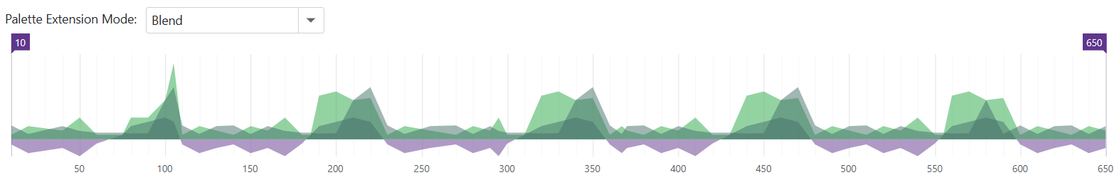
@using System.Linq.Expressions

<label>Palette Extension Mode:</label>
<DxComboBox Data="Enum.GetValues<ChartPaletteExtensionMode>()"
            @bind-Value="@ExtensionMode" />

<DxRangeSelector Width="100%"
                 Data="@Data"
                 ValueChangeMode="RangeSelectorValueChangeMode.OnHandleMove">
    <DxRangeSelectorChart Palette="@Palette"
                          PaletteExtensionMode="@ExtensionMode">
        @CreateChartAreaSeries(s => s.Y1)
        @CreateChartAreaSeries(s => s.Y2)
        @CreateChartAreaSeries(s => s.Y3)
    </DxRangeSelectorChart>
    <DxRangeSelectorScale TickInterval="50" />
</DxRangeSelector>

@code {
    ChartPaletteExtensionMode ExtensionMode { get; set; } = ChartPaletteExtensionMode.Alternate;
    string[] Palette => new string[] { "#5f368d", "#28a745" };

    IEnumerable<RangePoint> Data = Enumerable.Empty<RangePoint>();
    protected override void OnInitialized() {
        Data = GenerateData();
    }

    private RenderFragment CreateChartAreaSeries(Expression<Func<RangePoint, double>> valueField) =>
        @<DxChartAreaSeries ArgumentField="@(s => s.Arg)"
                            ValueField="@(valueField)">
        </DxChartAreaSeries>
    ;
}
Troubleshooting
If a Blazor application throws unexpected exceptions, refer to the following help topic: Troubleshooting.