DxTreeView Class
A navigation control that displays items as a tree.
Namespace: DevExpress.Blazor
Assembly: DevExpress.Blazor.v26.1.dll
Declaration
public class DxTreeView :
    DxComponent,
    IRequireSelfCascading,
    IModelWrapper<ITreeViewModel>
Remarks
The DevExpress TreeView component for Blazor (<DxTreeView>) displays hierarchical data structures within a tree-like UI. The component implements navigation within a web application.

Add a TreeView to a Project
Follow the steps below to add the TreeView component to an application:
- Create a Blazor Server or Blazor WebAssembly application.
- Add the
<DxTreeView></DxTreeView>markup to a.razorfile. - Configure the component: add nodes or bind the TreeView to data, handle expand/collapse events, enable node selection, and so on (see the sections below).
API Reference
Refer to the following list for the component API reference: DxTreeView Members.
Add Nodes (Unbound Mode)
In unbound mode, you should create a node hierarchy in the markup. A DxTreeViewNode class instance implements a node. The DxTreeView.Nodes collection declares root nodes. Each node can have its own collection of child nodes – DxTreeViewNode.Nodes.
For each node, you can specify the following settings:
- Name
- Specifies the node unique identifier.
- Text
- Specifies node text content.
- IconUrl | IconCssClass
- Specify the node icon.
- NavigateUrl
- Specifies the node navigation location.
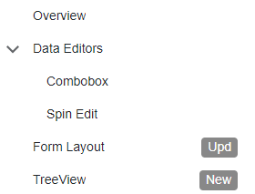
<DxTreeView>
    <Nodes>
        <DxTreeViewNode Name="Overview"
                        Text="Overview"
                        NavigateUrl="https://demos.devexpress.com/blazor/" />
        <DxTreeViewNode Name="Editors"
                        Text="Data Editors"
                        Expanded="true">
            <Nodes>
                <DxTreeViewNode Text="Combobox"
                                NavigateUrl="https://demos.devexpress.com/blazor/ComboBox" />
                <DxTreeViewNode Text="Spin Edit"
                                NavigateUrl="https://demos.devexpress.com/blazor/SpinEdit" />
            </Nodes>
        </DxTreeViewNode>
    <DxTreeViewNode Name="FormLayout"
                    Text="Form Layout"
                    BadgeText="Upd"
                    NavigateUrl="https://demos.devexpress.com/blazor/FormLayout" />
    <DxTreeViewNode Name="TreeView"
                    Text="TreeView"
                    BadgeText="New"
                    NavigateUrl="https://demos.devexpress.com/blazor/TreeView" />
    </Nodes>
</DxTreeView>
Bind to Data (Bound Mode)
You can populate the TreeView component with items from a data source.
Follow the steps below to bind TreeView to data:
Use the Data property to specify a data source. You can use different collection types:
- Flat data (a collection of items organized as a single-level structure)
- Hierarchical data (a collection of nested nodes)
Add the DataMappings tag to the component’s markup.
Create the DxTreeViewDataMapping instance and map node properties (HasChildren, IconCssClass, and so on) to data source fields. Mappings are used to assign data from the source collection to the component’s data model.
For flat data collections, use the Key and ParentKey properties to create a hierarchy of items. If the TreeView’s structure is linear, you can omit these properties.
For hierarchical data collections, the Children property is required to build the data model.
You can create multiple
DxTreeViewDataMappinginstances to specify different mappings for different nesting levels. Use the Level property to specify the node level for which data mappings are applied.
Flat Data
The following code snippet binds TreeView to a collection of flat data items. It specifies mappings for Text, Key, and ParentKey properties.
<DxTreeView Data="@ChemicalElements.Groups">
    <DataMappings>
        <DxTreeViewDataMapping Text="Name" Key="Name" ParentKey="CategoryName" />
    </DataMappings>
</DxTreeView>

Note
When DxTreeView binds to flat data, it reserves a ParentKey equal to 0 for root items. If a data item’s Key is also 0, the TreeView cannot build the hierarchy and fails to render. Use non‑zero Key values, or explicitly set ParentKey to a value that never appears in Key (for example, -1) to avoid conflicts.
Hierarchical Data
The following code snippet binds TreeView to a collection of hierarchical data items. The code specifies Children and Text mappings to adjust the TreeView data model to the specified data source.
<DxTreeView Data="@ChemicalElements.Groups">
    <DataMappings>
        <DxTreeViewDataMapping Text="Name" Children="Groups" />
    </DataMappings>
</DxTreeView>
Note
A data item’s Key must not equal its ParentKey. A self-reference breaks the hierarchy and blocks rendering.
Static Render Mode Specifics
In static render mode, nodes cannot be expanded or collapsed. Use a single-level tree view or set a parent node’s Expanded property to true to display an initially expanded tree.
<DxTreeView>
    <Nodes>
        <DxTreeViewNode Name="Overview" Text="Overview" NavigateUrl="https://demos.devexpress.com/blazor/" />
        <DxTreeViewNode Name="Editors" Text="Data Editors" Expanded="true">
            <Nodes>
                <DxTreeViewNode Text="Combobox" NavigateUrl="https://demos.devexpress.com/blazor/ComboBox" />
                <DxTreeViewNode Text="Spin Edit" NavigateUrl="https://demos.devexpress.com/blazor/SpinEdit" />
            </Nodes>
        </DxTreeViewNode>
        <DxTreeViewNode Name="FormLayout" Text="Form Layout" NavigateUrl="https://demos.devexpress.com/blazor/FormLayout" />
        <DxTreeViewNode Name="TreeView" Text="TreeView" NavigateUrl="https://demos.devexpress.com/blazor/TreeView" />
    </Nodes>
</DxTreeView>
If you need interactivity, enable interactive render mode. Refer to the following topic for more details: Enable Interactive Render Mode.
Load Child Nodes on Demand
When the LoadChildNodesOnDemand option is set to true, the component does not load child nodes until the parent node is expanded for the first time. Use this option to optimize component performance when it is bound to a large data source.
You can load child nodes on demand in either bound or unbound mode. Note that bound mode works with hierarchical structures only and requires the HasChildren property. The component uses this property to determine how to render nodes before they are expanded for the first time (for example, whether expand buttons should appear).
<DxTreeView @ref="@treeView"
            CssClass="cw-480"
            Data="@DataSource"
            AllowSelectNodes="true"
            LoadChildNodesOnDemand="true"
            SizeMode="Params.SizeMode"
            AnimationType="LayoutAnimationType.Slide">
    <DataMappings>
        <DxTreeViewDataMapping HasChildren="@(nameof(DateTimeGroup.HasSubGroups))"
                               Children="@(nameof(DateTimeGroup.SubGroups))"
                               Text="@(nameof(DateTimeGroup.Title))"
                               Expanded="@(nameof(DateTimeGroup.IsExpanded))"
                               Selected="@(nameof(DateTimeGroup.IsSelected))"/>
    </DataMappings>
</DxTreeView>

@code {
    DxTreeView treeView;

    IEnumerable<DateTimeGroup> DataSource = new List<DateTimeGroup>() {
        new DateTimeGroup(new DateTime(DateTime.Now.Year, 1, 1), DateTimeGroupType.Year)
    };
}
Refer to the following section for information about limitations: Load Child Nodes on Demand - Limitations.
Expand and Collapse Nodes
To expand or collapse a node, users can click or double-click it, or click its expand button.
The following code snippet shows a TreeView with custom Expand buttons.

The table below lists related API members:
Member | Description |
|---|---|
Specifies user actions that expand or collapse a node. | |
Specifies whether expand buttons are visible. | |
Expands or collapses the specified node. | |
Returns whether the specified node is expanded. | |
Expands the nodes down to the specified node. | |
Expands all nodes in the DxTreeView. | |
Collapses all nodes in the DxTreeView. | |
Specify a CSS class for the expand button’s icon. | |
Specify a CSS class for the collapse button’s icon. |
The following events fire when the state of a node changes:
Member | Description |
|---|---|
Fires when a node is about to be expanded and allows you to cancel the action. | |
Fires when a node is about to be collapsed and allows you to cancel the action. | |
Fires after a node has been expanded. | |
Fires after a node has been collapsed. | |
Fires when a TreeView’s node expands or collapses. |
Filter Nodes
Enable the ShowFilterPanel option to activate the filter panel. If a user types in a search string, the component displays matching nodes, and optionally, their parent/child nodes. Note that if you activate the filter option with the enabled LoadChildNodesOnDemand option, the component loads all its nodes into memory.
<DxTreeView ShowFilterPanel="true">
    @* ... *@
</DxTreeView>

Use the FilterMode property to specify how the component displays the filter operation results. The following options are available:
- EntireBranch
- The component displays a node that meets the filter criteria and all its parent and child nodes, even if they do not meet the criteria.
- ParentBranch
- The component displays a node that meets the filter criteria and all its parent nodes, even if they do not meet the criteria.
- Nodes
- The component displays only nodes that meet the filter criteria. A node at the hierarchy’s highest level that meets the filter criteria becomes the root node. The node’s child nodes that meet the filter criteria move to the upper hierarchy levels.
The table below lists available API members:
Member | Description |
|---|---|
Specifies the minimum number of characters a user must type in the search box to apply the filter. | |
Allows you to implement custom filter logic. | |
Specifies the filter criteria used to filter the component’s nodes. |
Select Nodes
Set the AllowSelectNodes property to true to enable node selection. Once a user clicks a node, it is highlighted and the SelectionChanged event is raised. The following example handles this event to expand the selected node (if it has children) and to collapse other nodes:
<DxTreeView @ref="@treeView" AllowSelectNodes="true" SelectionChanged="@SelectionChanged">
  ...
</DxTreeView>

@code  {
    DxTreeView treeView;

    protected void SelectionChanged(TreeViewNodeEventArgs e)  {
        treeView.CollapseAll();
        treeView.ExpandToNode((n) => n.Text == e.NodeInfo.Text);
        if (!e.NodeInfo.IsLeaf) {
          treeView.SetNodeExpanded((n) => n.Text == e.NodeInfo.Text, true);
        }
    }
}
Refer to the list below for other related API members:
- AllowSelection
- Specifies whether the TreeView node can be selected.
- GetSelectedNodeInfo()
- Returns information about the selected node.
- SelectNode(Func<ITreeViewNodeInfo, Boolean>)
- Selects the specified node.
- ClearSelection()
- Clears node selection.
Check Nodes
Set the CheckMode property to Multiple or Recursive to display checkboxes in nodes. The CheckedChanged event is raised when a user changes a node’s check state.
The NavigationCheckedChangedEventArgs<TInfo> class contains the following collections:
- CheckedItems
- Returns all checked items.
- LastCheckedItems
- Returns items checked during the last operation.
- LastUncheckedItems
- Returns items unchecked during the last operation.
The following code snippet handles the CheckedChanged event to respond to user interactions with node checkboxes. The handler obtains the collection of nodes whose state is checked. If the collection is not empty, the code displays the first node’s text.
First checked node: @FirstChecked

<DxTreeView Data="@Data"
            CheckMode="TreeViewCheckMode.Recursive"
            CheckedChanged="CheckedChanged">
    <DataMappings>
        <DxTreeViewDataMapping Text="Name"
                               Key="Id"
                               ParentKey="CategoryId" />
    </DataMappings>
</DxTreeView>

@code {
    string? FirstChecked = "none";
    void CheckedChanged(TreeViewCheckedChangedEventArgs e) {
        var firstCheckedNode = e.CheckedItems.FirstOrDefault();
        FirstChecked = firstCheckedNode != null ? firstCheckedNode.Text : "none";
    }
}
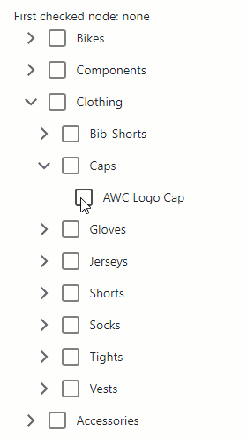
Set the DxTreeViewNode.AllowCheck property to false to prevent users from checking a specific node.
Note
The following actions change the check state of all nodes, even those that do not meet the applied filter criteria:
- CheckAll() method call
- ClearCheck() method call
- Recursive check mode update
Refer to the list below for other related API members:
- Checked
- Specifies whether the node is checked.
- CheckAll()
- Checks all nodes in the TreeView.
- CheckAllVisible
- Specifies whether the Check All box is visible.
- CheckAllText
- Specifies the label of the Check All box.
- ClearCheck()
- Unchecks all nodes.
- CheckNodeByClick
- Specifies whether users can click nodes to check and uncheck them.
Organize Navigation Within the Application
Use the NavigateUrl property to specify a URL where the client web browser navigates when a node is clicked. The DxTreeView.Target property specifies the common target attribute’s value for all nodes in the TreeView. To override the attribute value for a specific node, use the DxTreeViewNode.Target property.
The following code snippet sets the common target attribute’s value for all nodes to _blank and overrides this value for the first node (sets it to _self explicitly).
<DxTreeView Target="_blank">
    <Nodes>
        <DxTreeViewNode Name="Overview"
                        Text="Overview"
                        NavigateUrl="https://demos.devexpress.com/blazor/"
                        Target="_self"/>
        <DxTreeViewNode Name="Editors" Text="Data Editors" Expanded="true">
            <Nodes>
                <DxTreeViewNode Text="Combobox" NavigateUrl="https://demos.devexpress.com/blazor/ComboBox" />
                <DxTreeViewNode Text="Spin Edit" NavigateUrl="https://demos.devexpress.com/blazor/SpinEdit" />
            </Nodes>
        </DxTreeViewNode>
    </Nodes>
</DxTreeView>
The item becomes selected if its DxTreeViewNode.NavigateUrl property value matches the active web page. If the control does select the item, it expands all parent items. Set the AllowSelectNodes property value to true to enable this functionality.
The following example disables URL synchronization:
<DxTreeView AllowSelectNodes="true" UrlMatchMode="NavigationUrlMatchMode.None">
    <Nodes>
        <DxTreeViewNode NavigateUrl="./" Text="Overview"></DxTreeViewNode>
        <DxTreeViewNode NavigateUrl="grid" Text="Grid"></DxTreeViewNode>
    </Nodes>
</DxTreeView>

Load Child Nodes on Demand Mode and Node Selection
If the AllowSelectNodes property is set to true and a user navigates to a URL associated with a TreeView node, the component select this node. If the LoadChildNodesOnDemand property is true, the component applies proper selection only if a user has already loaded that node (expanded all its parent nodes).
The following code snippet demonstrates a TreeView with the enabled LoadChildNodesOnDemand property. When a user opens the https://localhost:44348/sortdata URL, the Sort Data node is not selected.
<DxTreeView CssClass="app-sidebar" AllowSelectNodes="true" LoadChildNodesOnDemand="true">
    <Nodes>
        <DxTreeViewNode Text="Grid">
            <Nodes>
                <DxTreeViewNode NavigateUrl="sortdata" Text="Sort Data"></DxTreeViewNode>
                <DxTreeViewNode NavigateUrl="groupdata" Text="Group Data"></DxTreeViewNode>
            </Nodes>
        </DxTreeViewNode>
        <DxTreeViewNode Text="Scheduler">
            <Nodes>
                <DxTreeViewNode NavigateUrl="viewtypes" Text="View Types"></DxTreeViewNode>
                <DxTreeViewNode NavigateUrl="resources" Text="Resources"></DxTreeViewNode>
            </Nodes>
        </DxTreeViewNode>
    </Nodes>
</DxTreeView>

The image below shows selection with the disabled LoadChildNodesOnDemand mode:

You can also use the DxTreeView.UrlMatchMode and DxTreeViewNode.UrlMatchMode properties to specify how the TreeView component matches the browser URL and node’s NavigateUrl property.
Apply Customizations
Disable User Interactions
Set the Enabled property to false to ignore user interactions.
<button type="button" @onclick="@(() => ToggleTreeViewEnabled())">Enable/Disable TreeView</button>

<DxTreeView Enabled="@TreeViewEnabled">
    <Nodes>
        <DxTreeViewNode Text="Metals">
            <Nodes>
                <DxTreeViewNode Text="Alkali metals" />
                <DxTreeViewNode Text="Inner transition elements">
                    <Nodes>
                        <DxTreeViewNode Text="Lanthanides" />
                        <DxTreeViewNode Text="Actinides" />
                    </Nodes>
                </DxTreeViewNode>
            </Nodes>
        </DxTreeViewNode>
    </Nodes>
</DxTreeView>

@code  {
    bool TreeViewEnabled { get; set; } = false;

    void ToggleTreeViewEnabled() { TreeViewEnabled = !TreeViewEnabled; }
}
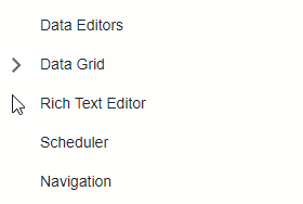
Add a Vertical Scrollbar
The TreeView component automatically displays a vertical scrollbar when its nodes do not fit the viewport:
<div>
    <DxTreeView CssClass="my-treeview">
        <Nodes>
            <DxTreeViewNode Text="Data Editors" />
            <DxTreeViewNode Text="Data Grid">
                <Nodes>
                    <DxTreeViewNode Text="Editing" />
                    <DxTreeViewNode Text="Sorting" />
                    <DxTreeViewNode Text="Export" />
                </Nodes>
            </DxTreeViewNode>
            <DxTreeViewNode Text="Rich Text Editor" />
            <DxTreeViewNode Text="Scheduler" />
            <DxTreeViewNode Text="Navigation" />
        </Nodes>
    </DxTreeView>
</div>
Wrap Node Text
If a Text value does not fit into a node as a single line, the node displays multiple lines of text. Set the TextWrapEnabled property to false to disable word wrap and trim extra words:
<div class="treeview-container">
    <DxTreeView TextWrapEnabled="false">
        <Nodes>
            <DxTreeViewNode Text="Data Binding">
                <Nodes>
                    <DxTreeViewNode Text="Large Data (Instant Feedback Source)" />
                    <DxTreeViewNode Text="Large Data (Queryable)" />
                    <DxTreeViewNode Text="Unbound Columns" />
                </Nodes>
            </DxTreeViewNode>
        </Nodes>
    </DxTreeView>
</div>

Templates
Use the following <DxTreeView> properties to specify a common node template and a text template for all nodes:
In unbound mode, you can create node templates individually. These templates have priority over common templates. Use the following <DxTreeViewNode> properties:
<DxTreeView Data="@ComponentSets.Data"
            @ref="@treeView">
    <DataMappings>
        <DxTreeViewDataMapping Children="ComponentSets" />
    </DataMappings>
    <NodeTemplate>
        @{
            var dataItem = (ComponentSet)context.DataItem;
        }
        @if (!context.IsLeaf) {
            <h4 class="tree-node-header">
                @if (context.Expanded) {
                    <span class="oi oi-chevron-top"></span>
                }
                else {
                    <span class="oi oi-chevron-bottom"></span>
                }
            <span class="tree-node-title">@dataItem.Title</span>
            </h4>
        }
        else {
            <div class="tree-node-content">
                <div class="tree-node-description">
                    <h5>@dataItem.Title</h5>
                    @dataItem.Description
                </div>
            </div>
        }
    </NodeTemplate>
</DxTreeView>

@code {
    DxTreeView treeView;
    protected override Task OnAfterRenderAsync(bool firstRender) {
        if(firstRender)
            treeView.ExpandAll();
        return base.OnAfterRenderAsync(firstRender);
    }
}
Keyboard Navigation
The DevExpress Blazor TreeView component supports keyboard shortcuts that allow users to access every UI element, navigate through nodes, and select nodes. Keyboard navigation is implemented both on the client and server.
Note
Keyboard support allows users to interact with application content in cases they cannot use a mouse or they rely on assistive technologies (like screen readers or switch devices). Refer to the Accessibility help topic for information on other accessibility areas that we address.
The following shortcut keys are available:
| Shortcut Keys | Description |
|---|---|
| Tab, Shift + Tab | Focuses the TreeView or moves focus to the next or previous focusable page element. Within TreeView: Moves focus between the filter panel (if visible), the Check All checkbox (if visible), and the first node in the tree. Within a node template: Moves focus between nested focusable elements. After the first/last element, exits nested object navigation. |
| Right Arrow | For a collapsed node: Expands the node. For an expanded node: Moves focus to the first child node. |
| Left Arrow | For an expanded node: Collapses the node. For child nodes: Moves focus to the parent node. |
| Down Arrow | Moves focus to the next visible node. After the last node, moves focus to the first node. |
| Up Arrow | Moves focus to the previous visible node. After the first node, moves focus to the last node. |
| Home | Moves focus to the first node in the tree. |
| End | Moves focus to the last node in the tree, without expanding nodes. |
| Space | If the focused node’s checkbox is enabled: Toggles the check state. If node selection is enabled: Selects the focused node. |
| Enter | Raises NodeClick and Click events. If node selection is enabled: Selects the focused node. If a node has children and selection is disabled: Toggles the focused node’s expanded state. For a templated node: Moves focus to the first focusable element within a template. |
| Esc | Within a node template: Exits nested object navigation. |
Examples
Our knowledge base contains a wide array of sample projects that demonstrate the most popular usage scenarios, such as:
- How to implement custom filter
- How to implement the Breadcrumb control based on a selected node
- How to load child nodes on demand (lazy loading)
You can find more task-based examples in the following topic: Blazor TreeView - Examples.
Troubleshooting
If a Blazor application throws unexpected exceptions, refer to the following help topic: Troubleshooting.