DxChartSeriesLabel Class
Defines a series label.
Namespace: DevExpress.Blazor
Assembly: DevExpress.Blazor.v26.1.dll
Declaration
public class DxChartSeriesLabel :
    DxComplexSettingsComponent<DxChartSeriesLabel, ChartSeriesLabelModel>,
    IModelProvider<ChartSeriesLabelConnectorModel>,
    IModelProvider<ChartSeriesLabelBorderModel>,
    IModelProvider<ChartFontModel>
Remarks
Use DxChartSeriesLabel objects to show and configure labels for series data points in the following components:
- DxChart<T>
- A control that visualizes bound data as graphs: bar, area, line, and others.
- DxPieChart<T>
- A control that visualizes data as Pie and Donut charts.
- DxPolarChart<T>
- A control that visualizes bound data as graphs in polar coordinates.
The specified settings apply to all the labels in the series.
To override settings of individual labels, handle the chart’s CustomizeSeriesPoint event and use the event argument’s PointLabel property. You can also use the FormatPattern property to specify the label’s format.
The following example demonstrates how to:
- define the label position at the series level;
- show only labels whose values are between 25 and 75;
- use the DxChartSeriesLabelConnector component to customize connectors between data points and labels.
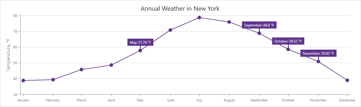
@inject IWeatherSummaryDataProvider WeatherSummaryDataProvider
<DxChart Data="@WeatherForecasts"
         CustomizeSeriesPoint="@PreparePointLabel"
         Width="100%">
    <DxChartLineSeries SummaryMethod="@(i => i.Average())"
                       ValueField="@((DetailedWeatherSummary i) => i.AverageTemperatureF)"
                       ArgumentField="@(i => new DateTime(2000, i.Date.Month, 1))"
                       Name="Temperature, F"
                       Filter="@((DetailedWeatherSummary  i) => i.City == "NEW YORK")">
        <DxChartSeriesLabel Position="RelativePosition.Outside"
                            FormatPattern="{argument:MMMM}: {value:#.##} °F">
            <DxChartSeriesLabelConnector Visible="true"
                                         Width="3" />
        </DxChartSeriesLabel>
    </DxChartLineSeries>
</DxChart>

@code {
    IEnumerable<DetailedWeatherSummary> WeatherForecasts;
    protected override async Task OnInitializedAsync() {
        WeatherForecasts = await WeatherSummaryDataProvider.GetDataAsync();
    }
    protected void PreparePointLabel(ChartSeriesPointCustomizationSettings pointSettings) {
        double value = (double)pointSettings.Point.Value;
        if (value > 50 && value < 70)
            pointSettings.PointLabel.Visible = true;
    }
}
You can also use the DxChartSeriesLabelBorder component to configure label borders. Set the Visible property to true to display borders and use Color, DashStyle, or Width properties to customize border appearance.
To customize font settings of a series label, use the DxChartFont object.
For additional information on how to configure series labels, refer to the following topic: Series Labels in Blazor Charts.
Pie Chart Specifics
The DxChartSeriesLabel component includes the following properties that apply to DxPieChartSeries labels only:
- TextOverflow | WordWrap
- Specify how to display the text of overflowing series labels.
- RadialOffset
- Shifts series labels radially away from or towards the chart center.
The following code snippet uses drop-down menus to choose how to display overflowing series labels:
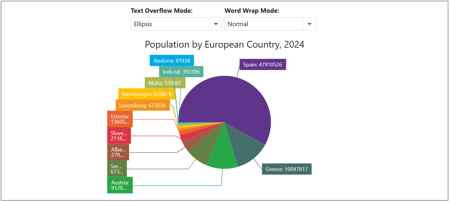
<label><strong>Text Overflow Mode: </strong></label>
<DxComboBox Text="TextOverflow" @bind-Value="@CurrentTextOverflowMode" Data="Enum.GetValues<ChartTextOverflow>()" />

<label><strong>Word Wrap Mode: </strong></label>
<DxComboBox Text="WordWrap" @bind-Value="@CurrentWordWrapMode" Data="Enum.GetValues<ChartWordWrap>()" />

<DxPieChart Data="@DataSource"
            Height="350px"
            StartAngle="180"
            LabelOverlap="PieChartLabelOverlap.Shift"
            PointSelectionMode="ChartSelectionMode.Multiple">
    <DxPieChartSeries ArgumentField="@((StatisticPoint v) => v.Country)"
                      ValueField="@((StatisticPoint v) => v.Population24)"
                      Name="2024">
        <DxChartSeriesLabel Visible="true"
                            TextOverflow="@CurrentTextOverflowMode"
                            WordWrap="@CurrentWordWrapMode"
                            FormatPattern="{argument}: {value}">
            <DxChartSeriesLabelConnector Visible="true" />
        </DxChartSeriesLabel>
    </DxPieChartSeries>
    <DxChartLegend HorizontalAlignment="HorizontalAlignment.Right"
                   Orientation="Orientation.Vertical"
                   Visible="false" />
    <DxChartTitle Text="Population by European Country, 2024" />
</DxPieChart>

@code {
    TextOverflow CurrentTextOverflowMode { get; set; } = ChartTextOverflow.Ellipsis;
    WordWrap CurrentWordWrapMode { get; set; } = ChartWordWrap.Normal;

    IEnumerable<StatisticPoint> DataSource = Enumerable.Empty<StatisticPoint>();
    protected override void OnInitialized() {
        DataSource = GenerateData();
    }
}
When the DxChartSeriesLabel.Position property is set to Inside, series labels may go beyond the boundaries of pie sectors. In this case, set the DxChartSeriesLabel.BackgroundColor property to transparent to display series labels correctly:
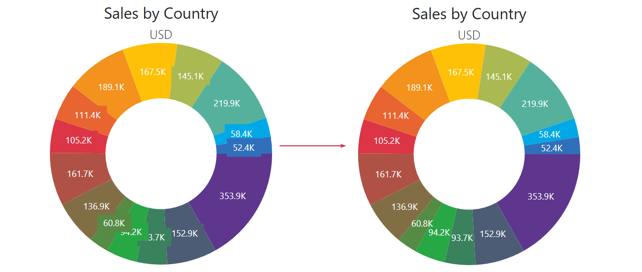
@using System.Drawing

<DxPieChart Data="@SalesData"
            InnerDiameter="0.5"
            T="SaleInfo">
    <DxPieChartSeries T="SaleInfo"
                      TArgument="string"
                      TValue="double"
                      ValueField="si => si.Amount"
                      ArgumentField="si => si.Country"
                      SummaryMethod="Enumerable.Sum">
        <DxChartSeriesLabel Visible="true"
                            Position="RelativePosition.Inside"
                            ValueFormat="ChartElementFormat.Thousands(1)"
                            BackgroundColor="System.Drawing.Color.Transparent">
        </DxChartSeriesLabel>
    </DxPieChartSeries>
    <DxChartTitle Text="Sales by Country">
        <DxChartSubTitle Text="USD" />
    </DxChartTitle>
    @* ... *@
</DxPieChart>