DxPopup Class
A modal popup window with custom content that overlays the current view.
Namespace: DevExpress.Blazor
Assembly: DevExpress.Blazor.v26.1.dll
Declaration
public class DxPopup :
    DxPopupBase
Remarks
The DevExpress Popup for Blazor allows you to show a modal pop-up window. The window traps focus and users cannot access HTML elements located outside the window until it is closed.

Add a Popup to a Project
Follow the steps below to add the Popup component to an application:
- Create a Blazor Server or Blazor WebAssembly application.
- Add the
<DxPopup></DxPopup>markup to a.razorfile. - Write code that manages the Popup’s visibility.
- Define the Popup’s content and appearance.
- Configure other options (see the sections below).
API Reference
Refer to the following list for the component API reference: DxPopup Members.
Popup Render
The Popup component renders in a root pop-up container that is placed directly in the document body. See the example of the HTML markup below. You do not need to copy this sample, as the Popup generates this markup automatically.
<body>
    <!-- ... -->
    <dxbl-popup-root>
        <!-- ... -->
        <dxbl-modal>
            <!-- Popup render -->
        </dxbl-modal>
        <!-- ... -->
    </dxbl-popup-root>
</body>
This behavior allows the Popup to be displayed correctly and prevents parent elements and CSS rules from clipping or affecting content.
Static Render Mode Specifics
Blazor Popup does not support static render mode. Enable interactivity to use the component in your application. Refer to the following topic for more details: Enable Interactive Render Mode.
Show and Close a Popup
Implement two-way binding for the Visible property to show the Popup in code and update the property value when a user closes the Popup.
<div @onclick="@(() => PopupVisible = true)">
    <p>CLICK TO SHOW A POP-UP WINDOW</p>
</div>

<DxPopup @bind-Visible="@PopupVisible">
</DxPopup>

@code {
    bool PopupVisible { get; set; } = false;
}
Call the ShowAsync and CloseAsync methods to show and close the Popup asynchronously. Make sure the component has been initialized before you call the ShowAsync method. Use the IsInitialized property to check the initialization state.
User Capabilities
Users can close the Popup in the following ways:
- Click the Close button in the header.
- Click outside the Popup’s boundaries.
- Press Escape.
Set the ShowCloseButton, CloseOnOutsideClick, and CloseOnEscape properties to false to disable these user capabilities.
Drag a Popup
Set the AllowDrag property to true to allow users to drag the Popup by its header to a new position. You can disable the AllowDragByHeaderOnly option to allow dragging by every window element – header, body, or footer.
<div @onclick="@(() => PopupVisible = true)">
    <p>CLICK TO SHOW A POP-UP WINDOW</p>
</div>

<DxPopup @bind-Visible="@PopupVisible"
         HeaderText="Header"
         BodyText="Lorem ipsum dolor sit amet, consectetur adipiscing elit. Mauris sit amet metus vel
                   nisi blandit tincidunt vel efficitur purus. Nunc nec turpis tempus, accumsan orci auctor,
                   imperdiet mauris. Fusce id purus magna."
         AllowDrag="true">
</DxPopup>

@code {
    bool PopupVisible { get; set; } = false;
}
You can handle the following events to process drag actions:
- DragStarted
- Fires when a user drags the Popup or resizes it by edges.
- DragCompleted
- Fires when a user drops the Popup.
Content and Appearance
The Popup consists of body and header with the Close button. Disable the ShowHeader option to hide the header. You can also enable the ShowFooter option to display the Popup footer.
Display Text
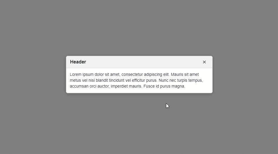
Use the HeaderText, BodyText, and FooterText properties to specify text displayed in Popup elements. All predefined appearance settings apply to these elements.
<div @onclick="@(() => PopupVisible = true)">
    <p>CLICK TO SHOW A POP-UP WINDOW</p>
</div>

<DxPopup @bind-Visible="@PopupVisible"
         HeaderText="Header"
         BodyText="Lorem ipsum dolor sit amet, consectetur adipiscing elit. Mauris sit amet metus vel
             nisi blandit tincidunt vel efficitur purus. Nunc nec turpis tempus, accumsan orci auctor,
             imperdiet mauris. Fusce id purus magna." />

@code {
    bool PopupVisible { get; set; } = false;
}
To customize the appearance of Popup elements, assign CSS classes to HeaderCssClass, BodyCssClass, and FooterCssClass properties.
Display Custom Content
Use HeaderContentTemplate, BodyContentTemplate, and FooterContentTemplate properties to display any UI render fragment in Popup elements. A render fragment can include formatted text, images, or another component. These templates affect content area only.
This template replaces default content but keeps the predefined space between the content area and border. The header’s content area does not include the Close button. The following image highlights the content area in red:

These templates take priority over the *Text and *CssClass properties described above.
Each template accepts an IPopupElementInfo object as the context parameter. You can use the parameter’s CloseCallback property to implement the Close button.
<div @onclick="@(() => PopupVisible = true)">
    <p>CLICK TO SHOW A POP-UP WINDOW</p>
</div>

<DxPopup @bind-Visible="@PopupVisible"
         HeaderText="Header"
         ShowFooter="true">
    <BodyContentTemplate>
        <i>
            Lorem ipsum dolor sit amet, consectetur adipiscing elit. Mauris sit amet metus vel
            nisi blandit tincidunt vel efficitur purus. Nunc nec turpis tempus, accumsan orci auctor,
            imperdiet mauris. Fusce id purus magna.
        </i>
    </BodyContentTemplate>
    <FooterContentTemplate>
        <DxButton RenderStyle="ButtonRenderStyle.Primary" Text="OK"
                  Click="@context.CloseCallback" />
    </FooterContentTemplate>
</DxPopup>

@code {
    bool PopupVisible { get; set; } = false;
}

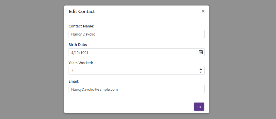
Customize Entire Elements
Specify HeaderTemplate, BodyTemplate, and FooterTemplate properties to define Popup element content and appearance. Predefined appearance settings do not apply. You can display any UI render fragment (for instance, formatted text, images, or another component).
These templates substitute the entire render fragments of corresponding elements. Predefined appearance settings, content alignment and paddings, and the corresponding Text, CssClass, and ContentTemplate properties have no effect.
Each template accepts an IPopupElementInfo object as the context parameter. You can use the parameter’s CloseCallback property to implement the Close button.
<div @onclick="@(() => PopupVisible = true)">
    <p>CLICK TO SHOW A POP-UP WINDOW</p>
</div>

<DxPopup @bind-Visible="@PopupVisible"
         HeaderText="Edit Contact"
         ShowFooter="true">
    <BodyTemplate Context="PopupContext">
        <div class="form-container">
            <DxFormLayout>
                <DxFormLayoutItem Caption="Contact Name:" ColSpanMd="12">
                    <Template>
                        <DxTextBox Text="Nancy Davolio" />
                    </Template>
                </DxFormLayoutItem>
                <DxFormLayoutItem Caption="Birth Date:" ColSpanMd="12">
                    <Template>
                        <DxDateEdit Date="DateTime.Now.AddYears(-30)" />
                    </Template>
                </DxFormLayoutItem>
                <DxFormLayoutItem Caption="Years Worked:" ColSpanMd="12">
                    <Template>
                        <DxSpinEdit Value="3" />
                    </Template>
                </DxFormLayoutItem>
                <DxFormLayoutItem Caption="Email:" ColSpanMd="12">
                    <Template>
                        <DxTextBox Text="NancyDavolio@sample.com" />
                    </Template>
                </DxFormLayoutItem>
            </DxFormLayout>
        </div>
    </BodyTemplate>
    <FooterContentTemplate>
        <DxButton RenderStyle="ButtonRenderStyle.Primary" Text="OK"
                  Click="@context.CloseCallback" />
    </FooterContentTemplate>
</DxPopup>

@code {
    bool PopupVisible { get; set; } = false;
}
Alignment
The Popup is centered both horizontally and vertically on the screen. Use the HorizontalAlignment and VerticalAlignment properties to change the Popup position.
<div @onclick="@(() => PopupVisible = true)">
    <p>CLICK TO SHOW A POP-UP WINDOW</p>
</div>

<DxPopup @bind-Visible="@PopupVisible"
         HeaderText="Header"
         BodyText="Lorem ipsum dolor sit amet, consectetur adipiscing elit. Mauris sit amet metus vel
             nisi blandit tincidunt vel efficitur purus. Nunc nec turpis tempus, accumsan orci auctor,
             imperdiet mauris. Fusce id purus magna."
         HorizontalAlignment="HorizontalAlignment.Right"
         VerticalAlignment="VerticalAlignment.Bottom" />

@code {
    bool PopupVisible { get; set; } = false;
}
You can specify PositionX and PositionY properties to display the component at the specific coordinates. These properties have priority over HorizontalAlignment and VerticalAlignment.
Size
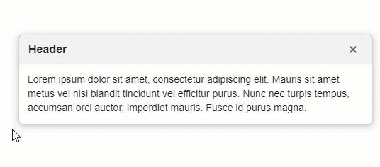
Popup width is equal to 500px on desktops. On phones and tablets, the width adapts to the viewport width. Popup height changes to fit content.
Use the Width and Height properties to specify the Popup size in CSS units:
- Specify the absolute width/height (for instance,
Width="300px"). - Specify the relative width/height (for instance,
Width="50%"). - Make the width/height fit the content (
Width="auto").
<div @onclick="@(() => PopupVisible = true)">
    <p>CLICK TO SHOW A POP-UP WINDOW</p>
</div>

<DxPopup @bind-Visible="@PopupVisible"
         HeaderText="Header"
         BodyText="Lorem ipsum dolor sit amet, consectetur adipiscing elit. Mauris sit amet metus vel
             nisi blandit tincidunt vel efficitur purus. Nunc nec turpis tempus, accumsan orci auctor,
             imperdiet mauris. Fusce id purus magna."
         Width="400px"
         Height="200px" />

@code {
    bool PopupVisible { get; set; } = false;
}

MinWidth, MaxWidth, MinHeight, and MaxHeight properties allow you to define size constraints when the Popup automatically adapts to its content.
<div @onclick="@(() => PopupVisible = true)">
    <p>CLICK TO SHOW A POP-UP WINDOW</p>
</div>

<DxPopup @bind-Visible="@PopupVisible"
         HeaderText="Header"
         BodyText="@DynamicText"
         Width="auto"
         MinWidth="300px"
         MaxWidth="600px" />

@code {
    bool PopupVisible { get; set; } = false;
    string DynamicText { get; set; } // Get text from an external source.
}
When Popup content does not fit the window’s size, this content is displayed over the window’s boundaries. Set the Scrollable property to true to show scrollbars and display all content inside the window’s boundaries.
Set the AllowResize property to true to allow users to change the component size at runtime.
<div @onclick="@(() => PopupVisible = true)">
    <p>CLICK TO SHOW A POP-UP WINDOW</p>
</div>

<DxPopup @bind-Visible="@PopupVisible"
         HeaderText="Header"
         BodyText="Lorem ipsum dolor sit amet, consectetur adipiscing elit. Mauris sit amet metus vel
                   nisi blandit tincidunt vel efficitur purus. Nunc nec turpis tempus, accumsan orci auctor,
                   imperdiet mauris. Fusce id purus magna."
         AllowResize="true"
         ApplyBackgroundShading="false">
</DxPopup>

@code {
    bool PopupVisible { get; set; } = false;
}
Respond to Show and Close Actions
Handle the following events to process show and close actions:
- Showing - Fires before the Popup is displayed and allows you to cancel this action.
- Shown - Fires after the Popup is displayed.
- Closing - Fires before the Popup is closed and allows you to cancel this action.
- Closed - Fires after the Popup is closed.
In the following example, neither the Close button in the header nor the custom OK button closes the Popup until a user enables the checkbox in the footer.

<div @onclick="@(() => EulaVisible = true)">
    <p>CLICK TO SHOW A POP-UP WINDOW</p>
</div>

<DxPopup @bind-Visible="@EulaVisible"
         ShowFooter="true"
         HeaderText="DevExpress EULA"
         Closing="EulaPopupClosing"
         Closed="EulaPopupClosed">
    <BodyContentTemplate>
        <p>
            The terms of our license are fully outlined/described in the Developer Express Inc End User
            License Agreement (EULA) included with our product installations. Before you can install and use
            a Developer Express Inc product, you must read, understand and accept the terms/conditions of
            our EULAs. <a target="" _blank"" rel="" noopener noreferrer"" href=""
                          https: //www.devexpress.com/support/eulas/"">More info...</a>
        </p>
    </BodyContentTemplate>
    <FooterContentTemplate Context="Context">
        <DxCheckBox class="my-margin" @bind-Checked="@EulaAccepted">
            I accept the terms of the EULA
        </DxCheckBox>
        <DxButton RenderStyle="ButtonRenderStyle.Primary" Text="OK" Click="Context.CloseCallback" />
    </FooterContentTemplate>
</DxPopup>
@code {
    bool EulaAccepted { get; set; }
    bool EulaVisible { get; set; }

    void EulaPopupClosed(PopupClosedEventArgs args) {
        EulaAccepted = false;
    }
    void EulaPopupClosing(PopupClosingEventArgs args) {
        args.Cancel = !EulaAccepted;
    }
}
Multiple Popups
You can show multiple Popups simultaneously. Their Z-indices are calculated based on the display order. To change a Popup’s z-index, specify the ZIndex property.
The following example creates a Popup that users can close only after they enable the checkbox. Another Popup appears if users do not enable the checkbox.

<div @onclick="@(() => EulaVisible = true)">
    <p>CLICK TO SHOW A POP-UP WINDOW</p>
</div>

<DxPopup @bind-Visible="@EulaVisible"
         ShowFooter="true"
         HeaderText="DevExpress EULA"
         Closing="EulaPopupClosing"
         Closed="EulaPopupClosed">
    <BodyContentTemplate>
        <p>
            The terms of our license are fully outlined/described in the Developer Express Inc End User
            License Agreement (EULA) included with our product installations. Before you can install and use
            a Developer Express Inc product, you must read, understand and accept the terms/conditions of
            our EULAs. <a target="" _blank"" rel="" noopener noreferrer"" href=""
                          https: //www.devexpress.com/support/eulas/"">More info...</a>
        </p>
    </BodyContentTemplate>
    <FooterContentTemplate Context="Context">
        <DxCheckBox class="m-checkbox" @bind-Checked="@EulaAccepted">
            I accept the terms of the EULA
        </DxCheckBox>
        <DxButton RenderStyle="ButtonRenderStyle.Primary" Text="OK" Click="Context.CloseCallback" />
    </FooterContentTemplate>
</DxPopup>
<DxPopup @bind-Visible="@MessageBoxVisible"
         ShowFooter="true"
         HeaderText="DevExpress EULA"
         BodyText="You must read and accept the terms of the EULA to continue.">
    <FooterContentTemplate Context="Context">
        <DxButton RenderStyle="ButtonRenderStyle.Primary" Text="OK" Click="Context.CloseCallback" />
    </FooterContentTemplate>
</DxPopup>
@code {
    bool EulaAccepted { get; set; }
    bool EulaVisible { get; set; }
    bool MessageBoxVisible { get; set; }

    void EulaPopupClosed() {
        EulaAccepted = false;
    }
    void EulaPopupClosing(PopupClosingEventArgs args) {
        if (!EulaAccepted) {
            args.Cancel = true;
            MessageBoxVisible = true;
        }
    }
}
Keyboard Navigation
When a Popup opens, it automatically receives focus. On mobile and tablet devices, focus moves to the Popup window. On desktop devices, focus moves to the first interactive element in the window or to the Close button.
Users can navigate through the component’s controls with keyboard shortcuts. The component supports keyboard navigation on the client and server.
| Shortcut Keys | Description |
|---|---|
| Tab | Moves focus forward through interactive Popup elements. After the last element, moves focus to the first interactive Popup element. |
| Shift + Tab | Moves focus backward through interactive Popup elements. After the first element, moves focus to the last interactive Popup element. |
| Esc | If CloseOnEscape is enabled, closes the Popup. |
Note
Keyboard support allows users to interact with application content in cases they cannot use a mouse or they rely on assistive technologies (like screen readers or switch devices). Refer to the Accessibility help topic for information on other accessibility areas that we address.
Accessibility Information
The Popup component is always assigned the dialog role and aria-modal attribute. This informs assistive technologies that the component is separated from the rest of the page and the content outside the pop-up window is inactive while it is open.
Note
The Popup’s role and aria-modal attributes cannot be changed.
The pop-up window’s accessible name is taken from its header element through the aria-labelledby attribute. However, if you customize the header’s content area with the HeaderContentTemplate property, you must manually label the component. Pass the following ARIA attributes to the Popup’s Attributes property:
- aria-labelledby – References the ID of another element (usually the visible popup title) that defines the accessible name. This is the preferred method.
- aria-label – Specify a string value that is used as the accessible name. Use this when a header element has no visible text, or when its text does not properly describe the popup’s purpose.
<DxPopup @bind-Visible="PopupVisible"
         aria-labelledby="my-custom-popup-header">
    <HeaderContentTemplate>
        <h2 id="my-custom-popup-header">Accessible Popup</h2>
    </HeaderContentTemplate>
    <BodyContentTemplate>
        @* ... *@
    </BodyContentTemplate>
</DxPopup>
Examples
Our knowledge base contains a wide array of sample projects that demonstrate the most popular usage scenarios, such as:
You can find more task-based examples in the following topic: Blazor Popup - Examples.
Troubleshooting
If a Blazor application throws unexpected exceptions, refer to the following help topic: Troubleshooting.