DxDropDownButtonItem Class
Defines a drop-down list item. Used in DxDropDownButton or DxSplitButton.
Namespace: DevExpress.Blazor
Assembly: DevExpress.Blazor.v26.1.dll
Declaration
public class DxDropDownButtonItem :
    DxDropDownButtonBase
Remarks
The DxDropDownButtonItem class implements the functionality of an individual item displayed in a drop-down list of a DxDropDownButton or DxSplitButton component. Use the Items property to manage the component’s item collection.

Item Appearance
Use the following API members to customize the drop-down button item’s appearance:
- Text
- Specifies the item text.
- Tooltip
- Specifies the item’s tooltip text.
- CssClass
- Assigns a CSS class to the item.
- IconCssClass | IconPosition
- Customize the item’s icon.
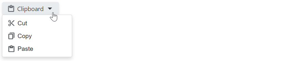
@using DevExpress.Images.Blazor

<DxDropDownButton RenderStyle="ButtonRenderStyle.Secondary"
                  Text="Clipboard"
                  IconUrl="@Icon.Clipboard">
    <Items>
        <DxDropDownButtonItem Text="Cut"  IconUrl="@Icon.Cut" />
        <DxDropDownButtonItem Text="Copy" IconUrl="@Icon.Copy" />
        <DxDropDownButtonItem Text="Paste" IconUrl="@Icon.ClipboardPaste" />
    </Items>
</DxDropDownButton>
Use the item’s Enabled property to specify whether the item is enabled. To hide the item, set its Visible property to false.
Item Groups
You can display horizontal lines within the menu to separate items into groups. To start a new group, set the item’s BeginGroup property to true.
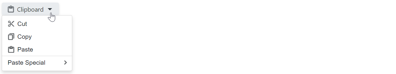
@using DevExpress.Images.Blazor

<DxDropDownButton RenderStyle="ButtonRenderStyle.Secondary"
                  Text="Clipboard"
                  IconUrl="@Icon.Clipboard">
    <Items>
        <DxDropDownButtonItem Text="Cut"  IconUrl="@Icon.Cut" />
        <DxDropDownButtonItem Text="Copy" IconUrl="@Icon.Copy" />
        <DxDropDownButtonItem Text="Paste" IconUrl="@Icon.ClipboardPaste" />
        <DxDropDownButtonItem Text="Paste Special" BeginGroup="true">
            <Items>
                <DxDropDownButtonItem Text="Paste Text Only" />
                <DxDropDownButtonItem Text="Paste Picture" Enabled="false" />
                <DxDropDownButtonItem Text="Paste as Hyperlink" />
            </Items>
        </DxDropDownButtonItem>
    </Items>
</DxDropDownButton>
Items with Hyperlinks
Use the NavigateUrl property to specify a URL where the web browser navigates when the drop-down list item is clicked. To specify where the browser should open the URL (for example, the current window or a new tab), use the Target property.
The following code snippet opens the Documentation item’s NavigateUrl link in the same tab and the Demos item’s link in a new tab:
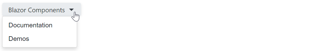
<DxDropDownButton Text="Blazor Components"
                  RenderStyleMode="ButtonRenderStyleMode.Outline" >
    <Items>
        <DxDropDownButtonItem Text="Documentation"
                              NavigateUrl="https://docs.devexpress.com/Blazor/400725/blazor-components" />
        <DxDropDownButtonItem Text="Demos"
                              NavigateUrl="https://demos.devexpress.com/blazor/"
                              Target="_blank" />
    </Items>
</DxDropDownButton>
Items with Drop-Down Elements
Drop-down button items can display drop-down menus or windows with custom content. Such items display the drop-down toggle icon. You can use the DropDownToggleCssClass property to customize the toggle’s appearance. To hide the toggle icon, set the DropDownToggleVisible property to false.
The DxDropDownButtonItem component allows you to configure settings of the item’s drop-down element. The following properties are available:
- DropDownCssClass
- Assigns a CSS class to the item’s drop-down element.
- DropDownPosition
- Positions the drop-down element relative to the item.
Drop-Down Menu
Populate the item’s <Items>...</Items> tag with DxDropDownButtonItem objects to create a nested menu:
@using DevExpress.Images.Blazor

<DxDropDownButton RenderStyle="ButtonRenderStyle.Secondary"
                  Text="Clipboard"
                  IconUrl="@Icon.Clipboard">
    <Items>
        <DxDropDownButtonItem Text="Cut"  IconUrl="@Icon.Cut" />
        <DxDropDownButtonItem Text="Copy" IconUrl="@Icon.Copy" />
        <DxDropDownButtonItem Text="Paste" IconUrl="@Icon.ClipboardPaste" />
        <DxDropDownButtonItem Text="Paste Special" BeginGroup="true">
            <Items>
                <DxDropDownButtonItem Text="Paste Text Only" />
                <DxDropDownButtonItem Text="Paste Picture" Enabled="false" />
                <DxDropDownButtonItem Text="Paste as Hyperlink" />
            </Items>
        </DxDropDownButtonItem>
    </Items>
</DxDropDownButton>
Drop-Down Content Template
Use the item’s DropDownContentTemplate property to display custom content within the item’s drop-down window.

<DxDropDownButton Text="Blazor Components"
                  RenderStyle="ButtonRenderStyle.Secondary">
    <Items>
        <DxDropDownButtonItem Text="Documentation" />
        <DxDropDownButtonItem Text="Demos" />
        <DxDropDownButtonItem Text="Click to search">
            <DropDownContentTemplate>
                <div>
                    <DxSearchBox aria-label="Search" />
                </div>
            </DropDownContentTemplate>
        </DxDropDownButtonItem>
    </Items>
</DxDropDownButton>
Handle Item Clicks
Handle the item’s Click event to react to item clicks. You can also use the DxDropDownButton.ItemClick or DxSplitButton.ItemClick event to specify a common click handler for all menu items.
@inject IJSRuntime JSRuntime
@using DevExpress.Images.Blazor

<p>The clicked item is @ClickedItem</p>

<DxDropDownButton RenderStyle="ButtonRenderStyle.Secondary"
                  Text="Clipboard"
                  IconUrl="@Icon.Clipboard"
                  ItemClick="@OnItemCommonClick">
    <Items>
        <DxDropDownButtonItem Text="Cut"
                              IconUrl="@Icon.Cut"
                              Click="@OnCutItemClick" />
        <DxDropDownButtonItem Text="Copy"
                              IconUrl="@Icon.Copy"
                              Click="@OnCopyItemClick" />
        <DxDropDownButtonItem Text="Paste"
                              IconUrl="@Icon.ClipboardPaste" />
    </Items>
</DxDropDownButton>

@code {
    public string ClickedItem { get; set; } = "";

    void OnCutItemClick(MouseEventArgs args) {
        ClickedItem = "Cut";
    }
    void OnCopyItemClick(MouseEventArgs args) {
        ClickedItem = "Copy";
    }

    async Task OnItemCommonClick(DropDownButtonItemClickEventArgs args) {
        await JSRuntime.InvokeVoidAsync("alert", $"The drop-down button item has been clicked.");
    }
}