DxListBox<TData, TValue> Class
A component that can connect to a data source and display a list of selectable items.
Namespace: DevExpress.Blazor
Assembly: DevExpress.Blazor.v26.1.dll
Declaration
public class DxListBox<TData, TValue> :
    DxListEditorBase<TData, TValue>,
    IListBoxComponent<TData, TValue>,
    IListBox<TData, TValue>,
    IListEditorBase<TData, TValue>,
    IEditorBase,
    IListBoxAccessor<TData>,
    IListEditorAccessorBase<TData>,
    IDropTargetComponent,
    IListBoxEditorItemDragDropOwner
Type Parameters
| Name | Description |
|---|---|
| TData | The data item type. |
| TValue | The value type. |
Remarks
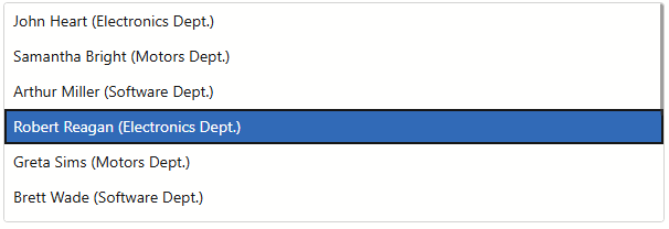
The DevExpress List Box for Blazor (<DxListBox>) allows you to display a list of selectable items from a data source.
Add a List Box to a Project
Follow the steps below to add a List Box component to an application:
- Create a Blazor Server or Blazor WebAssembly application.
- Add the
<DxListBox/ >markup to a.razorfile. - Use the Data property to bind the List Box to data.
- Configure the component: handle an item selection, customize item appearance, and so on (see Features and Capabilities).
API Reference
Refer to the following list for the component API reference: DxListBox Members.
Static Render Mode Specifics
Blazor List Box responds to data updates and supports user interaction when you enable interactive render mode. In static render mode, List Box can only display items.
Features and Capabilities
For in-depth information about DevExpress List Box for Blazor, review the following articles:
- Bind to Data
- Data Shaping
- Item Selection
- Multiple Columns
- Templates
- Keyboard Support
- Virtual Scrolling
- Size Modes
- Input Validation
- HTML Attributes
Troubleshooting
If a Blazor application throws unexpected exceptions, refer to the following help topic: Troubleshooting.