DxButton Class
A button control that supports advanced style and content customization options.
Namespace: DevExpress.Blazor
Assembly: DevExpress.Blazor.v26.1.dll
Declaration
public class DxButton :
    DxButtonBase
Remarks
The DevExpress Button for Blazor (<DxButton>) allows you to add a stylized button to your project and handle its click.
Add a Button to a Project
Follow the steps below to add the Button component to an application:
- Create a Blazor Server or Blazor WebAssembly application.
- Add the
<DxButton/>markup to a.razorfile. - Configure the component: specify the button’s content and appearance, handle button clicks, and so on (see the sections below).
API Reference
Refer to the following list for the component API reference: DxButton Members.
Static Render Mode Specifics
Blazor Button does not support static render mode. Enable interactivity to use the component in your application. Refer to the following topic for more details: Enable Interactive Render Mode.
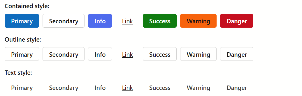
Button Content and Appearance
Use the Text property to specify the button’s text.
To configure button appearance, specify RenderStyle and RenderStyleMode properties.

<DxButton RenderStyle="ButtonRenderStyle.Primary"
          RenderStyleMode="ButtonRenderStyleMode.Contained"
          Text="Primary (Contained)" />
<DxButton RenderStyle="ButtonRenderStyle.Danger"
          RenderStyleMode="ButtonRenderStyleMode.Outline"
          Text="Danger (Outline)" />
<DxButton RenderStyle="ButtonRenderStyle.Link"
          RenderStyleMode="ButtonRenderStyleMode.Contained"
          Text="Link" />
To hide the button, set its Visible property to false.
Display Icons
The DxButton component supports icons. The following options are available:
- IconUrl
- Specifies the button icon URL.
- IconCssClass
- Specifies the icon’s CSS class.
- IconPosition
- Specifies the icon’s position.
The following code snippet assigns icons to buttons using Icon Library APIs:
<DxButton RenderStyle="@ButtonRenderStyle.Primary"
          Text="Accept"
          IconUrl="@Icon.CheckmarkCircle"/>
<DxButton RenderStyle="@ButtonRenderStyle.Secondary"
          Text="Cancel"
          IconUrl="@Icon.Cancel"/>
<DxButton RenderStyle="@ButtonRenderStyle.Info"
          Text="Help"
          IconUrl="@Icon.QuestionCircle"/>
<DxButton RenderStyle="@ButtonRenderStyle.Link"
          Text="Delete"
          IconUrl="@Icon.Delete"/>
Refer to the Icons help topic for additional information about icons in DevExpress Blazor components.
Size Modes
Use the SizeMode property to specify a button size. The following code snippet applies different size modes to Button components.
<DxButton Text="Small" SizeMode="SizeMode.Small" />

<DxButton Text="Medium" SizeMode="SizeMode.Medium" />

<DxButton Text="Large" SizeMode="SizeMode.Large" />

For additional information, refer to Size Modes.
Handle the Click Event
Handle the Click event to respond to the button’s click.
<DxButton Text="Click me!"
          Click="@ButtonClick">

@code {
    void ButtonClick(MouseEventArgs args) {
        Console.WriteLine("I am clicked!");
    }
}
If you use the NavigateUrl property together with the Click event’s handler, the browser handles the event first and then navigates to the specified URL.
To submit a form with a button click, set the SubmitFormOnClick option to true.
Set the Enabled property to false to disable the button.
<DxButton RenderStyle="ButtonRenderStyle.Primary"
          Text="Disabled button"
          Enabled="false" />

Custom Content
You can use the ChildContent property to add custom content to your button and customize its appearance and behavior:

    <DxButton RenderStyle="ButtonRenderStyle.Info"
              Click="@Like"
              IconCssClass="btn-icon btn-icon-like"
              SizeMode="Params.SizeMode"
              Text="Like">
        @context
        <span class="ms-1">@likes</span>
    </DxButton>
    @* ... *@
@code {
    int likes;

    void Like(MouseEventArgs args) {
        likes++;
    }
    protected override void OnInitialized() {
        likes = 1;
    }
}
Troubleshooting
If a Blazor application throws unexpected exceptions, refer to the following help topic: Troubleshooting.