DxInputBox Class
The input box component that can be added to the DxComboBox‘s EditBoxDisplayTemplate template.
Namespace: DevExpress.Blazor
Assembly: DevExpress.Blazor.v26.1.dll
Declaration
public class DxInputBox :
    RenderComponentBase,
    IDisposable
Remarks
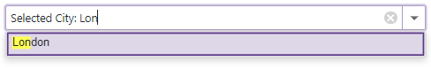
If you use the DxComboBox.EditBoxTemplate property to customize the appearance of a ComboBox item displayed in the edit box, you can also add the DxInputBox component to this template. The DxInputBox component allows you to enable user input and filter mode for the edit box.
Follow the steps:
- Add
<EditBoxDisplayTemplate>…</EditBoxDisplayTemplate>to the ComboBox markup. - Declare a
DxInputBoxobject within theEditBoxTemplatemarkup. - Optional. Use the
DxComboBox‘s InputCssClass to customize input box appearance. - Optional. Set the DxComboBox.AllowUserInput to
true. - Optional. Use the SearchMode property to enable search mode.
- Optional. Use the NullText property to display the prompt text in the edit box when the editor’s Value is
null.
<DxComboBox Data="@Cities"
            @bind-Value="@CurrentCity"
            AllowUserInput="true"
            SearchMode="ListSearchMode.AutoSearch"
            SearchFilterCondition="ListSearchFilterCondition.StartsWith"
            NullText="Select City ..."
            ClearButtonDisplayMode="DataEditorClearButtonDisplayMode.Auto">
    <EditBoxDisplayTemplate>
        @if (context != null) {
            <span class="content">Selected City: </span>
        }
        <DxInputBox/>
    </EditBoxDisplayTemplate>
</DxComboBox>

@code {
    string CurrentCity { get; set; } = "London";
    IEnumerable<string> Cities = new List<string>() { "New York", "London", "Berlin", "Paris" };
}
Inheritance
Object
ComponentBase
DevExpress.Blazor.Internal.RenderComponentBase
DxInputBox
See Also