DxSearchBox Class
A single-line editor that allows users to input text and search for it in your application.
Namespace: DevExpress.Blazor
Assembly: DevExpress.Blazor.v26.1.dll
Declaration
public class DxSearchBox :
    DxInputDataEditorBase<string>,
    IFocusableEditor
Remarks
The DevExpress Search Box for Blazor (<DxSearchBox>) allows you to input text and search for it in your application.

Add a Search Box to a Project
Follow the steps below to add the Search Box component to an application:
- Create a Blazor Server or Blazor WebAssembly application.
- Add the
<DxSearchBox>…</DxSearchBox>markup to a.razorfile. - Configure the component: specify the editor’s value, handle value changes, and so on (see the sections below).
API Reference
Refer to the following list for the component API reference: DxSearchBox Members.
Static Render Mode Specifics
Blazor Search Box does not support static render mode. Enable interactivity to use the component in your application. Refer to the following topic for more details: Enable Interactive Render Mode.
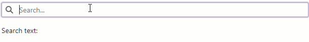
Search Text
Use the Text property to specify a search string or to bind the component to a data source object. You can use the @bind attribute to bind the Text property to a data field. Refer to the following topic for details: Two-Way Data Binding.
<DxSearchBox @bind-Text="@Value"
             aria-label="Search" />

<p class="demo-text cw-320 mt-3">
    Search text: <b>@Value</b>
</p>

@code {
    string Value { get; set; }
}
Handle Search Text Changes
If you do not use two-way data binding, handle the TextChanged event to respond to changes made in the editor.
<DxSearchBox Text="@Value"
             TextChanged="@OnTextChanged"
             aria-label="Search" />

<p class="cw-320 mt-3">
    Search text: <b>@Value</b>
</p>

@code {
    string Value { get; set; }
    void OnTextChanged(string newValue) {
        Value = newValue;
    }
}
You can also use the BindValueMode property to specify how and when to update the editor’s text.
Search Delay
The Text property value is updated when the editor loses focus (OnLostFocus mode). You can set the BindValueMode property to OnInput or OnDelayedInput to update the Text property when a user changes the input value.
The following code snippet shows the Search Box component that updates its text after a user is idle for 1 second (1,000ms):
<DxSearchBox @bind-Text="@Value"
             BindValueMode="BindValueMode.OnDelayedInput"
             InputDelay="1000"
             aria-label="Search" />

<p class="cw-320 mt-3">
    Search text: <b>@Value</b>
</p>

@code {
    string Value { get; set; }
}
Appearance Customization
Use the SizeMode property to specify a Search Box size. The following code snippet applies different size modes to Search Box components.
<DxSearchBox @bind-Text="@Value" SizeMode="SizeMode.Small"></DxSearchBox>

<DxSearchBox @bind-Text="@Value" SizeMode="SizeMode.Medium"></DxSearchBox>

<DxSearchBox @bind-Text="@Value" SizeMode="SizeMode.Large"></DxSearchBox>

@code {
    string Value { get; set; }
}

To customize styles for the Search Box container, use the CssClass property. The following code snippet applies a custom style to container borders:
<DxSearchBox @bind-Text="@Value"
             CssClass="my-style">
</DxSearchBox>

@code {
    string Value { get; set; }
}

You can also use the InputCssClass property to customize the editor’s input area.
For additional information, refer to the following help topics:
Clear Button and Placeholder
Set the ClearButtonDisplayMode property to Auto to display the Clear button in the Search Box when it is not empty. Use the NullText property to display the prompt text (placeholder) in the editor when its value is null.
<DxSearchBox @bind-Text="@Value"
             ClearButtonDisplayMode="DataEditorClearButtonDisplayMode.Auto"
             NullText="Search orders..."
             CssClass="cw-320"
             aria-label="Search" />

@code {
    string Value { get; set; }
}

Search Box with Submit Button
The following code implements a Search Box with a Submit button.
<DxSearchBox NullText="Type search text and click the Search button..."
             @bind-Text="@Text"
             aria-label="Search">
</DxSearchBox>

<DxButton Text="Search"
          CssClass="ms-3"
          Click="@OnSearchButtonClick"></DxButton>

<DxListBox TData="Product" TValue="Product" Data="@Products"
           SearchText="@SearchText"
           ListRenderMode="ListRenderMode.Virtual"
           SelectionMode="ListBoxSelectionMode.Multiple">
    <Columns>
    ...
    </Columns>
</DxListBox>

@code {
    string Text { get; set; }
    string SearchText { get; set; }

    void OnSearchButtonClick(MouseEventArgs args) {
        SearchText = Text;
    }
    ...
}

Add Search Box to Toolbar
You can integrate the DevExpress Blazor Search Box component into the Blazor Toolbar component.
<DxToolbar ItemRenderStyleMode="ToolbarRenderStyleMode.Plain"
           Title="DevExpress Logo">
    <TitleTemplate>
        <div class="icon-logo" role="img" aria-label="@context"></div>
    </TitleTemplate>
    <Items>
        <DxToolbarItem BeginGroup="true"
                       Alignment="ToolbarItemAlignment.Right">
            <Template>
                <DxSearchBox @bind-Text="@Value"
                             aria-label="Search" />
            </Template>
        </DxToolbarItem>
        <DxToolbarItem IconCssClass="tb-icon tb-icon-settings"
                       Tooltip="Settings" />
    </Items>
</DxToolbar>

@code {
    string Value { get; set; }
}

Add Command Buttons
You can add custom command buttons to the Search Box. Refer to Command Buttons for additional information.
The following code snippet adds custom buttons to the Search Box.
<DxSearchBox @bind-Text="@Value"
             aria-label="Search" >
    <Buttons>
        <DxEditorButton IconCssClass="oi oi-arrow-thick-bottom"
                        Click="@OnPreviousButtonClick">
        </DxEditorButton>
        <DxEditorButton IconCssClass="oi oi-arrow-thick-top"
                        Click="@OnNextButtonClick">
        </DxEditorButton>
    </Buttons>
</DxSearchBox>

@code {
    string Value { get; set; }

    void OnPreviousButtonClick() {
        // your logic
    }
    void OnNextButtonClick()  {
        // your logic
    }
}

HTML Attributes and Events
You can use HTML attributes and events to configure the Search Box.
<DxSearchBox @bind-Text="@Value"
             id="text"
             name="text"
             autocomplete="on"
             maxlength="10"
             @onselect="MyFunction">
</DxSearchBox>

@code {
    string Value { get; set; }
    void MyFunction(){
        //...
    }
}
Troubleshooting
If a Blazor application throws unexpected exceptions, refer to the following help topic: Troubleshooting.