DxChartPaneBorder Class
Defines pane border settings.
Namespace: DevExpress.Blazor
Assembly: DevExpress.Blazor.v26.1.dll
Declaration
public class DxChartPaneBorder :
    DxSettingsComponent<ChartPaneBorderModel>
Remarks
The DxChartPaneBorder component allows you to configure borders for DxChartPane.
To display borders in the DxChartPane component, enable the Visible property. You can then change the visibility of Left, Top, Right, and Bottom borders individually.
To customize pane border appearance, specify the following properties:
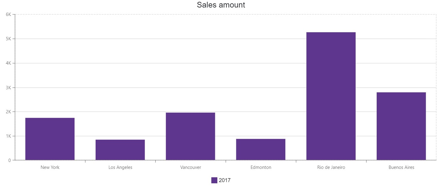
The following example shows pane borders and changes their appearance:
<DxChart Data="@SalesData" Height="500px">
    <DxChartTitle Text="Sales amount" />
    <DxChartLegend Position="RelativePosition.Outside" VerticalAlignment="VerticalEdge.Bottom" />
    <DxChartPane Name="Pane1" Height="60%" >
        <DxChartPaneBorder Visible="true"
                           Color="#D4D4D4"
                           DashStyle="ChartDashStyle.Dash" />
    </DxChartPane>
    <DxChartBarSeries Name="2017"
                      Filter="@((SaleInfo s) => s.Date.Year == 2017)"
                      SummaryMethod="Enumerable.Sum"
                      Pane="Pane1"
                      ArgumentField="@(s => s.City)"
                      ValueField="@(s => s.Amount)" />
</DxChart>
Inheritance
Object
ComponentBase
DxSettingsComponent<DevExpress.Blazor.Internal.ChartPaneBorderModel>
DxChartPaneBorder
See Also