Labels in Blazor Charts
- 17 minutes to read
This topic contains information on how to configure labels for series and axes.
Series Labels
Declare a DxChartSeriesLabel object in a series markup to configure labels for series data points. Set the DxChartSeriesLabel.Visible property to true to display labels:
<DxChart Data="forecasts">
    <DxChartLineSeries ArgumentField="@((WeatherForecast v) => v.Date)"
                       ValueField="@((WeatherForecast v) => v.TemperatureC)">
        <DxChartSeriesLabel Visible="true" />
    </DxChartLineSeries>
    @* ... *@
</DxChart>
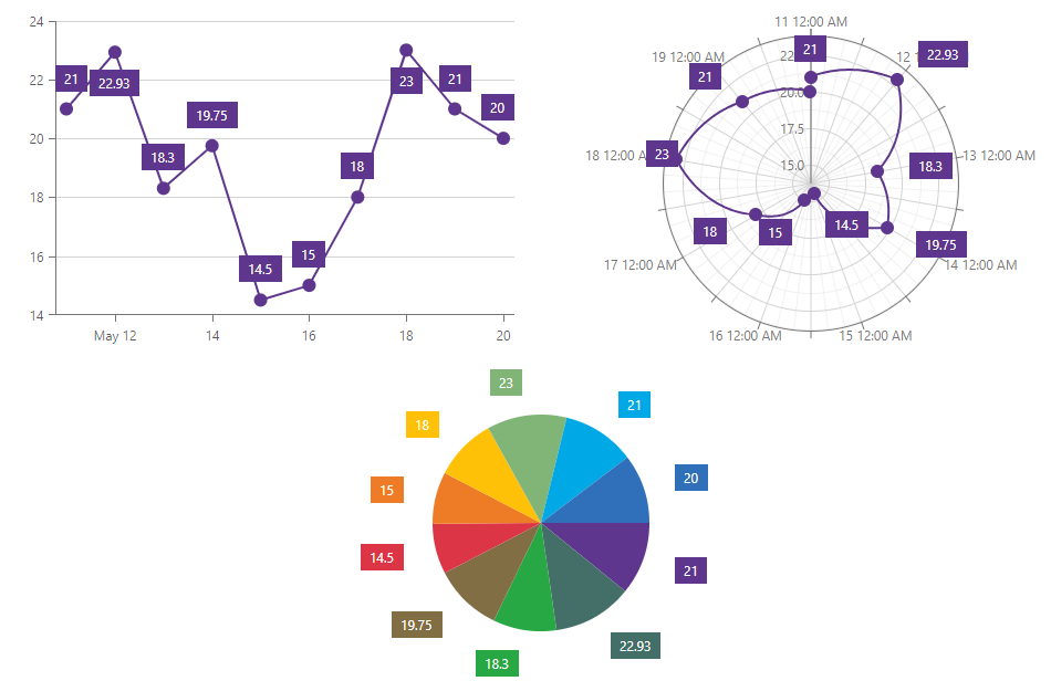
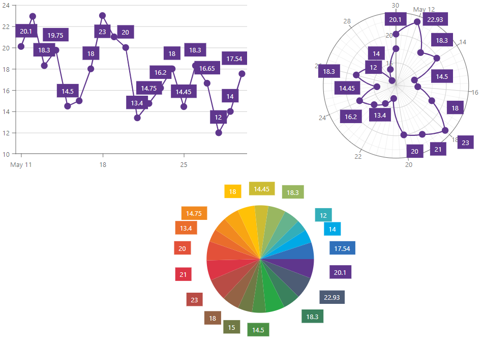
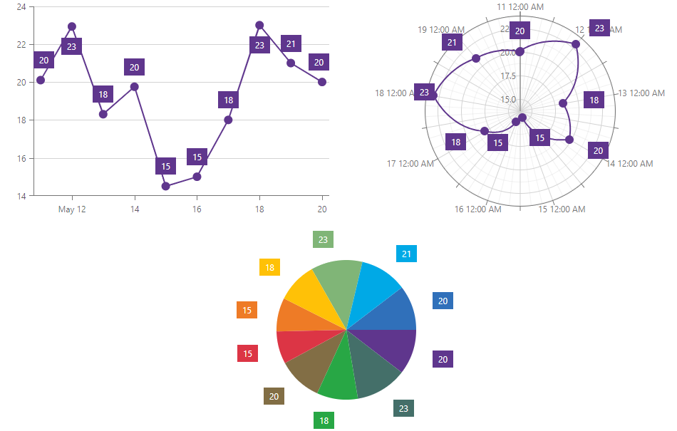
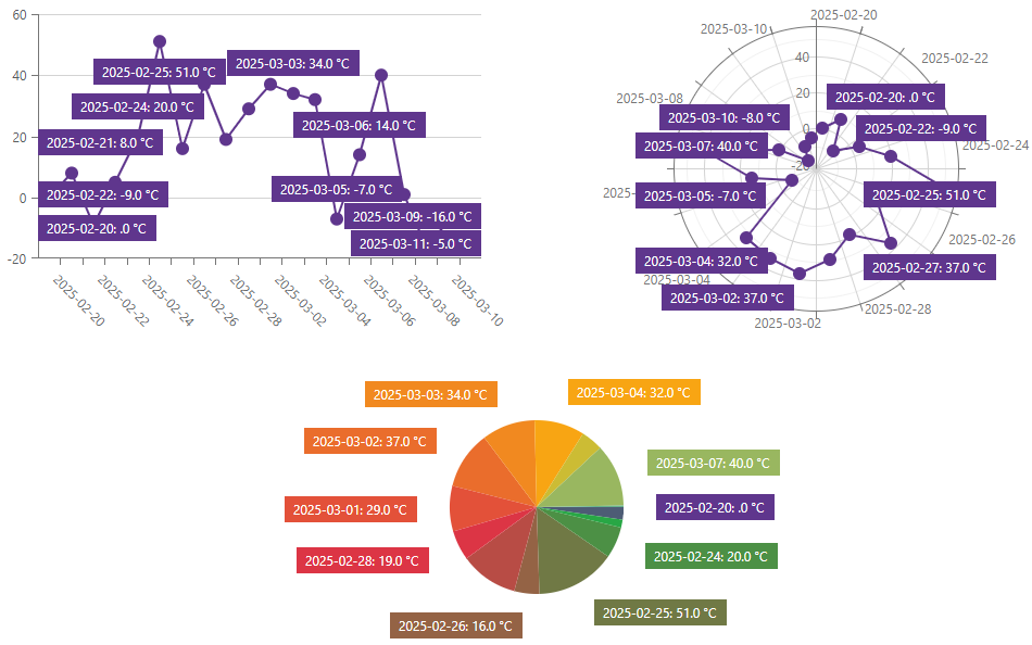
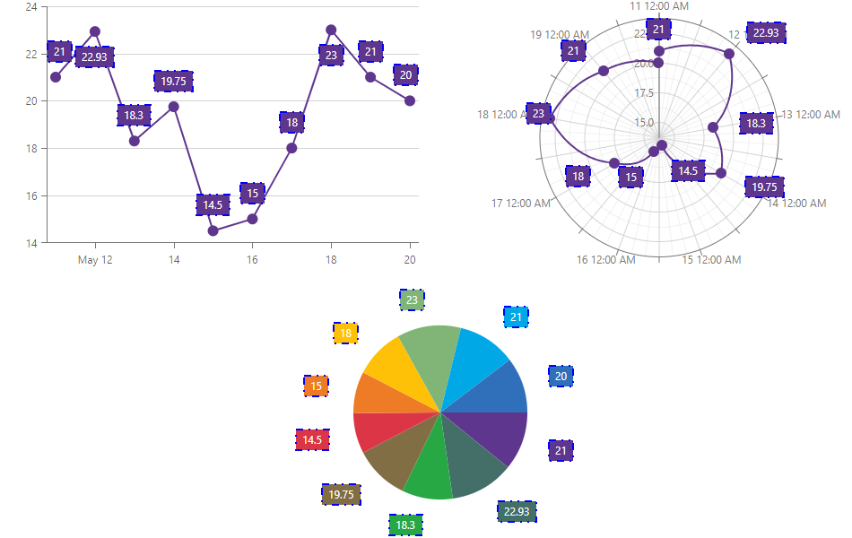
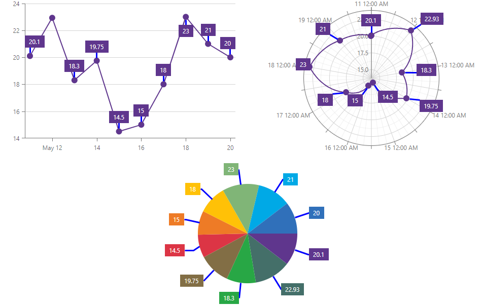
Manage Overlapping Labels
When a component contains a lot of data points or they are crowded, point labels may overlap:
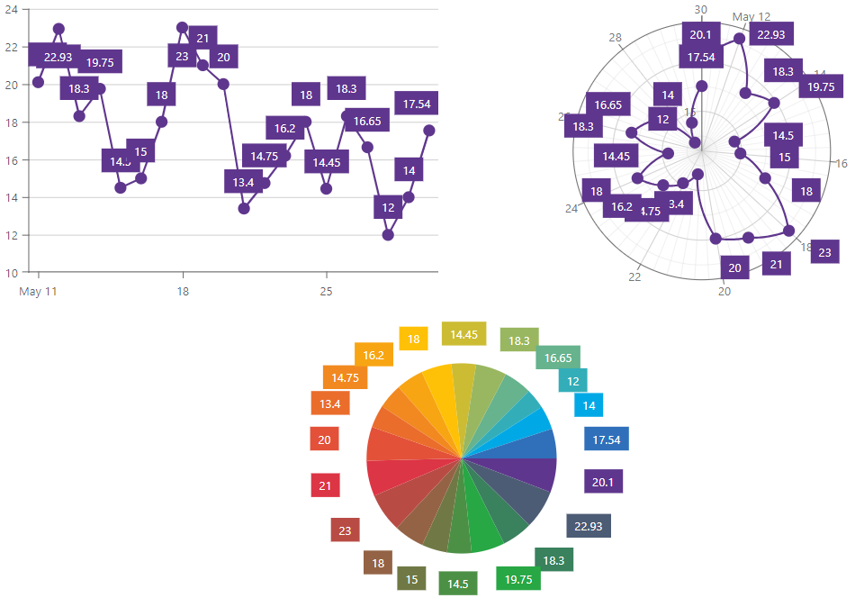
Use the LabelOverlap property to specify how the component resolves overlapping labels. The following code snippet hides overlapping point labels:
<DxChart Data="forecasts"
         LabelOverlap="ChartLabelOverlap.Hide">
    <DxChartLineSeries ArgumentField="@((WeatherForecast v) => v.Date)"
                       ValueField="@((WeatherForecast v) => v.TemperatureC)">
        <DxChartSeriesLabel Visible="true" />
    </DxChartLineSeries>
    @* ... *@
</DxChart>
Value Format
Use ArgumentFormat and ValueFormat properties to apply formatting to arguments and values. The ChartElementFormat class contains pre-defined options. To be in effect, an applied format should be compatible with the axis type. Refer to the following section for a list of available value formats: Value Formats.
The following example applies the FixedPoint formatting option to values:
<DxChart Data="forecasts">
    <DxChartLineSeries ArgumentField="@((WeatherForecast v) => v.Date)"
                       ValueField="@((WeatherForecast v) => v.TemperatureC)">
        <DxChartSeriesLabel Visible="true"
                            ValueFormat="ChartElementFormat.FixedPoint()" />
    </DxChartLineSeries>
    @* ... *@
</DxChart>
Custom Format
If you want to apply a custom format to labels, use the ChartElementFormat.FromLdmlString method. Refer to the following topic for additional information on how to specify custom formats: Custom Format String.
The following example rounds values to one decimal place. If the original value is a whole number, the value always displays zero.
<DxChart Data="forecasts">
    <DxChartLineSeries ArgumentField="@((WeatherForecast v) => v.Date)"
                       ValueField="@((WeatherForecast v) => v.TemperatureC)">
        <DxChartSeriesLabel Visible="true"
                            ValueFormat='ChartElementFormat.FromLdmlString("#.0")' />
    </DxChartLineSeries>
    @* ... *@
</DxChart>

Text Format (Pattern)
Use the FormatPattern property to format series label text. These patterns can include value placeholders and plain text. The following list contains available placeholders:
Common Placeholders
| Placeholder | Description |
|---|---|
| {argument} | The originalArgument after type cast. |
| {argumentText} | The argument with the applied format. |
| {originalArgument} | The raw point argument. |
| {originalValue} | The raw point value. |
| {seriesName} | The name of the series to which the point belongs. |
| {value} | The originalValue after type cast. |
| {valueText} | The value with the applied format. |
Bubble Series Placeholders
| Placeholder | Description |
|---|---|
| {size} | The bubble point’s size. |
Financial Series Placeholders
| Placeholder | Description |
|---|---|
| {closeValue} | The originalCloseValue after type cast. |
| {closeValueText} | The closeValue with the applied format. |
| {highValue} | The originalHighValue after type cast. |
| {highValueText} | The highValue with the applied format. |
| {lowValue} | The originalLowValue after type cast. |
| {lowValueText} | The lowValue with the applied format. |
| {openValue} | The originalOpenValue after type cast. |
| {openValueText} | The openValue with the applied format. |
| {originalCloseValue} | The point’s raw close value. |
| {originalHighValue} | The point’s raw high value. |
| {originalLowValue} | The point’s raw low value. |
| {originalOpenValue} | The point’s raw open value. |
| {reductionValue} | The reduction value. |
| {reductionValueText} | The reductionValue with the applied format. |
Range Series Placeholders
| Placeholder | Description |
|---|---|
| {index} | 0 - the minimum point value;1 - the maximum point value. |
Stacked Series Placeholders
| Placeholder | Description |
|---|---|
| {percent} | The point’s percentage value. |
| {percentText} | The percentage value with the applied format. |
| {total} | The sum of all values shown for the argument. |
| {totalText} | The total with the applied format. |
Refer to the following topic for the list of format specifiers for date-time and numeric values: LDML patterns.
Example
You want to display the following text in the label: DayOfWeek: Temperature °C. You can achieve this in two ways:
Specify ArgumentFormat and ValueFormat properties to format arguments and values, and then use resulting values to form text:
<DxChart Data="forecasts" LabelOverlap="ChartLabelOverlap.Hide"> <DxChartLineSeries ArgumentField="@((WeatherForecast v) => v.Date)" ValueField="@((WeatherForecast v) => v.TemperatureC)"> <DxChartSeriesLabel Visible="true" ArgumentFormat="ChartElementFormat.DayOfWeek" ValueFormat='ChartElementFormat.FromLdmlString("#.0")' FormatPattern="{argumentText}: {valueText} °C" /> </DxChartLineSeries> @* ... *@ </DxChart>Specify all format specifiers as part of format string placeholders. Refer to the following section for the list of available value formats: Value Formats.
<DxChart Data="forecasts" LabelOverlap="ChartLabelOverlap.Hide">
    <DxChartLineSeries ArgumentField="@((WeatherForecast v) => v.Date)"
                       ValueField="@((WeatherForecast v) => v.TemperatureC)">
        <DxChartSeriesLabel Visible="true"
                            FormatPattern="{argument:EEEE}: {value:#.0} °C" />
    </DxChartLineSeries>
    @* ... *@
</DxChart>
Label Position
Use the following properties to position series labels:
- HorizontalOffset | VerticalOffset
- Specify label offset in pixels.
- Alignment | Position | RotationAngle
- Specify how the component displays labels relative to series points.
The following example sets the rotation angle to 45 degrees:
<DxChart Data="forecasts" LabelOverlap="ChartLabelOverlap.Hide">
    <DxChartLineSeries ArgumentField="@((WeatherForecast v) => v.Date)"
                       ValueField="@((WeatherForecast v) => v.TemperatureC)">
        <DxChartSeriesLabel Visible="true"
                            RotationAngle="45" />
    </DxChartLineSeries>
    @* ... *@
</DxChart>
Appearance Customization
You can specify label color on the DxChartSeriesLabel component level. Use the BackgroundColor property.
The following example colors labels green:
<DxChart Data="forecasts">
    <DxChartLineSeries ArgumentField="@((WeatherForecast v) => v.Date)"
                       ValueField="@((WeatherForecast v) => v.TemperatureC)">
        <DxChartSeriesLabel Visible="true"
                            BackgroundColor="System.Drawing.Color.Green" />
    </DxChartLineSeries>
    @* ... *@
</DxChart>
For other customizations, use nested components. Refer to sections below for additional information.
Label Font
The DxChartFont object allows you to configure label font settings.
The following properties are available:
- Color | Opacity
- Specify the text color and its transparency.
- Family | Weight
- Specify font style settings.
- Size
- Specifies font size.
The following example sets the font size to 16:
<DxChart Data="forecasts">
    <DxChartLineSeries ArgumentField="@((WeatherForecast v) => v.Date)"
                       ValueField="@((WeatherForecast v) => v.TemperatureC)">
        <DxChartSeriesLabel Visible="true">
            <DxChartFont Size="16" />
        </DxChartSeriesLabel>
    </DxChartLineSeries>
    <DxChartLegend Visible="false"></DxChartLegend>
</DxChart>
Label Border
The DxChartSeriesLabelBorder object implements label borders. Declare it in the markup to cofigure border color, line style, and width.
The following example displays label borders and customizes their appearance:
<DxChart Data="forecasts">
    <DxChartLineSeries ArgumentField="@((WeatherForecast v) => v.Date)"
                       ValueField="@((WeatherForecast v) => v.TemperatureC)">
        <DxChartSeriesLabel Visible="true">
            <DxChartSeriesLabelBorder Visible="true"
                                      Color="Blue"
                                      Width="2"
                                      DashStyle="ChartDashStyle.DashDotDot" />
        </DxChartSeriesLabel>
    </DxChartLineSeries>
    @* ... *@
</DxChart>
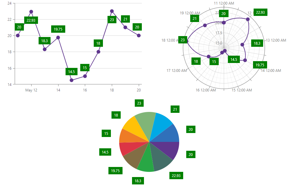
Label Connector
Use the DxChartSeriesLabelConnector component to display connectors between series points and labels. You can also specify connector color and width.
The following example shows label connectors and customizes their appearance:
<DxChart Data="forecasts">
    <DxChartLineSeries ArgumentField="@((WeatherForecast v) => v.Date)"
                       ValueField="@((WeatherForecast v) => v.TemperatureC)">
        <DxChartSeriesLabel Visible="true">
            <DxChartSeriesLabelConnector Visible="true"
                                         Color="System.Drawing.Color.Blue"
                                         Width="3" />
        </DxChartSeriesLabel>
    </DxChartLineSeries>
    <DxChartLegend Visible="false"></DxChartLegend>
</DxChart>
Pie Chart Specifics
The DxChartSeriesLabel component includes the following properties that apply to DxPieChartSeries labels only:
- TextOverflow | WordWrap
- Specify how to display the text of overflowing series labels.
- RadialOffset
- Shifts series labels radially away from or towards the chart center.
The following code snippet uses drop-down menus to choose how to display overflowing series labels:
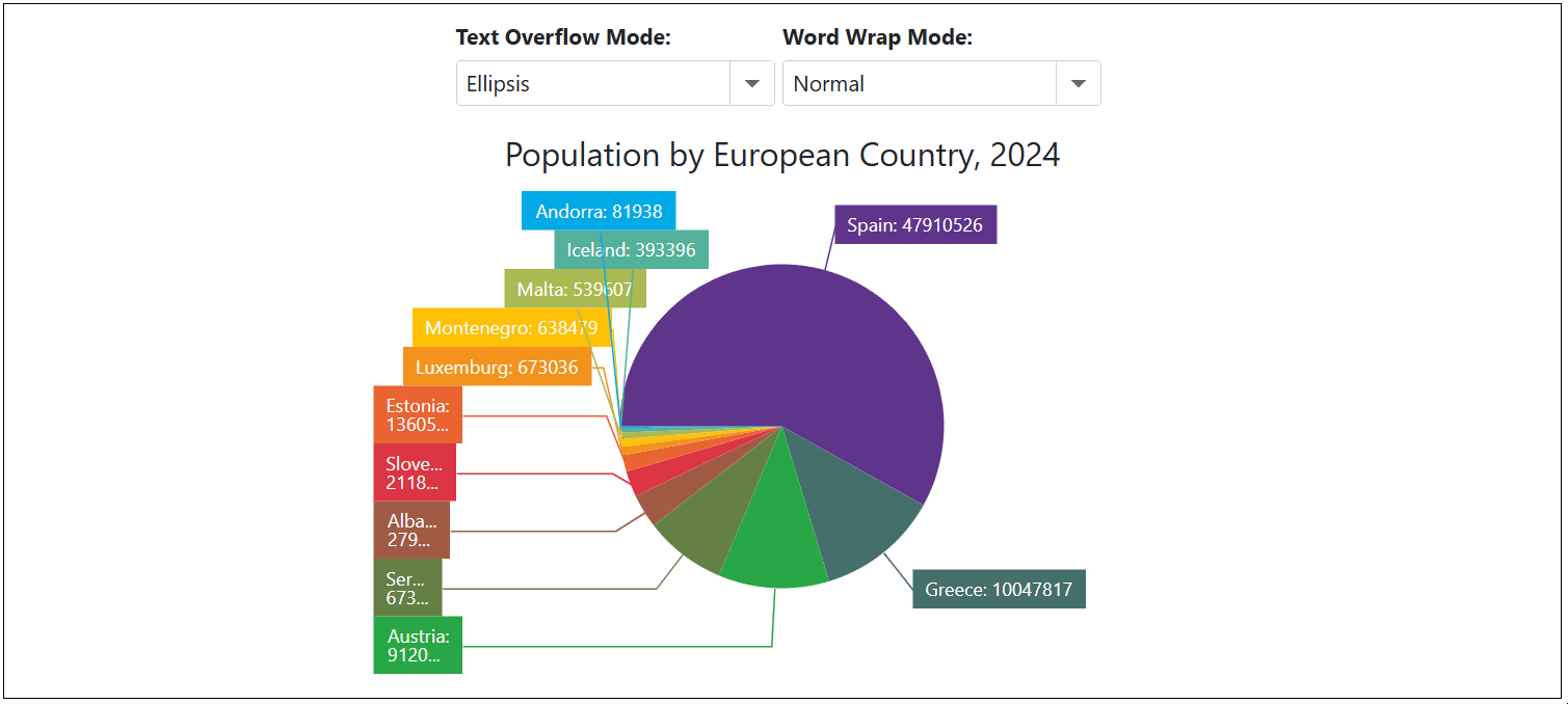
<label><strong>Text Overflow Mode: </strong></label>
<DxComboBox Text="TextOverflow" @bind-Value="@CurrentTextOverflowMode" Data="Enum.GetValues<ChartTextOverflow>()" />

<label><strong>Word Wrap Mode: </strong></label>
<DxComboBox Text="WordWrap" @bind-Value="@CurrentWordWrapMode" Data="Enum.GetValues<ChartWordWrap>()" />

<DxPieChart Data="@DataSource"
            Height="350px"
            StartAngle="180"
            LabelOverlap="PieChartLabelOverlap.Shift"
            PointSelectionMode="ChartSelectionMode.Multiple">
    <DxPieChartSeries ArgumentField="@((StatisticPoint v) => v.Country)"
                      ValueField="@((StatisticPoint v) => v.Population24)"
                      Name="2024">
        <DxChartSeriesLabel Visible="true"
                            TextOverflow="@CurrentTextOverflowMode"
                            WordWrap="@CurrentWordWrapMode"
                            FormatPattern="{argument}: {value}">
            <DxChartSeriesLabelConnector Visible="true" />
        </DxChartSeriesLabel>
    </DxPieChartSeries>
    <DxChartLegend HorizontalAlignment="HorizontalAlignment.Right"
                   Orientation="Orientation.Vertical"
                   Visible="false" />
    <DxChartTitle Text="Population by European Country, 2024" />
</DxPieChart>

@code {
    TextOverflow CurrentTextOverflowMode { get; set; } = ChartTextOverflow.Ellipsis;
    WordWrap CurrentWordWrapMode { get; set; } = ChartWordWrap.Normal;

    IEnumerable<StatisticPoint> DataSource = Enumerable.Empty<StatisticPoint>();
    protected override void OnInitialized() {
        DataSource = GenerateData();
    }
}
When the DxChartSeriesLabel.Position property is set to Inside, series labels may go beyond the boundaries of pie sectors. In this case, set the DxChartSeriesLabel.BackgroundColor property to transparent to display series labels correctly:
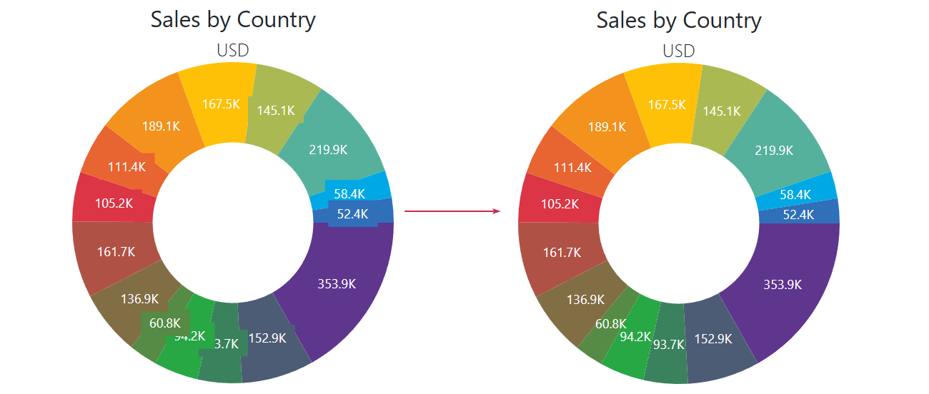
@using System.Drawing

<DxPieChart Data="@SalesData"
            InnerDiameter="0.5"
            T="SaleInfo">
    <DxPieChartSeries T="SaleInfo"
                      TArgument="string"
                      TValue="double"
                      ValueField="si => si.Amount"
                      ArgumentField="si => si.Country"
                      SummaryMethod="Enumerable.Sum">
        <DxChartSeriesLabel Visible="true"
                            Position="RelativePosition.Inside"
                            ValueFormat="ChartElementFormat.Thousands(1)"
                            BackgroundColor="System.Drawing.Color.Transparent">
        </DxChartSeriesLabel>
    </DxPieChartSeries>
    <DxChartTitle Text="Sales by Country">
        <DxChartSubTitle Text="USD" />
    </DxChartTitle>
    @* ... *@
</DxPieChart>
Individual Label Settings
All settings described above apply to all labels in the series. You can handle the CustomizeSeriesPoint event and use the event argument’s PointLabel property to modify settings for an individual label.
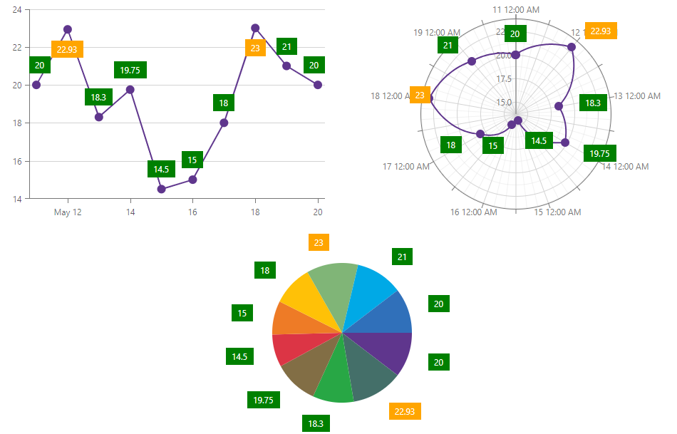
The following example specifies custom background color on a label level and overrides this settings for values greater than 22:
<DxChart Data="forecasts" CustomizeSeriesPoint="@OnCustomizeSeriesPoint">
    <DxChartLineSeries ArgumentField="@((WeatherForecast v) => v.Date)"
                       ValueField="@((WeatherForecast v) => v.TemperatureC)">
        <DxChartSeriesLabel Visible="true" BackgroundColor="System.Drawing.Color.Green" />
    </DxChartLineSeries>
    @* ... *@
</DxChart>

@code {
    void OnCustomizeSeriesPoint(ChartSeriesPointCustomizationSettings settings) {
        double value = (double)settings.Point.Value;
        if (value > 22)
            settings.PointLabel.BackgroundColor = System.Drawing.Color.Orange;
    }
}
Axis Labels
<DxChart> and <DxPolarChart> support axis label configuration. Use DxChartAxisLabel and DxPolarChartAxisLabel objects, respectively. <DxPieChart> does not have axes, so the settings below do not apply to this component.
Axis labels are visible by default. Set the DxChartAxisLabel.Visible property to false to hide them:
<DxChart Data="forecasts">
    <DxChartLineSeries ArgumentField="@((WeatherForecast v) => v.Date)"
                       ValueField="@((WeatherForecast v) => v.TemperatureC)">
    </DxChartLineSeries>
    <DxChartArgumentAxis>
        <DxChartAxisLabel Visible="false" />
    </DxChartArgumentAxis>
    <DxChartValueAxis>
        <DxChartAxisLabel Visible="false" />
    </DxChartValueAxis>
    @* ... *@
</DxChart>
Label Format
Use the Format property to format axis labels. The ChartElementFormat class contains pre-defined options. To be in effect, an applied format should be compatible with the axis type. Refer to the following section for a list of available value formats: Value Formats.
The following example displays days of week on the argument axis:
<DxChart Data="forecasts">
    <DxChartLineSeries ArgumentField="@((WeatherForecast v) => v.Date)"
                       ValueField="@((WeatherForecast v) => v.TemperatureC)">
    </DxChartLineSeries>
    <DxChartArgumentAxis>
        <DxChartAxisLabel Format="ChartElementFormat.DayOfWeek" />
    </DxChartArgumentAxis>
    @* ... *@
</DxChart>
Custom Format
If you want to apply a custom format to labels, use the ChartElementFormat.FromLdmlString method. Refer to the following topic for additional information on how to specify custom formats: Custom Format String.
In the following code snippet, the formatting pattern is dd M yy, where dd is the day, MMMMM is the first letter of the month, and yy is the last two digits of the year:
<DxChart Data="@forecasts">
    <DxChartArgumentAxis>
        <DxChartAxisLabel Format='ChartElementFormat.FromLdmlString("d MMMMM yy")'></DxChartAxisLabel>
    </DxChartArgumentAxis>
    @* ... *@
</DxChart>
Label Position
Chart and Polar Chart components allow you to arrange axis labels. Refer to sections below for additional information.
Overlapping Labels
Axis labels may overlap. The Chart component rotates such labels by default while the Polar Chart hides them. Use the Overlap property to resolve overlapping labels.
The following example arranges labels in two lines in the Chart, and leaves labels as is in the Polar Chart:
<DxChart Data="forecasts">
    <DxChartLineSeries ArgumentField="@((WeatherForecast v) => v.Date)"
                       ValueField="@((WeatherForecast v) => v.TemperatureC)">
    </DxChartLineSeries>
    <DxChartArgumentAxis>
        <DxChartAxisLabel Format="ChartElementFormat.LongDate"
                          Overlap="ChartAxisLabelOverlap.Stagger" />
    </DxChartArgumentAxis>
    @* ... *@
</DxChart>
Chart-Specific Settings
Use the following properties to position axis labels in Chart:
- Alignment
- Specifies the horizontal alignment for axis labels.
- Position
- Specifies axis label position.
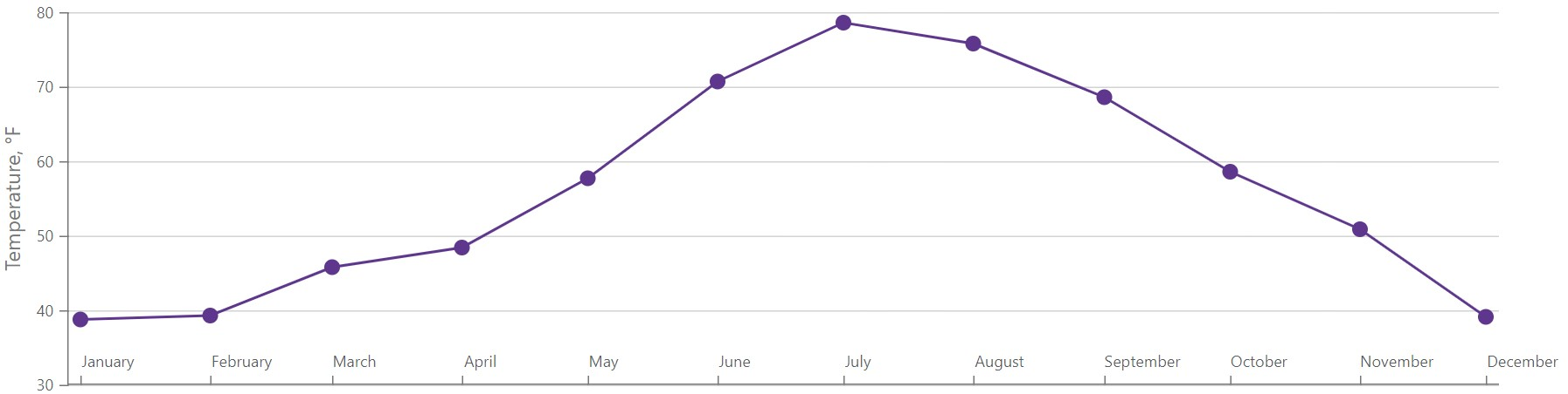
The following example places labels of the horizontal axis inside the chart area:
<DxChart Data="@forecasts">
    <DxChartLineSeries SummaryMethod="@(i => i.Average())"
                       ValueField="@((DetailedWeatherSummary i) => i.AverageTemperatureF)"
                       ArgumentField="@(i => new DateTime(2000, i.Date.Month, 1))"
                       Name="Temperature, F"
                       Filter="@((DetailedWeatherSummary  i) => i.City == "NEW YORK")">
    </DxChartLineSeries>
    <DxChartLegend Visible="false" />
    <DxChartValueAxis>
        <DxChartAxisTitle Text="Temperature, °F" />
    </DxChartValueAxis>
    <DxChartArgumentAxis>
        <DxChartAxisLabel Format="ChartElementFormat.Month"
                          Position="RelativePosition.Inside"
                          Alignment="HorizontalAlignment.Left" />
    </DxChartArgumentAxis>
</DxChart>
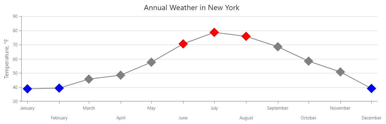
Display Mode
Use the DisplayMode property to specify how the Chart component displays axis labels when they do not overlap. Note that this property applies to horizontal axes only.
The following example arranges axis labels in two staggered rows:
<DxChart Data="@WeatherForecasts">
    <DxChartTitle Text="Annual Weather in New York" />
    <DxChartLineSeries SummaryMethod="@(i => i.Average())"
                       Color="@Color.Gray"
                       ValueField="@((DetailedWeatherSummary i) => i.AverageTemperatureF)"
                       ArgumentField="@(i => new DateTime(2000, i.Date.Month, 1))"
                       Name="Temperature, °F"
                       Filter="@((DetailedWeatherSummary  i) => i.City == "NEW YORK")">
        @* ... *@
    </DxChartLineSeries>
    <DxChartLegend Visible="false" />
    <DxChartValueAxis>
        <DxChartAxisTitle Text="Temperature, °F" />
    </DxChartValueAxis>
    <DxChartArgumentAxis>
        <DxChartAxisLabel Format="ChartElementFormat.Month"
                          DisplayMode="ChartAxisLabelDisplayMode.Stagger"
                          StaggeringSpacing="10" />
    </DxChartArgumentAxis>
</DxChart>
You can specify additional properties based on the chosen overlap or display mode:
- RotationAngle
- Specifies the rotation angle of axis labels when the Overlap or DisplayMode property is set to
Rotate. - StaggeringSpacing
- Specifies the space between two rows of axis labels when the Overlap or DisplayMode property is set to
Stagger.
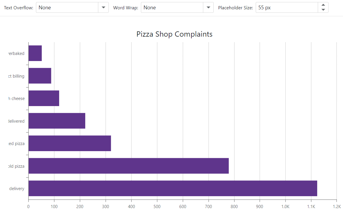
Text Overflow
The Chart component allows you to reserve an area for an axis and its labels (PlaceholderSize). When axis labels overflow this region, use the TextOverflow property to specify how axis labels are truncated or the WordWrap property to specify how they are wrapped.
The following example changes the content area size for the argument axis and uses drop-down menus to choose how to display axis labels:
<DxChart Data="@GetData()" Width="100%" Height="500" Rotated="true">
    <DxChartTitle Text="Pizza Shop Complaints" />
    <DxChartLegend Visible="false" />
        <DxChartBarSeries ArgumentField="@((DataPoint s) => s.Complaint)"
                          ValueField="@((DataPoint s) => s.Count)" />
    <DxChartTooltip Enabled="true">
        <div>
            <div>@context.Point.Argument</div>
            <div>Complaint frequency: @context.Point.Value</div>
        </div>
    </DxChartTooltip>
    <DxChartArgumentAxis PlaceholderSize="@CurrentPlaceholderSize">
        <DxChartAxisLabel WordWrap="@CurrentWordWrap"
                          TextOverflow="@CurrentTextOverflow" />
    </DxChartArgumentAxis>
</DxChart>

@code {
    ChartTextOverflow CurrentTextOverflow = ChartTextOverflow.Ellipsis;
    ChartWordWrap CurrentWordWrap = ChartWordWrap.Normal;
    double CurrentPlaceholderSize = 55;
    List<DataPoint> GetData() {
        List<DataPoint> result = new List<DataPoint>(7);
        result.Add(new DataPoint("Delayed delivery", 1123));
        result.Add(new DataPoint("Cold pizza", 780));
        result.Add(new DataPoint("Damaged pizza", 321));
        result.Add(new DataPoint("Wrong size delivered", 222));
        result.Add(new DataPoint("Not enough cheese", 120));
        result.Add(new DataPoint("Incorrect billing", 89));
        result.Add(new DataPoint("Underbaked or Overbaked", 52));
        return result;
    }
    public class DataPoint {
        public string Complaint { get; set; }
        public int Count { get; set; }
        public DataPoint(string complaint, int count) {
            Complaint = complaint;
            Count = count;
        }
    }
}
Value Formats
This section contains ChartElementFormat built-in formats.
Numeric Formats
- FixedPoint - 100.11 → 100
- Percent - 0.1 → 10%
- Decimal - 100.11 → 100
- Exponential - 1 000 → 1E+3
- Thousands - 1 000.11 → 1K
- Millions - 1 000 000.11 → 1M
- Billions - 1 000 000 000.11 → 1B
- Trillions - 1 000 000 000 000 → 1T
- LargeNumber - Uses “Thousands”, “Millions”, “Billions”, or “Trillions” format depending on the actual value.
Currency Formats
- Currency - “$3.95”
Date-Time Formats
- LongDate - “Thursday, January 01, 1970”
- LongTime - “12:00:00 AM”
- LongDateLongTime - “Thursday, January 01, 1970, 12:00:00 AM”
- MonthAndDay - “January 01”
- MonthAndYear - “1970 January”
- QuarterAndYear - “QI 1970”
- ShortDate - “1/25/1970”
- ShortTime - “12:00 AM”
- ShortDateShortTime - “1/25/1970, 12:00 AM”
- Millisecond - “010”
- Second - “00”
- Minute - “00”
- Hour - “12”
- Day - “01”
- DayOfWeek - “Thursday”
- Month - “January”
- Quarter - “QI”
- Year - “1970”