DxMenu Class
An adaptive menu component.
Namespace: DevExpress.Blazor
Assembly: DevExpress.Blazor.v24.2.dll
NuGet Package: DevExpress.Blazor
#Declaration
public class DxMenu :
DxNavigationControlComponent<IMenuModel>#Remarks
<DxMenu> adds a menu to your Blazor application.
#Add Menu to a Project
To add a <DxMenu> component to an application, follow the steps below:
- Create an application. If you use Microsoft project templates, configure the application as described in this topic: Register DevExpress Blazor Resources.
- Add the
<DxMenu>…</DxMenu>markup to your application. - Configure the component: add items, change the orientation, specify display mode, and so on (see the sections below).
#Items
Specify menu items in the DxMenu.Items collection. Each item is a DxMenuItem class instance that can have a collection of child items (the DxMenuItem.Items property).
Use the ItemsPosition property to align items in the menu. To customize item content and appearance, use the Text, IconCssClass, DxMenu.SubMenuCssClass, and DxMenuItem.SubMenuCssClass properties. To add a separator before an item, use the BeginGroup property.
You can also use the Expanded property to show a drop-down window with child items. Note that a node is visible only when all its parent nodes are visible.
<div class="card">
    <DxMenu Title="DevExpress"
            ItemsPosition="ItemPosition.Start">
        <Items>
            <DxMenuItem Text="Products" IconCssClass="oi oi-layers" Expanded="true">
                <Items>
                    <DxMenuItem Text="Subscriptions / Packs" />
                    <DxMenuItem Text=".NET Windows Forms Components" />
                    <DxMenuItem Text="Reporting / Printing Suites" />
                    <DxMenuItem Text="VCL Components and Tools" />
                    <DxMenuItem Text="ASP.NET Components" />
                </Items>
            </DxMenuItem>
            <DxMenuItem Text="Support" IconCssClass="oi oi-person">
                <Items>
                    <DxMenuItem Text="Knowledge Base" />
                    <DxMenuItem Text="Documentation" />
                    <DxMenuItem Text="Support Center" />
                    <DxMenuItem Text="Newsgroups" />
                    <DxMenuItem Text="Best Practices" />
                </Items>
            </DxMenuItem>
            <DxMenuItem Text="Documentation" IconCssClass="oi oi-book" BeginGroup="true" />
            <DxMenuItem Text="Demos" IconCssClass="oi oi-monitor" />
            <DxMenuItem Text="Blogs" IconCssClass="oi oi-bell" />
        </Items>
    </DxMenu>
</div>

#Data Binding
You can populate the Menu component with items from a data source.
Follow the steps below to bind Menu to data:
Use the Data property to specify a data source. You can use different collection types:
- Flat data (a collection of items organized as a single-level structure)
- Hierarchical data (a collection of nested items)
Add the DataMappings tag to the component’s markup.
Create the DxMenuDataMapping instance and map item properties (BeginGroup, CssClass, and so on) to data source fields. Mappings are used to assign data from the source collection to the component’s data model.
For flat data collections, use the Key and ParentKey properties to create a hierarchy of items. If the Menu’s structure is linear, you can omit these properties.
For hierarchical data collections, the Children property is required to build the data model.
You can create multiple
DxMenuDataMappinginstances to specify different mappings for different nesting levels. Use the Level property to specify the item level for which data mappings are applied.
The following code snippet loads menu items from the TextFormattingMenu class. Each menu item has child items. The code specifies the Children and Text mappings to adjust the menu data model to the specified data source.
<div class="card menu-card-container w-100">
    <div class="card-header p-0 fw-normal">
        <DxMenu ItemClick="@(e => ((TextFormattingMenuItem)e.ItemInfo.Data).Click())"
                Data="@MenuItems"
                SizeMode="@Params.SizeMode">
            <DataMappings>
                <DxMenuDataMapping Text="Text"
                                   Children="Children"
                                   BeginGroup="BeginGroup"
                                   CssClass="CssClass"
                                   Enabled="Enabled" />
            </DataMappings>
        </DxMenu>
    </div>
    <div class="card-body">
        <div style="@Formatting.GetStyleString()">
            <span class="demo-preventsel">Lorem ipsum dolor sit amet, consectetur adipiscing elit. Mauris sit amet metus vel nisi blandit tincidunt vel efficitur purus. Nunc nec turpis tempus, accumsan orci auctor, imperdiet mauris. Fusce id purus magna.</span>
        </div>
    </div>
</div>

@code {
    List<TextFormattingMenuItem> menuItems;
    List<TextFormattingMenuItem> MenuItems => menuItems = menuItems ?? TextFormattingMenu.MenuItems(Formatting);
    TextFormatting Formatting { get; } = new TextFormatting();
}
#.NET 8 and .NET 9 Specifics
In static render mode, you can use a single-level menu.
<DxMenu Orientation="@Orientation.Vertical">
    <Items>
        <DxMenuItem NavigateUrl="/" Text="Home" />
        <DxMenuItem NavigateUrl="/counter" Text="Counter" />
        <DxMenuItem NavigateUrl="/weather" Text="Weather" />
    </Items>
</DxMenu>
If you need interactivity, enable interactive render mode. Refer to the following topic for more details: Enable Interactive Render Mode.
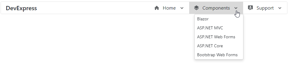
#Orientation
The Menu’s default orientation is Horizontal (menu items are arranged in a row). Use the Orientation property to change the orientation.
<div>
    <DxMenu Title="DevExpress"
            Orientation="Orientation.Vertical"
            DisplayMode="MenuDisplayMode.Desktop">
        <Items>
            <DxMenuItem Text="Home" IconCssClass="menu-icon-home menu-icon">
                <Items>
                    <DxMenuItem Text="News">
                        <Items>
                            <DxMenuItem Text="Explore our newest features" />
                            <DxMenuItem Text="Website news" />
                        </Items>
                    </DxMenuItem>
                    <DxMenuItem Text="Our Mission" />
                    <DxMenuItem Text="Our Customers" />
                </Items>
            </DxMenuItem>
            <DxMenuItem Text="Components" IconCssClass="menu-icon-products menu-icon">
                <Items>
                    <DxMenuItem Text="Blazor" />
                    <DxMenuItem Text="ASP.NET MVC" />
                    <DxMenuItem Text="ASP.NET Web Forms" />
                    <DxMenuItem Text="ASP.NET Core" />
                    <DxMenuItem Text="Bootstrap Web Forms" />
                </Items>
            </DxMenuItem>
            <DxMenuItem Text="Support" IconCssClass="menu-icon-support menu-icon">
                <Items>
                    <DxMenuItem Text="Getting Started" />
                    <DxMenuItem Text="Documentation" />
                    <DxMenuItem Text="Support Center" />
                    <DxMenuItem Text="Code Examples" />
                    <DxMenuItem Text="Blogs" />
                </Items>
            </DxMenuItem>
        </Items>
    </DxMenu>
</div>
#Display Modes
The Menu component supports different display modes (the DisplayMode property):
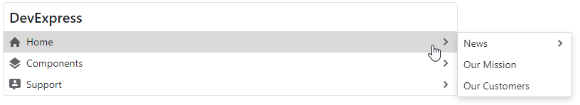
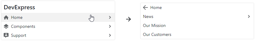
Auto- the menu is adapted to the device type.Desktop- the menu is shown as a panel with root items. The menu view also depends on the orientation. In the horizontal orientation, child items are available in drop-down menus. In the vertical orientation, submenus with child items are shown to the side of the menu container.Mobile- the menu has a compact view and depends on the orientation. In the horizontal orientation, it is a hamburger menu. In the vertical orientation, the menu looks like a desktop menu - a panel with root items, but submenus are shown in the main menu container and have the Back button.
The following code snippet specifies display mode:
<div>
    <DxMenu Title="DevExpress"
            Orientation="Orientation.Vertical"
            DisplayMode="MenuDisplayMode.Mobile">
        <Items>
            <DxMenuItem Text="Home" IconCssClass="menu-icon-home menu-icon">
                <Items>
                    <DxMenuItem Text="News">
                        <Items>
                            <DxMenuItem Text="Explore our newest features" />
                            <DxMenuItem Text="Website news" />
                        </Items>
                    </DxMenuItem>
                    <DxMenuItem Text="Our Mission" />
                    <DxMenuItem Text="Our Customers" />
                </Items>
            </DxMenuItem>
            <DxMenuItem Text="Components" IconCssClass="menu-icon-products menu-icon">
                <Items>
                    <DxMenuItem Text="Blazor" />
                    <DxMenuItem Text="ASP.NET MVC" />
                    <DxMenuItem Text="ASP.NET Web Forms" />
                    <DxMenuItem Text="ASP.NET Core" />
                    <DxMenuItem Text="Bootstrap Web Forms" />
                </Items>
            </DxMenuItem>
            <DxMenuItem Text="Support" IconCssClass="menu-icon-support menu-icon">
                <Items>
                    <DxMenuItem Text="Getting Started" />
                    <DxMenuItem Text="Documentation" />
                    <DxMenuItem Text="Support Center" />
                    <DxMenuItem Text="Code Examples" />
                    <DxMenuItem Text="Blogs" />
                </Items>
            </DxMenuItem>
        </Items>
    </DxMenu>
</div>
#Adaptivity
The Menu component supports adaptive mode when items are arranged horizontally. The following properties specify how the menu behaves when the width of the browser window changes and it cannot fit all items:
- CollapseItemToIconMode
- Specifies whether the menu displays icons instead of captions in items. You can also specify the order in which menu hides its items (AdaptivePriority).
- CollapseItemsToHamburgerMenu
- Specifies whether menu items are collapsed into a hamburger menu. Use the HamburgerButtonPosition property to specify the hamburger button’s position.
<div class="card w-auto">
    <DxMenu Title="DevExpress"
            CollapseItemToIconMode="MenuCollapseItemToIconMode.Sequentially"
            CollapseItemsToHamburgerMenu="true">
        <Items>
            <DxMenuItem Text="Home" IconCssClass="menu-icon-home menu-icon">
                <Items>
                    <DxMenuItem Text="News">
                        <Items>
                            <DxMenuItem Text="Explore our newest features" />
                            <DxMenuItem Text="Website news" />
                        </Items>
                    </DxMenuItem>
                    <DxMenuItem Text="Our Mission" />
                    <DxMenuItem Text="Our Customers" />
                </Items>
            </DxMenuItem>
            <DxMenuItem Text="Components" IconCssClass="menu-icon-products menu-icon">
                <Items>
                    <DxMenuItem Text="Blazor" />
                    <DxMenuItem Text="ASP.NET MVC" />
                    <DxMenuItem Text="ASP.NET Web Forms" />
                    <DxMenuItem Text="ASP.NET Core" />
                    <DxMenuItem Text="Bootstrap Web Forms" />
                </Items>
            </DxMenuItem>
            <DxMenuItem Text="Support" IconCssClass="menu-icon-support menu-icon">
                <Items>
                    <DxMenuItem Text="Getting Started" />
                    <DxMenuItem Text="Documentation" />
                    <DxMenuItem Text="Support Center" />
                    <DxMenuItem Text="Code Examples" />
                    <DxMenuItem Text="Blogs" />
                </Items>
            </DxMenuItem>
            <DxMenuItem Text="Contacts" IconCssClass="menu-icon-contacts menu-icon" />
            <DxMenuItem Text="About" IconCssClass="menu-icon-about menu-icon" />
        </Items>
    </DxMenu>
</div>
You can also use the DisplayMode property in Auto mode to show the Menu as a panel or in a compact view depending on the device type.
#Templates
The Menu component allows you to use templates to customize the layout and appearance of the menu title and menu items.
#Title Template
Use the TitleTemplate property to specify the template for the menu title.
<div class="card w-50">
    <DxMenu Title="DevExpress Logo">
        <TitleTemplate>
            <img width="120" src="images/Logo-Monochrome.svg" alt="@context" />
        </TitleTemplate>
        <Items>
            <DxMenuItem Text="Products" />
            <DxMenuItem Text="Support" />
            <DxMenuItem Text="Documentation" />
            <DxMenuItem Text="Demos" />
        </Items>
    </DxMenu>
</div>

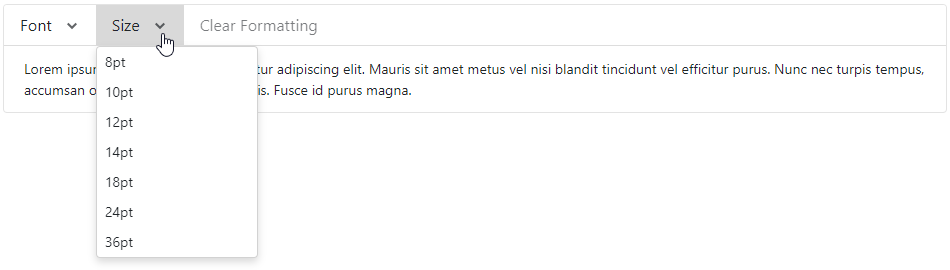
#Item Templates
You can specify a template for all items or for an individual item. Individual templates override common templates.
| What to Customize | Common Templates | Individual Templates |
|---|---|---|
| A whole item | Dx |
Dx |
| An item’s text | Dx |
Dx |
| An item’s submenu | Dx |
Dx |
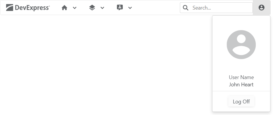
The following example uses templates to create the Search and User Profile menu items:
<DxMenu Orientation="Orientation.Horizontal"
@* ... *@
        SubMenuCssClass="menu-dropdown"
        SizeMode="@Params.SizeMode">
    <TitleTemplate>
        <div class="icon-logo" role="img" aria-label="@context"></div>
    </TitleTemplate>

    <Items>
        <DxMenuItem Text="Home" IconCssClass="menu-icon-home menu-icon">
            <Items>
                <DxMenuItem Text="News">
                    <Items>
                        <DxMenuItem Text="Explore our newest features" />
                        <DxMenuItem Text="Website news" />
                    </Items>
                </DxMenuItem>
                <DxMenuItem Text="Our Mission" />
                <DxMenuItem Text="Our Customers" />
            </Items>
        </DxMenuItem>
        <DxMenuItem Text="Components" IconCssClass="menu-icon-products menu-icon">
            <Items>
                <DxMenuItem Text="Blazor" />
                <DxMenuItem Text="ASP.NET MVC" />
                <DxMenuItem Text="ASP.NET Web Forms" />
                <DxMenuItem Text="ASP.NET Core" />
                <DxMenuItem Text="Bootstrap Web Forms" />
            </Items>
        </DxMenuItem>
        <DxMenuItem Text="Support" IconCssClass="menu-icon-support menu-icon">
            <Items>
                <DxMenuItem Text="Getting Started" />
                <DxMenuItem Text="Documentation" />
                <DxMenuItem Text="Support Center" />
                <DxMenuItem Text="Code Examples" />
                <DxMenuItem Text="Blogs" />
            </Items>
        </DxMenuItem>
        <DxMenuItem CssClass="search-menu-item" Position="ItemPosition.End">
            <Template>
                <DxSearchBox CssClass="search" aria-label="Search" />
            </Template>
        </DxMenuItem>
        <DxMenuItem CssClass="notoggle" Position="ItemPosition.End">
            <TextTemplate>
                <div class="menu-icon-user-profile menu-icon" />
            </TextTemplate>
            <SubMenuTemplate>
                <div class="w-100 user-profile">
                    <div class="flex-column align-items-center justify-content-center">
                        <div class="logo-container d-flex align-items-center justify-content-center">
                            <div class="menu-icon-user-profile menu-icon menu-icon-large" />
                        </div>
                        <div class="user-name-container bm-3 mb-2">
                            <div class="tm-8 text-center">User Name</div>
                            <div class="text-center">John Heart</div>
                        </div>
                        <div class="d-flex justify-content-center log-off-btn">
                            <DxButton Text="Log Off" RenderStyle="@ButtonRenderStyle.Secondary"></DxButton>
                        </div>
                    </div>
                </div>
            </SubMenuTemplate>
        </DxMenuItem>
    </Items>
</DxMenu>
#Keyboard Navigation
The DevExpress Blazor Menu component supports keyboard shortcuts that allow users to access every UI element and navigate through menu and submenu items. Keyboard navigation is implemented both on the client and server.
The table below lists common keyboard shortcuts:
| Shortcut Keys | Description |
|---|---|
| Tab, Shift + Tab | Focuses the menu/hamburger button or moves focus to the next or previous focusable page element. |
| Enter, Space | For items without child items: Invokes a click event handler for the focused menu item, closes submenus, and moves focus to the corresponding main menu item. For items with child items: Invokes a click event handler for the focused menu item, opens a submenu, and moves focus to its first item. For templated items: Moves focus to the first focusable element within the template. |
| Esc, Tab | For templates within menu items: Moves focus to the corresponding menu item. |
The following sections describe keyboard shortcuts available in different menu display and orientation modes.
#Desktop Horizontal Menu
| Shortcut Keys | Description |
|---|---|
| End | Moves focus to the last menu/submenu item. |
| Home | Moves focus to the first menu/submenu item. |
| Esc | Closes opened submenus and moves focus to the corresponding main menu item. |
| Up Arrow | For main menu items with child items: Opens a submenu and moves focus to its last item. For submenu items: Moves focus to the previous item. |
| Down Arrow | For main menu items with child items: Opens a submenu and moves focus to its first item. For submenu items: Moves focus to the next item. |
| Right Arrow | For main menu items: Moves focus to the next item. For submenu items with child items: Opens a submenu and moves focus to its first item. For submenu items without child items: Closes submenus, moves focus to the next main menu item, and opens its submenu. |
| Left Arrow | For main menu items: Moves focus to the previous menu item. For the first level submenu items: Closes the submenu, moves focus to the previous main menu item, and opens its submenu. For another level submenu items: Closes the current level submenu and moves focus to the corresponding parent item. |
#Desktop Vertical Menu
| Shortcut Keys | Description |
|---|---|
| End | Moves focus to the last menu/submenu item. |
| Home | Moves focus to the first menu/submenu item. |
| Esc | Closes opened submenus and moves focus to the corresponding main menu item. |
| Up Arrow | Moves focus to the previous menu item. |
| Down Arrow | Moves focus to the next menu item. |
| Left Arrow | For main menu items with child items: Opens a submenu and moves focus to its last item. For submenu items: Closes the submenu and moves focus to the corresponding parent item. |
| Right Arrow | For items with child items: Opens a submenu and moves focus to its first item. |
#Mobile Vertical Menu
| Shortcut Keys | Description |
|---|---|
| Down Arrow | Moves focus to the next menu item. |
| Up Arrow | Moves focus to the previous menu item. |
| Right Arrow | For items with child items: Opens a submenu. |
| Left Arrow | For main menu items with child items: Opens a submenu and moves focus to its last item. For submenu items: Closes the submenu and moves focus to the corresponding parent item. |
#Mobile Horizontal Menu
| Shortcut Keys | Description |
|---|---|
| Down Arrow | For the hamburger button: Opens the main menu and moves focus to its first item. For menu items: Moves focus to the next item without expanding/collapsing an item. |
| Up Arrow | For the hamburger button: Opens the main menu and moves focus to its last item. For menu items: Moves focus to the previous item without expanding/collapsing an item. |
| Right Arrow | Expands the focused collapsed item or moves focus to the first child item. |
| Left Arrow | Collapses the focused expanded item or moves focus to the corresponding parent item. |
| Home | Moves focus to the first item in the tree without expanding/collapsing an item. |
| End | Moves focus to the last item in the tree without expanding/collapsing an item. |
| Esc | Closes the menu and moves focus to the hamburger button. |
#Troubleshooting
If a Blazor application throws unexpected exceptions, refer to the following help topic: Troubleshooting.