DxRadio<TValue> Class
An individual radio button that allows you to build radio groups with a custom item layout.
Namespace: DevExpress.Blazor
Assembly: DevExpress.Blazor.v26.1.dll
Declaration
public class DxRadio<TValue> :
    RadioBase<TValue, TValue>,
    ISynchronizedRadio,
    ICheckBoxInternalOwner,
    IRequireSelfCascading
Type Parameters
| Name | Description |
|---|---|
| TValue | The value type. |
Remarks
The DevExpress Radio Button for Blazor (<DxRadio>) allows you to create individual radio buttons and combine them into groups. A user can select only one button in a group at a time.
Note
As an alternative, you can use the DevExpress Radio Group component (<DxRadioGroup>). The Radio Group component allows you to generate a set of radio buttons based on a collection, while the Radio Button component allows you to create and customize radio buttons individually.
Add a Radio Button to a Project
Follow the steps below to add a Radio Button component to an application:
- Create a Blazor Server or Blazor WebAssembly application.
- Add the
<DxRadio>…</DxRadio>markup to a.razorfile. - Specify a radio button value, the name of a radio group to which the button belongs, and a group value. Customize the radio button as your needs dictate (review instructions below).
API Reference
Refer to the following list for the component API reference: DxRadio Members.
Static Render Mode Specifics
Blazor Radio Button does not support static render mode. Enable interactivity to use the component in your application. Refer to the following topic for more details: Enable Interactive Render Mode.
Specify Radio Button Value, Group Name, and Group Value
The main Radio Button API members are listed below.
| API Member | Description |
|---|---|
| Value | Specifies the radio button’s value. |
| GroupName | Specifies the name of a radio group to which the radio button belongs. This property is required. |
| GroupValue | Specifies the value of the selected radio button. You can use the @bind attribute to bind the GroupValue property to a data field. Refer to Two-Way Data Binding. |
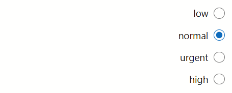
The following code snippet creates a simple radio group.
<div role="radiogroup">
    @foreach(var priorityLevel in PriorityLevels) {
        <DxRadio GroupName="priorities-radio-group"
                 @bind-GroupValue="@SelectedPriorityLevel"
                 Value="@priorityLevel">
            @priorityLevel
        </DxRadio>
    }
</div>

@code {
    string SelectedPriorityLevel { get; set; } = "normal";
    IEnumerable<string> PriorityLevels = new[] { "low", "normal", "urgent", "high" };
}
The following code snippet creates cascading radio groups. One group is visible at first (general-radio-group). The second group (aot-radio-group) appears if a user selects radio button 1 or 2 in the first group.
<fieldset role="radiogroup">
    <legend>Are you developing Blazor WebAssembly apps?</legend>
    @foreach(var option in GeneralAnswerOptions) {
        <DxRadio GroupName="general-radio-group"
                    @bind-GroupValue="@GeneralAnswer"
                    Value="@option">
            @option
        </DxRadio>
    }
</fieldset>
@if(AOTGroupVisible) {
    <fieldset role="radiogroup">
        <legend>Do you expect to enable AOT in your Blazor WebAssembly apps?</legend>
        @foreach(var option in AOTAnswerOptions) {
            <DxRadio GroupName="aot-radio-group"
                        @bind-GroupValue="@AOTAnswer"
                        Value="@option">
                @option
            </DxRadio>
        }
    </fieldset>
}

@code {
    string GeneralAnswer { get; set; }
    string AOTAnswer { get; set; }
    bool AOTGroupVisible => !string.IsNullOrEmpty(GeneralAnswer) && GeneralAnswer != GeneralAnswerOptions.Last();
    IEnumerable<string> GeneralAnswerOptions = new[] {
        "Yes.",
        "No, but I plan to develop a WebAssembly app in the near future.",
        "No."
    };
    IEnumerable<string> AOTAnswerOptions = new[] {
        "Yes, I already enabled it.",
        "Yes, I plan to enable it AOT in my WebAssembly app.",
        "No."
    };
}
Note
To improve accessibility support, radio buttons must be grouped together in a radiogroup to indicate which ones affect the same value. Refer to the following topic for additional information: ARIA: radiogroup role. See code examples above.
Customize Appearance
Use the following properties to customize radio button appearance:
| API Member | Description |
|---|---|
| Alignment | Specifies the position of the radio button’s label relative to the container boundaries. |
| CssClass | Assigns a CSS class to the editor. |
| IconCssClass | Specifies the name of the CSS class applied to the radio button’s icon. |
| LabelPosition | Specifies the position of the button label relative to the clickable circle. |
| LabelWrapMode | Specifies word wrap style for the label. |
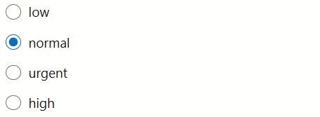
The following code snippet changes content position.
<div class="w-400" role="radiogroup">
@foreach (var priorityLevel in PriorityLevels) {
    <DxRadio GroupName="priorities-radio-group"
             @bind-GroupValue="@SelectedPriorityLevel"
             Value="@priorityLevel"
             LabelPosition="LabelPosition.Left"
             Alignment="CheckBoxContentAlignment.Right">
        @priorityLevel
    </DxRadio>
}
</div>

@code {
    string SelectedPriorityLevel { get; set; } = "normal";
    IEnumerable<string> PriorityLevels = new[] { "low", "normal", "urgent", "high" };
}
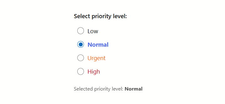
The following code snippet applies different styles to radio buttons with different priority levels.
<fieldset role="radiogroup">
    @foreach(var priorityLevel in PriorityLevels) {
        <DxRadio GroupName="priorities-radio-group"
                 @bind-GroupValue="@SelectedPriorityLevel"
                 Value="@priorityLevel"
                 CssClass="@GetItemCssClass(priorityLevel)">
        </DxRadio>
    }
</fieldset>

@code {
    string SelectedPriorityLevel { get; set; } = "normal";
    IEnumerable<string> PriorityLevels = new[] { "low", "normal", "urgent", "high" };
    string GetItemCssClass(string priorityLevel) {
        var result = $"dx-demo-radio priority-{priorityLevel}";
        if(priorityLevel == SelectedPriorityLevel)
            result += " dx-demo-radio-selected";
        return result;
    }
}
Disable Radio Buttons
Radio buttons support disabled mode. Set the Enabled property to false to disable a radio button. A user cannot focus or select this radio button.
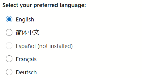
The following code snippet disables radio buttons conditionally (based on installed languages).
<fieldset role="radiogroup">
    <legend>Select your preferred language:</legend>
    @foreach (var language in Languages) {
        <DxRadio GroupName="disabled-option-radio-group"
                 @bind-GroupValue="@PreferredLanguage"
                 Value="@language"
                 Enabled="@IsLanguageInstalled(language)">
            @GetOptionLabel(language)
        </DxRadio>
    }
</fieldset>

@code {
    IEnumerable<string> Languages = new[] { "English", "简体中文", "Español", "Français", "Deutsch" };
    bool IsLanguageInstalled(string language) => language != "Español";
    string GetOptionLabel(string language) {
        var result = language;
        if (!IsLanguageInstalled(language))
            result += " (not installed)";
        return result;
    }
}
Input Validation
You can add a standalone Radio component or Form Layout component to Blazor’s standard EditForm. This form validates user input based on data annotation attributes defined in a model and indicates errors.
For additional information, refer to the following help topic: Validate Input.