GridElementType Enum
Lists values that define a Grid element’s type.
Namespace: DevExpress.Blazor
Assembly: DevExpress.Blazor.Grid.v26.1.dll
Declaration
public enum GridElementTypeMembers
| Name | Description |
|---|---|
DataRow
|
A data row. |
DataCell
|
A data column cell. |
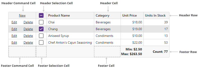
CommandCell
|
A command column cell. |
SelectionCell
|
A selection column cell. |
EmptyBandCell
|
A band‘s empty data cell. |
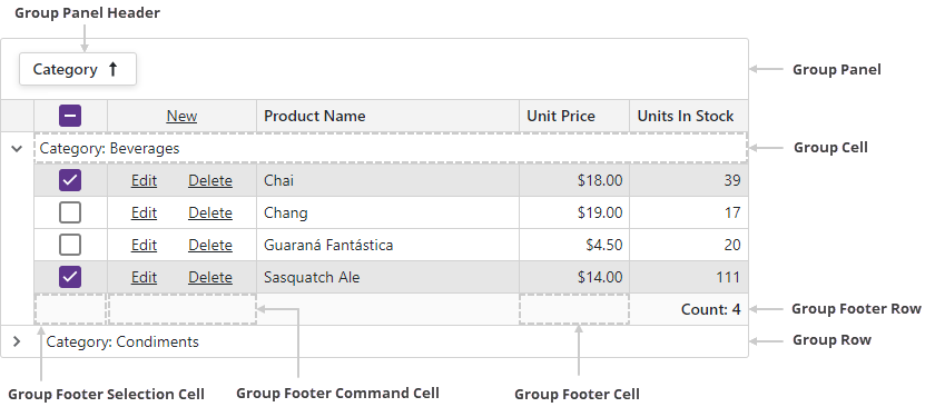
GroupRow
|
A group row. |
GroupCell
|
A group row cell. |
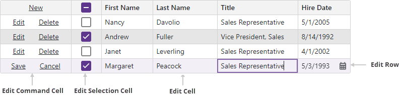
EditRow
|
An edit row. |
EditCell
|
A cell displayed in the edited row. |
EditCommandCell
|
A command column cell displayed in the edited row. |
EditSelectionCell
|
A selection column cell displayed in the edited row. |
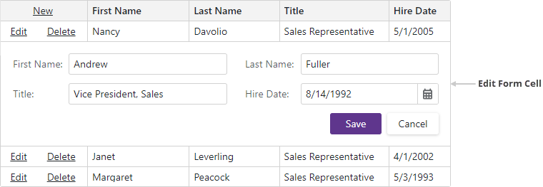
EditFormCell
|
An edit form cell. |
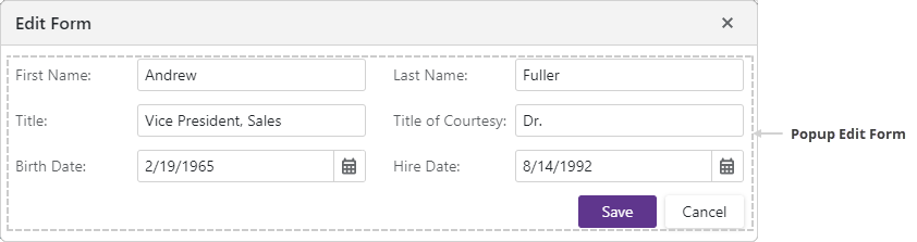
PopupEditForm
|
|
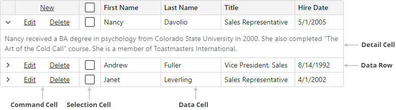
DetailCell
|
A detail row cell. |
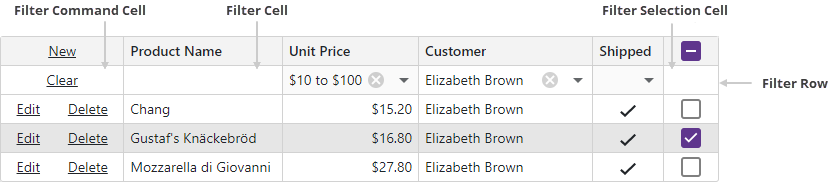
FilterRow
|
The filter row. |
FilterCell
|
A filter row‘s edit cell. |
FilterCommandCell
|
A filter row‘s command column cell. |
FilterSelectionCell
|
A filter row‘s selection column cell. |
HeaderRow
|
The row that contains Grid column headers. |
HeaderCell
|
A data column header cell. |
HeaderCommandCell
|
A command column header cell. |
HeaderSelectionCell
|
A selection column header cell. |
HeaderBandCell
|
A band‘s header cell. |
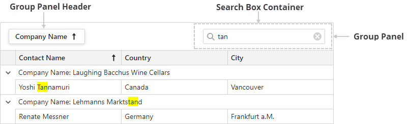
GroupPanel
|
The group panel. |
GroupPanelHeader
|
A column header in the group panel. |
FooterRow
|
The footer. |
FooterCell
|
A footer cell. |
FooterCommandCell
|
The footer‘s command column cell. |
FooterSelectionCell
|
The footer‘s selection column cell. |
FooterBandCell
|
A band‘s footer cell. |
GroupFooterRow
|
A group footer. |
GroupFooterCell
|
A group footer cell. |
GroupFooterCommandCell
|
A group footer‘s command column cell. |
GroupFooterSelectionCell
|
A group footer‘s selection column cell. |
GroupFooterBandCell
|
A band‘s group footer cell. |
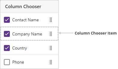
ColumnChooserItem
|
A column chooser item. |
PagerContainer
|
A container that stores the Grid pager. |
SearchBoxContainer
|
A container that stores the Grid search box. |
ToolbarContainer
|
A container that stores the Grid toolbar. |
DragHint
|
A drag hint. |
RowDragAnchorCell
|
A drag anchor. |
EmptyDataArea
|
An empty data area. |
EditNewItemRow
|
A new item row. |
FilterPanel
|
The filter panel. |
Related API Members
The following properties accept/return GridElementType values:
Remarks
Use this enumeration’s values to define an element type when you handle the CustomizeElement event.
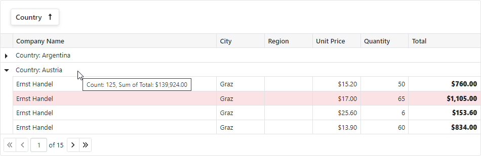
The following code customizes the appearance of grid elements that meet the following criteria:
- Data rows with Total > 1000 are highlighted.
- All Total values are bold.
- If grid rows are grouped by Country, the group row’s tooltip displays group summary values.
<DxGrid @ref="Grid" CustomizeElement="Grid_CustomizeElement" ... />
@* ... *@
@code {
    // ...
    IGrid Grid { get; set; }
    void Grid_CustomizeElement(GridCustomizeElementEventArgs e) {
        if(e.ElementType == GridElementType.DataRow && (System.Decimal)e.Grid.GetRowValue(e.VisibleIndex, "Total") > 1000) {
            e.CssClass = "highlighted-item";
        }
        if(e.ElementType == GridElementType.DataCell && e.Column.Name == "Total") {
            e.CssClass = "fw-800";
        }
        if(e.ElementType == GridElementType.GroupRow && e.Column.Name == "Country") {
            var summaryItems = e.Grid.GetGroupSummaryItems().Select(i => e.Grid.GetGroupSummaryDisplayText(i, e.VisibleIndex));
            e.Attributes["title"] = string.Join(", ", summaryItems);
        }
    }
}
.highlighted-item > td {
    background-color: var(--dxds-color-surface-danger-subdued-rest)
}
.highlighted-item > td:first-child {
    background-color: transparent;
}
.fw-800 {
    font-weight: 800;
}
Images
Grid Rows
Data Row
Empty Data Area

Edit Elements
Header and Footer
Search Box Panel
Header Band Elements

Group Elements
Filter Elements
Toolbar Container

Column Chooser
Drag Elements
