Styling and Themes
- 3 minutes to read
The appearance of DevExpress Blazor components depends on your application’s theme and applied customizations. This topic describes all available options you can use to customize your application.
Themes
The DevExpress Blazor suite ships with a set of built-in DevExpress themes that includes Classic and Fluent themes. You can also apply an external Bootstrap theme using an appropriate Bootstrap theme stylesheet. DevExpress Blazor components also support Bootstrap themes. You can apply a theme from an external library, such as Bootswatch, using an appropriate theme stylesheet.
Refer to the following topic for additional information on how to apply a theme to a Blazor application: Themes.
Size Modes
You can change the size of components within your application. You can use the SizeMode application-wide option to specify the size mode for DevExpress Blazor components that support this feature. Individual controls can use their own SizeMode property to override the global option.

Refer to the following topic for additional information: Size Modes.
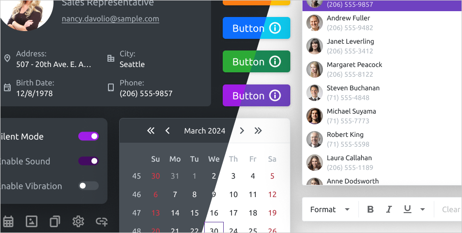
Appearance Customization
You can customize DevExpress Blazor components in the following ways: add custom icons, apply CSS rules, customize accent colors for Fluent themes, and build a custom Classic theme.
Apply CSS Classes
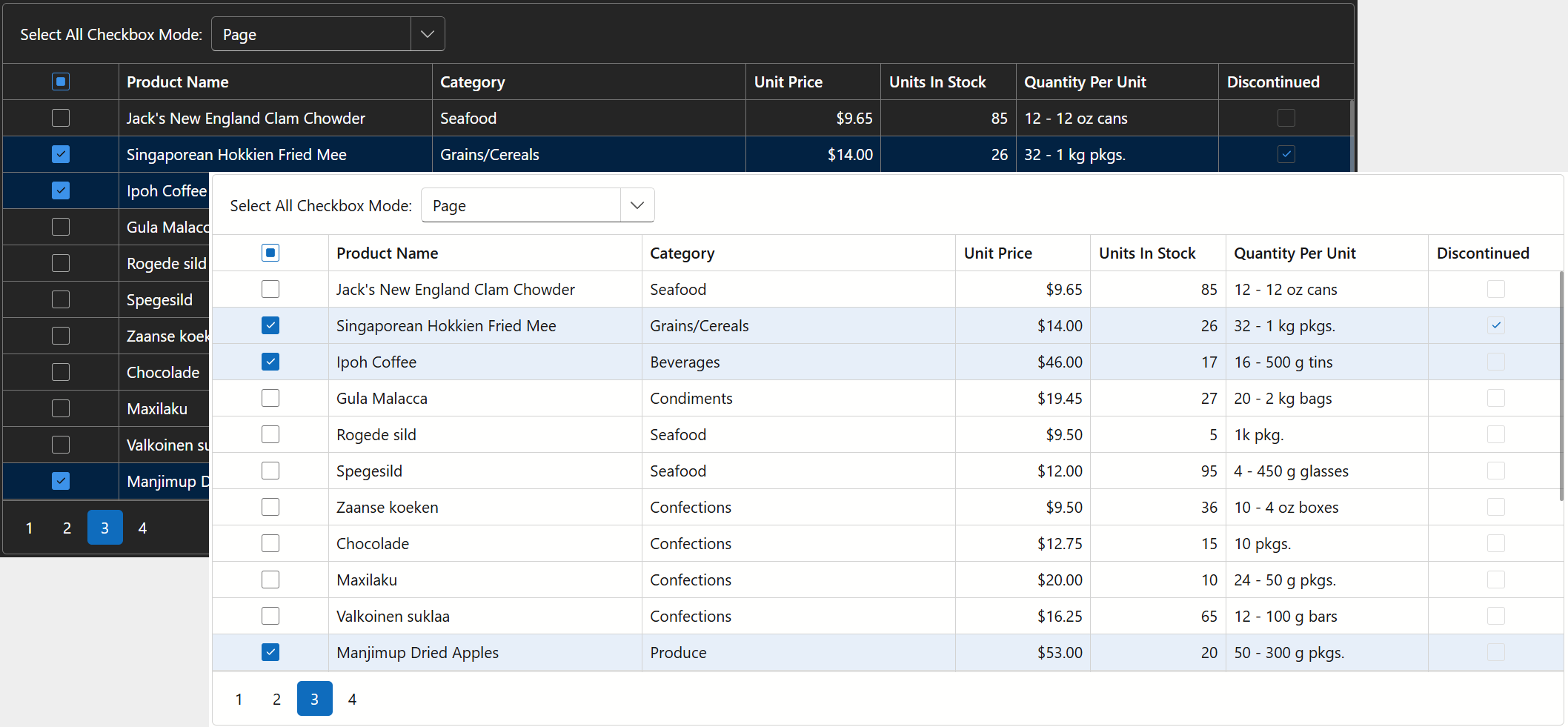
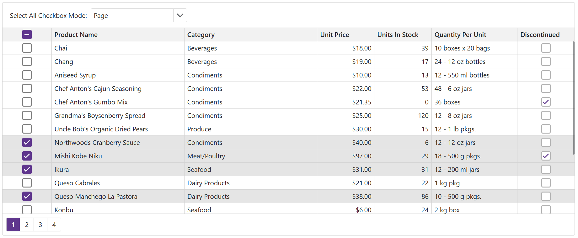
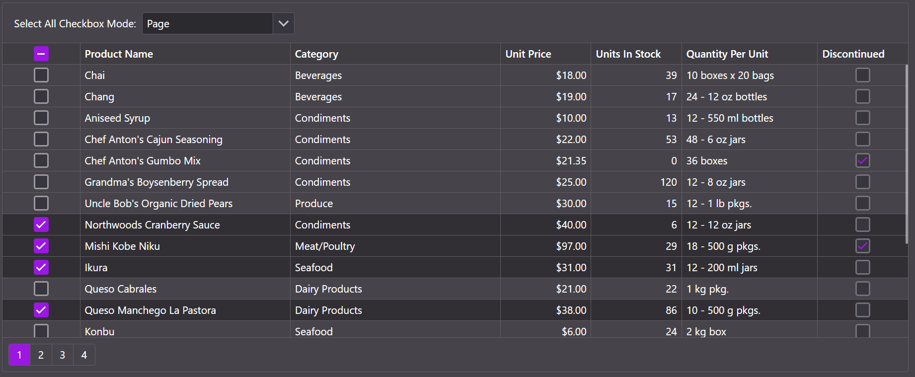
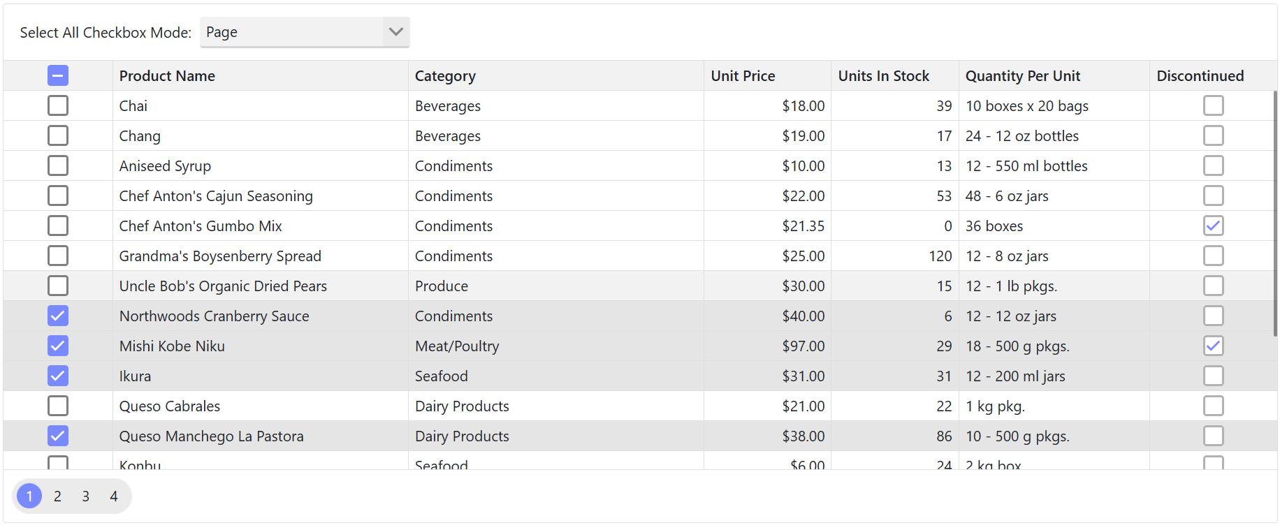
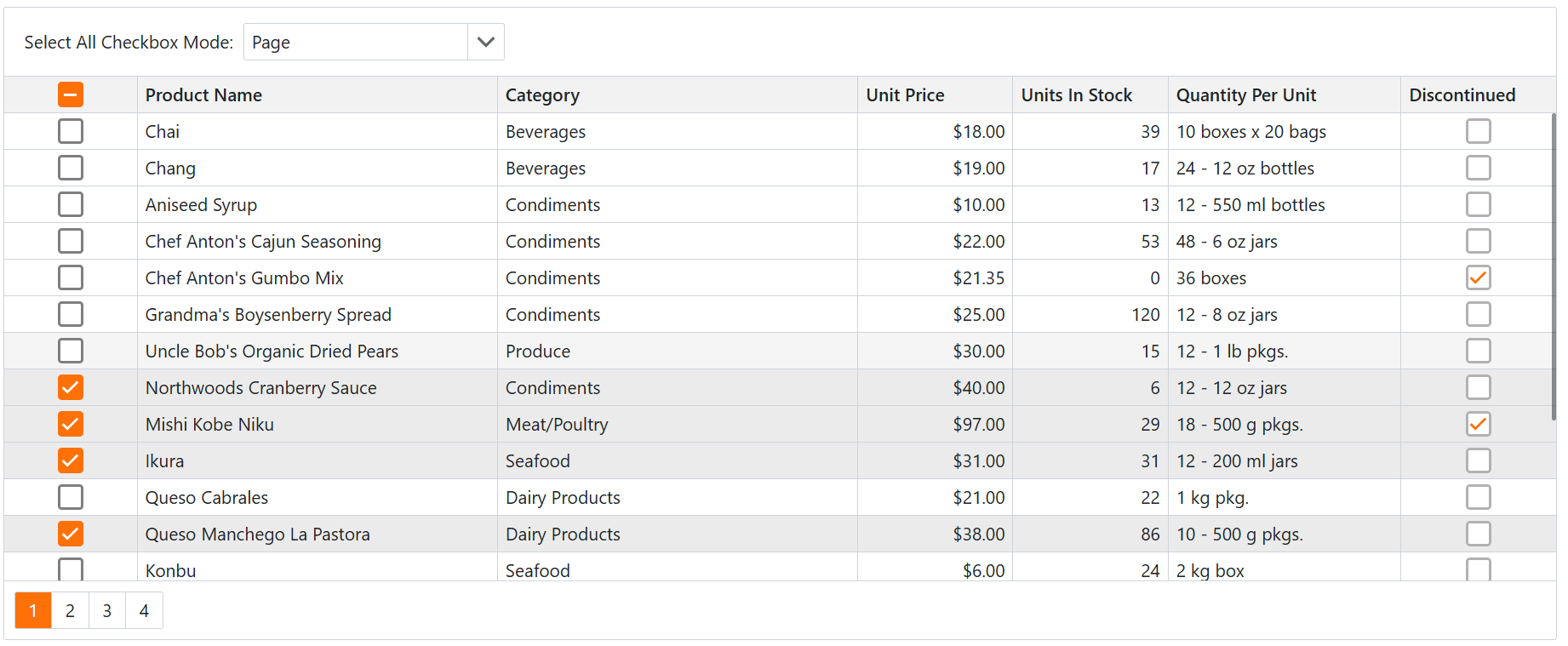
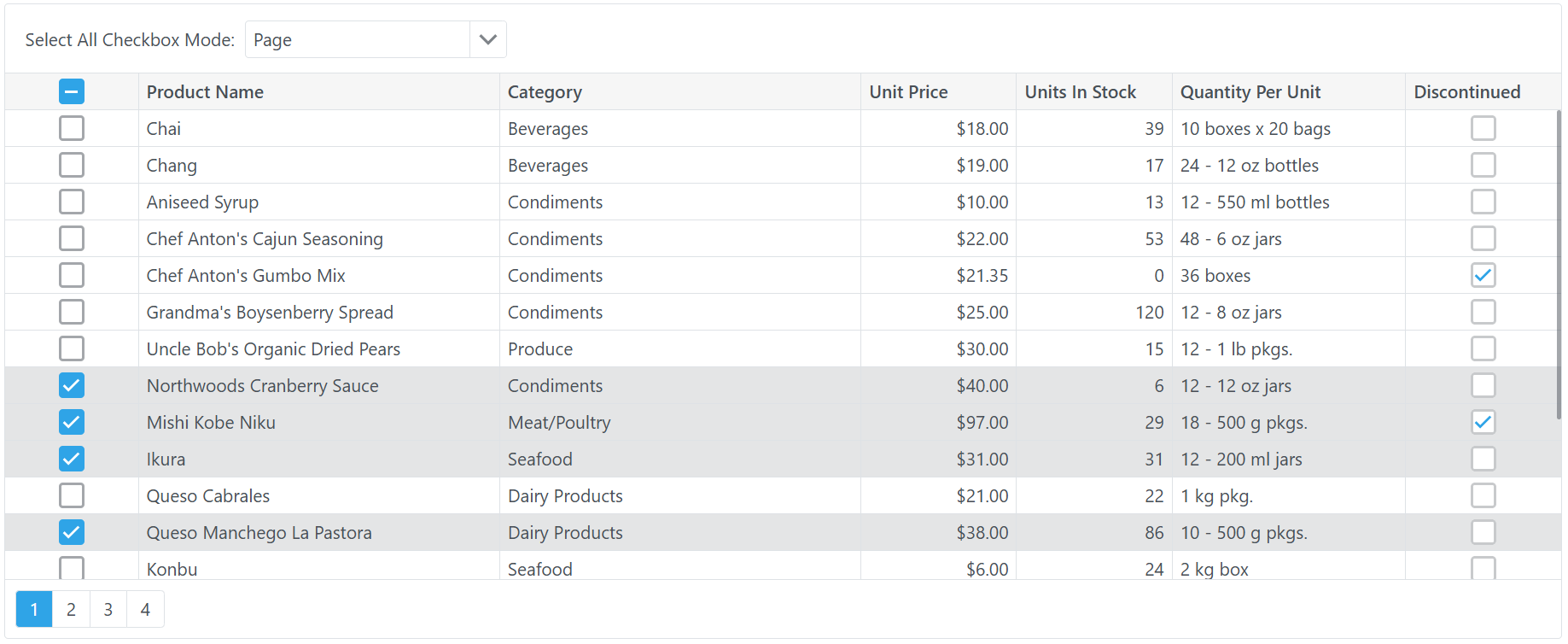
If you need to customize individual components or their elements, use corresponding CssClass properties. The Blazor Grid also includes the CustomizeElement event that customizes the component’s rows, columns, and other predefined areas. These API members support isolated styles.
Note
DevExpress Blazor components do not support CSS zoom-related properties, such as zoom, scale, and transform.
Add Stylesheets
If you need to customize multiple components on several pages or keep all custom CSS rules in one place, you can create a custom stylesheet in addition to the application’s theme. Ensure that you add this stylesheet when registering a theme. Refer to the following help topic for additional information: Add Stylesheets to a Theme.
For additional information about CSS, refer to the following topics:
Add Custom Icons
DevExpress components support custom icons from any library of your choice. For navigation and layout components, you can use the IconUrl property to specify your icon’s URL. For other components, use the IconCssClass property to assign a CSS class that specifies a custom icon for a component or its element.

Refer to the following topic for additional information: Icons.
Customize Accent Colors in Fluent Themes
DevExpress Fluent themes utilize accent colors to highlight interactive elements and ensure consistency across UI components. You can apply an accent color from the built-in collection or set a custom color to match user preferences or brand colors.
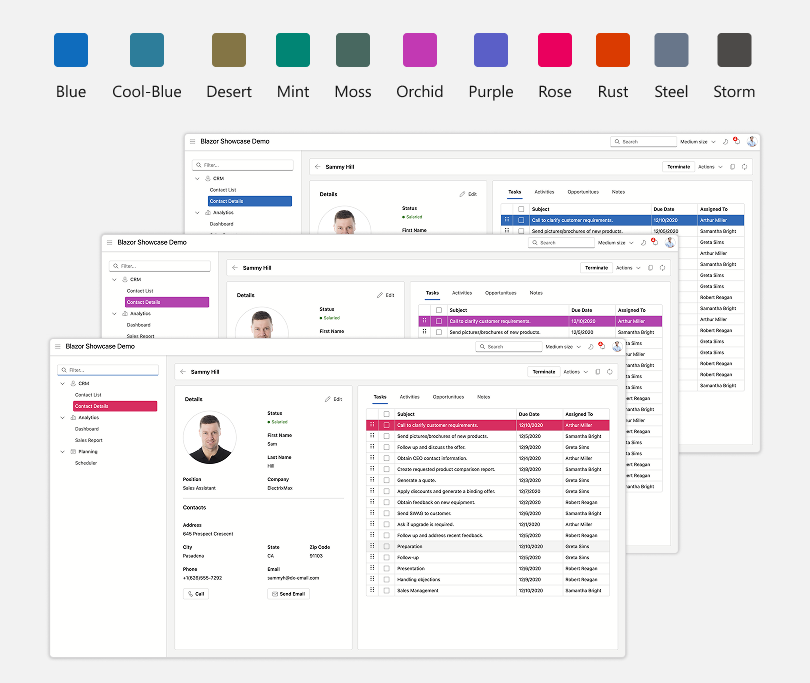
Refer to the following help topic for available options: Accent Colors in Fluent Themes.
Build a Custom Classic Theme
If you need to make significant changes to the entire application, you can build a custom Classic theme.

Refer to the following topic for step-by-step instructions on how to create a custom theme based on a built-in Classic theme: Classic Theme Customization (SCSS).