DxButtonGroup Class
A component that displays a set of buttons.
Namespace: DevExpress.Blazor
Assembly: DevExpress.Blazor.v26.1.dll
Declaration
public class DxButtonGroup :
    DxComponentBase,
    INestedSettingsOwner,
    IDisposable
Remarks
The DevExpress Button Group component for Blazor (<DxButtonGroup>) can display a set of buttons. You can arrange buttons vertically or horizontally, enable selection, and apply predefined styles.

Add a Button Group to a Project
Follow the steps below to add a Button Group component to an application:
- Create a Blazor Server or Blazor WebAssembly application.
- Add the following markup to a
.razorfile:<DxButtonGroup>…</DxButtonGroup>. - Populate the component with button group items.
- Configure the component’s layout and choose an appropriate selection mode.
- Customize button appearance at the component level or apply individual customizations.
API Reference
Refer to the following list for the component API reference: DxButtonGroup Members.
Static Render Mode Specifics
Blazor Button Group does not support static render mode. Enable interactivity to use the component in your application. Refer to the following topic for more details: Enable Interactive Render Mode.
Item Collection
Use the Items property to specify a collection of button group items. The DxButtonGroupItem object implements a button group item.

<DxButtonGroup RenderStyle="ButtonRenderStyle.Secondary">
    <Items>
        <DxButtonGroupItem Text="Add Task" />
        <DxButtonGroupItem Text="Edit Task" />
        <DxButtonGroupItem Text="Assign Task" />
        <DxButtonGroupItem Text="Complete Task" />
        <DxButtonGroupItem Text="Archive Task" />
    </Items>
</DxButtonGroup>
You can set an item’s DxButtonGroupItem.Visible or DxButtonGroupItem.Enabled property to false to hide or disable a specific item. To hide or disable all items in the component, use the DxButtonGroup.Visible or DxButtonGroup.Enabled property.
Items with Hyperlinks
Use the DxButtonGroupItem.NavigateUrl property to specify a URL to which the web browser navigates when the button group item is clicked. To specify where the browser should open the URL (same tab or new tab), use the DxButtonGroupItem.Target property.
The following code snippet opens the Blazor Documentation item’s NavigateUrl link in the same tab and the Blazor Demos item’s link in a new tab:
<DxButtonGroup RenderStyle="ButtonRenderStyle.Secondary">
    <Items>
        <DxButtonGroupItem Text="Blazor Documentation"
                           NavigateUrl="https://docs.devexpress.com/Blazor/400725/blazor-components"
                           Target="_blank"/>
        <DxButtonGroupItem Text="Blazor Demos"
                           NavigateUrl="https://demos.devexpress.com/blazor/"
                           Target="_blank" />
    </Items>
</DxButtonGroup>
Item Arrangement
The <DxButtonGroup> component arranges its items in a row (the orientation mode is Horizontal). Use the DxButtonGroup.Orientation property to change the mode to Vertical.

@using DevExpress.Images.Blazor

<DxButtonGroup RenderStyle="ButtonRenderStyle.Secondary"
               Orientation="Orientation.Vertical">
    <Items>
        <DxButtonGroupItem Text="Add Task"
                           IconUrl="@Icon.AddCircle" />
        <DxButtonGroupItem Text="Edit Task"
                           IconUrl="@Icon.Editor" />
        <DxButtonGroupItem Text="Assign Task"
                           IconUrl="@Icon.UserAccountCircle" />
        <DxButtonGroupItem Text="Complete Task"
                           IconUrl="@Icon.CheckmarkCircle" />
        <DxButtonGroupItem Text="Archive Task"
                           IconUrl="@Icon.Delete" />
    </Items>
</DxButtonGroup>
Item Selection
The <DxButtonGroup> component supports item selection. Use the DxButtonGroup.SelectionMode property to specify the selection mode. The default mode is None – users cannot select button group items.
Set the DxButtonGroup.SelectionMode property to Single or Multiple to enable single or multiple item selection. To select specific items in code, set their DxButtonGroupItem.Selected properties to true. To respond to property changes, handle corresponding DxButtonGroupItem.SelectedChanged events.
The following code snippet sets the component’s selection mode to Single and displays the current selection state of the Admin button group item:
<p>Is item selected - @IsItemSelected</p>

<DxButtonGroup RenderStyle="ButtonRenderStyle.Secondary"
               RenderStyleMode="ButtonRenderStyleMode.Outline"
               SelectionMode="ButtonGroupSelectionMode.Single">
    <Items>
        <DxButtonGroupItem Text="Admin"
                           Selected="@IsItemSelected"
                           SelectedChanged="@OnSelectedChanged"/>
        <DxButtonGroupItem Text="Editor" />
        <DxButtonGroupItem Text="Guest" />
    </Items>
</DxButtonGroup>

@code {
    bool IsItemSelected = false;

    void OnSelectedChanged(bool isSelected) {
        IsItemSelected = isSelected;
    }
}
Handle Item Clicks
Use the DxButtonGroup.ItemClick event to specify a common click handler for all button group items. To react to an individual item click, handle the item’s Click event.
@using DevExpress.Images.Blazor

<p>The clicked item is @ClickedItem</p>

<DxButtonGroup RenderStyle="ButtonRenderStyle.Secondary"
               ItemClick="@OnItemClick" >
    <Items>
        <DxButtonGroupItem Text="Add Task"
                           IconUrl="@Icon.AddCircle"
                           Click="@OnAddItemClick" />
        <DxButtonGroupItem Text="Edit Task"
                           IconUrl="@Icon.Editor"
                           Click="@OnEditItemClick" />
        <DxButtonGroupItem Text="Assign Task"
                           IconUrl="@Icon.UserAccountCircle" />
        <DxButtonGroupItem Text="Complete Task"
                           IconUrl="@Icon.CheckmarkCircle" />
        <DxButtonGroupItem Text="Archive Task"
                           IconUrl="@Icon.Delete" />
    </Items>
</DxButtonGroup>

@code{
    public string ClickedItem { get; set; } = "";

    void OnAddItemClick(MouseEventArgs args) {
        ClickedItem = "Add Task";
    }
    void OnEditItemClick(MouseEventArgs args) {
        ClickedItem = "Edit Task";
    }

    async Task OnItemClick(ButtonGroupItemClickEventArgs args) {
        await JSRuntime.InvokeVoidAsync("alert", $"The button group item has been clicked.");
    }
}
You can also use a button group item to submit a form. To enable form submit, set the DxButtonGroupItem.SubmotFormOnClick property to true.
Size Modes
Use the SizeMode property to specify <DxButtonGroup> component size in code. The following code snippet applies different size modes to Button Group components:
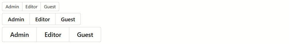
@foreach(SizeMode sizeMode in Enum.GetValues<SizeMode>()) {
    <DxButtonGroup SizeMode="sizeMode"
                   RenderStyle="ButtonRenderStyle.Secondary">
        <Items>
            <DxButtonGroupItem Text="Admin" />
            <DxButtonGroupItem Text="Editor" />
            <DxButtonGroupItem Text="Guest" />
        </Items>
    </DxButtonGroup>
}
Customization
This section describes how you can customize the <DxButtonGroup> component and its items.
Predefined Styles
The <DxButtonGroup> component allows you to apply predefined styles to all button group items or to an individual item. You can use the following properties:
- DxButtonGroup.RenderStyle | DxButtonGroupItem.RenderStyle
- Specify a button’s predefined style.
- DxButtonGroup.RenderStyleMode | DxButtonGroupItem.RenderStyleMode
- Specify a button’s color filling type.
Note
Individual item settings have priority over component settings.

@foreach(ButtonRenderStyleMode styleMode in Enum.GetValues<ButtonRenderStyleMode>()) {
    <div>
        <p><b>@styleMode Mode:</b></p>
        <DxButtonGroup RenderStyleMode="styleMode">
            <Items>
                <DxButtonGroupItem Text="Primary" />
                <DxButtonGroupItem Text="Secondary" RenderStyle="ButtonRenderStyle.Secondary" />
                <DxButtonGroupItem Text="Info" RenderStyle="ButtonRenderStyle.Info" />
                <DxButtonGroupItem Text="Link" RenderStyle="ButtonRenderStyle.Link" />
                <DxButtonGroupItem Text="Success" RenderStyle="ButtonRenderStyle.Success" />
                <DxButtonGroupItem Text="Warning" RenderStyle="ButtonRenderStyle.Warning" />
                <DxButtonGroupItem Text="Danger" RenderStyle="ButtonRenderStyle.Danger" />
            </Items>
        </DxButtonGroup>
    </div>
}
Icons
You can add icons to button group items. The following options are available:
- IconUrl
- Specifies the button icon URL.
- IconCssClass
- Specifies the icon’s CSS class.
- IconPosition
- Specifies the icon’s position.
The following code snippet assigns icons to DxButtonGroupItem components using Icon Library APIs:
@using DevExpress.Images.Blazor

<DxButtonGroup RenderStyle="ButtonRenderStyle.Secondary">
    <Items>
        <DxButtonGroupItem Text="Add Task"
                           IconUrl="@Icon.AddCircle" />
        <DxButtonGroupItem Text="Edit Task"
                           IconUrl="@Icon.EditPen" />
        <DxButtonGroupItem Text="Assign Task"
                           IconUrl="@Icon.UserAccountCircle" />
        <DxButtonGroupItem Text="Complete Task"
                           IconUrl="@Icon.CheckmarkCircle" />
        <DxButtonGroupItem Text="Archive Task"
                           IconUrl="@Icon.Delete" />
    </Items>
</DxButtonGroup>
Refer to the Icons help topic for additional information about icons in DevExpress Blazor components.
Tooltips
Use an item’s DxButtonGroupItem.Tooltip property to specify tooltip text.

<DxButtonGroup RenderStyle="ButtonRenderStyle.Secondary">
    <Items>
        <DxButtonGroupItem Text="Blazor Documentation"
                           NavigateUrl="https://docs.devexpress.com/Blazor/400725/blazor-components"
                           Tooltip="This item contains a link" />
        <DxButtonGroupItem Text="Blazor Demos"
                           NavigateUrl="https://demos.devexpress.com/blazor/"
                           Target="_blank"
                           Tooltip="This item contains a link" />
    </Items>
</DxButtonGroup>
Keyboard Navigation
The DevExpress Blazor Button Group component supports keyboard shortcuts that allow users to navigate through button group items, select items, and invoke their click event handlers.
Note
Keyboard support allows users to interact with application content in cases they cannot use a mouse or they rely on assistive technologies (like screen readers or switch devices). Refer to the Accessibility help topic for information on other accessibility areas that we address.
The following shortcut keys are available:
| Shortcut Keys | Description |
|---|---|
| Tab | Moves focus to the next button in the group. From the last button, moves focus to the next page element. |
| Shift+Tab | Moves focus to the previous button in the group. From the first button, moves focus to the previous page element. |
| End | Moves focus to the last visible item. |
| Home | Moves focus to the first visible item. |
| Enter, Space | Invokes a click event handler for the focused item. For Single and Multiple selection modes: selects the focused item. |
Troubleshooting
If a Blazor application throws unexpected exceptions, refer to the following help topic: Troubleshooting.