Axes in Blazor Charts
- 12 minutes to read
This topic describes how to configure axes and their visual elements in <DxChart> and <DxPolarChart>.
Axes in Chart
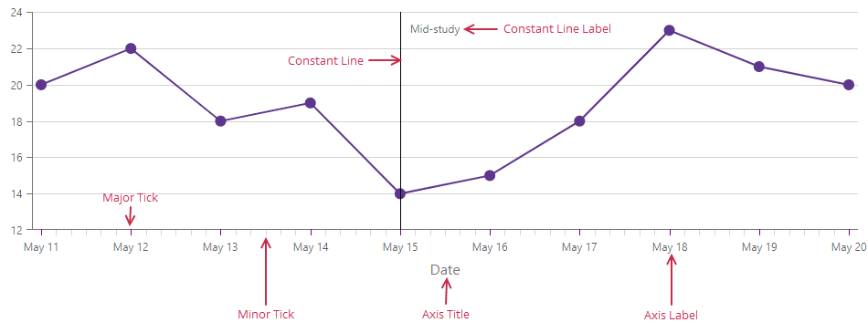
The DxChartArgumentAxis object implements the Chart’s X-axis. The following image demonstrates visual elements related to the argument axis:
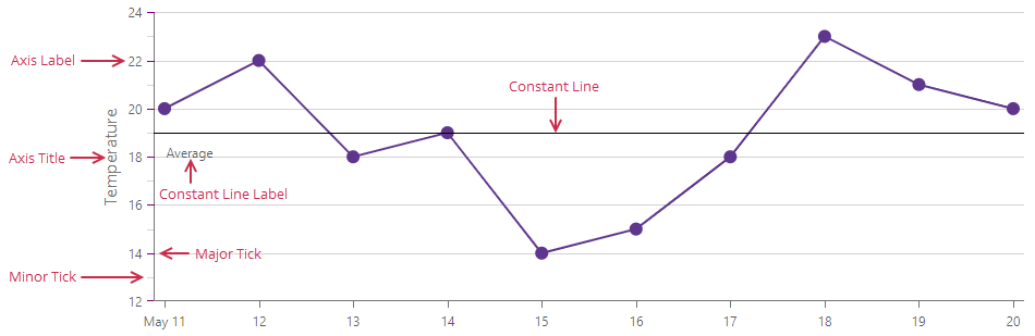
The DxChartValueAxis object implements the Chart’s Y-axis. The following image demonstrates visual elements related to the value axis:
Use the Visible property to toggle axis visibility:
<DxChart Data="forecasts">
    <DxChartLineSeries ArgumentField="@((WeatherForecast v) => v.Date)"
                       ValueField="@((WeatherForecast v) => v.TemperatureC)" />
    <DxChartArgumentAxis Visible="false" />
    <DxChartValueAxis Visible="false" />
    @* ... *@
</DxChart>
Nested components implement visual elements and allow you to customize axes. Refer to sections below for additional information on how to use individual axis elements.
Axis Title
The DxChartAxisTitle object implements the axis title. You can use the following properties to configure the title:
- Text
- Specifies the axis title text.
- HorizontalAlignment
- Specifies the horizontal alignment for the axis title.
- CssClass
- Assigns a CSS class to the chart axis title.
- DxChartFont
- Contains the element’s font settings.
The following example specifies titles for both axes and aligns the argument axis title to the right:
<DxChart Data="forecasts">
    <DxChartLineSeries ArgumentField="@((WeatherForecast v) => v.Date)"
                       ValueField="@((WeatherForecast v) => v.TemperatureC)" />
    <DxChartLineSeries ArgumentField="@((WeatherForecast v) => v.Date)"
                       ValueField="@((WeatherForecast v) => v.Precipitation)" />
    <DxChartArgumentAxis>
        <DxChartAxisTitle Text="Date" HorizontalAlignment="HorizontalAlignment.Right" />
    </DxChartArgumentAxis>
    <DxChartValueAxis>
        <DxChartAxisTitle Text="Temperature" />
    </DxChartValueAxis>
</DxChart>
Axis Strips
Use the DxChartAxisStrip object to highlight a range between two axis values or an area above and/or below a value. Such highlighted areas allow users to see whether a point is within a predefined range. You can add multiple strips to an axis.
To create an axis strip, complete the following steps:
Add a
DxChartAxisStripobject to axis markup (DxChartArgumentAxis or DxChartValueAxis).Specify StartValue and EndValue properties to define the strip range. Use both properties to highlight an area between two values. Define only one property to highlight the area above or below a certain value.
Specify the Color property to display the strip.
Optional. Add a DxChartAxisStripLabel object to strip markup to configure strip label settings.
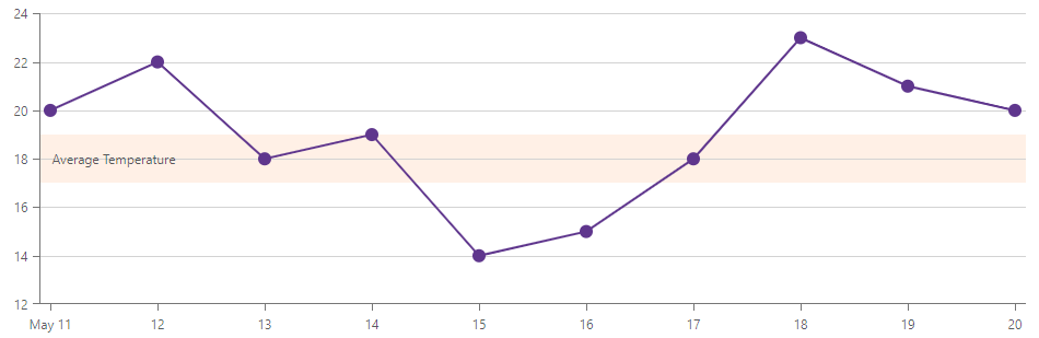
The following example creates the Average Temperature axis strip to highlight the range between 17 and 19 on the value axis:
<DxChart Data="forecasts">
    <DxChartLineSeries ArgumentField="@((WeatherForecast v) => v.Date)"
                       ValueField="@((WeatherForecast v) => v.TemperatureC)" />
    <DxChartValueAxis>
        <DxChartAxisStrip StartValue="17"
                          EndValue="19"
                          Color="rgba(255, 155, 85, 0.15)">
            <DxChartAxisStripLabel Text="Average Temperature" />
        </DxChartAxisStrip>
    </DxChartValueAxis>
    <DxChartLegend Visible="false"></DxChartLegend>
</DxChart>
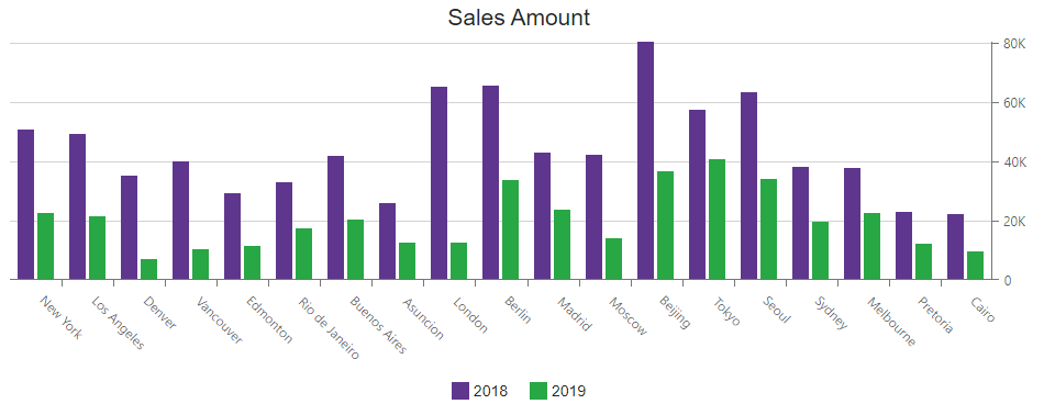
Axis Position
You can use the following properties to change the axis position in the Chart component:
- CustomPosition
- Specifies the position of an axis on another axis.
- Offset
- Specifies the shift of an axis.
- Alignment
- Specifies the pane edge next to which to place an axis.
The following example displays the value axis at the right edge of the pane:
<DxChart Data="@dataSource">
    <DxChartTitle Text="Sales Amount" />
    <DxChartLegend Position="RelativePosition.Outside" VerticalAlignment="VerticalEdge.Bottom" />
    <DxChartBarSeries Name="2018"
                      Filter="@((SaleInfo s) => s.Date.Year == 2018)"
                      SummaryMethod="Enumerable.Sum"
                      ArgumentField="@(s => s.City)"
                      ValueField="@(s => s.Amount)" />
    <DxChartBarSeries Name="2019"
                      Filter="@((SaleInfo s) => s.Date.Year == 2019)"
                      SummaryMethod="Enumerable.Sum"
                      ArgumentField="@(s => s.City)"
                      ValueField="@(s => s.Amount)" />
    <DxChartValueAxis Alignment="ChartAxisAlignment.Far" />
</DxChart>
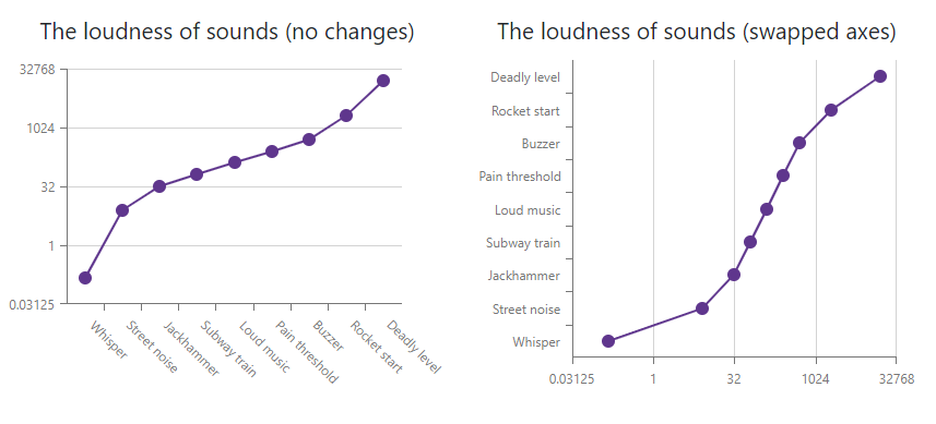
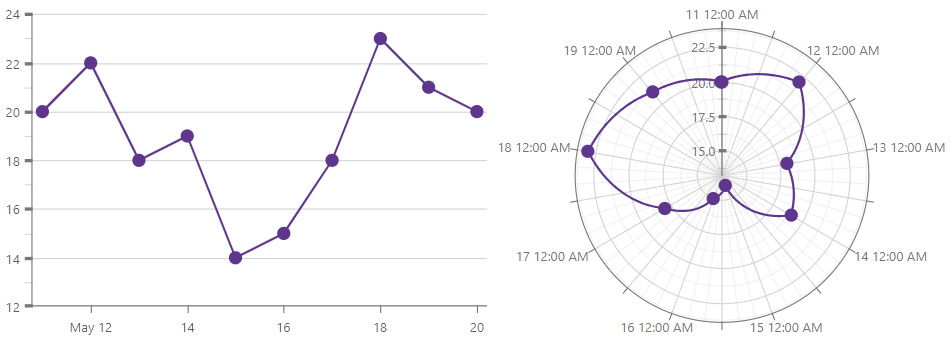
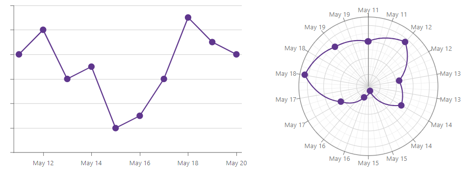
Axis Rotation
The Chart component allows you to swap argument and value axes. To rotate the Chart, set the DxChart.Rotated property to true.
The following example creates two charts, binds them to the same data source, and rotates the second chart:
<DxChart Data="@GetData()">
    <DxChartTitle Text="The loudness of sounds (no changes)" />
    <DxChartLegend Visible="false" />
    <DxChartArgumentAxis Type="ChartAxisType.Discrete" />
    <DxChartValueAxis Type="ChartAxisType.Logarithmic"
                      LogarithmBase="2" />
    <DxChartLineSeries ArgumentField="@((DataPoint s) => s.Argument)"
                       ValueField="@((DataPoint s) => s.Value)" />
</DxChart>
<DxChart Data="@GetData()" Rotated="true">
    <DxChartTitle Text="The loudness of sounds (swapped axes)" />
    <DxChartLegend Visible="false" />
    <DxChartArgumentAxis Type="ChartAxisType.Discrete" />
    <DxChartValueAxis Type="ChartAxisType.Logarithmic"
                      LogarithmBase="2" />
    <DxChartLineSeries ArgumentField="@((DataPoint s) => s.Argument)"
                       ValueField="@((DataPoint s) => s.Value)" />
</DxChart>
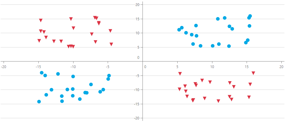
Axis Range
Use the DxChartAxisRange object to define the visible range for an axis scale.
To set the range, use one of the following options:
- Specify both StartValue and EndValue properties.
- Specify Length and StartValue / EndValue properties.
- Specify the Length property only. When you leave StartValue and EndValue properties unspecified, the chart component uses the last axis value as the end value.
The following example shifts axes so that the origin is in the center of the chart plane:
<DxChart T="DataPoint"
         Data="points">
    <DxChartScatterSeries T="DataPoint"
                          TArgument="double"
                          TValue="double"
                          ArgumentField="point=>point.Y"
                          ValueField="point=>point.X"
                          Filter=@"(point => point.X < 0 && point.Y < 0 || point.X > 0 && point.Y > 0)"
                          Color="@(Color.FromArgb(0, 169, 230))" />
    <DxChartScatterSeries T="DataPoint"
                          TArgument="double"
                          TValue="double"
                          ArgumentField="point=>point.Y"
                          ValueField="point=>point.X"
                          Filter=@"(point => point.X > 0 && point.Y < 0 || point.X < 0 && point.Y > 0)"
                          Color="@(Color.FromArgb(220, 53, 69))">
        <DxChartSeriesPoint Symbol=ChartPointSymbol.TriangleDown />
    </DxChartScatterSeries>
    <DxChartValueAxis>
        <DxChartAxisRange StartValue=-20.0 EndValue=20.0 />
    </DxChartValueAxis>
    <DxChartArgumentAxis>
        <DxChartAxisRange StartValue=-20.0 EndValue=20.0 />
    </DxChartArgumentAxis>
    @* ... *@
</DxChart>
You can use the following properties to configure axis margins:
- EndOnTick
- Specifies whether an axis should start and end on ticks.
- SideMarginsEnabled
- Specifies whether the component should add margins between the outermost series points and the chart boundaries.
Scale Breaks
A scale break allows you to cut a part of the axis to improve the readability of a chart with high amplitude values or outliers. You can specify as many breaks as required.
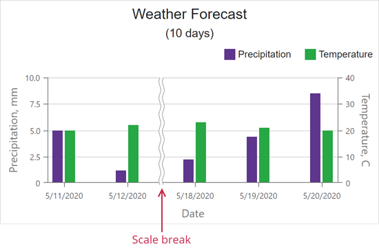
Declare the DxChartScaleBreak object in the markup to create a scale break. StartValue and EndValue properties limit the scale break. Note that the scale break is visible only if its range exceeds the tick interval.
<DxChart Data="@SalesData">
    <DxChartArgumentAxis>
        <DxChartScaleBreak StartValue="@(new DateTime(2017, 01, 04))" EndValue="@(new DateTime(2017, 04, 04))" />
    </DxChartArgumentAxis>
    <DxChartValueAxis>
        <DxChartScaleBreak StartValue="50" EndValue="200" />
    </DxChartValueAxis>
    @* ... *@
</DxChart>
You can set the AutoBreaksEnabled property to true to allow the component to automatically calculate scale breaks for the value axis:
<DxChart Data="@SalesData">
    <DxChartValueAxis AutoBreaksEnabled="true" >
      @* ... *@
    </DxChartValueAxis>
</DxChart>
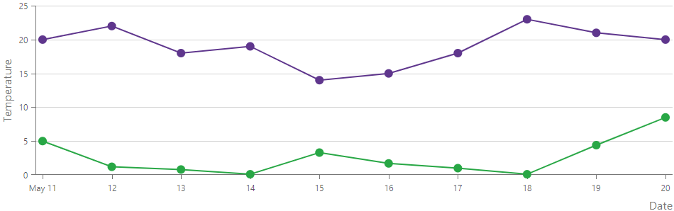
Multiple Value Axes
If the data range or format is series-specific, each series can use its own Y-axis. The number of value axes in a Chart is unlimited. To assign an axis to a series, pass the axis identifier (Name) to the Axis property of the series as follows:
<DxChart Data="forecasts">
    <DxChartLineSeries ArgumentField="@((WeatherForecast v) => v.Date)"
                       ValueField="@((WeatherForecast v) => v.TemperatureC)" />
    <DxChartLineSeries ArgumentField="@((WeatherForecast v) => v.Date)"
                       ValueField="@((WeatherForecast v) => v.Precipitation)"
                       Axis="Precipitation" />
    <DxChartValueAxis>
        <DxChartAxisTitle Text="Temperature" />
    </DxChartValueAxis>
    <DxChartValueAxis Name="Precipitation"
                      Alignment="ChartAxisAlignment.Far">
        <DxChartAxisTitle Text="Precipitation" />
    </DxChartValueAxis>
    @* ... *@
</DxChart>
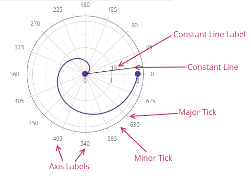
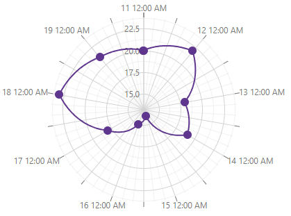
Axes in Polar Chart
The DxPolarChartArgumentAxis object implements the Polar Chart’s X-axis. The following image demonstrates visual elements related to the argument axis:
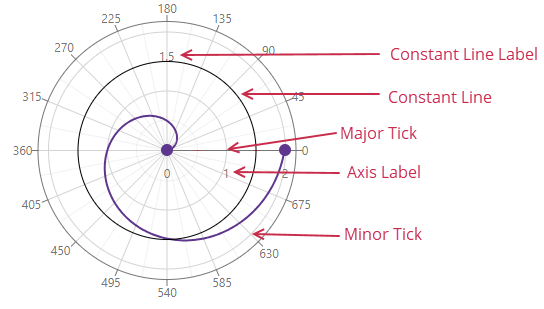
The DxPolarChartValueAxis object implements the Chart’s Y-axis. The following image demonstrates visual elements related to the value axis:
Use the Visible property to toggle axis visibility:
<DxPolarChart Data="forecasts">
    <DxPolarChartLineSeries ArgumentField="@((WeatherForecast v) => v.Date)"
                            ValueField="@((WeatherForecast v) => v.TemperatureC)" />
    <DxPolarChartArgumentAxis Visible="false" />
    <DxPolarChartValueAxis Visible="false" />
    @* ... *@
</DxPolarChart>
Nested components implement visual elements and allow you to customize axes. Refer to sections below for additional information on how to use individual axis elements.
Axis Rotation
Use the StartAngle property to rotate the Polar Chart’s argument axis clockwise (negative angles) or counterclockwise (positive angles).
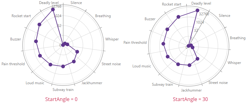
The following code snippet sets the StartAngle property to 30:
<DxPolarChart Data="@GetData()">
    <DxChartLegend Visible="false" />
    <DxPolarChartArgumentAxis Type="ChartAxisType.Discrete"
                              StartAngle="30" />
    <DxPolarChartValueAxis Type="ChartAxisType.Logarithmic" LogarithmBase="2" />
    <DxPolarChartLineSeries ArgumentField="@((DataPoint s) => s.Argument)" ValueField="@((DataPoint s) => s.Value)" />
</DxPolarChart>

@code {
    List<DataPoint> GetData() {
        List<DataPoint> result = new List<DataPoint>(11);
        result.Add(new DataPoint("Silence", 0));
        result.Add(new DataPoint("Breathing", 0.075));
        result.Add(new DataPoint("Whisper", 0.15));
        result.Add(new DataPoint("Street noise", 8));
        result.Add(new DataPoint("Jackhummer", 32));
        result.Add(new DataPoint("Subway train", 64));
        result.Add(new DataPoint("Loud music", 128));
        result.Add(new DataPoint("Pain threshold", 256));
        result.Add(new DataPoint("Buzzer", 512));
        result.Add(new DataPoint("Rocket start", 2048));
        result.Add(new DataPoint("Deadly level", 16348));
        return result;
    }

    struct DataPoint {
        public DataPoint (string argument, double value) { Argument = argument; Value = value; }
        public string Argument { get; set; }
        public double Value { get; set; }
    }
}
Common Axis Settings
The sections below list configurations applicable to both <DxChart> and <DxPolarChart>.
Axis Types
The following list outlines all available axis types:
- Continious
- Displays numeric and DateTime arguments/values.
- Discrete
- Displays string arguments/values (categories).
- Logarithmic
- Displays numeric arguments/values that grow exponentially. Each axis tick value is a specified logarithm base raised to a power (10⁻², 10⁻¹, 10⁰, 10¹, 10⁻², and so on).
Blazor Charts determine axis types based on the data type of the first series in the chart markup. You can use the Type property to change the axis type.
You may need to cast values specified in the data source, for instance, when the assigned data source stores dates or numbers as strings. Use ArgumentType and ValueType properties to specify the axis value type:
<DxChart Data="forecasts">
    @* ... *@
    <DxChartArgumentAxis Type="ChartAxisType.Discrete"
                         ArgumentType="ChartAxisDataType.DateTime" />
    <DxChartValueAxis ValueType="ChartAxisDataType.Numeric" />
</DxChart>
Axis Ticks
Major ticks (DxChartAxisTick) and minor ticks (DxChartAxisMinorTick) divide an axis into sections. Discrete axes do not support minor ticks.
Use the following properties to configure ticks:
- DiscreteDivisionMode
- Specifies whether ticks and grid lines lie between or next to axis labels.
- TickInterval | MinorTickInterval | MinorTickCount
- Specify tick intervals.
Shift- Specifies the offset of tick centers relative to an axis line.
Color|Opacity- Specify the tick color.
Length|Width- Specify the tick size.
The following example displays all ticks and sets major tick width to 3:
<DxChart Data="forecasts">
    @* ... *@
    <DxChartValueAxis>
        <DxChartAxisTick Width="3" />
        <DxChartAxisMinorTick Visible="true" />
    </DxChartValueAxis>
</DxChart>
Axis Labels
The DxChartAxisLabel object allows you to configure axis labels. For example, you can specify the Format property to change the display format for labels.
For additional information about label settings, refer to the following topic: Labels in Blazor Charts.
The following example hides value axis labels and applies the MonthAndDay pattern to the argument axis:
<DxChart Data="forecasts">
    <DxChartLineSeries ArgumentField="@((WeatherForecast v) => v.Date)"
                       ValueField="@((WeatherForecast v) => v.TemperatureC)" />
    <DxChartArgumentAxis>
        <DxChartAxisLabel Format="ChartElementFormat.MonthAndDay" />
    </DxChartArgumentAxis>
    <DxChartValueAxis>
        <DxChartAxisLabel Visible="false" />
    </DxChartValueAxis>
    @* ... *@
</DxChart>
Constant Lines
Use the DxChartConstantLine component to mark an individual axis value (Value). A constant line label initially displays this value. Use the Text property to change label text. Each axis can contain multiple constant lines.
If the created constant line is outside the visible axis range, use the ExtendAxis property to extend the axis and include the constant line into the visible axis range.
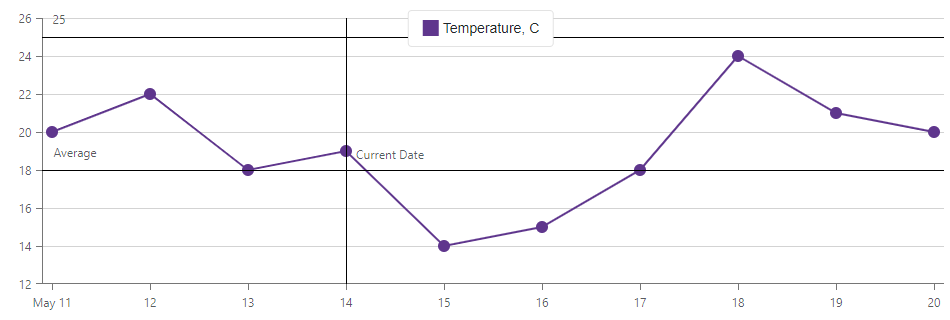
The following example creates two constant lines for the value axis and one line for the argument axis:
<DxChart Data="@forecasts">
    <DxChartArgumentAxis>
        <DxChartConstantLine Value="@("2020-May-14")">
            <DxChartConstantLineLabel Text="Current Date"
                                      VerticalAlignment="VerticalAlignment.Center"
                                      Position="RelativePosition.Inside" />
        </DxChartConstantLine>
    </DxChartArgumentAxis>
    <DxChartValueAxis>
        <DxChartConstantLine Value="18">
            <DxChartConstantLineLabel Text="Average"
                                      HorizontalAlignment="HorizontalAlignment.Left"
                                      Position="RelativePosition.Inside" />
        </DxChartConstantLine>
        <DxChartConstantLine Value="25" />
    </DxChartValueAxis>
    @* ... *@
</DxChart>
Use the following properties to configure a constant line:
- Color | DashStyle | Width
- Specify constant line appearance.
- PaddingLeftRight | PaddingTopBottom
- Adjust the position of the constant line label.
- DisplayBehindSeries
- Specifies whether the constant line is behind or in front of series.
- DxChartFont
- Specifies font settings for the constant line label.
Grid Lines
Grid lines (DxChartAxisGridLines) span the entire plot area. These lines help users to compare point positions with corresponding axis values.
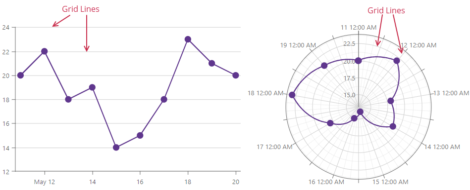
The following example disables grid lines:
<DxChart Data="forecasts">
    <DxChartLineSeries ArgumentField="@((WeatherForecast v) => v.Date)"
                       ValueField="@((WeatherForecast v) => v.TemperatureC)" />
    <DxChartValueAxis>
        <DxChartAxisGridLines Visible="false" />
    </DxChartValueAxis>
    @* ... *@
</DxChart>
Task-Based Examples
This section contains code samples that demonstrate axis functionality.
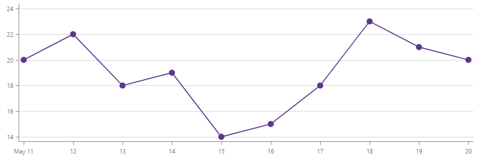
Limit the Visible Range
The DxChartAxisRange object limits the range of values displayed on the axis. The Chart may add space between the top and botton series points and the component’s boundaries:
<DxChart Data="forecasts">
    <DxChartLineSeries ArgumentField="@((WeatherForecast v) => v.Date)"
                       ValueField="@((WeatherForecast v) => v.TemperatureC)" />
    <DxChartValueAxis>
        <DxChartAxisRange StartValue="14" EndValue="24" />
    </DxChartValueAxis>
    @* ... *@
</DxChart>
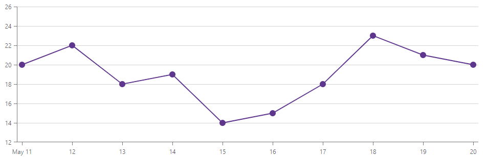
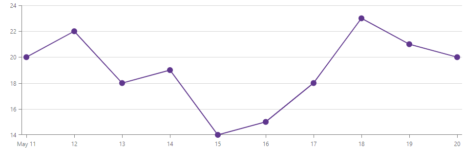
This happens because the EndOnTick property forces the component to add an additional tick. Set the EndOnTick to false to remove these ticks:
<DxChartValueAxis EndOnTick="false">
    <DxChartAxisRange StartValue="14" EndValue="24" />
</DxChartValueAxis>
If you also want to allow series to intersect or lie on the axis, disable the SideMarginsEnabled option:
<DxChartValueAxis EndOnTick="false"
                  SideMarginsEnabled="false">
    <DxChartAxisRange StartValue="14" EndValue="24" />
</DxChartValueAxis>
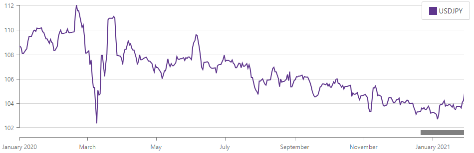
Set Initial Zoom Settings
You can display a specific data range when the Chart is rendered for the first time. Limit the visible axis range and enable zoom to allow users to pan the plot area to view initially hidden data.
The following example displays data from the January 1, 2020 to January 29, 2021 at the first render:
<DxChart Data="@UsdJpyData">
    <DxChartLineSeries T="DatePricePoint"
                       TArgument="DateTime"
                       TValue="double"
                       ArgumentField="i => i.DateTimeStamp"
                       ValueField="i => i.Price"
                       Name="USDJPY">
        <DxChartSeriesPoint Visible="false" />
        <DxChartAggregationSettings Enabled="true"
                                    Method="ChartAggregationMethod.Average" />
    </DxChartLineSeries>
    <DxChartArgumentAxis>
        <DxChartAxisRange StartValue="new DateTime(2020, 01, 01)"
                          EndValue="new DateTime(2021, 01, 29)" />
    </DxChartArgumentAxis>
    <DxChartZoomAndPanSettings ArgumentAxisZoomAndPanMode="ChartAxisZoomAndPanMode.Both" />
    <DxChartScrollBarSettings ArgumentAxisScrollBarVisible="true"
                              ArgumentAxisScrollBarPosition="ChartScrollBarPosition.Bottom" />
</DxChart>
Implement a Bi-Directional Chart
In a bi-directional bar chart, two sets of bars come from the axis in the center in two opposite directions. This chart can be used to compare two values side by side.
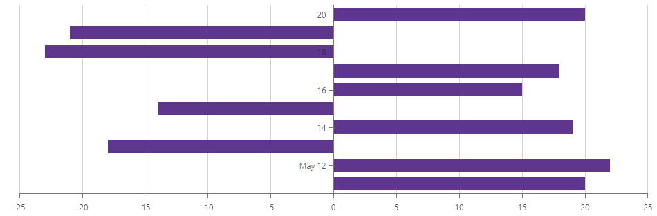
To impmlement such a chart, activate the Rotated option and use the CustomPosition property to position axes as your data set requires:
<DxChart Data="forecasts" Rotated="true">
    <DxChartBarSeries ArgumentField="@((Forecast v) => v.Date)"
                      ValueField="@((Forecast v) => v.TemperatureC)">
    </DxChartBarSeries>
    <DxChartArgumentAxis CustomPosition="0" />
    <DxChartLegend Visible="false"></DxChartLegend>
</DxChart>