DxColorPalette Class
A Color Palette component that allows users to select colors.
Namespace: DevExpress.Blazor
Assembly: DevExpress.Blazor.v26.1.dll
Declaration
public class DxColorPalette :
    DxEditorBase,
    IColorPaletteAccessor,
    IParameterTrackerSettingsOwner,
    INestedSettingsOwner
Remarks
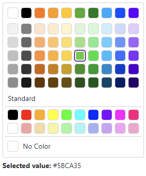
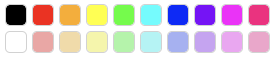
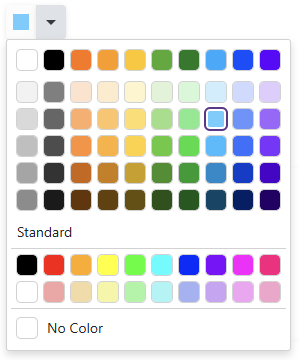
DevExpress Color Palette for Blazor (<DxColorPalette>) allows users to select colors. The palette can show multiple groups of colors (predefined sets or custom colors).
The default Color Palette configuration includes three color groups: Universal, Universal Gradient, and Standard.

Add a Color Palette to a Project
Follow the steps below to add a Color Palette component to an application:
- Create a Blazor Server or Blazor WebAssembly application.
- Enable interactive render mode. Refer to
Static Render Mode Specifics. - Add the
<DxColorPalette>…</DxColorPalette>markup to a.razorfile. - Configure the component (see sections below).
API Reference
Refer to the following list for the component API reference: DxColorPalette Members.
Static Render Mode Specifics
Blazor ColorPalette does not support static render mode. Enable interactivity to use the component in your application. Refer to the following topic for more details: Enable Interactive Render Mode.
Selected Color
Use the Value property to specify a selected color. To respond color changes, handle the ValueChanged event. You can also use the @bind attribute for the Value property to implement two-way data binding.
<DxColorPalette @bind-Value="@Value"></DxColorPalette>

<p><b>Selected value:</b> @Value</p>

@code {
    string Value { get; set; } = "#5BCA35";
}
Color Groups
Follow the steps below to add multiple groups of colors to the palette:
- Add
<Groups>...</Groups>to the component markup to define the Groups collection. - Add DxColorPaletteGroup objects to the collection. Use the Colors property to specify a palette preset or add custom colors to the palette.
Palette Presets
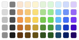
The Color Palette component allows you to use predefined sets of colors (presets). The following presets are available:
- Universal

- Universal Gradient
- Fluent Theme

- Fluent Theme Gradient
- Pastel
- Pastel Gradient
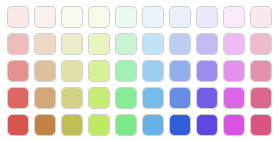
- Warm

- Warm Gradient
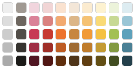
- Cold
- Cold Gradient
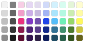
- Standard
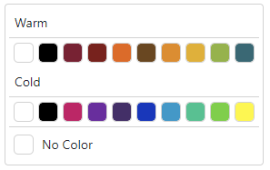
The following code snippet adds two color groups that use Warm and Cold presets:
<DxColorPalette @bind-Value="@Value">
    <Groups>
        <DxColorPaletteGroup Header="Warm"
                             Colors="@DxColorPalettePresets.GetPalette(ColorPalettePresetType.Warm)" />
        <DxColorPaletteGroup Header="Cold"
                             Colors="@DxColorPalettePresets.GetPalette(ColorPalettePresetType.Cold)" />
    </Groups>
</DxColorPalette>

@code {
    string Value { get; set; }
}
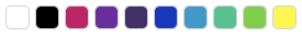
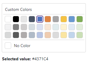
Custom Colors
You can add a group of custom colors to the Color Palette. Declare a DxColorPaletteGroup object and use its Colors property to specify a collection of colors.
The Colors property accepts the following formats:
- Longhand and shorthand hexadecimal color values:
#ffff00,#ff0. - RGB and RGBA color codes:
rgb(255, 0, 0),rgba(0, 230, 0, 0.3). - HTML color name (case-insensitive):
red,DarkGreen.
<DxColorPalette @bind-Value="@Value">
    <Groups>
        <DxColorPaletteGroup Header="Custom Colors" Colors="@Colors.ToList()" />
    </Groups>
</DxColorPalette>

<p><b>Selected value:</b> @Value</p>

@code {
    public List<string> Colors = new List<string> {
        "#ffffff", "#000000", "#E6E6E6", "#475467", "#4371C4", "#ED7E31", "#A5A4A5", "#FEC005", "#5A9BD5", "#72AE48",
        "#F2F2F3", "#7F7F7F", "#D0CECE", "#D4DDE3", "#DAE1F4", "#FCE5D4", "#DEECED", "#FFF2CC", "#DEEAF6", "#E1EFD9",
        "#D7D8D8", "#585959", "#AFABAB", "#ACBAC9", "#B4C5E7", "#F6CAAC", "#DBDBDB", "#FFE498", "#BCD6EE", "#C5E0B2"
    };

    string Value { get; set; }
}
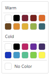
Columns
Use the ColumnCount property to change the column count in the palette.
<DxColorPalette @bind-Value="@Value"
                ColumnCount="5">
    <Groups>
        <DxColorPaletteGroup Header="Warm"
                             Colors="@DxColorPalettePresets.GetPalette(ColorPalettePresetType.Warm)" />
        <DxColorPaletteGroup Header="Cold"
                             Colors="@DxColorPalettePresets.GetPalette(ColorPalettePresetType.Cold)" />
    </Groups>
</DxColorPalette>

@code {
    string Value { get; set; }
}
Reset Color
Users can click the No Color tile to reset the selected color.
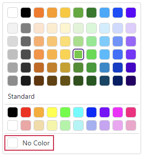
You can set the ShowNoColorTile property to false to hide the No Color tile.
<DxColorPalette @bind-Value="@Value"
                ShowNoColorTile="false"/>

@code {
    string Value { get; set; } = "#5BCA35";
}
Tile Customization
Use the TileCssClass property to customize tile appearance.
<DxColorPalette @bind-Value="@Value"
                TileCssClass="custom-tile-class" />

@code {
    string Value { get; set; } = "#5BCA35";
}
Add Color Palette to Other Components
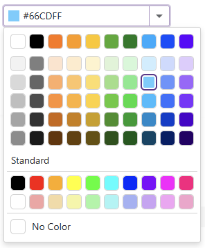
You can embed a Color Palette component into other UI controls, such as DropDownBox or Split Button.
DropDownBox Integration
The following code adds the Color Palette component to the DropDownBox component:
<DxDropDownBox @bind-Value="@Value"
               QueryDisplayText="@QueryText"
               NullText="Select color..."
               CssClass="cw-240">
    <DropDownBodyTemplate>
        <DxColorPalette Value="@GetColorDropDownValue(context.DropDownBox)"
                        ValueChanged="@(value => ColorDropDownValueChanged(value, context.DropDownBox))"
                        CssClass="dropdown-template-color-palette" />
    </DropDownBodyTemplate>
    <EditBoxDisplayTemplate>
        <div class="template-container">
            <span class="dxbl-image dropdown-icon-color dropdown-icon-color-background"></span>
            <DxInputBox />
        </div>
    </EditBoxDisplayTemplate>
</DxDropDownBox>

@code {
    object Value { get; set; } = "#66CDFF";
    RenderFragment GetSelectedValueDescription() {
        if (Value != null)
            return @<text>Value: @Value</text>;
        else
            return @<text>No selected color</text>;
    }
    string GetColorDropDownValue(IDropDownBox dropDownBox) {
        return dropDownBox.Value as string;
    }
    void ColorDropDownValueChanged(string value, IDropDownBox dropDownBox) {
        dropDownBox.BeginUpdate();
        dropDownBox.Value = value;
        dropDownBox.DropDownVisible = false;
        dropDownBox.EndUpdate();
    }
    string QueryText(DropDownBoxQueryDisplayTextContext arg) {
        return arg.Value as string;
    }
}
Split Button Integration
The following code adds the Color Palette component to the Split Button component.
<DxSplitButton @bind-DropDownVisible="@SplitButtonDropDownVisible"
               RenderStyle="ButtonRenderStyle.Secondary"
               IconCssClass="splitbutton-icon-color splitbutton-icon-color-background">
    <DropDownContentTemplate>
        <DxColorPalette Value="@GetColorSplitButtonValue()"
                        ValueChanged="@ColorSplitButtonValueChanged"
                        CssClass="splitbutton-template-color-palette" />
    </DropDownContentTemplate>
</DxSplitButton>

@code {
    string Value { get; set; } = "#66CDFF";
    bool SplitButtonDropDownVisible { get; set; }
    RenderFragment GetSelectedValueDescription() {
        if(Value != null)
            return @<text>Value: @Value</text>;
        else
            return @<text>No selected color</text>;
    }
    string GetColorSplitButtonValue() {
        return Value as string;
    }
    void ColorSplitButtonValueChanged(string value) {
        Value = value;
        SplitButtonDropDownVisible = false;
    }
}
Keyboard Navigation
The DevExpress Blazor Color Palette supports keyboard navigation. The following shortcut keys are available:
| Shortcut Keys | Description |
|---|---|
| Tab , Shift + Tab | Moves focus between color groups and the No Color tile. If a group has a selected color or if a user selected a color in this group before, moves focus to the corresponding tile. Otherwise, moves focus to the first tile. |
| Right Arrow | Moves focus to the next tile in the current row. When focus reaches the right edge, it moves to the next row. |
| Left Arrow | Moves focus to the previous tile in the current row. When focus reaches the left edge, it moves to the previous row. |
| Up Arrow | Moves focus to the previous row of tiles. |
| Down Arrow | Moves focus to the next row of tiles. |
| Home | Moves focus to the first tile in the current row. |
| End | Moves focus to the last tile in the current row. |
Note
Keyboard support allows users to interact with application content in cases they cannot use a mouse or they rely on assistive technologies (like screen readers or switch devices). Refer to the Accessibility help topic for information on other accessibility areas that we address.