DxPolarChartAreaSeries<T, TArgument, TValue> Class
Defines an area series.
Namespace: DevExpress.Blazor
Assembly: DevExpress.Blazor.v26.1.dll
Declaration
public class DxPolarChartAreaSeries<T, TArgument, TValue> :
    DxPolarChartBaseSeries<T, TArgument, TValue>
Type Parameters
| Name | Description |
|---|---|
| T | The data type. |
| TArgument | The series argument type. |
| TValue | The series value type. |
Remarks
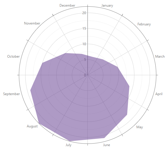
An area series displays data as a polyline that connects series values. The internal area is filled with a color.
Declare an Area Series
- Use the Polar Chart’s Data property to specify a data source.
- Add a
<DxPolarChartAreaSeries>tag to the component’s markup. - Assign data source fields that contain arguments and values for data points to ArgumentField and ValueField properties.
- Optional. Configure the series: customize appearance, add labels, choose selection and hover modes, and so on.
<DxPolarChart Data=@DataSource>
    <DxPolarChartAreaSeries ArgumentField="@((DiscretePoint i) => i.Arg)"
                            ValueField="@((DiscretePoint i) => i.Day)">
    </DxPolarChartAreaSeries>
    <DxChartLegend Visible="false" />
</DxPolarChart>
Nested Component Structure
You can add the following child components to an area series:
The following code snippet declares these objects in the markup:
<DxPolarChart Data=@DataSource>
    <DxPolarChartAreaSeries ArgumentField="@((DiscretePoint i) => i.Arg)"
                            ValueField="@((DiscretePoint i) => i.Day)">
        <DxChartSeriesLegendItem Text="Daily Temperature" />
        <DxChartSeriesLabel Visible="true" FormatPattern="{value:##.#}" />
    </DxPolarChartAreaSeries>
    <DxChartLegend Visible="true" Position="RelativePosition.Outside" />
</DxPolarChart>

Customize Appearance
The Polar Chart allows you to customize an area series. The following options are available:
- BreakOnEmptyPoints
- Specifies whether the series should break on points with null values.
- Closed
- Specifies whether to connect first and last series points.
- Color
- Specifies the color of the series.
- Opacity
- Specifies area series opacity.

@using System.Drawing

<DxPolarChart Data=@DataSource>
    <DxPolarChartAreaSeries ArgumentField="@((DiscretePoint i) => i.Arg)"
                            ValueField="@((DiscretePoint i) => i.Day)"
                            Color="Color.Beige"
                            Opacity="0.3">
    </DxPolarChartAreaSeries>
</DxPolarChart>
User Interaction Options
Users can select and hover over the series and its elements. The table below describes available interation options.
| Description | Component Level | Seies Level |
|---|---|---|
| Hover Over Series and Its Elements | Not Applicable | HoverMode |
| Series Selection | SeriesSelectionMode | SelectionMode |
| Point Selection | PointSelectionMode | Not Applicable |
Implements
Inheritance
Object
ComponentBase
DxSettingsComponent<DevExpress.Blazor.Internal.IPolarChartSeriesModel>
DxComplexSettingsComponent<DxPolarChartBaseSeries<T, TArgument, TValue>, DevExpress.Blazor.Internal.IPolarChartSeriesModel>
DxPolarChartBaseSeries<T, TArgument, TValue>
DxPolarChartAreaSeries<T, TArgument, TValue>
See Also