DxTooltipSettings Class
Contains tooltip settings.
Namespace: DevExpress.Blazor
Assembly: DevExpress.Blazor.v26.1.dll
Declaration
public class DxTooltipSettings :
    DxComplexSettingsComponent<DxTooltipSettings, TooltipSettingsModel>,
    IModelProvider<BorderSettingsModel>,
    IModelProvider<FontSettingsModel>,
    IModelProvider<TextFormatSettingsModel>,
    IModelProvider<ShadowSettingsModel>
Remarks
Use DxTooltipSettings objects to configure tooltips for the following components:
- DxBarGauge
- A component that visualizes data as circular bars where each bar indicates a single value.
- DxSankey
- A component that depicts value flow between two entity sets.
- DxSparkline
- A component that visualizes value trends as an inline graph.
To enable the component’s tooltip functionality, add a DxTooltipSettings object to component markup and set its Enabled property to true.
Component-Level Settings
The DxTooltipSettings component allows you to specify the following properties at the component level:
- Color | Opacity | ArrowLength | CornerRadius
- Customize tooltip appearance.
- PaddingLeftRight | PaddingTopBottom
- Configure paddings between tooltip edges and its content.
- ZIndex
- Specifies the tooltip stack order.
Nested Objects
In addition to component-level settings, you can also add the following objects to DxTooltipSettings markup:
- DxBorderSettings
- Contains the element’s border settings.
- DxFontSettings
- Contains the element’s font settings.
- DxShadowSettings
- Contains settings for the element’s shadows.
- DxTextFormatSettings
- Contains the element’s format settings.
The following code snippet configures tooltips in the DxBarGauge component:
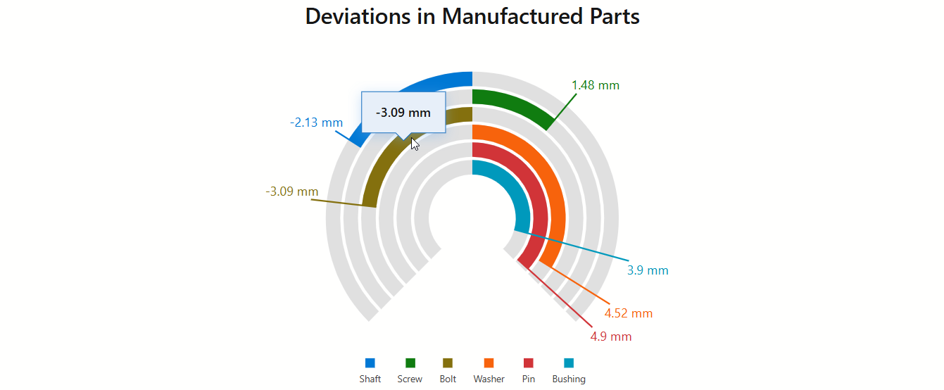
<DxBarGauge Width="100%"
            Height="100%"
            StartValue="-5"
            EndValue="5"
            BaseValue="0"
            Values="@Values">
    @* ... *@
    <DxTooltipSettings Enabled="true" Color="var(--dxds-primary-10)">
        <DxFontSettings Size="16"
                        Weight="600" />
        <DxTextFormatSettings LdmlString="@LabelFormat" />
        <DxShadowSettings Blur="8"
                          Color="var(--dxds-primary-50)" />
        <DxBorderSettings LineStyle="LineStyle.Solid"
                          Width="1"
                          Color="var(--dxds-primary-90)" />
    </DxTooltipSettings>
</DxBarGauge>

@code {
    double[] Values = new double[] { -2.13, 1.48, -3.09, 4.52, 4.9, 3.9 };
    string[] LegendItemCaptions = new string[] { "Shaft", "Screw", "Bolt", "Washer", "Pin", "Bushing" };
    string LabelFormat = "##.## mm;-##.## mm";
}
Inheritance
Object
ComponentBase
DxSettingsComponent<DevExpress.Blazor.ClientComponents.Internal.TooltipSettingsModel>
DxComplexSettingsComponent<DxTooltipSettings, DevExpress.Blazor.ClientComponents.Internal.TooltipSettingsModel>
DxTooltipSettings
See Also