DxLoadingPanel Class
A loading panel component that can display an overlay over components/containers.
Namespace: DevExpress.Blazor
Assembly: DevExpress.Blazor.v26.1.dll
Declaration
public class DxLoadingPanel :
    DxComponentBase
Remarks
The Blazor Loading Panel displays a progress indicator. We designed this component as a panel that can contain child content. You can also use it as a standalone component.
Add a Loading Panel to a Project
Follow the steps below to add a Loading Panel component to an application:
- Create a Blazor Server or Blazor WebAssembly application.
- Add component markup to a
.razorfile:<DxLoadingPanel>…</DxLoadingPanel>. - Specify where to display the Loading Panel.
- Write code that manages the component’s visibility.
- Configure other options (see sections below).
API Reference
Refer to the following list for the component API reference: DxLoadingPanel Members.
Static Render Mode Specifics
Blazor Loading Panel does not support static render mode. Enable interactivity to use the component in your application. Refer to the following topic for more details: Enable Interactive Render Mode.
Attach a Loading Panel to Target Content
You can use the PositionTarget property to attach the Loading Panel to a target element. Link the panel to content in this manner if you cannot place Loading Panel’s markup around target content (content needs to be at a specific position in DOM).
<DxFormLayout>
    <DxFormLayoutGroup Caption="Target Group" Id="show-panel">
        @* ... *@
    </DxFormLayoutGroup>
</DxFormLayout>

<DxLoadingPanel Visible="true"
                ApplyBackgroundShading="true"
                PositionTarget="#show-panel" />
You can also use the PositionTarget property to cover the entire page. Use the <body> tag as a target UI element:
<DxLoadingPanel Visible="true"
                PositionTarget="body"
                ApplyBackgroundShading="true" />
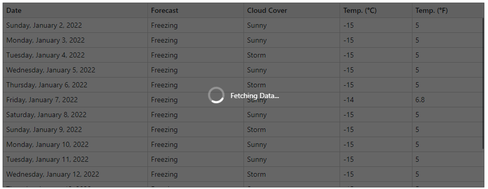
Add the Loading Panel without additional parameters to display the panel instead of the content area during page load operations. In this case, the panel occupies the entire parent container:
@if (SomeCondition == null) {
    <DxLoadingPanel Visible="true" />
}
else {
    ...
}
In other cases, specify target content as the Loading Panel’s ChildContent:
<DxLoadingPanel Visible="true"
                ApplyBackgroundShading="true"
                CssClass="w-100">
    <DxMemo @bind-Text="@Text"
            Rows="10" />
</DxLoadingPanel>
Display a Loading Panel
Use the Visible property to show/hide the Loading Panel when an operation starts/finishes.
The following example imitates a time-consuming operation and uses the Visible property to show the panel at the beginning and hide it at the end of the operation:
<DxButton Click="Click">Start operation</DxButton>

<DxLoadingPanel @bind-Visible=@Visible
                ApplyBackgroundShading="true"
                CssClass="w-100">
    <DxMemo @bind-Text="@Text"
            Rows="10" />
</DxLoadingPanel>

@code {
    bool Visible { get; set; } = false;
    private async Task Click() {
        Visible = true;
        await Task.Delay(3000);
        Visible = false;
    }
    string Text = "Andrew received his BTS commercial in 1987 and a Ph.D. in international marketing at the University " +
                  "of Dallas in 1994. He speaks French and Italian fluently, and reads German. He joined the company as " +
                  "a sales representative. After that, he was promoted to sales manager in January 2005 and vice president " +
                  "of sales in March 2006. Andrew is a member of the Sales Management Round table, Seattle Chamber of Commerce, and Pacific Rim Importers Association.";
}

You can also enable the CloseOnClick property to allow users to close the Loading Panel.
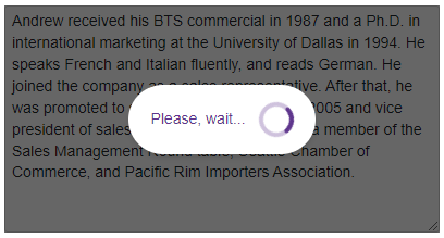
Customize Appearance
The following example changes the default Text and its position relative to the panel’s indicator (the TextAlignment property).
<DxLoadingPanel Visible="true"
                ApplyBackgroundShading="true"
                Text="Please, wait..."
                TextAlignment="LoadingPanelTextAlignment.Left"
                CssClass="w-100">
    <DxMemo @bind-Text="@Text"
            Rows="10" />
</DxLoadingPanel>

@code {
    string Text = "Andrew received his BTS commercial in 1987 and a Ph.D. in international marketing at the University " +
                  "of Dallas in 1994. He speaks French and Italian fluently, and reads German. He joined the company as " +
                  "a sales representative. After that, he was promoted to sales manager in January 2005 and vice president " +
                  "of sales in March 2006. Andrew is a member of the Sales Management Round table, Seattle Chamber of Commerce, and Pacific Rim Importers Association.";
}
You can also customize the panel’s indicator. Use the following API members:
- IndicatorAnimationType
- Specifies the indicator’s animation type.
- IndicatorAreaVisible
- Specifies the indicator’s area visibility.
- IndicatorCssClass
- Assigns a CSS class to the indicator.
- IndicatorTemplate
- Specifies custom content for the indicator.
- IndicatorVisible
- Specifies visibility of the Loading Panel’s indicator.
Component Lifecycle: Child Component Re-Render
When DxLoadingPanel contains a child component with a complex-typed parameter, the child is re-rendered when the parent DxLoadingPanel is clicked. This behavior is expected for Blazor components that accept complex-typed parameters, because the framework cannot know whether the values of a complex-typed parameter have mutated internally, so the framework always treats the parameter set as changed. Refer to the following Microsoft help topic for additional information: ASP.NET Core Razor component lifecycle
You can use the following approaches to prevent unnecessary re-render:
Pass primitive-typed fields to the child component instead of passing the entire object as a parameter.
Override the
ShouldRendermethod. Refer to the following Microsoft help topic for additional information: Avoid unnecessary rendering of component subtrees.Do not use
DxLoadingPanelas a parent component and specify its PositionTarget property.<TestComponent Object=_someObject Id="show-panel"/> <DxLoadingPanel PositionTarget="#show-panel" />Use static panel mode and render
DxLoadingPanelconditionally. Do not specifyDxLoadingPanelchild content, nor the PositionTarget property.@if (SomeCondition == null) { <DxLoadingPanel Visible="true" /> } else { <TestComponent Object=_someObject Id="show-panel"/> }
Loading Panel Delay
To avoid UI flicker on fast operations, you can introduce a 100-200 millisecond delay before the loading panel appears. If the operation completes within this interval, the loading animation is never shown.
While DxLoadingPanel does not have a built-in delay property, you can implement this behavior using the following pattern:
<DxLoadingPanel Visible="@ShowSpinner"
                IndicatorAnimationType="WaitIndicatorAnimationType.Spin">
    @* ... *@
</DxLoadingPanel>

@code {
    bool ShowSpinner = false;

    async Task RunOperationWithDelay()
    {
        ShowSpinner = false;
        var delayTask = Task.Delay(200);
        var operationTask = YourOperationAsync();
        var completedTask = await Task.WhenAny(delayTask, operationTask);
        if (completedTask == delayTask) ShowSpinner = true;
        await operationTask;
        ShowSpinner = false;
    }

    async Task YourOperationAsync()
    {
        // Simulate work
        await Task.Delay(500);
    }
}