DxScheduler Class
A calendar and scheduler component that displays a detailed snapshot of events/appointments in your web application across a single day, a week, or a month.
Namespace: DevExpress.Blazor
Assembly: DevExpress.Blazor.v26.1.dll
Declaration
public class DxScheduler :
    DxComponentBase,
    ISchedulerViewOwner,
    ISchedulerAppointmentActions,
    IHandleEvent,
    IAsyncDisposable,
    INestedSettingsOwner
Remarks
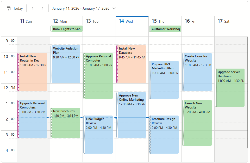
The DevExpress Blazor Scheduler (DxScheduler) allows users to view and manage appointments.
Add a Scheduler to a Project
Follow the steps below to add the Scheduler component to an application:
- Create a Blazor Server or Blazor WebAssembly application.
- Add the
<DxScheduler>…</DxScheduler>markup to a.razorfile. - Bind the component to data.
- Configure the component: add views, set up appointments, and so on.
API Reference
Refer to the following list for the component API reference: DxScheduler Members.
Static Render Mode Specifics
Blazor Scheduler supports static render mode to display data in a pre-defined time interval. Users cannot switch to other views or time intervals. To use these and other features, enable interactivity on a Razor page, and allow the Scheduler component to execute scripts.
Features
The list below includes features available in the Blazor Scheduler component:
- Bind to Data
- Day, Week, Work Week, and Timeline Views
- Appointment Types
- Recurring Appointments
- Manage Appointments
- Labels
- Status Items
- Resources
- Customization
- Keyboard Support
Examples
Our knowledge base contains a wide array of sample projects that demonstrate the most popular usage scenarios, such as:
- How to load appointments for visible interval only (lazy loading)
- How to implement CRUD operations with a Web API Service
You can find more task-based examples in the following topic: Examples.
Troubleshooting
If a Blazor application throws unexpected exceptions, refer to the following help topic: Troubleshooting.