DxPieChart<T> Class
A control that visualizes data as Pie and Donut charts.
Namespace: DevExpress.Blazor
Assembly: DevExpress.Blazor.v26.1.dll
Declaration
public class DxPieChart<T> :
    DxChartBase,
    IComponentContainer<IPieChartSeriesModel>,
    IModelProvider<PieChartAnnotationModel>
Type Parameters
| Name | Description |
|---|---|
| T | The data item type. |
Remarks
The DevExpress Pie Chart component (<DxPieChart>) allows you to create Pie and Donut chart types for Blazor applications.
Add a Chart to a Project
Follow the steps below to add the Pie Chart component to an application:
- Create a Blazor Server or Blazor WebAssembly application.
- Add the
<DxPieChart>…</DxPieChart>markup to a.razorfile. - Bind the component to data.
- Configure the component: add series, specify the chart’s size, define labels and tooltips, and so on (see the sections below).
API Reference
Refer to the following list for the component API reference: DxPieChart Members.
Static Render Mode Specifics
Blazor Charts support static render mode to display data as static images. To use other features, enable interactivity on a Razor page, and allow chart components to execute scripts and display data.
Bind to Data
Use the Pie Chart’s Data property to specify an IEnumerable<T> data source. The chart should also contain at least one series to display data (see the section below for additional information: Series). For a sample data source, refer to our GitHub repository.
Note
The Pie Chart supports bound mode only.
<DxPieChart Data="@SalesData">
    @* A place for series *@
</DxPieChart>

@code {
    IEnumerable<SaleInfo> SalesData;

    protected override async Task OnInitializedAsync() {
        SalesData = await Sales.GetSalesAsync();
    }
}
If the data source collection implements the INotifyCollectionChanged interface, the Chart is updated automatically each time the collection changes. Otherwise, use the RefreshData method to reload data and redraw the component. To re-render the Chart area without a data reload, call the RedrawAsync method.
To track the moment when the chart rendering is finished and the component is completely loaded, handle the Rendered event.
For additional information, refer to the following article: Bind Blazor Charts to Data.
Series
Use the DxPieChartSeries<T, TArgument, TValue> object to create a PieChart-specific series. You should use the following series properties to bind the data source fields to the series:
- ArgumentField: specifies the data source field that contains arguments for chart points.
- ValueField: specifies the data source field that contain values for chart points.
The table below lists settings for a pie series:
Member | Description |
|---|---|
Specifies the method that calculates summaries for points with the same argument value. | |
Specifies a data source field that contains arguments for series values. | |
Specifies an expression used to filter series values. | |
Specifies the name for a series. | |
Specifies a data source field that contains values for series points. | |
Specifies the series visibility. |
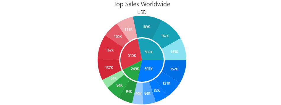
Place several series at the same chart hierarchy level to create a nested donut:
<DxPieChart Data="@SalesData"
            T="SaleInfo">
    <DxPieChartSeries T="SaleInfo"
                      TArgument="string"
                      TValue="double"
                      ValueField="si => si.Amount"
                      ArgumentField="si => si.Region"
                      SummaryMethod="Enumerable.Sum"
                      Name="Region Sales">
    </DxPieChartSeries>
    <DxPieChartSeries T="SaleInfo"
                      TArgument="string"
                      TValue="double"
                      ValueField="si => si.Amount"
                      ArgumentField="si => si.City"
                      SummaryMethod="Enumerable.Sum"
                      Name="City Sales">
    </DxPieChartSeries>
    @* ... *@
</DxPieChart>

@code {
    @* ... *@
    protected override async Task OnInitializedAsync() {
        SalesData = (await Sales.GetSalesAsync()).Where(si => si.Region != "Africa" && si.Region != "Australia");
    }
}
Note
To align the pie and donut series, sort your data source before passing it to the chart component.
Labels
Use the DxChartSeriesLabel component to configure labels for series data points. These settings apply to all labels in the series.
Set the DxChartSeriesLabel.Visible property to true to display labels:
<DxPieChart Data="forecasts">
    <DxPieChartSeries ArgumentField="@((WeatherForecast v) => v.Date)"
                      ValueField="@((WeatherForecast v) => v.TemperatureC)">
        <DxChartSeriesLabel Visible="true" />
    </DxPieChartSeries>
    @* ... *@
</DxPieChart>
The DxChartSeriesLabel component includes the following properties that apply to DxPieChartSeries labels only:
- TextOverflow | WordWrap
- Specify how to display the text of overflowing series labels.
- RadialOffset
- Shifts series labels radially away from or towards the chart center.
The following code snippet uses drop-down menus to choose how to display overflowing series labels:
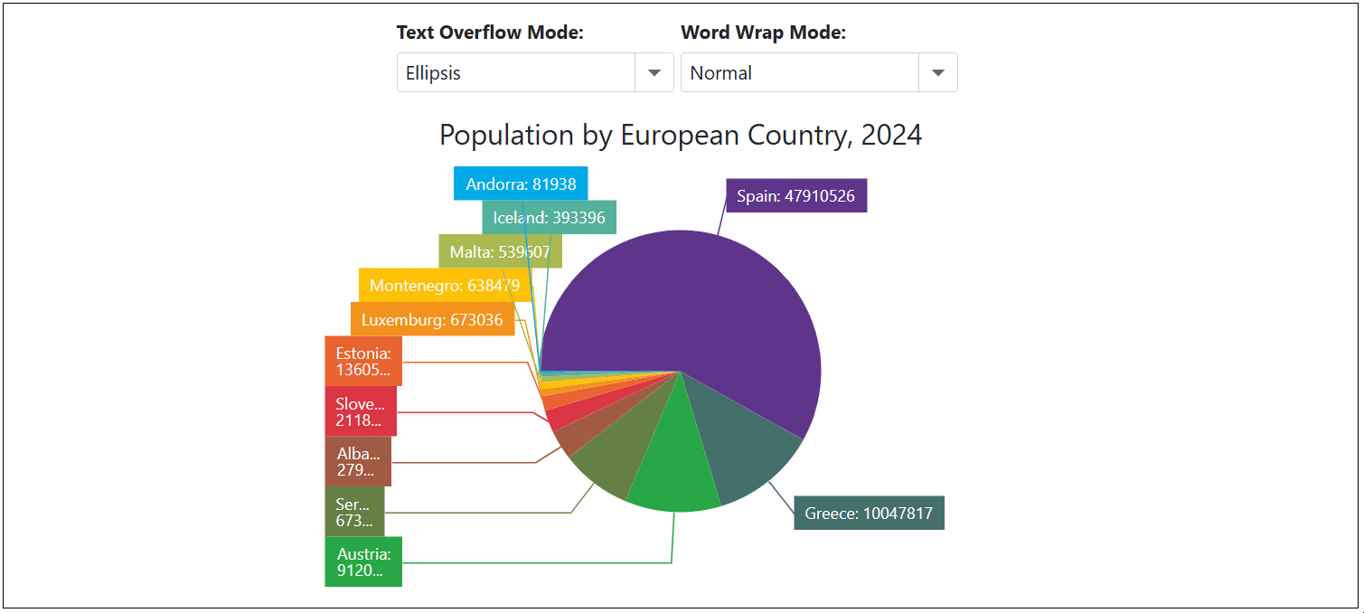
<label><strong>Text Overflow Mode: </strong></label>
<DxComboBox Text="TextOverflow" @bind-Value="@CurrentTextOverflowMode" Data="Enum.GetValues<ChartTextOverflow>()" />

<label><strong>Word Wrap Mode: </strong></label>
<DxComboBox Text="WordWrap" @bind-Value="@CurrentWordWrapMode" Data="Enum.GetValues<ChartWordWrap>()" />

<DxPieChart Data="@DataSource"
            Height="350px"
            StartAngle="180"
            LabelOverlap="PieChartLabelOverlap.Shift"
            PointSelectionMode="ChartSelectionMode.Multiple">
    <DxPieChartSeries ArgumentField="@((StatisticPoint v) => v.Country)"
                      ValueField="@((StatisticPoint v) => v.Population24)"
                      Name="2024">
        <DxChartSeriesLabel Visible="true"
                            TextOverflow="@CurrentTextOverflowMode"
                            WordWrap="@CurrentWordWrapMode"
                            FormatPattern="{argument}: {value}">
            <DxChartSeriesLabelConnector Visible="true" />
        </DxChartSeriesLabel>
    </DxPieChartSeries>
    <DxChartLegend HorizontalAlignment="HorizontalAlignment.Right"
                   Orientation="Orientation.Vertical"
                   Visible="false" />
    <DxChartTitle Text="Population by European Country, 2024" />
</DxPieChart>

@code {
    TextOverflow CurrentTextOverflowMode { get; set; } = ChartTextOverflow.Ellipsis;
    WordWrap CurrentWordWrapMode { get; set; } = ChartWordWrap.Normal;

    IEnumerable<StatisticPoint> DataSource = Enumerable.Empty<StatisticPoint>();
    protected override void OnInitialized() {
        DataSource = GenerateData();
    }
}
When the DxChartSeriesLabel.Position property is set to Inside, series labels may go beyond the boundaries of pie sectors. In this case, set the DxChartSeriesLabel.BackgroundColor property to transparent to display series labels correctly:
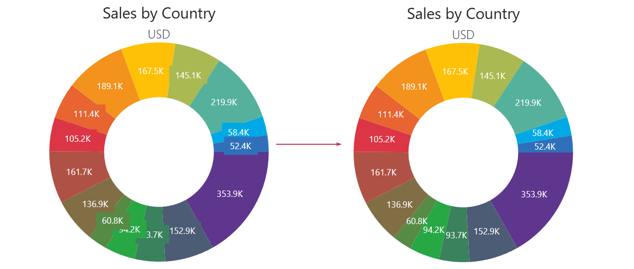
@using System.Drawing

<DxPieChart Data="@SalesData"
            InnerDiameter="0.5"
            T="SaleInfo">
    <DxPieChartSeries T="SaleInfo"
                      TArgument="string"
                      TValue="double"
                      ValueField="si => si.Amount"
                      ArgumentField="si => si.Country"
                      SummaryMethod="Enumerable.Sum">
        <DxChartSeriesLabel Visible="true"
                            Position="RelativePosition.Inside"
                            ValueFormat="ChartElementFormat.Thousands(1)"
                            BackgroundColor="System.Drawing.Color.Transparent">
        </DxChartSeriesLabel>
    </DxPieChartSeries>
    <DxChartTitle Text="Sales by Country">
        <DxChartSubTitle Text="USD" />
    </DxChartTitle>
    @* ... *@
</DxPieChart>
For additional information on how to customize series labels, refer to the following topic: Labels in Blazor Charts.
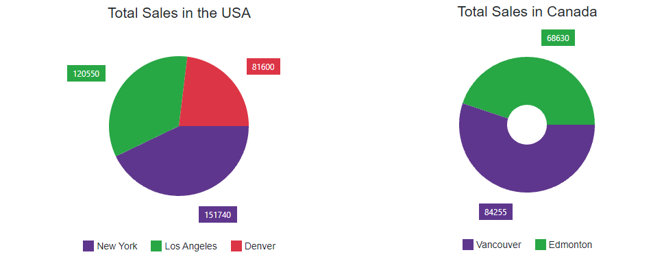
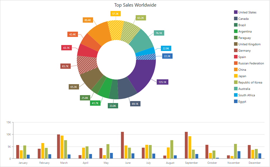
Donut
Use the InnerDiameter property to change the chart’s shape to Donut. The InnerDiameter is a value from 0 to 1 that is the ratio of the inner diameter to the outer diameter (Diameter).
The following code creates a donut with an outer diameter of 0.7 * 300 = 210 pixels, and inner diameter of 210 * 0.5 = 105 pixels.
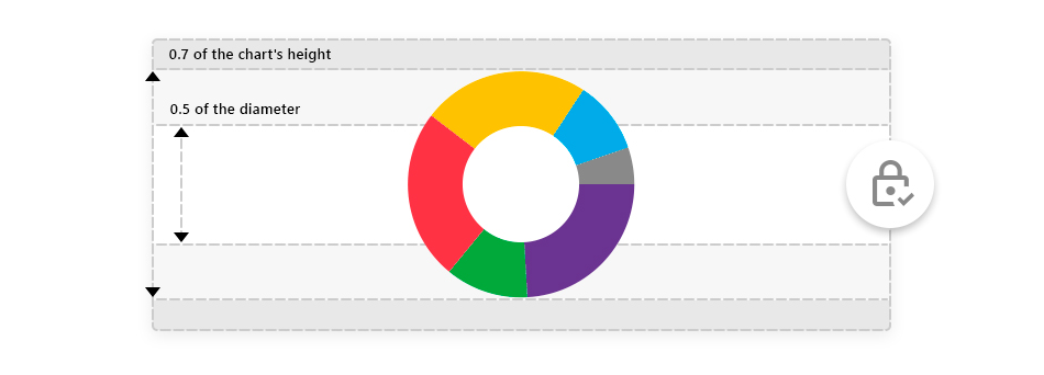
<DxPieChart Data="@SalesData"
            Diameter="0.7"
            InnerDiameter="0.5"
            Height="300"
            Width="950">
    <DxPieChartSeries T="SaleInfo"
                      TArgument="string"
                      TValue="double"
                      ValueField="si => si.Amount"
                      ArgumentField="si => si.Region"
                      SummaryMethod="Enumerable.Sum">
    </DxPieChartSeries>
    <DxChartLegend Visible="false" />
</DxPieChart>
Sizing
You can change the size of the Pie Chart component.
Use the Width and Height properties to specify a custom size for the chart component. The following code snippet sets the chart component size to 75% of the parent component (<div>).
<div class="chart-container">
    <DxPieChart Data="@SalesInfo" Width="75%" Height="75%"> @* Width = 699px; Height = 330px *@
        @* ... *@
    </DxPieChart>
</div>
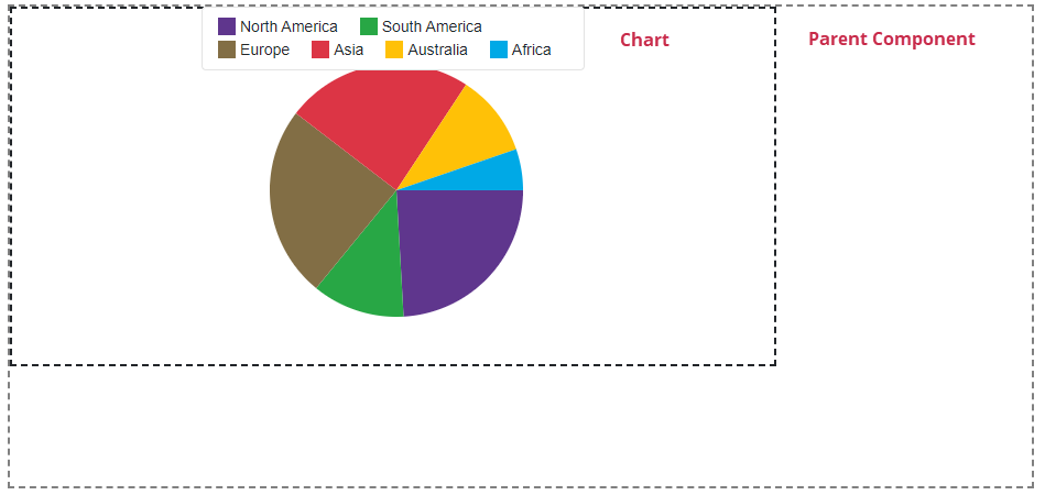
You can also use the RedrawOnResize property to specify whether to redraw the chart when its container size changes.
Slice Layout
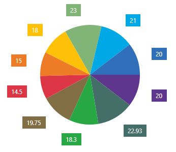
DxPieChart<T> allows you to control the slice layout algorithm. The following options are available:
- StartAngle
- Specifies the angle at which the chart lays out the first series slice.
- SegmentDirection
- Specifies the direction in which the chart arranges series slices.
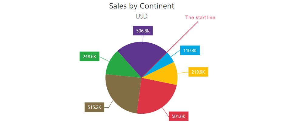
The following image demonstrates the default slice arrangement where the StartAngle property value is 0 and the SegmentDirection property is set to Clockwise:
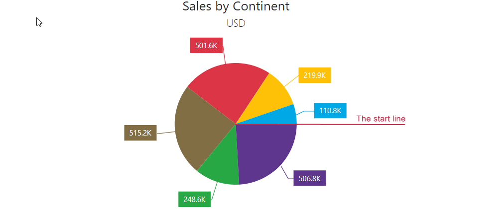
The following code snippet arranges series slices counterclockwise and sets the start line angle to 45 degrees:
<DxPieChart Data="@SalesData"
            SegmentDirection="PieChartSegmentDirection.CounterClockwise"
            StartAngle="45"
            T="SaleInfo">
    @* ... *@
</DxPieChart>
Legend
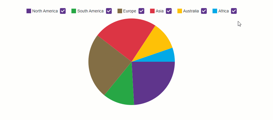
A Pie Chart’s legend lists all chart sectors. The DxChartLegend component implements the chart legend. Use the Visible property to hide or show the legend, and the Position property to specify the legend’s position.
Enable the AllowToggleSeries property to display checkboxes that toggle the visibility of individual sectors.
<DxPieChart Data="@SalesData">
    <DxPieChartSeries T="SaleInfo"
                      TArgument="string"
                      TValue="double"
                      ValueField="si => si.Amount"
                      ArgumentField="si => si.Region"
                      SummaryMethod="Enumerable.Sum">
    </DxPieChartSeries>
    <DxChartLegend AllowToggleSeries="true"
                   Position="RelativePosition.Outside" />
</DxPieChart>
Refer to the following section for additional information about legend: Descriptive Elements - Legend.
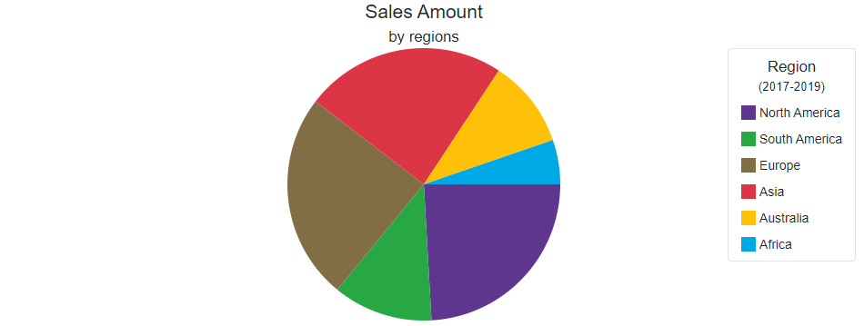
Titles and Subtitles
The <DxPieChart> component can display titles (DxChartTitle) and subtitles (DxChartSubTitle) for the following items:
- The Pie Chart component (
<DxPieChart>) - Legend (
<DxChartLegend>)
<DxPieChart Data="@SalesData" Width="950">
    <DxChartTitle Text="Sales Amount">
        <DxChartSubTitle Text="by regions" />
    </DxChartTitle>
    <DxPieChartSeries T="SaleInfo"
                      TArgument="string"
                      TValue="double"
                      ValueField="si => si.Amount"
                      ArgumentField="si => si.Region"
                      SummaryMethod="Enumerable.Sum">
    </DxPieChartSeries>
    <DxChartLegend HorizontalAlignment="HorizontalAlignment.Right"
                   Orientation="Orientation.Vertical">
        <DxChartTitle Text="Region">
            <DxChartSubTitle Text="(2017-2019)" />
        </DxChartTitle>
    </DxChartLegend>
</DxPieChart>
Refer to the following section for additional information about titles: Descriptive Elements - Titles and Subtitles.
Annotations
Annotations are comments that contain information about chart content. The DxPieChart<T> component supports text and image annotations. You can anchor annotations to chart elements (series points) or position annotations based on pixel coordinates.
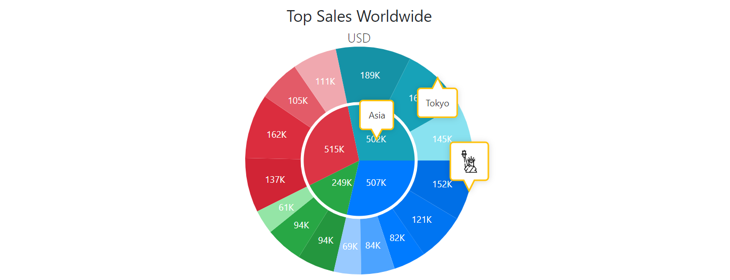
Refer to the following section for additional information about annotations: Annotations in Blazor Charts.
Tooltips
The Pie Chart can display tooltips when the mouse pointer is above a chart series. Use the DxChartTooltip element to specify tooltip templates.
The Tooltip class contains the following properties:
- Enabled - Specifies whether tooltips are enabled. Set this property to
trueto display tooltips. - Position - Specifies the tooltip position.
<DxPieChart Data="@SalesData">
    <DxChartTooltip Enabled="true"
                    Position="RelativePosition.Outside">
        <div class="tooltip-content">
            <div class="tooltip-title">@context.Point.Argument</div>
            <div>Sales: @($"${context.Point.Value:#,0.00}")</div>
        </div>
    </DxChartTooltip>
    <DxPieChartSeries T="SaleInfo"
                      TArgument="string"
                      TValue="double"
                      ValueField="si => si.Amount"
                      ArgumentField="si => si.Region"
                      SummaryMethod="Enumerable.Sum">
        <DxChartSeriesLabel Visible="true"
                            Position="RelativePosition.Outside"
                            Format="ChartElementFormat.Thousands(1)">
            <DxChartSeriesLabelConnector Visible="true" />
        </DxChartSeriesLabel>
    </DxPieChartSeries>
    @* ... *@
</DxPieChart>
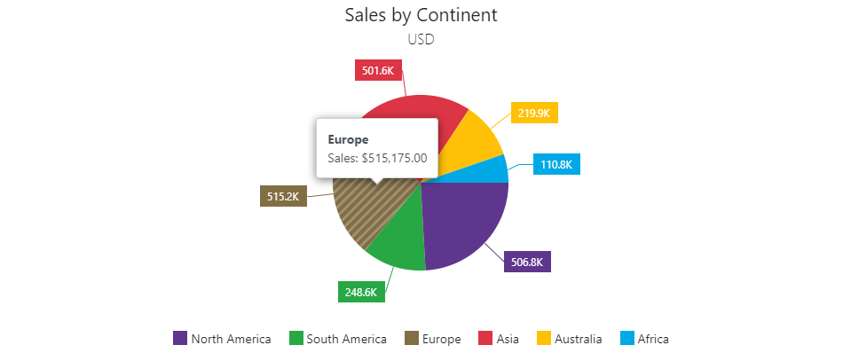
Refer to the following section for additional information about titles: Descriptive Elements - Tooltips.
Selection and Hover
The <PieChart> component allows users to select and hover over pie sectors.
Refer to the following topic for additional information: User Interaction Options in Blazor Charts.
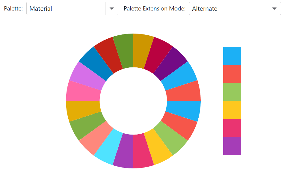
Palette
The DxPieChart component allows you to create a custom palette to colorize chart series. To apply a palette, assign it to the Palette property.
When the number of series points (for DxPieChart) exceeds the number of palette colors, you can use the PaletteExtensionMode property to extend the palette.
The following example uses drop-down menus to change the color palette and its extension mode:
<div class="flex-container">
    <DxPieChart Data="@GetData()"
                Width="400"
                InnerDiameter="0.5"
                Palette="@CurrentColors"
                PaletteExtensionMode="@CurrentPaletteMode">
        <DxChartLegend Visible="false" />
        <DxPieChartSeries ArgumentField="@((DataPoint s) => s.Argument)"
                          ValueField="@((DataPoint s) => s.Value)" />
    </DxPieChart>
    <div class="palette-container">
        @foreach (var color in CurrentColors) {
            <div class="palette-item" style="background-color: @color"></div>
        }
    </div>
</div>

@code {
    public enum Palettes {
        Material,
        Bootstrap,
        Tailwind
    }
    Dictionary<Palettes, string[]> Colors = new Dictionary<Palettes, string[]>() {
        { Palettes.Material, new string[] { "#1db2f5", "#f5564a", "#97c95c", "#ffc720", "#eb3573", "#a63db8" } },
        { Palettes.Bootstrap, new string[] { "#0d6efd", "#6c757d", "#28a745", "#dc3545", "#ffc107", "#17a2b8" } },
        { Palettes.Tailwind, new string[] { "#ef4444", "#eab308", "#22c55e", "#0ea5e9", "#8b5cf6", "#ec4899" } }
    };
    string[] CurrentColors;
    Palettes currentPalette = Palettes.Material;
    Palettes CurrentPalette {
        get => currentPalette;
        set {
            CurrentColors = Colors[value];
            currentPalette = value;
        }
    }
    ChartPaletteExtensionMode CurrentPaletteMode = ChartPaletteExtensionMode.Alternate;
    List<DataPoint> GetData() {
        List<DataPoint> result = new List<DataPoint>();
        for(var i = 0; i < 20; i++) {
            result.Add(new DataPoint($"Item{i}", 1));
        }
        return result;
    }
    public class DataPoint {
        public string Argument { get; set; }
        public int Value { get; set; }
        public DataPoint(string argument, int value) {
            Argument = argument;
            Value = value;
        }
    }
    protected override void OnInitialized() {
        CurrentColors = Colors[currentPalette];
    }
}
Export
Call ExportAsync method overloads to export chart data. The following code snippet uses a drop-down menu to export chart data to a file in the specified format:
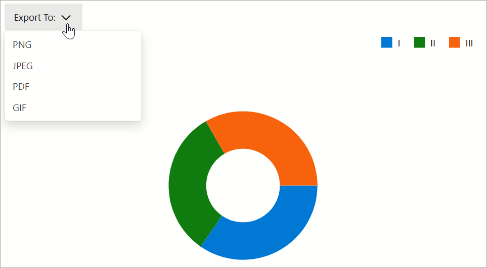
@using System.Drawing
<DxMenu ItemClick="Export">
    <Items>
        <DxMenuItem Text="Export To:">
            <Items>
                <DxMenuItem Text="PNG" />
                <DxMenuItem Text="JPEG" />
                <DxMenuItem Text="PDF" />
                <DxMenuItem Text="GIF" />
            </Items>
        </DxMenuItem>
    </Items>
</DxMenu>
<DxPieChart @ref="chart"
            Data="@dataPoints"
            LabelOverlap="PieChartLabelOverlap.Hide"
            Diameter="0.7"
            InnerDiameter="0.5"
            Width=700 Height=400>
    <DxPieChartSeries ArgumentField="@((DataPoint i) => i.Arg)"
                      ValueField="@((DataPoint i) => i.Value1)"
                      Name="Series 1" />
    <DxChartLegend Orientation="Orientation.Horizontal"
                   HorizontalAlignment="HorizontalAlignment.Right"
                   Position="RelativePosition.Outside" />
</DxPieChart>

@code {
    DxChartBase chart;
    private DataPoint[] dataPoints;
    protected override void OnInitialized() {
        dataPoints = GetDataPoints();
    }
    void Export(MenuItemClickEventArgs args) {
        ChartExportFormat format = ChartExportFormat.Png;
        Color backgroundColor = Color.White;
        int margin = 4;
        if(Enum.TryParse<ChartExportFormat>(args.ItemInfo.Text, true, out format))
            chart?.ExportAsync("Exported_Chart", format, margin, backgroundColor);
    }
}
Troubleshooting
If a Blazor application throws unexpected exceptions, refer to the following help topic: Troubleshooting.