DxSplitter Class
A component that displays multiple resizable and collapsible panes.
Namespace: DevExpress.Blazor
Assembly: DevExpress.Blazor.v26.1.dll
Declaration
public class DxSplitter :
    ParameterTrackerComponent,
    INestedSettingsOwner,
    IDisposable
Remarks
The DevExpress Splitter for Blazor (<DxSplitter>) divides web page content into multiple resizable and collapsible panes. The component can nest other splitter components to create complex layouts.

Add a Splitter to a Project
Follow the steps below to add a Splitter component to an application:
- Create a Blazor Server or Blazor WebAssembly application.
Add the following markup to a
.razorfile:<DxSplitter> <Panes> @* ... *@ </Panes> </DxSplitter>- Populate the Panes collection with panes (DxSplitterPane objects).
- Configure other options (see sections below).
API Reference
Refer to the following list for the component API reference: DxSplitter Members.
Static Render Mode Specifics
You can use the DxSplitter component in static render mode except for pane expand and collapse functionalities.
Orientation and Hierarchical Pane Structure
The Splitter component displays a single-level stack of panels. Use the Orientation property to specify pane stack direction. To create multilevel panes, insert another Splitter component within pane content.
<DxSplitter CssClass="border" Height="200px" Width="950px">
    <Panes>
        <DxSplitterPane>Pane 1</DxSplitterPane>
        <DxSplitterPane>
            <DxSplitter Orientation="Orientation.Vertical">
                <Panes>
                    <DxSplitterPane>Pane 2-1</DxSplitterPane>
                    <DxSplitterPane>Pane 2-2</DxSplitterPane>
                </Panes>
            </DxSplitter>
        </DxSplitterPane>
        <DxSplitterPane>Pane 3</DxSplitterPane>
    </Panes>
</DxSplitter>

Pane Size
Use the Size property to specify the width of vertical panes and the height of horizontal panes.
When the AllowResize property is set to true, users can resize the pane. Use MinSize and MaxSize properties to restrict pane size changes.
<DxSplitter CssClass="border"  Width="100%" Height="600px">
    <Panes>
        <DxSplitterPane Size="30%" MinSize="100px">@PaneContent1</DxSplitterPane>
        <DxSplitterPane Size="50%" MaxSize="70%">@PaneContent2</DxSplitterPane>
        <DxSplitterPane>@PaneContent3</DxSplitterPane>
    </Panes>
</DxSplitter>
Handle the SizeChanged event to react to pane size changes. This event does not fire for the last pane, which serves as the flexible remainder. The pane’s size is automatically calculated from the splitter’s total size and its Size property always remains null.
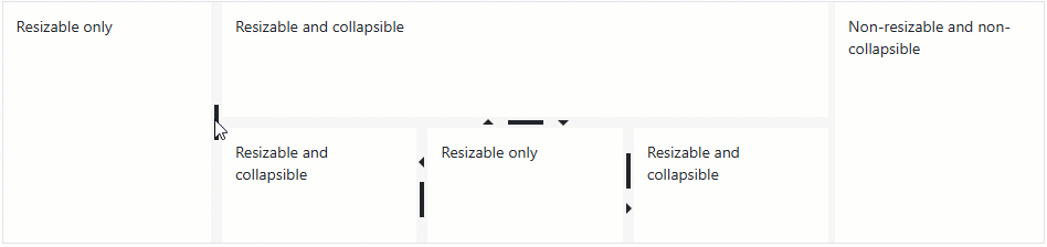
Expand and Collapse Panes
Set a pane’s AllowCollapse property to true to allow users to collapse the pane.
Use the Collapsed property to determine the pane collapse state. When the state changes, the Splitter raises the CollapsedChanged event.
Keyboard Navigation
The DevExpress Blazor Splitter component supports keyboard shortcuts that allow users to access and move splitter separators, expand and collapse panes.
Note
Keyboard support allows users to interact with application content in cases they cannot use a mouse or they rely on assistive technologies (like screen readers or switch devices). Refer to the Accessibility help topic for information on other accessibility areas that we address.
The following shortcut keys are available:
| Shortcut Keys | Description |
|---|---|
| Tab, Shift + Tab |
Moves focus to the next or previous splitter separator or a focusable element inside a pane. |
| Right Arrow | Moves a vertical separator to the right. |
| Left Arrow | Moves a vertical separator to the left. |
| Down Arrow | Moves a horizontal separator down. |
| Up Arrow | Moves a horizontal separator up. |
| Enter | Expands or collapses a pane. If a separator can be collapsed in both directions, collapses to the nearest edge. |
Troubleshooting
If a Blazor application throws unexpected exceptions, refer to the following help topic: Troubleshooting.