DxDropDown Class
A control that displays a drop-down window with custom content.
Namespace: DevExpress.Blazor
Assembly: DevExpress.Blazor.v26.1.dll
Declaration
public class DxDropDown :
    DxComponentBase,
    IPopupEventInfo,
    IDropDownSettings,
    IParentPopupBranchInfo,
    IPopupLayer,
    IAsyncDisposable
Remarks
The DevExpress DropDown for Blazor (<DxDropDown>) allows you to create a drop-down window in your application.
Add a DropDown to a Project
Follow the steps below to add the DropDown component to an application:
- Create a Blazor Server or Blazor WebAssembly application.
- Add the
<DxDropDown></DxDropDown>markup to a.razorfile. - Write code that manages the DropDown’s visibility.
- Define the DropDown’s content and appearance.
- Configure other options (see the sections below).
API Reference
Refer to the following list for the component API reference: DxDropDown Members.
Static Render Mode Specifics
Blazor DropDown does not support static render mode. Enable interactivity to use the component in your application. Refer to the following topic for more details: Enable Interactive Render Mode.
Show and Close a DropDown
Implement two-way binding for the IsOpen property to show the DropDown in code.
<DxButton Id="showDDbutton" aria-describedby="dropDown" Click="() => IsOpen = true">Show DropDown</DxButton>
<DxDropDown Id="dropDown"
            @bind-IsOpen="@IsOpen"
            Width="400"
            BodyText="Lorem ipsum dolor sit amet, consectetuer adipiscing elit.
              Maecenas porttitor congue massa.">
</DxDropDown>
@code {
    bool IsOpen { get; set; } = false;
}
You can call the ShowAsync and CloseAsync methods to show and close a drop-down window asynchronously.
<DxButton Text="Show" Click="ShowDropDown" />
<DxButton Text="Close" Click="CloseDropDown" />
<DxDropDown @ref="dropDown"
            Width="400"
            BodyText="Lorem ipsum dolor sit amet, consectetuer adipiscing elit.
              Maecenas porttitor congue massa.">
</DxDropDown>
@code {
    DxDropDown dropDown { get; set; }
    async Task ShowDropDown(MouseEventArgs args) {
        await dropDown.ShowAsync();
    }
    async Task CloseDropDown(MouseEventArgs args) {
        await dropDown.CloseAsync();
    }
}
User Capabilities
Users can close the DropDown in the following ways:
- Press Escape.
- Click outside the DropDown’s boundaries. Set the CloseOnOutsideClick property to
falseto disable this option.
Respond to Show and Close Actions
Handle the following events to process show and close actions:
- Showing
- Fires before the drop-down window is displayed.
- Shown
- Fires after the drop-down window is displayed.
- Closing
- Fires before the drop-down window is closed.
- Closed
- Fires after the drop-down window is closed.
Content and Appearance
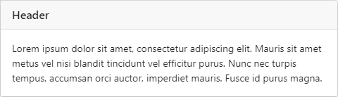
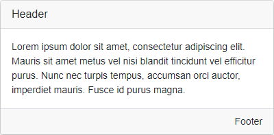
The drop-down window consists of header, body, and footer. The header and footer are initially hidden. Set HeaderVisible and FooterVisible properties to true to display these elements.
Each element can display text, a template for content, or a template for the entire element.
Display Text
Use the following properties to specify text displayed in the DropDown elements: HeaderText, BodyText, and FooterText.
<DxButton Id="showDDbutton" Click="() => IsOpen = true">Show DropDown</DxButton>
<DxDropDown @bind-IsOpen="@IsOpen"
            Width="400"
            HeaderVisible="true"
            FooterVisible="true"
            HeaderText="Header"
            BodyText="Lorem ipsum dolor sit amet, consectetur adipiscing elit. Mauris sit amet metus vel
             nisi blandit tincidunt vel efficitur purus. Nunc nec turpis tempus, accumsan orci auctor,
             imperdiet mauris. Fusce id purus magna."
            FooterText="Footer">
</DxDropDown>
@code {
    bool IsOpen { get; set; } = false;

}
To customize the appearance of DropDown elements, assign CSS classes to HeaderCssClass, BodyCssClass, and FooterCssClass properties.
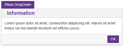
Display Custom Content
Use the following properties to display any UI render fragment in DropDown elements: HeaderContentTemplate, BodyContentTemplate, and FooterContentTemplate. A render fragment can include formatted text, images, another component, etc. These templates affect the content area only.
These templates take priority over the Text and CssClass properties described above.
Each template has the context parameter. You can use the parameter’s CloseCallback property to implement a custom close button.
<DxButton Id="showDDbutton" Click="() => IsOpen = true">Show DropDown</DxButton>
<DxDropDown @bind-IsOpen="@IsOpen"
            HeaderVisible="true"
            FooterVisible="true"
            Width="400"
            BodyText="Lorem ipsum dolor sit amet, consectetur adipiscing elit. Mauris sit amet metus vel
             nisi blandit tincidunt vel efficitur purus.">
    <HeaderContentTemplate>
        <div class="my-header">
            Information
        </div>
    </HeaderContentTemplate>
    <FooterContentTemplate>
        <DxButton RenderStyle="ButtonRenderStyle.Primary" Text="OK" Click="@context.CloseCallback" />
    </FooterContentTemplate>
</DxDropDown>

@code {
    bool IsOpen { get; set; } = false;
}
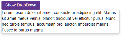
Customize Entire Elements (Template)
Specify HeaderTemplate, BodyTemplate, and FooterTemplate properties to define the content and appearance of DropDown elements. You can display any UI render fragment (for instance, formatted text, images, or another component).
These templates substitute entire render fragments of the corresponding elements. Predefined appearance settings, content alignment and paddings, and Text, CssClass, and ContentTemplate properties have no effect.
Each template has the context parameter. You can use the parameter’s CloseCallback property to implement a custom close button.
<DxButton Id="showDDbtton" Click="() => IsOpenWindow = true">Show DropDown</DxButton>
<DxDropDown Width="400"
            @bind-IsOpen="@IsOpenWindow"
            PositionTarget="#showDDbtton"
            PositionMode="DropDownPositionMode.Bottom">
    <BodyTemplate>
        Lorem ipsum dolor sit amet, consectetur adipiscing elit.
        Mauris sit amet metus velnisi blandit tincidunt vel efficitur purus.
        Nunc nec turpis tempus, accumsan orci auctor,
        imperdiet mauris. Fusce id purus magna.
    </BodyTemplate>
</DxDropDown>

@code {
    bool IsOpenWindow { get; set; } = false;
}
DropDown Size
Use the Width and Height properties to specify the drop-down window’s size.
<DxButton Id="showDDbutton" Click="() => IsOpen = true">Show DropDown</DxButton>
<DxDropDown @bind-IsOpen="@IsOpen"
            Width="max(25vw, 300px)"
            Height="250"
            BodyText="Lorem ipsum dolor sit amet, consectetur adipiscing elit. Mauris sit amet metus vel
             nisi blandit tincidunt vel efficitur purus. Nunc nec turpis tempus, accumsan orci auctor,
             imperdiet mauris. Fusce id purus magna.">
</DxDropDown>
@code {
    bool IsOpen { get; set; } = false;
}
Set the AllowResize property to true to allow users to resize the DropDown. Use the following properties to restrict changes to the component size: MinWidth, MaxWidth, MinHeight, MaxHeight.
<DxButton Id="showDDbutton" Click="() => IsOpen = true">Show DropDown</DxButton>
<DxDropDown @bind-IsOpen="@IsOpen"
            AllowResize="true"
            MinWidth="200"
            MaxWidth="400"
            MinHeight="200"
            MaxHeight="400"
            BodyText="Lorem ipsum dolor sit amet, consectetur adipiscing elit. Mauris sit amet metus vel
             nisi blandit tincidunt vel efficitur purus. Nunc nec turpis tempus, accumsan orci auctor,
             imperdiet mauris. Fusce id purus magna.">
</DxDropDown>
@code {
    bool IsOpen { get; set; } = false;
}
The DropDown’s height changes to fit its content. When the height is restricted and the content exceeds the window’s boundaries, the control displays a vertical scrollbar. You can set the Scrollable property to false to disable the vertical scrollbar.
DropDown Position
Use the PositionMode property to specify the DropDown position relative to a target element (PositionTarget) or to a Rectangle object (PositionRectangle). The HorizontalOffset and VerticalOffset properties set the component offset from the specified position.
<DxButton Id="showDDbtton" Click="() => IsOpen = true">Show a drop-down window</DxButton>
<DxDropDown PositionTarget="#showDDbtton"
            PositionMode="DropDownPositionMode.Bottom"
            HorizontalOffset="120"
            VerticalOffset="70"
            Width="210px"
            BodyText="Lorem ipsum dolor sit amet, consectetur adipiscing elit."
            @bind-IsOpen="@IsOpen">
</DxDropDown>

@code {
    bool IsOpen { get; set; } = false;
}
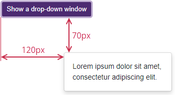
The DropDown recalculates its position when certain page elements are changed (for instance, when the page is scrolled or resized). You can call the RepositionAsync method to force the DropDown to recalculate its position.
Position Restrictions
Use the RestrictionMode property to specify an element that restricts the DropDown position. The available options are as follows:
- Viewport
- The drop-down window position is restricted by the viewport.
- Page
- The drop-down window position is restricted by the page.
- Rectangle
- The drop-down window position is restricted by a rectangle’s boundaries (RestrictionRectangle).
- TargetElement
- The drop-down window position is restricted by a target element’s boundaries (RestrictionTarget).
The PositionMode and FitToRestriction properties determine how the DropDown behaves to fit the specified boundaries. When the component does not fit the restrictions, it can be hidden or closed, based on the CloseMode property value.
<OptionsContent>
    <OptionComboBox Label="Close mode:" CssClass="ow-100" Data="@CloseModeSource" @bind-Value="@CloseMode"/>
    <OptionCheckBox Label="Fit to container" @bind-Checked="FitToRestriction"/>
</OptionsContent>
@* ... *@
        <DxDropDown
            @bind-IsOpen="@IsOpen"
            Id="dropDown-flipping"
            CloseOnOutsideClick="false"
            PositionMode="DropDownPositionMode.Bottom"
            PositionTarget=".flipping-button"
            RestrictionTarget=".flipping-overflow-container"
            RestrictionMode="DropDownRestrictionMode.TargetElement"
            PreventCloseOnPositionTargetClick="true"
            CloseMode="@CloseMode"
            FitToRestriction="@FitToRestriction"
            FooterVisible="true"
            SizeMode="Params.SizeMode"
            Width="240">
            <BodyContentTemplate>
                <span class="fs-75">@Constants.ContentShort</span>
            </BodyContentTemplate>
            <FooterContentTemplate>
                <DxButton CssClass="popup-button my-1 ms-2" RenderStyle="ButtonRenderStyle.Primary" Text="OK" Click="@context.CloseCallback" />
            </FooterContentTemplate>
        </DxDropDown>
        @* ... *@
@code {
@* ... *@
    DropDownCloseMode[] CloseModeSource { get; } = Enum.GetValues<DropDownCloseMode>();
    DropDownCloseMode CloseMode { get; set; } = DropDownCloseMode.Hide;
    @* ... *@
}
Keyboard Navigation
When FocusOnOpen is true, the drop-down window receives focus when it opens. On mobile and tablet devices, focus moves to the drop-down window. On desktop devices, focus moves to the first interactive element in the drop-down window.
Users can navigate through the component’s controls with keyboard shortcuts when the DropDown has focus. The component supports keyboard navigation on the client and server.
| Shortcut Keys | Description |
|---|---|
| Tab | Moves focus forward through interactive DropDown elements. After the last element, moves focus to the first interactive DropDown element. |
| Shift + Tab | Moves focus backward through interactive DropDown elements. After the first element, moves focus to the last interactive DropDown element. |
| Esc | Closes the DropDown. |
Note
Keyboard support allows users to interact with application content in cases they cannot use a mouse or they rely on assistive technologies (like screen readers or switch devices). Refer to the Accessibility help topic for information on other accessibility areas that we address.
Accessibility Information
The DropDown component is always assigned the dialog role. This informs assistive technologies that the component is separated from the rest of the page.
Note
The DropDown’s role attribute cannot be changed.
The drop-down window’s accessible name is taken from its header element through the aria-labelledby attribute. If you customize the header’s content area with the HeaderContentTemplate property, you must label the component. Pass the following ARIA attributes to the DropDown’s Attributes property:
- aria-labelledby – References the ID of another element (usually the visible drop-down window title) that defines the accessible name. This is the preferred method.
- aria-label – Specify a string value that is used as the accessible name. Use this when a drop-down window header element has no visible text, or when its text does not properly describe the drop-down window’s purpose.
<DxDropDown @bind-IsOpen="IsOpen"
            HeaderVisible="true"
            aria-labelledby="my-custom-dropdown-header">
    <HeaderContentTemplate>
        <h2 id="my-custom-dropdown-header">Accessible Dropdown</h2>
    </HeaderContentTemplate>
    <BodyContentTemplate>
        @* ... *@
    </BodyContentTemplate>
</DxDropDown>
Troubleshooting
If a Blazor application throws unexpected exceptions, refer to the following help topic: Troubleshooting.