DxDropDownButton Class
A toggleable button that reveals a drop-down element with a list of commands or custom content.
Namespace: DevExpress.Blazor
Assembly: DevExpress.Blazor.v26.1.dll
Declaration
public class DxDropDownButton :
    DxDropDownButtonBase
Remarks
The DevExpress Drop-Down Button component for Blazor (<DxDropDownButton>) combines the functionality of a button and a drop-down. Once a user clicks the main button, the drop-down window displays either a command list or custom content. You can apply a predefined style to the main button and customize the component’s layout and appearance.

Add a Drop-Down Button to a Project
Follow the steps below to add a Drop-Down Button component to an application:
- Create a Blazor Server or Blazor WebAssembly application.
- Add the following markup to a
.razorfile:<DxDropDownButton>…</DxDropDownButton>. - Specify the drop-down window’s content. You can populate the window with a list of commands or display custom content.
- Customize component appearance.
- Optional. Specify the button text.
API Reference
Refer to the following list for the component API reference: DxDropDownButton Members.
Static Render Mode Specifics
Blazor Drop-Down Button does not support static render mode. Enable interactivity to use the component in your application. Refer to the following topic for more details: Enable Interactive Render Mode.
Drop-Down List
The <DxDropDownButton> component supports unbound mode only. Add DxDropDownButtonItem objects to the component markup and use the Items property to specify a collection of root items. Each item can contain child items.
When a user clicks a drop-down list item, the drop-down menu closes. To change this behavior, set the CloseDropDownOnItemClick property to false.
Item Groups
You can display horizontal lines within the menu to separate items into groups. To start a new group, set the item’s BeginGroup property to true.
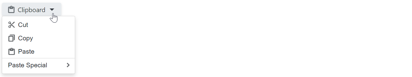
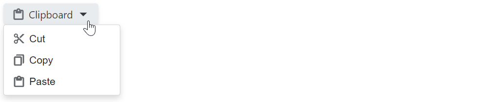
@using DevExpress.Images.Blazor

<DxDropDownButton RenderStyle="ButtonRenderStyle.Secondary"
                  Text="Clipboard"
                  IconUrl="@Icon.Clipboard">
    <Items>
        <DxDropDownButtonItem Text="Cut"  IconUrl="@Icon.Cut" />
        <DxDropDownButtonItem Text="Copy" IconUrl="@Icon.Copy" />
        <DxDropDownButtonItem Text="Paste" IconUrl="@Icon.ClipboardPaste" />
        <DxDropDownButtonItem Text="Paste Special" BeginGroup="true">
            <Items>
                <DxDropDownButtonItem Text="Paste Text Only" />
                <DxDropDownButtonItem Text="Paste Picture" Enabled="false" />
                <DxDropDownButtonItem Text="Paste as Hyperlink" />
            </Items>
        </DxDropDownButtonItem>
    </Items>
</DxDropDownButton>
Items with Hyperlinks
Use the NavigateUrl property to specify a URL where the web browser navigates when the drop-down list item is clicked. To specify where the browser should open the URL (for example, the current window or a new tab), use the Target property.
The following code snippet opens the Documentation item’s NavigateUrl link in the same tab and the Demos item’s link in a new tab:
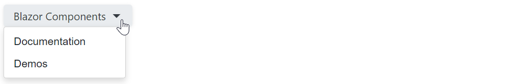
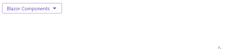
<DxDropDownButton Text="Blazor Components"
                  RenderStyleMode="ButtonRenderStyleMode.Outline" >
    <Items>
        <DxDropDownButtonItem Text="Documentation"
                              NavigateUrl="https://docs.devexpress.com/Blazor/400725/blazor-components" />
        <DxDropDownButtonItem Text="Demos"
                              NavigateUrl="https://demos.devexpress.com/blazor/"
                              Target="_blank" />
    </Items>
</DxDropDownButton>
Items with Custom Drop-Down Content
Use the item’s DropDownContentTemplate property to display custom content within the item’s drop-down window.

<DxDropDownButton Text="Blazor Components"
                  RenderStyle="ButtonRenderStyle.Secondary">
    <Items>
        <DxDropDownButtonItem Text="Documentation" />
        <DxDropDownButtonItem Text="Demos" />
        <DxDropDownButtonItem Text="Click to search">
            <DropDownContentTemplate>
                <div>
                    <DxSearchBox aria-label="Search" />
                </div>
            </DropDownContentTemplate>
        </DxDropDownButtonItem>
    </Items>
</DxDropDownButton>
Click Events
Use the component’s ItemClick event to specify a common click handler for all drop-down list items. To react to an individual item click, handle the item’s Click event.
@inject IJSRuntime JSRuntime
@using DevExpress.Images.Blazor

<p>The clicked item is @ClickedItem</p>

<DxDropDownButton RenderStyle="ButtonRenderStyle.Secondary"
                  Text="Clipboard"
                  IconUrl="@Icon.Clipboard"
                  ItemClick="@OnItemCommonClick">
    <Items>
        <DxDropDownButtonItem Text="Cut"
                              IconUrl="@Icon.Cut"
                              Click="@OnCutItemClick" />
        <DxDropDownButtonItem Text="Copy"
                              IconUrl="@Icon.Copy"
                              Click="@OnCopyItemClick" />
        <DxDropDownButtonItem Text="Paste"
                              IconUrl="@Icon.ClipboardPaste" />
    </Items>
</DxDropDownButton>

@code {
    public string ClickedItem { get; set; } = "";

    void OnCutItemClick(MouseEventArgs args) {
        ClickedItem = "Cut";
    }
    void OnCopyItemClick(MouseEventArgs args) {
        ClickedItem = "Copy";
    }

    async Task OnItemCommonClick(DropDownButtonItemClickEventArgs args) {
        await JSRuntime.InvokeVoidAsync("alert", $"The drop-down button item has been clicked.");
    }
}
Custom Drop-Down Window Content
The <DxDropDownButton> component can display a drop-down window with custom content. Specify the component’s DropDownContentTemplate property to customize the drop-down window’s layout and appearance.
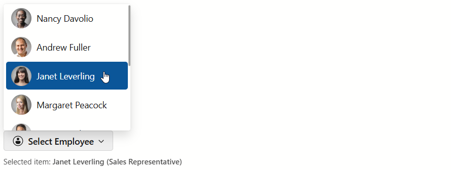
@inject NwindDataService NwindDataService

<DxDropDownButton RenderStyle="ButtonRenderStyle.Secondary"
                  Text="Select Employee"
                  CssClass="me-1"
                  IconCssClass="menu-icon-user-profile menu-icon"
                  DropDownVisible="DropDownVisible">
    <DropDownContentTemplate>
        <DxListBox Data="@Data"
                   @bind-Value="@Value"
                   CssClass="cw-640 ch-360">
            <ItemDisplayTemplate>
                <div class="listbox-item-template">
                    <img src="@StaticAssetUtils.GetImagePath(GetImageFileName(context.DataItem))"
                         alt="@context.DataItem.FullName"/>
                    <span class="listbox-item-template-name">@context.DataItem.FullName</span>
                </div>
            </ItemDisplayTemplate>
        </DxListBox>
    </DropDownContentTemplate>
</DxDropDownButton>
<p class="demo-text cw-400 mt-2">
    Selected item: <b>@Value?.Text</b>
</p>

@code {
    IEnumerable<Employee> Data { get; set; }
    bool DropDownVisible { get; set; }
    Employee Value { get; set; }
    protected override async Task OnInitializedAsync() {
        Data = await NwindDataService.GetEmployeesAsync();
        Value = Data.FirstOrDefault();
        DropDownVisible = false;
    }
    string GetImageFileName(Employee employee) {
        return $"employees/item-template{employee.EmployeeId}.jpg";
    }
}
Size Modes
Use the SizeMode property to specify <DxDropDownButton> component size in code. The following code snippet applies different size modes to Drop-Down Button components:
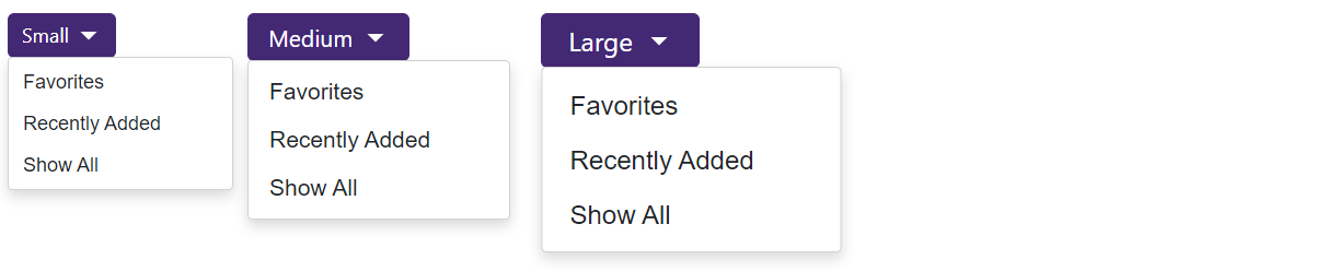
<DxDropDownButton Text="Small" SizeMode="SizeMode.Small">
    <Items>
        <DxDropDownButtonItem Text="Favorites" />
        <DxDropDownButtonItem Text="Recently Added" />
        <DxDropDownButtonItem Text="Show All" />
    </Items>
</DxDropDownButton>
<DxDropDownButton Text="Medium" SizeMode="SizeMode.Medium">
    <Items>
        <DxDropDownButtonItem Text="Favorites" />
        <DxDropDownButtonItem Text="Recently Added" />
        <DxDropDownButtonItem Text="Show All" />
    </Items>
</DxDropDownButton>
<DxDropDownButton Text="Large" SizeMode="SizeMode.Large">
    <Items>
        <DxDropDownButtonItem Text="Favorites" />
        <DxDropDownButtonItem Text="Recently Added" />
        <DxDropDownButtonItem Text="Show All" />
    </Items>
</DxDropDownButton>
Customization
This section describes how you can customize the <DxDropDownButton> component and its elements.
Predefined Styles
The <DxDropDownButton> component allows you to stylize the main button with predefined styles. You can use the following properties:
- RenderStyle
- Specifies the drop-down button’s predefined style.
- RenderStyleMode
- Specifies the drop-down button’s color filling type.

<DxDropDownButton RenderStyle="ButtonRenderStyle.Primary"
                  RenderStyleMode="ButtonRenderStyleMode.Contained"
                  Text="Primary (Contained)">
    @* ... *@
</DxDropDownButton>
<DxDropDownButton RenderStyle="ButtonRenderStyle.Danger"
                  RenderStyleMode="ButtonRenderStyleMode.Outline"
                  Text="Danger (Outline)">
    @* ... *@
</DxDropDownButton>
<DxDropDownButton RenderStyle="ButtonRenderStyle.Link"
                  RenderStyleMode="ButtonRenderStyleMode.Contained"
                  Text="Link">
    @* ... *@
</DxDropDownButton>
Icons
The <DxDropDownButton> component allows you to add icons to the main button and its nested items. The following properties are available:
- IconCssClass
- Specifies the icon’s CSS class.
- IconPosition
- Specifies the icon’s position.
@using DevExpress.Images.Blazor

<DxDropDownButton RenderStyle="ButtonRenderStyle.Secondary"
                  Text="Clipboard"
                  IconUrl="@Icon.Clipboard">
    <Items>
        <DxDropDownButtonItem Text="Cut" IconUrl="@Icon.Cut" />
        <DxDropDownButtonItem Text="Copy" IconUrl="@Icon.Copy" />
        <DxDropDownButtonItem Text="Paste" IconUrl="@Icon.ClipboardPaste" />
    </Items>
</DxDropDownButton>
Drop-Down Elements
The <DxDropDownButton> component displays the drop-down toggle icon if a command reveals the drop-down element. You can use the DropDownToggleCssClass property to customize toggle appearance. To hide the toggle icon, set the DropDownToggleVisible property to false.
You can also configure settings of drop-down elements. The following properties are available:
- DropDownCssClass
- Assigns a CSS class to the drop-down element
- DropDownPosition
- Specifies the drop-down element’s position relative to the target element.
- DropDownDisplayMode
- Specifies how the Drop-Down Button component displays its drop-down elements.
- OpenDropDownOnItemClick
- Specifies whether to open a drop-down element on item click in
DropDowndisplay mode on desktop devices.
The following code snippet changes the position of the main drop-down element in the DxDropDownButton component and customizes the drop-down toggle icon:

<DxDropDownButton Text="Blazor Components"
                  RenderStyleMode="ButtonRenderStyleMode.Outline"
                  DropDownToggleCssClass="toggle-icon"
                  DropDownPosition="DropDownPosition.Right">
    <Items>
        <DxDropDownButtonItem Text="Documentation"
                              NavigateUrl="https://docs.devexpress.com/Blazor/400725/blazor-components" />
        <DxDropDownButtonItem Text="Demos"
                              NavigateUrl="https://demos.devexpress.com/blazor/" />
    </Items>
</DxDropDownButton>
Tooltips
Use the Tooltip property to specify tooltip text for the main button or a drop-down list item.
<DxDropDownButton Text="Blazor Components"
                  RenderStyleMode="ButtonRenderStyleMode.Outline"
                  Tooltip="Click to see possible options">
    <Items>
        <DxDropDownButtonItem Text="Documentation"
                              NavigateUrl="https://docs.devexpress.com/Blazor/400725/blazor-components"
                              Tooltip="This item contains a link" />
        <DxDropDownButtonItem Text="Demos"
                              NavigateUrl="https://demos.devexpress.com/blazor/"
                              Tooltip="This item contains a link" />
    </Items>
</DxDropDownButton>
Keyboard Navigation
The DevExpress Blazor Drop-Down Button component supports keyboard shortcuts that allow users to access a drop-down element and navigate through drop-down list items.
Note
Keyboard support allows users to interact with application content in cases they cannot use a mouse or they rely on assistive technologies (like screen readers or switch devices). Refer to the Accessibility help topic for information on other accessibility areas that we address.
The following shortcut keys are available:
| Shortcut Keys | Description |
|---|---|
| Tab, Shift+Tab | When the Drop-Down Button is focused, moves focus to the next/previous focusable element on a page. |
| Enter, Space Alt+Down Arrow |
Opens a drop-down window and moves focus to its first item. |
| Right Arrow | For drop-down list items: Opens a drop-down window and moves focus to its first item. |
| Alt+Up Arrow | Closes all drop-down windows and moves focus to the main button. |
| Esc | Closes the current drop-down window and moves focus to the corresponding root item (or main button). |
| Left Arrow | For drop-down list items: Closes the current drop-down window and moves focus to the corresponding root item. |
| Down Arrow | Moves focus to the next drop-down list item. |
| Up Arrow | Moves focus to the previous drop-down list item. |
Troubleshooting
If a Blazor application throws unexpected exceptions, refer to the following help topic: Troubleshooting.