DxBarGauge Class
A component that visualizes data as circular bars where each bar indicates a single value.
Namespace: DevExpress.Blazor
Assembly: DevExpress.Blazor.v26.1.dll
Declaration
public class DxBarGauge :
    GaugeBase,
    IModelProvider<BarGaugeLegendSettingsModel>,
    IModelProvider<BarGaugeLabelSettingsModel>
Remarks
The DevExpress Bar Gauge for Blazor (<DxBarGauge>) displays data as circular bars where each bar indicates a single value. The Bar Gauge allows you to configure its geometry and layout settings, customize visual elements, and apply a custom color scheme. The component also supports export and printing functionality, and real-time data updates.

Add a Bar Gauge to a Project
Follow the steps below to add a Bar Gauge component to an application:
- Create a Blazor Server or Blazor WebAssembly application.
- Add the following markup to a
.razorfile:<DxBarGauge>…</DxBarGauge>. - Specify the Values property to bind the component to data.
- Configure the component’s visual elements (see sections below).
API Reference
Refer to the following list for the component API reference: DxBarGauge Members.
Static Render Mode Specifics
Blazor Bar Gauge responds to data updates and supports user interaction when you enable interactive render mode. In static render mode, Bar Gauge can only display data as static images.
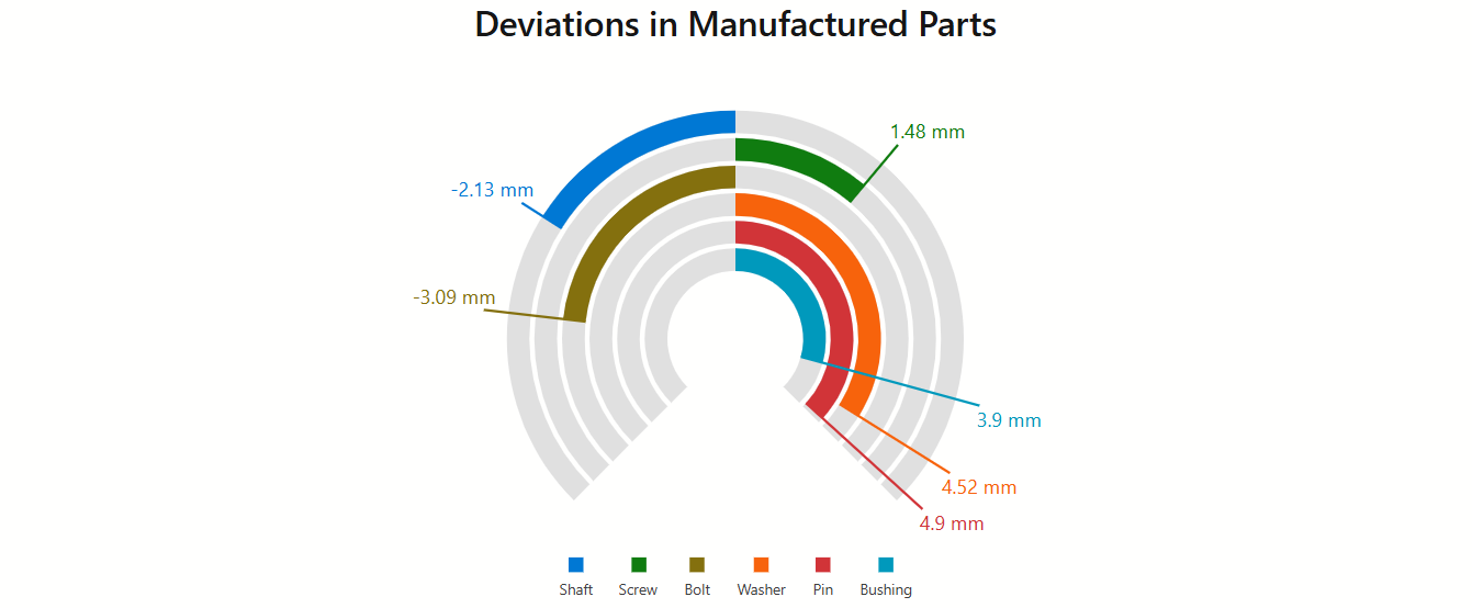
Bars
The <DxBarGauge> component displays data as circular bars. Each bar consists of a colored part that indicates a value and the background track that indicates the value range. To display data, assign an array of values to the Values property.
<DxBarGauge Width="100%"
            Height="500px"
            StartValue="-5"
            EndValue="5"
            Values="@Values">
    @* ... *@
</DxBarGauge>

@code {
    double[] Values = new double[] { -2.13, 1.48, -3.09, 4.52, 4.9, 3.9 };
    // ...
}
Scale Range
<DxBarGauge> renders bars from the beginning of the gauge’s scale. To define the scale range, use StartValue and EndValue properties. You can also specify the BaseValue property to shift the bar origin.
The following code snippet changes the bar gauge’s scale range and sets the base value:
<DxBarGauge Width="100%"
            Height="500px"
            StartValue="-5"
            EndValue="5"
            BaseValue="0"
            Values="@Values">
    @* ... *@
</DxBarGauge>

@code {
    double[] Values = new double[] { -2.13, 1.48, -3.09, 4.52, 4.9, 3.9 };
    // ...
}
Arrangement and Geometry
<DxBarGauge> allows you to customize bar arrangement. You can use the following properties:
- BarSpacing
- Specifies the distance between bars.
- InnerRadius
- Specifies the relative radius of the innermost circular bar.
Additionally, you can add a DxGaugeGeometrySettings object to bar gauge markup to customize the gauge arc’s shape. DxGaugeGeometrySettings.StartAngle and DxGaugeGeometrySettings.EndAngle properties are available.
The following code snippet changes the shape of the DxBarGauge‘s arc to a circle:
<DxBarGauge Width="100%"
            Height="300px"
            StartValue="0"
            EndValue="100"
            Values="@Values">
    <DxGaugeGeometrySettings StartAngle="-90"
                             EndAngle="270"/>
    @* ...*@
</DxBarGauge>

@code {
    double[] Values = new double[] { 47.27, 65.32, 84.59, 81.86, 99 };
}
Labels
Add a DxBarGaugeLabelSettings object to bar gauge markup to configure bar labels. You can specify object root-level properties (for example, ConnectorColor or Indent ) or add and configure the following nested objects:
- DxFontSettings
- Contains the element’s font settings.
- DxTextFormatSettings
- Contains the element’s format settings.
Additionally, you can use the DxBarGauge.LabelOverlap property to specify how the Bar Gauge resolves label overlap.
To hide bar labels, set the DxBarGaugeLabelSettings.Visible property to false.
The following code snippet configures DxBarGauge labels:
<DxBarGauge Width="100%"
            Height="500px"
            StartValue="0"
            EndValue="100"
            Values="@Values">
    <DxBarGaugeLabelSettings Indent="30"
                             ConnectorColor="var(--dxds-primary-90)"
                             ConnectorWidth="4">
        <DxFontSettings Weight="600" />
        <DxTextFormatSettings LdmlString="@LabelFormat" />
    </DxBarGaugeLabelSettings>
    @* ... *@
</DxBarGauge>

@code {
    double[] Values = new double[] { 47.27, 65.32, 84.59, 81.86, 99 };
    string LabelFormat = "##.#'%' ";
    // ...
}
Refer to the DxBarGaugeLabelSettings class description for additional information.
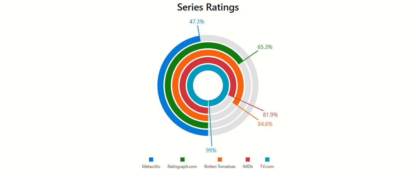
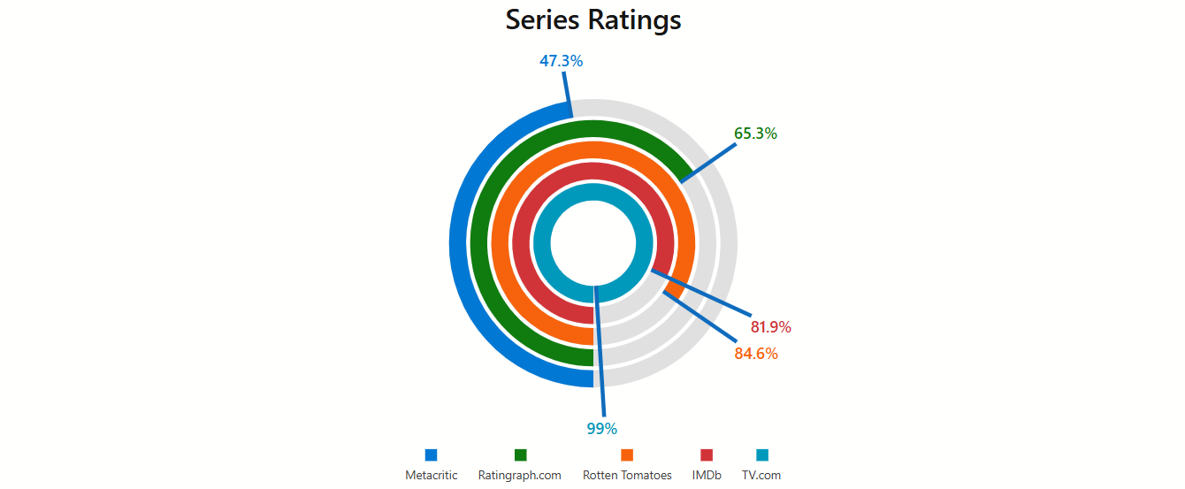
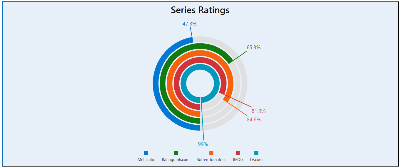
Legend
The bar gauge legend helps a user identify bars. The legend displays items (one per a bar) that consist of a marker and caption. Follow the steps below to create and display a legend:
- Add a DxBarGaugeLegendSettings object to bar gauge markup.
- Enable the DxBarGaugeLegendSettings.Visible property.
- Optional. Configure legend settings. You can specify root-level properties (for example, Orientation or ItemCaptions ) or add and configure the legend’s nested objects.
The following code snippet adds a legend to the DxBarGauge component and configures legend settings:
<DxBarGauge Width="100%"
            Height="500px"
            StartValue="0"
            EndValue="100"
            Values="@Values">
    <DxBarGaugeLegendSettings Visible="true"
                              ItemCaptions="@LegendItemCaptions"
                              VerticalAlignment="VerticalEdge.Bottom"
                              HorizontalAlignment="HorizontalAlignment.Center">
        <DxLegendTitleSettings Text="Series">
            <DxFontSettings Color="var(--dxds-primary-90)" Weight="700" />
        </DxLegendTitleSettings>
        <DxBorderSettings Visible="true" Color="var(--dxds-primary-90)" />
        <DxFontSettings Weight="300" />
        <DxMarginSettings Top="30" />
    </DxBarGaugeLegendSettings>
    @* ... *@
</DxBarGauge>

@code {
    double[] Values = new double[] { 47.27, 65.32, 84.59, 81.86, 99 };
    string[] LegendItemCaptions = new string[] { "Metacritic", "Ratingraph.com", "Rotten Tomatoes", "IMDb", "TV.com" };
}
Refer to the DxBarGaugeLegendSettings class description for additional information.
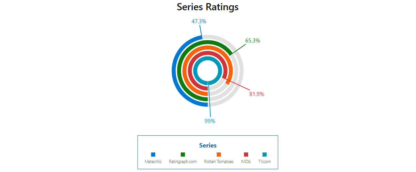
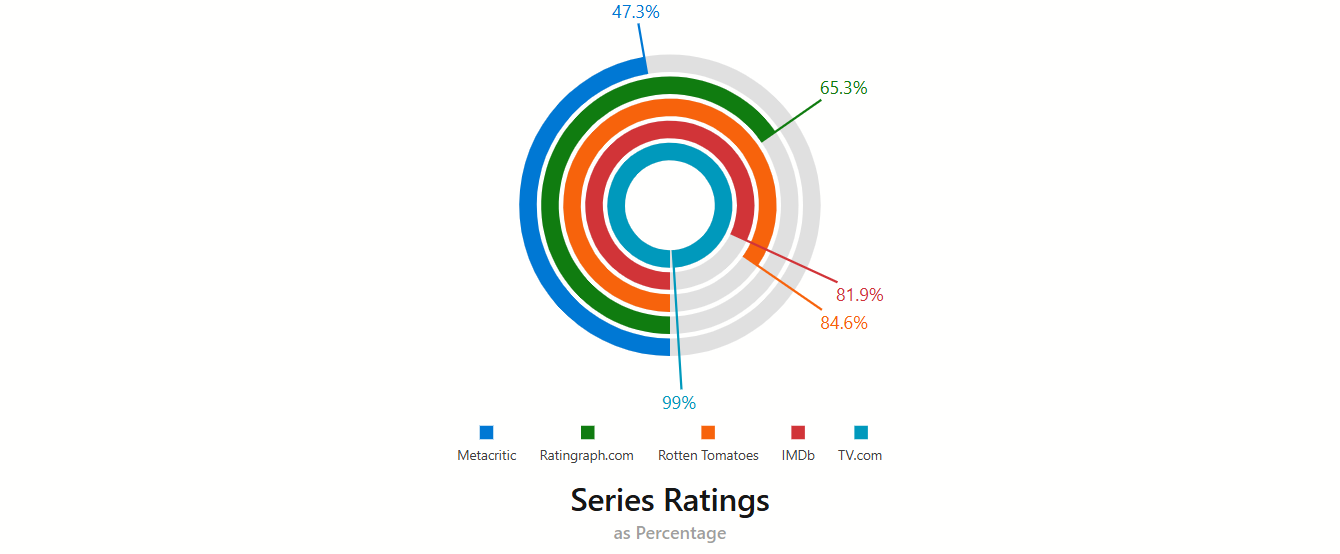
Titles and Subtitles
The <DxBarGauge> component can display titles and subtitles for the bar gauge area and legend. Add the following objects to component markup to configure title and subtitle settings:
- DxTitleSettings
- Contains title settings.
- DxSubtitleSettings
- Contains subtitle settings.
- DxLegendTitleSettings
- Contains settings for the legend title.
- DxLegendSubtitleSettings
- Contains settings for the legend subtitle.
The following code snippet customizes the Bar Gauge‘s title and subtitle:
<DxBarGauge Width="100%"
            Height="500px"
            StartValue="0"
            EndValue="100"
            Values="@Values">
    <DxTitleSettings Text="Series Ratings"
                     VerticalAlignment="VerticalEdge.Bottom">
        <DxFontSettings Size="28" Weight="600" />
        <DxSubtitleSettings Text="as Percentage">
            <DxFontSettings Opacity="0.5" Weight="500" />
        </DxSubtitleSettings>
    </DxTitleSettings>
    @* ... *@
</DxBarGauge>

@code {
    double[] Values = new double[] { 47.27, 65.32, 84.59, 81.86, 99 };
    // ...
}
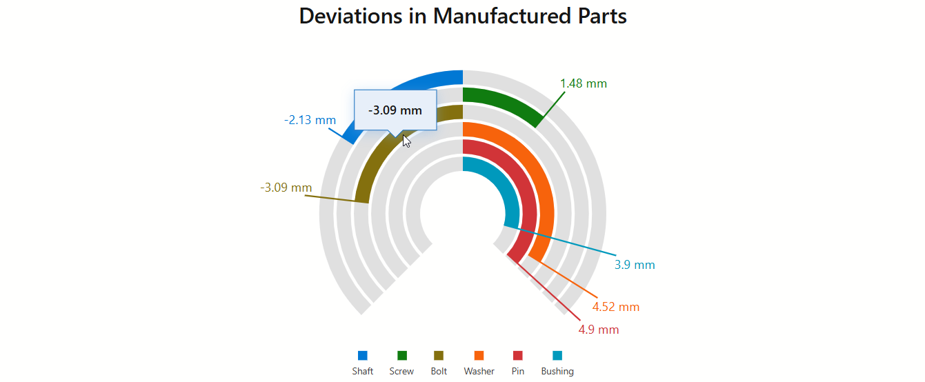
Tooltips
The DxBarGuage component displays tooltips when a user hovers a mouse pointer over bars. To create tooltips, follow the steps below:
- Add a DxTooltipSettings object to bar gauge markup.
- Set the DxTooltipSettings.Enabled property to
true. - Optional. Configure tooltip settings. You can specify root-level properties (for example, Color or CornerRadius ) or add and configure nested objects.
The following code snippet configures tooltips in the DxBarGauge component:
<DxBarGauge Width="100%"
            Height="100%"
            StartValue="-5"
            EndValue="5"
            BaseValue="0"
            Values="@Values">
    @* ... *@
    <DxTooltipSettings Enabled="true" Color="var(--dxds-primary-10)">
        <DxFontSettings Size="16"
                        Weight="600" />
        <DxTextFormatSettings LdmlString="@LabelFormat" />
        <DxShadowSettings Blur="8"
                          Color="var(--dxds-primary-50)" />
        <DxBorderSettings LineStyle="LineStyle.Solid"
                          Width="1"
                          Color="var(--dxds-primary-90)" />
    </DxTooltipSettings>
</DxBarGauge>

@code {
    double[] Values = new double[] { -2.13, 1.48, -3.09, 4.52, 4.9, 3.9 };
    string[] LegendItemCaptions = new string[] { "Shaft", "Screw", "Bolt", "Washer", "Pin", "Bushing" };
    string LabelFormat = "##.## mm;-##.## mm";
}
Refer to the DxTooltipSettings class description for additional information.
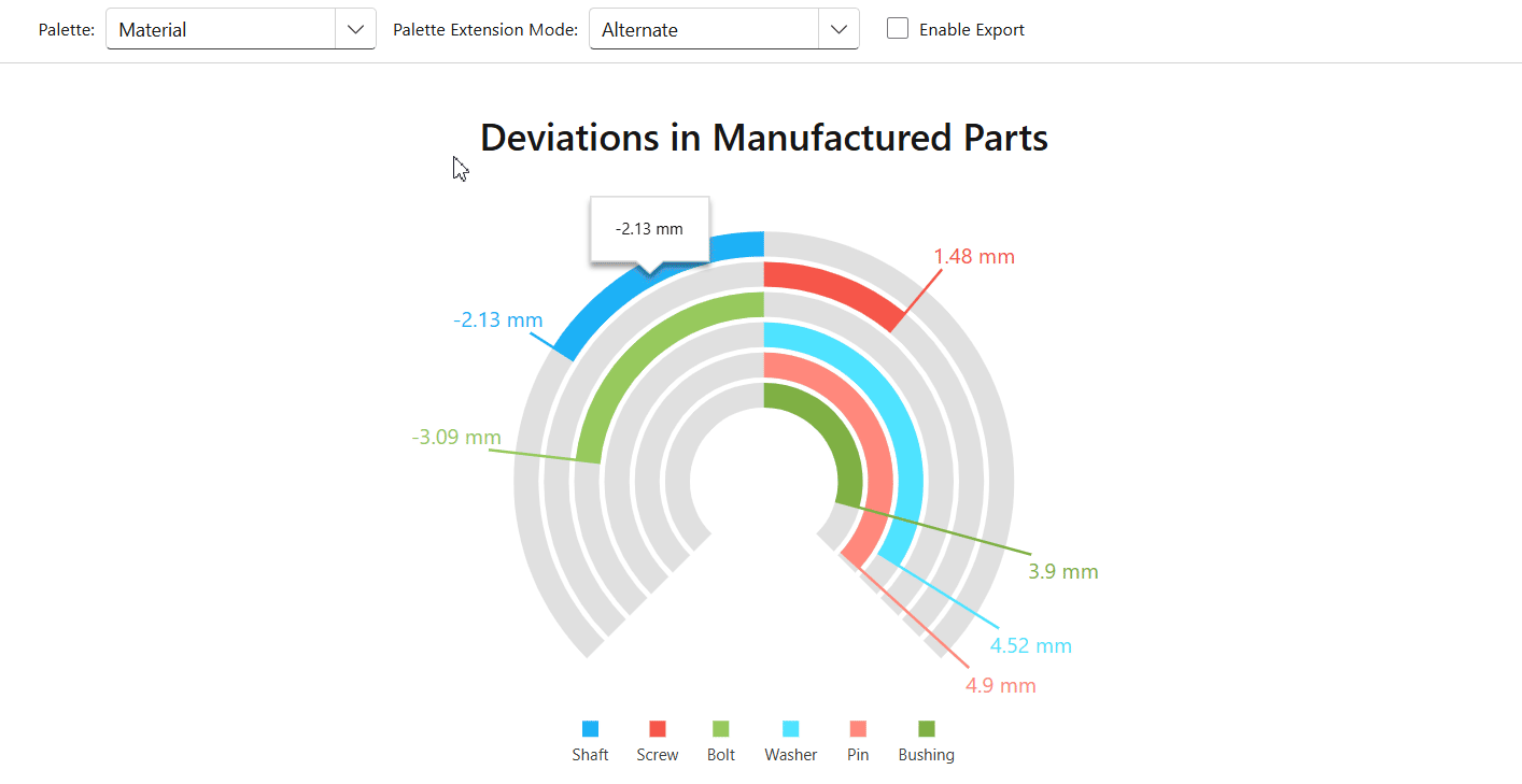
Customization
This section describes settings that allow you to customize the appearance of the bar gauge component and its container.
Palette
<DxBarGauge> allows you to create a custom palette for bars. To apply a palette, assign it to the Palette property.
When the number of bars exceeds the number of palette colors, you can use the PaletteExtensionMode property to specify how to extend the palette.
The following example uses drop-down menus to change the color palette and its extension mode in DxBarGauge:
<DxBarGauge Width="100%"
            Height="500px"
            StartValue="-5"
            EndValue="5"
            BaseValue="0"
            PaletteExtensionMode="@CurrentPaletteMode"
            Palette="@Colors[CurrentPalette]"
            Values="@Values">
    @* ... *@
</DxBarGauge>

@code {
    public enum Palettes {
        Material,
        Bootstrap,
        Tailwind
    }
    Dictionary<Palettes, string[]> Colors = new Dictionary<Palettes, string[]>() {
        { Palettes.Material, new string[] { "#1db2f5", "#f5564a", "#97c95c" } },
        { Palettes.Bootstrap, new string[] { "#0d6efd", "#6c757d", "#28a745" } },
        { Palettes.Tailwind, new string[] { "#ef4444", "#eab308", "#22c55e" } }
    };
    Palettes CurrentPalette = Palettes.Material;
    PaletteExtensionMode CurrentPaletteMode = PaletteExtensionMode.Alternate;
    double[] Values = new double[] { -2.13, 1.48, -3.09, 4.52, 4.9, 3.9 };
    // ...
}
Additionally, you can specify the BackgroundColor property to customize the bar background color.
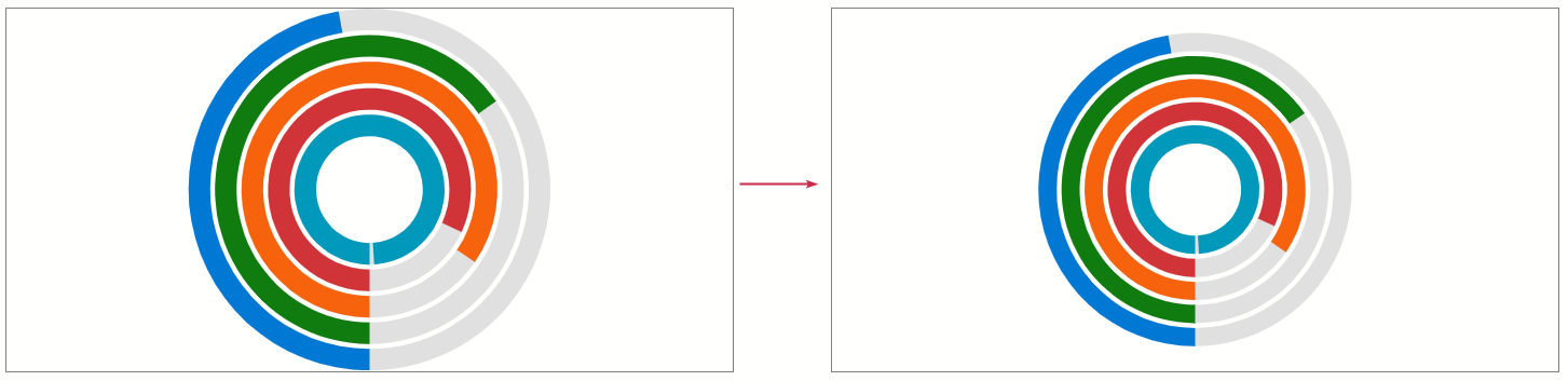
Size
Use Height and Width properties to specify the size of the component container. When the container size changes at runtime, the component is redrawn. To disable this behavior, set the RedrawOnResize property to false.
You can also use a DxMarginSettings object to add margins between the widget and container borders.
The following code snippet sets the bar gauge size and configures margin settings:
<DxBarGauge Width="600px"
            Height="300px"
            StartValue="0"
            EndValue="100"
            CssClass="myCssClass"
            Values="@Values">
    <@* ... *@
    <DxMarginSettings Top="20" Right="30" Bottom="20" Left="30"/>
</DxBarGauge>

@code {
    double[] Values = new double[] { 47.27, 65.32, 84.59, 81.86, 99 };
    // ...
}
CSS Customization
Use the CssClass property to customize the appearance of the component’s container. The following code snippet adds borders to the bar gauge container and sets its background color:
<DxBarGauge Width="600px"
            Height="300px"
            StartValue="0"
            EndValue="100"
            CssClass="myCssClass"
            Values="@Values">
    <@* ... *@
</DxBarGauge>

@code {
    double[] Values = new double[] { 47.27, 65.32, 84.59, 81.86, 99 };
    // ...
}
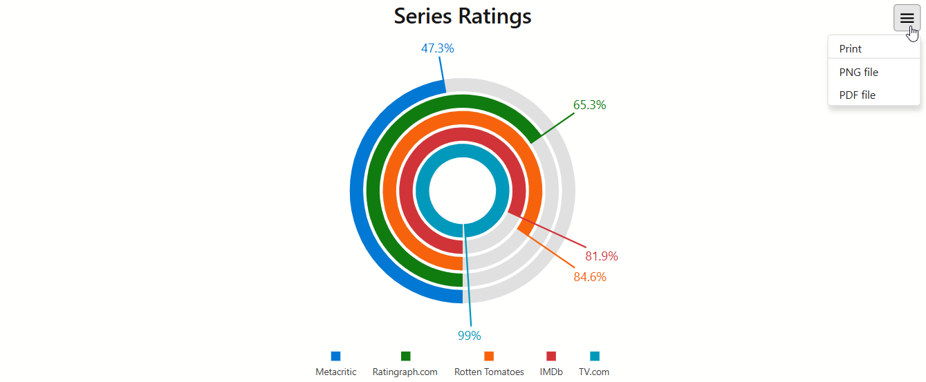
Export and Printing
<DxBarGauge> allows you to export and print its data. Call the PrintAsync() method to invoke the browser’s Print dialog.
To export bar gauge data, call the ExportToAsync(String, DataExportFormat) method. After the file is exported, the component raises the Exported event.
<DxBarGauge> also allows you to get its SVG markup with a GetSvgMarkupAsync() method call.
The following code snippet displays a custom Export to PDF button that exports component data to a PDF file. The Exported event is handled to show information about the exported file:
@inject IJSRuntime JSRuntime

<DxBarGauge Width="100%"
            Height="500px"
            @ref="@BarGauge"
            Exported="@OnExported"
            StartValue="-5"
            EndValue="5"
            BaseValue="0"
            Values="@Values">
    @* ...*@
</DxBarGauge>

<DxButton Text="Export to PDF" Click="@ExportToPdf" />

@code {
    DxBarGauge BarGauge;
    string fileName = "Custom PDF";

    async Task ExportToPdf() {
        await BarGauge.ExportToAsync(fileName, DataExportFormat.Pdf);
    }
    async Task OnExported() {
        await JSRuntime.InvokeVoidAsync("alert", $"The Bar Gauge is exported to the {fileName} file.");
    }

    double[] Values = new double[] { -2.13, 1.48, -3.09, 4.52, 4.9, 3.9 };
    // ...
}
The component also allows you to display the Export hamburger menu with export and print commands. To activate this functionality, add a DxExportSettings object to component markup and set its Enabled property to true.
The following code snippet customizes the Export hamburger menu in the DxBarGauge component and specifies the name of the exported file:
    <DxBarGauge Width="100%"
                Height="100%"
                StartValue="0"
                EndValue="100"
                Values="@Values">
        <DxExportSettings Enabled="true"
                          FileName="My file"
                          Formats="@exportFormats" />
        @* ... *@
    </DxBarGauge>
</div>

@code {
    double[] Values = new double[] { 47.27, 65.32, 84.59, 81.86, 99 };
    string LabelFormat = "##.#'%' ";
    string[] LegendItemCaptions = new string[] { "Metacritic", "Ratingraph.com", "Rotten Tomatoes", "IMDb", "TV.com" };
    DataExportFormat[] exportFormats = new DataExportFormat[] {
        DataExportFormat.Png,
        DataExportFormat.Pdf};
}
Troubleshooting
If a Blazor application throws unexpected exceptions, refer to the following help topic: Troubleshooting.