DxPopupBase.SizeMode Property
Specifies the size of the component and its content.
Namespace: DevExpress.Blazor
Assembly: DevExpress.Blazor.v26.1.dll
Declaration
[DefaultValue(null)]
[Parameter]
public SizeMode? SizeMode { get; set; }
Property Value
| Type | Default | Description |
|---|---|---|
| Nullable<SizeMode> | null | The size mode. If the property is not specified (the value is |
Available values:
| Name | Description |
|---|---|
| Small | Small size. |
| Medium | Medium size. |
| Large | Large size. |
Remarks
The SizeMode property allows you to apply different size modes to the DxPopup component and its content. For additional information, refer to the following topic: Size Modes.
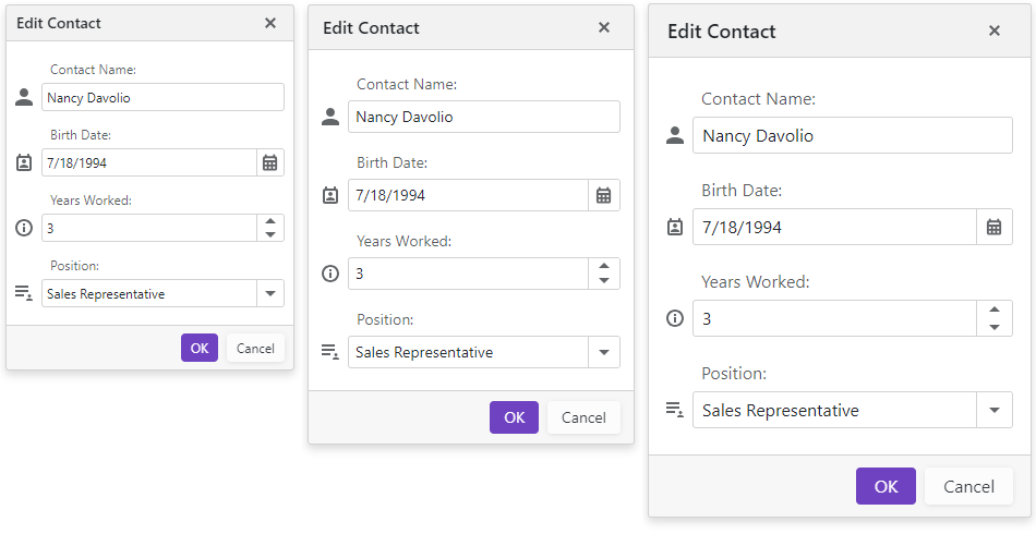
The following code snippet applies the Large size mode to the DxPopup component.
<div class="target-container" @onclick="@(() => PopupVisible = true)">
    <p class="target-caption">CLICK TO SHOW A POP-UP WINDOW</p>
</div>
<DxPopup @bind-Visible="@PopupVisible"
         ShowFooter="true"
         HeaderText="Edit Contact"
         SizeMode="SizeMode.Large">
    <BodyContentTemplate>
        <SampleEditForm/>
    </BodyContentTemplate>
    <FooterContentTemplate>
        <DxButton RenderStyle="ButtonRenderStyle.Primary" Text="OK" Click="@(() => PopupVisible = false)" />
        <DxButton RenderStyle="ButtonRenderStyle.Secondary" Text="Cancel" Click="@(() => PopupVisible = false)" />
    </FooterContentTemplate>
</DxPopup>

@code {
    bool PopupVisible { get; set; }
}
See Also