DxDropDownButtonItem.BeginGroup Property
Specifies whether to display the group separator before the item.
Namespace: DevExpress.Blazor
Assembly: DevExpress.Blazor.v26.1.dll
Declaration
[DefaultValue(false)]
[Parameter]
public bool BeginGroup { get; set; }
Property Value
| Type | Default | Description |
|---|---|---|
| Boolean | false |
|
Remarks
DxDropDownButton and DxSplitButton components can display drop-down menus. You can display horizontal lines within the menu to separate items into groups. To start a new group, set the BeginGroup property to true.
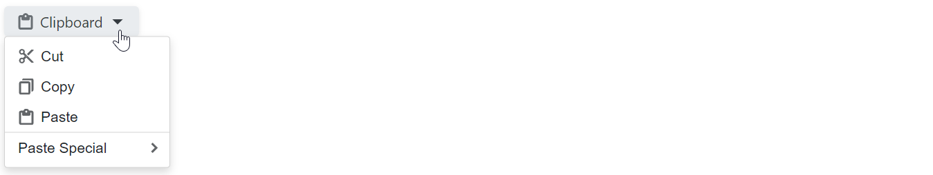
@using DevExpress.Images.Blazor

<DxDropDownButton RenderStyle="ButtonRenderStyle.Secondary"
                  Text="Clipboard"
                  IconUrl="@Icon.Clipboard">
    <Items>
        <DxDropDownButtonItem Text="Cut"  IconUrl="@Icon.Cut" />
        <DxDropDownButtonItem Text="Copy" IconUrl="@Icon.Copy" />
        <DxDropDownButtonItem Text="Paste" IconUrl="@Icon.ClipboardPaste" />
        <DxDropDownButtonItem Text="Paste Special" BeginGroup="true">
            <Items>
                <DxDropDownButtonItem Text="Paste Text Only" />
                <DxDropDownButtonItem Text="Paste Picture" Enabled="false" />
                <DxDropDownButtonItem Text="Paste as Hyperlink" />
            </Items>
        </DxDropDownButtonItem>
    </Items>
</DxDropDownButton>
See Also