DxChartPaneBorder.DashStyle Property
Specifies the line style for pane borders.
Namespace: DevExpress.Blazor
Assembly: DevExpress.Blazor.v26.1.dll
Declaration
[DefaultValue(ChartDashStyle.Solid)]
[Parameter]
public ChartDashStyle DashStyle { get; set; }
Property Value
| Type | Default | Description |
|---|---|---|
| ChartDashStyle | Solid | A ChartDashStyle enumeration value. |
Available values:
| Name | Description |
|---|---|
| Solid | A continuous solid line. |
| Dash | A dashed line. |
| Dot | A dotted line. |
| LongDash | A line that displays long dashes. |
| DashDot | A line that repeats the dash-dot pattern. |
| DashDotDot | A line that repeats the dash-dot-dot pattern. |
Remarks
To display borders in the DxChartPane component, enable the Visible property. You can then change the visibility of Left, Top, Right, and Bottom borders individually.
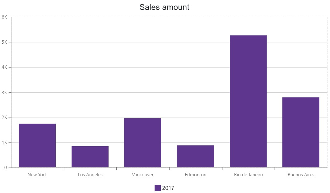
The following code snippet shows pane borders and changes their dash style:
<DxChart Data="@SalesData" Height="500px">
    <DxChartTitle Text="Sales amount" />
    <DxChartLegend Position="RelativePosition.Outside" VerticalAlignment="VerticalEdge.Bottom" />
    <DxChartPane Name="Pane1" Height="60%">
        <DxChartPaneBorder Visible="true" DashStyle="ChartDashStyle.DashDotDot" />
    </DxChartPane>
    <DxChartBarSeries Name="2017"
                      Filter="@((SaleInfo s) => s.Date.Year == 2017)"
                      SummaryMethod="Enumerable.Sum"
                      Pane="Pane1"
                      ArgumentField="@(s => s.City)"
                      ValueField="@(s => s.Amount)" />
</DxChart>
See Also