DxTimeEdit<T> Class
A time editor with a drop-down time picker.
Namespace: DevExpress.Blazor
Assembly: DevExpress.Blazor.v25.2.dll
NuGet Package: DevExpress.Blazor
Declaration
public class DxTimeEdit<T> :
    DxMaskedInputBase<T>,
    IDropDownOwner,
    IFocusableEditor
Type Parameters
| Name | Description |
|---|---|
| T | The data type. Supported types: DateTime, TimeSpan, TimeOnly, and their nullable instances. |
Remarks
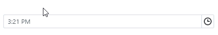
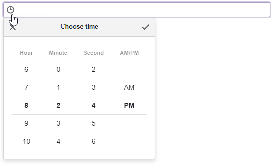
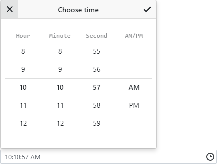
The DevExpress Time Edit for Blazor (<DxTimeEdit>) displays a drop-down time picker. A user can enter the time into the text box or pick it in the drop-down window.

The component’s appearance depends on the current culture. If the culture does not use a 12-hour time format, time values are in 24-hour format and the drop-down window’s AM/PM column is not displayed.
Add a Time Edit to a Project
Follow the steps below to add the Time Edit component to an application:
- Create a Blazor Server or Blazor WebAssembly application.
- Add the
<DxTimeEdit>…</DxTimeEdit>markup to a.razorfile. - Configure the component: specify the editor’s value, apply a mask, add a clear button and placeholder, and so on (see the sections below).
API Reference
Refer to the following list for the component API reference: DxTimeEdit Members.
Static Render Mode Specifics
Blazor Time Edit does not support static render mode. Enable interactivity to use the component in your application. Refer to the following topic for more details: Enable Interactive Render Mode.
Edit Value
Use the Time property to specify or read the control’s edit value. To limit the value range, use the MinTime and MaxTime properties. Refer to the following section for details: Set a Time Range.
You can use the @bind attribute to bind the Time property to a data field. Refer to the following help topic for details: Two-Way Data Binding.
<DxTimeEdit @bind-Time="@TimeValue" ></DxTimeEdit>

@code {
    TimeSpan TimeValue { get; set; } = DateTime.Now.TimeOfDay;
}
If you do not use two-way binding, handle the TimeChanged event to respond to the editor’s time change. The following code snippet enables the Update Time button if the specified value differs from the system time.
<DxTimeEdit Time="@Time"
            TimeChanged="@((TimeSpan newValue) => OnTimeChanged(newValue))">
</DxTimeEdit>

<button type="button" class="btn btn-primary" disabled="@IsDisabled">Update Time</button>

@code {
    TimeSpan Time = DateTime.Now.TimeOfDay;
    bool IsDisabled = true;

    void OnTimeChanged(TimeSpan newValue) {
        Time = newValue;
        if (newValue != DateTime.Now.TimeOfDay)
            IsDisabled = false;
        else IsDisabled = true;
    }
}
Apply a Mask
The Time Edit component supports date-time masks. Apply a date-time mask to the component to display its value in a specific time format. Users can navigate between mask sections (such as hours, minutes, and seconds) and increase/decrease section values with the Up and Down arrow keys and mouse wheel.

Assign a predefined or custom pattern to the Mask property to apply a mask. To customize mask settings, add the DxDateTimeMaskProperties component to the Time Edit markup.
The following code snippet applies a date-time mask:
<DxTimeEdit @bind-Time="@Time"
            Mask="@DateTimeMask.ShortTime">
    <DxDateTimeMaskProperties CaretMode="@MaskCaretMode.Advancing" />
</DxTimeEdit>

@code {
    DateTime Time { get; set; } = DateTime.Now;
}
Null Time Values and Placeholder
If the Time Edit component is bound to a nullable object, users can press Alt + Del to clear the editor value (set it to null).
Set the ClearButtonDisplayMode property to Auto to display the Clear button when the editor has a non-null value. Use the NullText property to specify the prompt text (placeholder) when the editor value is null.
<DxTimeEdit @bind-Time="@TimeValue"
            ClearButtonDisplayMode="DataEditorClearButtonDisplayMode.Auto"
            NullText="Select time...">
</DxTimeEdit>

@code {
    TimeSpan? TimeValue { get; set; } = DateTime.Now.TimeOfDay;
}

Time Format
Use the following properties to specify a value format:
- Format
- Applies the same time format in display and edit modes.
- DisplayFormat
- Specifies the time format in display mode.
See the Standard Date and Time Format Strings and Custom Date and Time Format Strings MSDN articles for additional information about supported formats.
The following example applies the a 12-hour clock format in display mode and the a 24-hour clock format in edit mode:
<DxTimeEdit @bind-Time="@TimeValue"
            Format="HH:mm"
            DisplayFormat="@DisplayFormat"></DxTimeEdit>

@code {
    TimeSpan TimeValue { get; set; } = DateTime.Now.TimeOfDay;
    string DisplayFormat { get; } = string.IsNullOrEmpty(System.Globalization.CultureInfo.CurrentCulture.DateTimeFormat.AMDesignator) ? "HH:mm" : "h:mm tt";
}
In many scenarios, users can benefit from a limited range of values. For instance, since meetings typically start on the hour or at 30-minute intervals, there is no need to show all 60 minute options. You can simplify the time picker by removing unnecessary values and specifying the time intervals using the following properties:
Set a Time Range
Use the MinTime and MaxTime properties to specify a range of available time values. The Time Edit’s time picker disables times outside the range.
The default minimum and maximum values are TimeSpan(0) and TimeSpan(1, 0, 0, 0). Custom values should meet the following criteria:
- MaxTime is greater than MinTime.
- MaxTime is less than 24 hours.
- MinTime is greater than or equal to zero.
Note
- If a user types a value that is out of the range, the Time Edit keeps the previously selected time.
- The Time Edit shows a notification message each time a user tries to navigate to a time value that is out of the range. To customize the notification text, use the OutOfRangeNotificationText property.
- You can set the Time property to a time outside the range. In this case, the Time Edit shows this specified time, and the Time Edit’s picker displays the closest available time.
The following code snippet implements the Time Edit component that allows users to select time from the current hour.
<DxTimeEdit @bind-Time="@TimeValue"
            MinTime="@MinTime"
            MaxTime="@MaxTime">
</DxTimeEdit>

@code {
    TimeSpan TimeValue { get; set; } = DateTime.Now.TimeOfDay;
    TimeSpan MinTime { get; set; }
    TimeSpan MaxTime { get; set; }

    protected override void OnInitialized() {
        MinTime = new TimeSpan(TimeValue.Hours, 0, 0);
        MaxTime = new TimeSpan(TimeValue.Hours, 59, 59);
    }
}

Appearance Customization
Use the SizeMode property to specify a Time Edit size. The following code snippet applies different size modes to Time Edit components.
<DxTimeEdit @bind-Time="@TimeValue" SizeMode="SizeMode.Small"></DxTimeEdit>

<DxTimeEdit @bind-Time="@TimeValue" SizeMode="SizeMode.Medium"></DxTimeEdit>

<DxTimeEdit @bind-Time="@TimeValue" SizeMode="SizeMode.Large"></DxTimeEdit>

@code {
    TimeSpan TimeValue { get; set; } = DateTime.Now.TimeOfDay;
}

To customize Time Edit input, use the InputCssClass property. The following code snippet applies several CSS rules to the input:

For additional information, refer to the following help topics:
Hide Built-In Drop-Down Button
Set the ShowDropDownButton to false to hide the built-in button that invokes a drop-down time picker. If you need a custom drop-down button, you can add a new command button.
Add Command Buttons
You can add custom command buttons to the Time Edit component. Refer to Command Buttons for additional information.
The following code snippet hides the built-in drop-down button, adds a new drop-down button, and specifies its position.
<DxTimeEdit Time="DateTime.Today.TimeOfDay" ShowDropDownButton=false>
    <Buttons>
        <DxTimeEditDropDownButton Position="EditorButtonPosition.Left"/>
    </Buttons>
</DxTimeEdit>
Input Validation
You can add a standalone Time Edit or a Form Layout to the Blazor’s standard EditForm. This form validates user input and informs users of errors. Use the model’s data annotation attributes to specify input restrictions.
<EditForm Model="@starship" Context="EditFormContext">
    <DataAnnotationsValidator />
    <DxFormLayout >
        <DxFormLayoutItem Caption="Time:" ColSpanMd="6" >
            <Template >
                <DxTimeEdit @bind-Time="@starship.Time" />
            </Template>
        </DxFormLayoutItem>
        @*...*@
    </DxFormLayout>
</EditForm>

@code {
    private Starship starship=new Starship();
}
For additional information, refer to the following help topic: Validate Input.
Drop-Down Window Direction
Use the DropDownDirection property to specify the direction in which the drop-down window is displayed relative to the input element. The default value is Down. The following code changes the direction to Up:
<DxTimeEdit Time="DateTime.Now.TimeOfDay" DropDownDirection="DropDownDirection.Up" />
Note
If the editor is close to a browser window’s edge and there is not enough space to display the drop-down window in the specified direction, the drop-down window is displayed in the opposite direction.
Keyboard Navigation
The DevExpress Blazor Time Edit supports keyboard navigation. Users can navigate to the editor’s input element and within the time picker.
Note
Keyboard support allows users to interact with application content in cases they cannot use a mouse or they rely on assistive technologies (like screen readers or switch devices). Refer to the Accessibility help topic for information on other accessibility areas that we address.
Shortcut Keys for Input Element
The following shortcut keys are available when the editor’s input element is focused:
| Shortcut Keys | Description |
|---|---|
| Tab | Moves focus to the next focusable element on a page. Note that the drop-down button, custom buttons, and the Clear button are excluded from the page tab sequence. |
| Shift + Tab | Moves focus to the previous focusable element on a page. |
| Alt + Del | Clears the editor value (sets it to null). |
| Alt + Down Arrow | Opens the drop-down time picker. |
Shortcut Keys for Drop-Down Time Picker
The following shortcut keys are available when the drop-down time picker is open:
| Shortcut Keys | Description |
|---|---|
| Right Arrow | Moves focus to the next carousel (Hour, Minute, Second, AM/PM). If the current carousel is the last, focus does not change. |
| Left Arrow | Moves focus to the previous carousel (AM/PM, Second, Minute, Hour). If the current carousel is the first, focus does not change. |
| Up Arrow | Selects the previous value in the current carousel. |
| Down Arrow | Selects the next value in the current carousel. |
| Tab | Moves focus to the next focusable element in the time picker. When focus is on the last focusable element in the time picker, moves focus to the first focusable element. |
| Shift + Tab | Moves focus to the previous focusable element in the time picker. When focus is on the first focusable element in the time picker, moves focus to the last focusable element. |
| Space, Enter | Selects the time and moves focus to the next carousel. If the current carousel is the last, closes the time picker, updates the Time parameter value, and moves focus to the input element. |
| Esc, Alt + Up Arrow | Closes the time picker and moves focus to the input element. |
Tab Sequence in Time Picker

Read-Only State
<DxTimeEdit> supports a read-only state. Set the ReadOnly property to true to activate this option.
<DxTimeEdit @bind-Time="@Time" ReadOnly="true"> </DxTimeEdit>

@code {
  TimeSpan Time = DateTime.Now.TimeOfDay;
}
HTML Attributes and Events
You can use HTML attributes and events to configure the Time Edit.
<DxTimeEdit Time="DateTime.Now.TimeOfDay"
            id="time"
            name="time"
            autocomplete="on"
            @oncopy="MyFunction">
</DxTimeEdit>

@code {
    void MyFunction(){
        //...
    }
}
Troubleshooting
If a Blazor application throws unexpected exceptions, refer to the following help topic: Troubleshooting.