Command Buttons
- 3 minutes to read
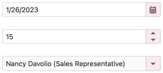
DevExpress Blazor Editors display built-in command buttons that allow users to open drop-down windows and increase/decrease editor values. Users can interact with these buttons using a mouse or a keyboard.
You can customize command buttons in the following ways:
Buttons are displayed in the following order:
- Clear button.
- Custom buttons and customized component-specific buttons (in the order they are defined in markup).
- Built-in buttons.
Hide Built-in Buttons
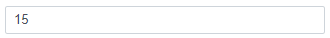
Use Show***Button / Show***Buttons properties to hide built-in buttons.
The following code snippet hides built-in spin buttons in the Spin Edit component (sets ShowSpinButtons to false):
<DxSpinEdit Value="15" ShowSpinButtons="false"></DxSpinEdit>
Add Component-Specific Buttons and Customize Them
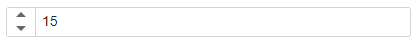
You can add component-specific buttons (drop-down buttons or spin buttons) to editors and customize their appearance.
The following buttons are available:
- DxComboBoxDropDownButton
- DxDateEditDropDownButton
- DxDropDownBoxDropDownButton
- DxSpinButtons
- DxTimeEditDropDownButton
Follow the steps below to add these buttons to an editor:
- Define the
Buttonscollection: add the<Buttons>tag to the editor markup. - Add a button object to the
Buttonscollection. - Specify button properties to customize its appearance (
CssClass,Position,Tooltip,Focusable, and so on).
The following code snippet hides built-in spin buttons, adds new spin buttons, and changes their position:
<DxSpinEdit Value="15" ShowSpinButtons="false">
    <Buttons>
        <DxSpinButtons Position="EditorButtonPosition.Left" />
    </Buttons>
</DxSpinEdit>
Add Custom Buttons
You can add fully customizable buttons to the following editors:
- DxComboBox<TData, TValue>
- DxDateEdit<T>
- DxDateRangePicker<T>
- DxDropDownBox
- DxMaskedInput<T>
- DxSpinEdit<T>
- DxTextBox
- DxTimeEdit<T>
- Define the
Buttonscollection: add the<Buttons>tag to the editor markup. - Add a DxEditorButton object to the
Buttonscollection. - Specify button properties to customize its appearance (
CssClass,Position,Tooltip,Focusable, and so on). - Handle the button’s
Clickevent to implement custom logic.
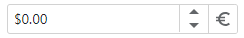
The following code snippet adds a custom currency button to the right of the spin buttons:
@using System.Globalization

<DxSpinEdit @bind-Value="@Price"
            Mask="@NumericMask.Currency"
            ShowSpinButtons="false">
    <Buttons>
        <DxSpinButtons />
        <DxEditorButton IconCssClass="@($"editor-icon {CurrencyButtonIconClass}")"
                        Tooltip="Change currency"
                        Click="@OnChangeCultureInfoButtonClick"
                        CssClass="editor-width" />
    </Buttons>
    <ChildContent>
        <DxNumericMaskProperties Culture="MaskCultureInfo" />
    </ChildContent>
</DxSpinEdit>

@code{
    double Price { get; set; }
    string CurrencyButtonIconClass { get; set; } = "editor-icon-euro";
    CultureInfo MaskCultureInfo { get; set; } = CultureInfoItems[0];
    static CultureInfo[] CultureInfoItems { get; set; } = {
        CultureInfo.GetCultureInfo("en-US"),
        CultureInfo.GetCultureInfo("de-DE")
    };
    void OnChangeCultureInfoButtonClick() {
        var isCurrentCultureUs = MaskCultureInfo.Equals(CultureInfoItems[0]);
        MaskCultureInfo = isCurrentCultureUs ? CultureInfoItems[1] : CultureInfoItems[0];
        CurrencyButtonIconClass = isCurrentCultureUs ? "editor-icon-dollar" : "editor-icon-euro";
    }
}
The following video shows how to add a custom button to the Text Box component:
Make Command Buttons Focusable
You can make customized component-specific buttons and custom buttons focusable (set the Focusable property to true). In this case, buttons are included in the page’s tab sequence, and users can access them with a keyboard:
- Tab / Shift+Tab: Move focus through focusable elements on the page (including buttons).
- Enter / Space: Invoke a click event handler for a focused button.
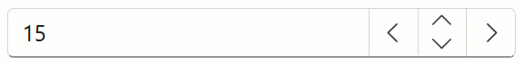
The following code snippet makes customized spin buttons and custom large increment buttons focusable:
<DxSpinEdit @bind-Value="@SpinEditValue"
            BindValueMode="BindValueMode.OnInput"
            ShowSpinButtons="false"
            CssClass="editor-width">
    <Buttons>
        <DxEditorButton IconCssClass="editor-icon editor-icon-chevron-left"
                        Tooltip="Decrement by 10"
                        Focusable="true"
                        Click="@(_ => OnLargeIncrementButtonClick(false))" />
        <DxSpinButtons Focusable="true"/>
        <DxEditorButton IconCssClass="editor-icon editor-icon-chevron-right"
                        Tooltip="Increment by 10"
                        Focusable="true"
                        Click="@(_ => OnLargeIncrementButtonClick(true))" />
    </Buttons>
</DxSpinEdit>

@code {
    Decimal SpinEditValue { get; set; } = 15;
    void OnLargeIncrementButtonClick(bool isIncrement) {
        SpinEditValue += isIncrement ? 10 : -10;
    }
}
Note that built-in command buttons are not focusable. Users can access them using a mouse or the editor’s keyboard shortcuts (refer to the corresponding editor’s Keyboard Support help topic).