DxTagBox<TData, TValue>.ColumnCellDisplayTemplate Property
Specifies a template used to display column cells in the TagBox.
Namespace: DevExpress.Blazor
Assembly: DevExpress.Blazor.v26.1.dll
Declaration
[Parameter]
public RenderFragment<TagBoxColumnCellDisplayTemplateContext<TData>> ColumnCellDisplayTemplate { get; set; }
Property Value
| Type | Description |
|---|---|
| RenderFragment<TagBoxColumnCellDisplayTemplateContext<TData>> | The template for column cells. |
Remarks
The ColumnCellDisplayTemplate property allows you to customize the appearance of every cell in the TagBox control. The template accepts a TagBoxColumnCellDisplayTemplateContext<TData> object as the context parameter. You can use the parameter’s members to:
Note
The ColumnCellDisplayTemplate property can be used alongside the CellDisplayTemplate property. If both templates are defined, the column-specific CellDisplayTemplate overrides the global ColumnCellDisplayTemplate for cells within that particular column.
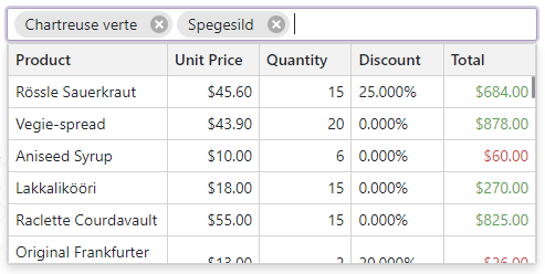
The following code snippet customizes the appearance of all cells in a TagBox control.
<DxComboBox Data="Accounting.Profits"
            @bind-Value="AnnualProfit"
            EditFormat="{0} ({5:C})">
    <Columns>
        <DxListEditorColumn FieldName="Year">
            <CellDisplayTemplate>
                <div class="text-left">
                    @context.Value
                </div>
            </CellDisplayTemplate>
        </DxListEditorColumn>
        <DxListEditorColumn FieldName="Q1" />
        <DxListEditorColumn FieldName="Q2" />
        <DxListEditorColumn FieldName="Q3" />
        <DxListEditorColumn FieldName="Q4" />
        <DxListEditorColumn FieldName="Total" />
    </Columns>
    <ColumnCellDisplayTemplate>
        <div class="text-right">
            @($"{context.Value:C}")
        </div>
    </ColumnCellDisplayTemplate>
</DxComboBox>

@code {
    Profit AnnualProfit { get; set; }
}