
DxListBox<TData, TValue> Class

A component that can connect to a data source and display a list of selectable items.

Namespace: DevExpress.Blazor

Assembly: DevExpress.Blazor.v23.2.dll

NuGet Package: DevExpress.Blazor

Declaration

public class DxListBox<TData, TValue> :
    ComponentBase,
    IListBox<TData, TValue>

Type Parameters

Name Description
TData

The data item type.

TValue

The value type.

Remarks

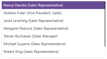
The DevExpress List Box for Blazor (<DxListBox>) allows you to display a list of selectable items from a data source.

List Box

Run Demo: List Box - Overview

Add a List Box to a Project

Follow the steps below to add a List Box component to an application:

  1. Use a DevExpress Project Template to create a new Blazor Server or Blazor WebAssembly application. If you use a Microsoft project template or already have a Blazor project, configure your project to incorporate DevExpress Blazor components.
  2. Add the <DxListBox></DxListBox> markup to a .razor file.
  3. Bind the component to data.
  4. Configure the component: handle an item selection, customize item appearance, and so on (see sections below).

Bind to Data

Strongly Typed Collection

Use the Data property to bind the List Box to a strongly typed collection. Initialize this collection in the OnInitialized lifecycle method or before this method is invoked. Use the DataAsync property instead of the Data property if a strongly typed collection is loaded asynchronously (for instance, from an HTTP request).

Use the Value or Values property to select one or multiple List Box items programmatically. You can use the @bind attribute to bind these properties to a data field. Refer to the following topic for more information: Two-Way Data Binding.

<DxListBox Data="@Cities" @bind-Values="@Values"></DxListBox>

@code {
  IEnumerable<string> Cities = new List<string>() {
    "London",
    "Berlin",
    "Paris",
  };

  IEnumerable<string> Values { get; set; } 
}

The List Box control can detect IQueryable<T> collections and use benefits of the corresponding LINQ query providers (such as Entity Framework).

Custom Object Collection

You can bind the List Box to a data collection (Data) that stores custom objects (IEnumerable<CustomType>). The Values collection can also contain custom objects. In this case, you need to override the following methods for your custom object:

  • GetHashCode. The List Box uses hash codes to compare items. Override this method to make sure that compared objects have the same hash code.

  • Equals. The default Equals method determines whether two object instances are equal. The compared items will not be equal if they are different instances (even if they have exactly the same properties). As a result, the component will not display the selected items.

You also need to set the List Box’s TextFieldName property. It specifies the custom object’s field name that returns strings to be shown in the List Box. If the TextFieldName property is not specified, the List Box component searches for a Text field in the data source and uses this field as a text field. Otherwise, the List Box is populated with CustomType.ToString() values.

@using StaffData

<DxListBox Data="@Staff.DataSource"
           @bind-Values="@Values"
           TextFieldName="@nameof(Person.Text)">
</DxListBox>

@code {
    IEnumerable<Person> Values { get; set; } = Staff.DataSource.Take(1);
}

List Box

Run Demo: List Box - Overview

Custom Data

When you bind an editor to data from a Web API service, assign the data type to the component’s T parameter and use the CustomData property to implement custom data load logic.

View Example: Data Editors for Blazor - Custom data binding

You can also enable Virtual Scrolling to improve client-side performance.

Item Selection

Use the SelectionMode property to change the selection mode. The component supports the following modes:

Single (default)

Users can only select one List Box item at a time. A user should click a List Box item to select it.

Use the Value property to access/specify the selected item in code. To respond to selection changes, handle the ValueChanged event.

Multiple

Users can select multiple items in the List Box. A user should click the initial item, hold the Shift key, and select the final item to specify the range of items. To add/remove individual items to/from the selection, a user should click an item with the Ctrl key pressed. Enable the ShowCheckboxes property to allow users to use checkboxes to select items.

Use the Values property to access/specify selected items in multiple selection mode. To respond to selection changes, handle the ValuesChanged event.

None (selection functionality is disabled)
Users cannot select List Box items.

The code below enables multiple selection in the List Box and adds checkboxes to the component. Users can click items or corresponding checkboxes to change selection.

@using StaffData

<DxListBox Data="@Staff.DataSource"
           TextFieldName="@nameof(Person.Text)"
           SelectionMode="ListBoxSelectionMode.Multiple"
           ShowCheckboxes="true"
           @bind-Values="@Values">
</DxListBox>

@code {
    IEnumerable<Person> Values { get; set; }
}

ListBox ShowCheckboxes

Run Demo: List Box - Multiple Selection

Multiple Columns

The List Box control can display data across multiple columns. Follow the steps below to create columns:

  1. Add a <Columns> tag to the component’s markup to declare the column collection.
  2. Populate the Columns collection with DxListEditorColumn objects. These objects include the following properties:

    • FieldName - Specifies the data source field that populates column items.
    • Caption - Specifies the column header.
    • Visible - Specifies column visibility.
    • VisibleIndex - Specifies column position.
    • Width - Specifies column width.
@using StaffData

<DxListBox Data="@Staff.DataSource"
           @bind-Values="@Values">
    <Columns>
        <DxListEditorColumn FieldName="Id" Width="50px" />
        <DxListEditorColumn FieldName="FirstName" Caption="Name"/>
        <DxListEditorColumn FieldName="LastName" Caption="Surname"/>
    </Columns>
</DxListBox>

@code {
    IEnumerable<Person> Values { get; set; } = Staff.DataSource.Take(1);
}

List Box - Multiple Columns

Run Demo: List Box – Multiple Columns

Virtual Scrolling

Set the ListRenderMode property to ListRenderMode.Virtual to enable virtual scrolling. In this mode, the List Box renders data on demand when a user scrolls list items.

@using StaffData

<DxListBox Data="@Staff.DataSource"
           TData="Person"
           TValue="Person"
           ListRenderMode="ListRenderMode.Virtual">
</DxListBox>

Run Demo: List Box - Virtual Scrolling

Item Display Template

The ItemDisplayTemplate property allows you to customize the appearance of List Box items. The property accepts a ListBoxItemDisplayTemplateContext<TData> object as the context parameter. You can use the parameter’s members to get information about items:

The example below displays List Box items as contact cards. Each item shows an employee’s first name, last name, photo, and phone number.

@inject NwindDataService NwindDataService

<DxListBox Data="@Data"
            @bind-Value="@Value"
            SizeMode="Params.SizeMode"
            CssClass="cw-400 chi-220">
    <ItemDisplayTemplate>
        <div class="listbox-item-template">
            <img src="@StaticAssetUtils.GetImagePath(GetImageFileName(context.DataItem))" alt="@context.DataItem.FullName" />
            <div class="listbox-item-template-text">
                <span>@context.DataItem.FullName</span>
                <span class="listbox-item-template-text-phone">@context.DataItem.HomePhone</span>
            </div>
        </div>
    </ItemDisplayTemplate>
</DxListBox>

@code {
    IEnumerable<Employee> Data { get; set; }
    Employee Value { get; set; }

    protected override async Task OnInitializedAsync() {
        Data = await NwindDataService.GetEmployeesAsync();
        Value = Data.FirstOrDefault();
    }

    string GetImageFileName(Employee employee) {
        return $"employees/item-template{employee.EmployeeId}.jpg";
    }
}

ListBox - Item Display Template

Run Demo: ListBox - Item Display Template

Column Cell Display Template

The DataColumnCellDisplayTemplate allows you to specify custom content and change cell appearance in List Box columns. The template accepts a GridDataColumnCellDisplayTemplateContext object as the context parameter. You can use the parameter’s members to get information about columns.

The code below customizes the appearance of different columns.

@inject NwindDataService NwindDataService

<DxListBox TData="Product" TValue="Product" Data="@Data"
            @bind-Values="@SelectedProducts"
            SelectionMode="ListBoxSelectionMode.Multiple">
    <Columns>
        <DxListEditorColumn FieldName="@nameof(Product.ProductName)" Caption="Product" Width="30%"/>
        <DxListEditorColumn FieldName="@nameof(Product.UnitPrice)" Caption="Unit Price"/>
        <DxListEditorColumn FieldName="@nameof(Product.Quantity)"/>
        <DxListEditorColumn FieldName="@nameof(Product.Discount)"/>
        <DxListEditorColumn FieldName="@nameof(Product.Total)" />
    </Columns>
    <ColumnCellDisplayTemplate>
        @{
            object displayValue;
            string cssClass = string.Empty;
            switch (context.Column.FieldName) {
                case nameof(Product.UnitPrice):
                    cssClass = alignRightCssClass;
                    displayValue = $"{context.Value:c}";
                    break;
                case nameof(Product.Quantity):
                    cssClass = alignRightCssClass;
                    displayValue = context.DisplayText;
                    break;
                case nameof(Product.Discount):
                    displayValue = $"{context.Value:p}";
                    break;
                case nameof(Product.Total):
                    var value = context.DataItem.UnitPrice * context.DataItem.Quantity;
                    var valueCssClass = value >= totalPriceCeiling ? textGreenCssClass : textRedCssClass;
                    cssClass = $"{alignRightCssClass} {valueCssClass}";
                    displayValue = $"{value:c}";
                    break;
                default:
                    displayValue = context.DisplayText;
                    break;
            }
        }
        <div class="@cssClass">@displayValue</div>
    </ColumnCellDisplayTemplate>
</DxListBox>

@code {
    IEnumerable<Product> Data { get; set; }
    IEnumerable<Product> SelectedProducts { get; set; }
    int totalPriceCeiling = 100;
    string alignRightCssClass = "align-right";
    string textGreenCssClass = "text-green";
    string textRedCssClass = "text-red";
    protected override async Task OnInitializedAsync() {
        var invoices = await NwindDataService.GetInvoicesAsync();
        var products = await NwindDataService.GetProductsAsync();
        Data = invoices.Join(products, i => i.ProductId, p => p.ProductId, (i, p) =>
            new Product {
                ProductName = i.ProductName,
                UnitPrice = i.UnitPrice,
                Quantity = i.Quantity,
                Discount = i.Discount
            }
        );
        SelectedProducts = Data.Skip(1).Take(3);
    }
    public class Product {
        public string ProductName { get; set; }
        public decimal UnitPrice { get; set; }
        public int Quantity { get; set; }
        public float Discount { get; set; }
        public int Total { get; set; }
        public override bool Equals(object obj) {
            return obj is Product product && string.Equals(product.ProductName, ProductName) && product.Quantity == Quantity;
        }
        public override int GetHashCode() {
            return HashCode.Combine(ProductName, Quantity);
        }
    }
}

ListBox - Column Cell Display Template

Run Demo: List Box - Column Cell Display Template

Empty Data Area Template

The List Box displays an empty data area in the following cases:

  • The Data property is unset.
  • The specified data source does not contain items.
  • You use the DataAsync property or the CustomData property to bind the List Box to a data source. The component sends the first request to a remote data source and waits for a response.

Use the EmptyDataAreaTemplate to customize content displayed in the empty data area. The template’s context parameter has the IsDataLoading property that allows you to determine whether the List Box data is still loading data.

The code below embeds the Wait Indicator component into the List Box.

@inject NwindDataService NwindDataService
<DxListBox TData="@WebApiLookup" TValue="string"
           ListRenderMode="ListRenderMode.Virtual"
           CssClass="cw-400 chi-220"
           CustomData="@LoadCustomData"
           @key="ComponentKey">
    <EmptyDataAreaTemplate>
        @if (context.IsDataLoading) {
            <div class="empty-data-area-template">
                <div class="d-flex flex-column">
                    <DxWaitIndicator Visible="true"
                                     CssClass="m-auto"
                                     AnimationType="WaitIndicatorAnimationType.Spin" />
                    <p class="dxbl-text d-block mt-1">Loading, please wait...</p>
                </div>
            </div>
        }
    </EmptyDataAreaTemplate>
</DxListBox>

@code {
    [Inject] protected HttpClient Client { get; set; }
    Guid ComponentKey { get; set; } = Guid.NewGuid();
    async Task<LoadResult> LoadCustomData(DataSourceLoadOptionsBase options, CancellationToken cancellationToken) {
        using var response = await Client.GetAsync(options.ConvertToGetRequestUri
            ("https://js.devexpress.com/Demos/NetCore/api/DataGridWebApi/CustomersLookup"), cancellationToken);
        response.EnsureSuccessStatusCode();
        if(options.RequireTotalCount)
            await Task.Delay(3000, cancellationToken);
        using var responseStream = await response.Content.ReadAsStreamAsync();
        var result = await JsonSerializer.DeserializeAsync<LoadResult>(responseStream, cancellationToken: cancellationToken);
        return result;
    }
    void ReloadListBox() {
        ComponentKey = Guid.NewGuid();
    }
    public class WebApiLookup {
        public string Text { get; set; }
        public string Value { get; set; }
    }
}

ListBox - Empty Data Area Template

Run Demo: List Box - Empty Data Area Template

Input Validation

You can add a standalone List Box or the corresponding Form Layout component to the Blazor’s standard EditForm. This form validates user input based on data annotation attributes defined in a model and indicates errors.

<EditForm Model="@model" Context="EditFormContext">
    <DataAnnotationsValidator />
    <DxFormLayout >
        <DxFormLayoutItem Caption="Values:" ColSpanMd="6" >
            <DxListBox Data="@(new List<string>() { "Defense", "Exploration", "Diplomacy" })"
                       @bind-Values="@model.Values" />
        </DxFormLayoutItem >
        @*...*@
    </DxFormLayout>
</EditForm>

@code {
    private Model model=new Model();
}

If you handle the ValueChanged event and cannot use two-way binding, specify the ValueExpression or ValuesExpression property to identify the value passed to the event handler.

For more information, refer to the following help topic: Validate Input.

Run Demo: Form Validation

Read-Only State

<DxListBox> supports read-only state. Set the ReadOnly property to true to activate this option.

@using StaffData

<DxListBox Data="@Staff.DataSource"
           Values="@Values"
           ReadOnly="true" />

@code {
    IEnumerable<Person> Values => Staff.DataSource.Take(1);
}

Run Demo: List Box - Read-Only and Disabled Modes

Troubleshooting

If a Blazor application throws unexpected exceptions, refer to the following help topic: Troubleshooting.

Inheritance

Object
ComponentBase
DxListBox<TData, TValue>
See Also