The Blazor ListBox allows you to organize list items into groups. This enhance user experience by allowing users to locate required values faster. To group data, specify the GroupFieldName property. Values from the specified field appear within group headers.
Note the following specifics:
The ListBox supports only one group level.
Users cannot collapse groups.
Group headers do not take part in search operations.
Multi-column ListBox controls also support groups.
using System;
using System.Collections.Generic;
using System.Runtime.InteropServices;

namespace BlazorDemo.Data.Northwind {
    public partial class Customer {
        public Customer() {
            Orders = new HashSet<Order>();
        }
        public string CustomerId { get; set; }
        public string CompanyName { get; set; }
        public string ContactName { get; set; }
        public string ContactTitle { get; set; }
        public string Address { get; set; }
        public string City { get; set; }
        public string Region { get; set; }
        public string PostalCode { get; set; }
        public string Country { get; set; }
        public string Phone { get; set; }
        public string Fax { get; set; }
        public virtual ICollection<Order> Orders { get; set; }
    }
}
using System.Collections.Generic;
using System.Linq;
using System.Threading;
using System.Threading.Tasks;
using BlazorDemo.Data.Northwind;
using BlazorDemo.DataProviders;

namespace BlazorDemo.Services {
    public partial class NwindDataService {
        public Task<IEnumerable<Customer>> GetCustomersAsync(CancellationToken ct = default) {
            // Return your data here
        }
    }
}
using BlazorDemo.Services;
using Microsoft.Extensions.DependencyInjection;

public class Startup {
    public void ConfigureServices(IServiceCollection services) {
        // ...
        services.AddScoped<NwindDataService>();
    }
}
The Blazor List Box ships with API members that allow you to use search and filter capabilities.
Search Box
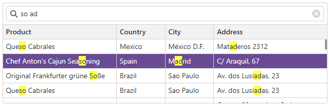
Use the ShowSearchBox property to display the search box in the List Box component. Once a user enters the text in the search box, the List Box looks for rows with matching values, highlights search results, and filters out all other rows. Search is case-insensitive and applies to cells in visible columns only.
namespace StaffData {
    public static class Staff {
        private static readonly Lazy<List<Person>> dataSource = new Lazy<List<Person>>(() => {
            var dataSource = new List<Person>() {
                new Person() { Id = 0 , FirstName = "John", LastName = "Heart", Department=Department.Electronics },
                new Person() { Id = 1 , FirstName = "Samantha", LastName = "Bright", Department=Department.Motors },
                new Person() { Id = 2 , FirstName = "Arthur", LastName = "Miller", Department=Department.Software },
                new Person() { Id = 3 , FirstName = "Robert", LastName = "Reagan", Department=Department.Electronics },
                new Person() { Id = 4 , FirstName=  "Greta", LastName = "Sims", Department=Department.Motors },
                new Person() { Id = 5 , FirstName = "Brett", LastName = "Wade", Department=Department.Software },
                new Person() { Id = 6 , FirstName = "Sandra", LastName = "Johnson", Department=Department.Electronics },
                new Person() { Id = 7 , FirstName = "Edward", LastName = "Holmes", Department=Department.Motors },
                new Person() { Id = 8 , FirstName = "Barbara", LastName = "Banks", Department=Department.Software },
                new Person() { Id = 9 , FirstName = "Kevin", LastName = "Carter", Department=Department.Electronics },
                new Person() { Id = 10, FirstName = "Cynthia", LastName = "Stanwick", Department=Department.Motors },
                new Person() { Id = 11, FirstName = "Sam", LastName = "Hill", Department=Department.Electronics }};
            return dataSource;
        });
        public static List<Person> DataSource { get { return dataSource.Value; } }
    }

    public class Person {
        public int Id { get; set; }
        public string FirstName { get; set; }
        public string LastName { get; set; }
        public Department Department { get; set; }
        public string Text => $"{FirstName} {LastName} ({Department} Dept.)";
        public override bool Equals(object obj) {
            if (obj is Person typedObj) {
                return (this.Id == typedObj.Id) && (this.FirstName == typedObj.FirstName) && (this.LastName == typedObj.LastName)
                && (this.Department == typedObj.Department);
            }
            return base.Equals(obj);
        }
        public override int GetHashCode() {
            return HashCode.Combine(Id, FirstName, LastName);
        }
    }

    public enum Department { Motors, Electronics, Software }
}
To respond to search text changes, handle the SearchTextChanged event. The event is handled automatically when you use two-way data binding for the SearchText property (@bind-SearchText).
Set a column’s SearchEnabled property to false to exclude a specific column from search operations.
If the search text contains multiple words separated by space characters, the words can be treated as a single condition or individual conditions based on the SearchTextParseMode property value.
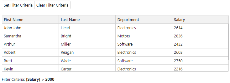
Filter Criteria
The List Box allows you to filter its data in code. You can create a criteria operator object that specifies the filter expression and pass this object to the SetFilterCriteria(CriteriaOperator) method. To get the applied filter criteria, use the GetFilterCriteria() method.
For additional information about criteria operators, see the following topics:
You can disable individual items in the List Box. To do this, use the DisabledFieldName property. The property specifies a Boolean field that stores each item’s enabled or disabled state. Disabled items are grayed out and cannot be selected.
Note
Disabled items can improve component usability, but cannot replace adequate security measures. Users may still be able to select disabled items on the client side, so you should implement appropriate security checks in your code.
using System;
using System.Collections.Generic;
using System.Runtime.InteropServices;

namespace BlazorDemo.Data.Northwind {
    public partial class Product {
        public Product() {
            OrderDetails = new HashSet<OrderDetail>();
        }
        public int ProductId { get; set; }
        public string ProductName { get; set; }
        public int? SupplierId { get; set; }
        public int? CategoryId { get; set; }
        public string QuantityPerUnit { get; set; }
        public decimal? UnitPrice { get; set; }
        public short? UnitsInStock { get; set; }
        public short? UnitsOnOrder { get; set; }
        public short? ReorderLevel { get; set; }
        public bool Discontinued { get; set; }
        public bool InStock => !Discontinued;
        public virtual Category Category { get; set; }
        public virtual Supplier Supplier { get; set; }
        public virtual ICollection<OrderDetail> OrderDetails { get; set; }
    }
}
using System.Collections.Generic;
using System.Linq;
using System.Threading;
using System.Threading.Tasks;
using BlazorDemo.Data.Northwind;
using BlazorDemo.DataProviders;

namespace BlazorDemo.Services {
    public partial class NwindDataService {
        public Task<IEnumerable<Product>> GetProductsAsync(CancellationToken ct = default) {
            // Return your data here
        }
    }
}
using BlazorDemo.Services;
using Microsoft.Extensions.DependencyInjection;

public class Startup {
    public void ConfigureServices(IServiceCollection services) {
        // ...
        services.AddScoped<NwindDataService>();
    }
}