DxRibbonTab.IconCssClass Property
Specifies the name of the CSS class applied to the Ribbon tab’s icon.
Namespace: DevExpress.Blazor
Assembly: DevExpress.Blazor.v26.1.dll
Declaration
[DefaultValue(null)]
[Parameter]
public string IconCssClass { get; set; }
Property Value
| Type | Default | Description |
|---|---|---|
| String | null | The CSS class name. |
Remarks
Use the IconCssClass property to specify a CSS class of the Ribbon tab’s icon. To reference an icon by its CSS class, connect an icon library to your project.
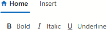
The following code snippet assigns the icon from DevExtreme Icon Library to the Ribbon’s Home tab:
<DxRibbon>
    <DxRibbonTab Text="Home"
                 IconCssClass="dx-icon-home">
        <DxRibbonGroup Text="Style">
            <DxRibbonItem Text="Bold" IconCssClass="dx-icon-bold" />
            <DxRibbonItem Text="Italic" IconCssClass="dx-icon-italic" />
            <DxRibbonItem Text="Underline" IconCssClass="dx-icon-underline" />
        </DxRibbonGroup>
    </DxRibbonTab>
    <DxRibbonTab Text="Insert" />
</DxRibbon>
Note
To specify a custom image as a tab icon, use the IconUrl property.
See Also