DxRibbonGroup.IconUrl Property
Specifies the icon URL for collapsed ribbon groups.
Namespace: DevExpress.Blazor
Assembly: DevExpress.Blazor.v26.1.dll
Declaration
[DefaultValue(null)]
[Parameter]
public string IconUrl { get; set; }
Property Value
| Type | Default | Description |
|---|---|---|
| String | null | The icon’s URL. |
Remarks
When the ribbon width decreases, the component collapses groups and display them as drop-down buttons. Use the IconUrl property to specify an icon for that button.
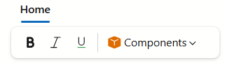
@using DevExpress.Images.Blazor

<DxRibbon>
    <DxRibbonTab Text="Home">
        <DxRibbonGroup Text="Format">
            <DxRibbonItem Text="Bold" IconUrl="@Icon.TextFontBold" />
            <DxRibbonItem Text="Italic" IconUrl="@Icon.TextFontItalic" />
            <DxRibbonItem Text="Underline" IconUrl="@Icon.TextFontUnderline" />
        </DxRibbonGroup>
        <DxRibbonGroup Text="Components"
                       IconUrl="@Icon.CubeProductYellow">
            @* .. *@
        </DxRibbonGroup>
    </DxRibbonTab>
</DxRibbon>
Refer to the Icons help topic for additional information about icons in DevExpress Blazor components.
See Also