DxDropDownButton.RenderStyle Property
Specifies the drop-down button’s predefined style.
Namespace: DevExpress.Blazor
Assembly: DevExpress.Blazor.v26.1.dll
Declaration
[DefaultValue(ButtonRenderStyle.Primary)]
[Parameter]
public ButtonRenderStyle RenderStyle { get; set; }
Property Value
| Type | Default | Description |
|---|---|---|
| ButtonRenderStyle | Primary | A ButtonRenderStyle enumeration value. |
Available values:
| Name | Description |
|---|---|
| None | Resets the button’s style. |
| Primary | Applies the primary style to the button. |
| Secondary | Applies the secondary style to the button. |
| Info | Applies the info style to the button. |
| Link | Applies the link style to the button. |
| Success | Applies the success style to the button. |
| Warning | Applies the warning style to the button. |
| Danger | Applies the danger style to the button. |
| Dark | Applies the dark style to the button. |
| Light | Applies the light style to the button. |
Remarks
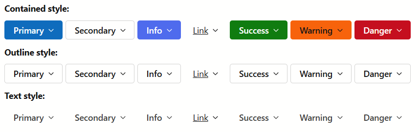
The <DxDropDownButton> component allows you to customize the appearance of the root drop-down button. You can use the following properties:
RenderStyle- Specifies the drop-down button’s predefined style.
- RenderStyleMode
- Specifies the drop-down button’s color filling type.
Note
These properties do not apply to the button’s nested items.
<DxDropDownButton RenderStyle="ButtonRenderStyle.Success"
                  RenderStyleMode="ButtonRenderStyleMode.Outline"
                  Text="Success"
                  Tooltip="Outline mode" />