DxDropDown.HeaderTemplate Property
Specifies a template for the drop-down window’s header. Replaces the default render fragment (including paddings, scrollbars, etc.)
Namespace: DevExpress.Blazor
Assembly: DevExpress.Blazor.v26.1.dll
Declaration
[Parameter]
public RenderFragment<IPopupElementInfo> HeaderTemplate { get; set; }
Property Value
| Type | Description |
|---|---|
| RenderFragment<IPopupElementInfo> | The header template. |
Remarks
Use the HeaderTemplate property to display any UI render fragment in the header element of the drop-down window. This template changes the default header rendering, including paddings, scrollbar, and inner content alignment. If you need to place custom content in the drop-down window header but retain its default rendering, use the HeaderContentTemplate instead.
The HeaderTemplate has the context parameter. You can use the parameter’s CloseCallback property to implement a custom close button.
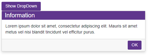
<DxButton Id="showDDbtton" Click="() => IsOpen = true">Show DropDown</DxButton>
<DxDropDown HeaderVisible="true"
            FooterVisible="true"
            Width="max(25vw, 300px)"
            BodyText="Lorem ipsum dolor sit amet, consectetur adipiscing elit. Mauris sit amet metus vel
             nisi blandit tincidunt vel efficitur purus."
            @bind-IsOpen="@IsOpen"
            PositionTarget="#showDDbtton"
            PositionMode="DropDownPositionMode.Bottom">
    <HeaderTemplate>
        <div class="my-header">
            Information
        </div>
    </HeaderTemplate>
    <FooterContentTemplate>
        <DxButton RenderStyle="ButtonRenderStyle.Primary" Text="OK" Click="@context.CloseCallback" />
    </FooterContentTemplate>
</DxDropDown>

@code {
    bool IsOpen { get; set; } = false;
}
The HeaderTemplate property has priority over HeaderText, HeaderContentTemplate, and HeaderTextTemplate properties.