DxDropDown.ChildContent Property
Specifies body content.
Namespace: DevExpress.Blazor
Assembly: DevExpress.Blazor.v26.1.dll
Declaration
[Parameter]
public RenderFragment ChildContent { get; set; }
Property Value
| Type | Description |
|---|---|
| RenderFragment | Content markup. |
Remarks
The ChildContent component parameter can store custom component content that does not belong to other component’s RenderFragment properties as shown below:
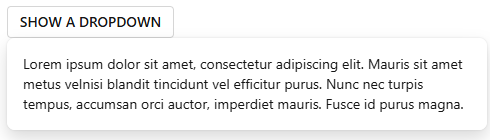
<DxButton Click="() => IsOpen = !IsOpen"
          RenderStyle="ButtonRenderStyle.Secondary">SHOW A DROPDOWN</DxButton>

<DxDropDown @bind-IsOpen="@IsOpen"
            Id="dropDown-overview">
    <ChildContent>
        Lorem ipsum dolor sit amet, consectetur adipiscing elit.
        Mauris sit amet metus velnisi blandit tincidunt vel efficitur purus.
        Nunc nec turpis tempus, accumsan orci auctor,
        imperdiet mauris. Fusce id purus magna.
    </ChildContent>
</DxDropDown>

@code {
    bool IsOpen { get; set; } = false;
}
Note
Since ChildContent contains nested markup of its parent class, the template content must conform to HTML semantics.
This property is equivalent to the BodyContentTemplate property; however, we recommend that you explicitly specify BodyContentTemplate in the markup. This notation allows you to specify the following templates on the component level:
- BodyTemplate
- BodyTextTemplate
- FooterContentTemplate
- FooterTemplate
- FooterTextTemplate
- HeaderContentTemplate
- HeaderTemplate
- HeaderTextTemplate
<DxButton Click="() => IsOpen = !IsOpen"
          RenderStyle="ButtonRenderStyle.Secondary">SHOW A DROPDOWN</DxButton>

<DxDropDown @bind-IsOpen="@IsOpen"
            Id="dropDown-overview">
    <BodyContentTemplate>
        Lorem ipsum dolor sit amet, consectetur adipiscing elit.
        Mauris sit amet metus velnisi blandit tincidunt vel efficitur purus.
        Nunc nec turpis tempus, accumsan orci auctor,
        imperdiet mauris. Fusce id purus magna.
    </BodyContentTemplate>
</DxDropDown>

@code {
    bool IsOpen { get; set; } = false;
}
See Also