DxContextMenu Class
A context menu component.
Namespace: DevExpress.Blazor
Assembly: DevExpress.Blazor.v25.2.dll
NuGet Package: DevExpress.Blazor
Declaration
public class DxContextMenu :
    DxComponentBase,
    IModelWrapper<IContextMenuModel>,
IDisposableRemarks
<DxContextMenu> adds a context menu to your Blazor application.
Add a Context Menu to a Project
Follow the steps below to add the Context Menu component to an application:
- Create a Blazor Server or Blazor WebAssembly application.
- Add the
<DxContextMenu>…</DxContextMenu>markup to a.razorfile. Configure the component: add items, customize their appearance, handle clicks, and so on (see the sections below).
You can use two methods to populate the control:
Add code that invokes the context menu when users right-click an HTML element.
API Reference
Refer to the following list for the component API reference: DxContextMenu Members.
Static Render Mode Specifics
Blazor Context Menu does not support static render mode. Enable interactivity to use the component in your application. Refer to the following topic for more details: Enable Interactive Render Mode.
Unbound Mode
In this mode, you should add items to the Context Menu component markup. Use the DxContextMenuBase.Items property to specify a collection of root items. Each item is a DxContextMenuItem class instance that can have a collection of child items (the DxContextMenuItem.Items property).
<DxContextMenu>
    <Items>
        <DxContextMenuItem Text="Font">
            <Items>
                <DxContextMenuItem Text="Times New Roman"></DxContextMenuItem>
                <DxContextMenuItem Text="Tahoma"></DxContextMenuItem>
                <DxContextMenuItem Text="Verdana"></DxContextMenuItem>
            </Items>
        </DxContextMenuItem>
        <DxContextMenuItem Text="Size">
            <Items>
                <DxContextMenuItem Text="8pt"></DxContextMenuItem>
                <DxContextMenuItem Text="10pt"></DxContextMenuItem>
                <DxContextMenuItem Text="12pt"></DxContextMenuItem>
            </Items>
        </DxContextMenuItem>
        <DxContextMenuItem Text="Style">
            <Items>
                <DxContextMenuItem Text="Bold"></DxContextMenuItem>
                <DxContextMenuItem Text="Italic"></DxContextMenuItem>
                <DxContextMenuItem Text="Underline"></DxContextMenuItem>
            </Items>
        </DxContextMenuItem>
        <DxContextMenuItem Text="Clear Formatting" BeginGroup="true"></DxContextMenuItem>
    </Items>
</DxContextMenu>

Customize Items
To specify an item’s name, use the Name property.
The table below lists API members that allow you to customize item appearance.
| Member | Description |
|---|---|
| Text | Specifies a menu item’s text. |
| IconCssClass | Specifies the CSS class of a menu item’s icon. |
| IconUrl | Specifies the URL of a menu item’s icon. |
The following code adds items to a menu and specify their icons:
<DxContextMenu>
    <Items>
        <DxContextMenuItem Text="Home" IconCssClass="oi oi-home"></DxContextMenuItem>
        <DxContextMenuItem Text="Contacts" IconCssClass="oi oi-phone"></DxContextMenuItem>
        <DxContextMenuItem Text="Calendar" IconCssClass="oi oi-calendar"></DxContextMenuItem>
    </Items>
</DxContextMenu>
Item Templates
The Context Menu component allows you to use templates to customize the layout and appearance of menu items. You can specify a template for all items or an individual item. Individual templates override common templates.
| What to Customize | Common Templates | Individual Templates |
|---|---|---|
| A whole item | DxContextMenu.ItemTemplate | DxContextMenuItem.Template |
| An item’s text | DxContextMenu.ItemTextTemplate | DxContextMenuItem.TextTemplate |
| An item’s submenu | DxContextMenu.SubMenuTemplate | DxContextMenuItem.SubMenuTemplate |
The following example defines submenu templates for Text color and Background color menu items:
<div class="demo-preventsel target-container" tabindex="0"
     @oncontextmenu="@OnContextMenu"
     @oncontextmenu:preventDefault
     @onkeydown="@OnKeyDown">
    <p class="d-inline-block text-center m-auto">Lorem ipsum dolor sit amet, consectetur adipiscing elit. Mauris sit amet metus vel nisi blandit tincidunt vel efficitur purus. Nunc nec turpis tempus, accumsan orci auctor, imperdiet mauris. Fusce id purus magna.</p>
</div>

<DxContextMenu @ref="@ContextMenu" PositionTarget="#section-Templates .target-container" SizeMode="Params.SizeMode">
    <Items>
        <DxContextMenuItem Text="Text color">
            <SubMenuTemplate>
                <DxColorPalette Value="@TextColor" ValueChanged="ChangeTextColor">
                    <Groups>
                        <DxColorPaletteGroup Header="Text color" Colors="DxColorPalettePresets.GetPalette(ColorPalettePresetType.Universal)" />
                        <DxColorPaletteGroup Colors="DxColorPalettePresets.GetPalette(ColorPalettePresetType.UniversalGradient)" />
                    </Groups>
                </DxColorPalette>
            </SubMenuTemplate>
        </DxContextMenuItem>
        <DxContextMenuItem Text="Background color">
            <SubMenuTemplate>
                <DxColorPalette Value="@BackgroundColor" ValueChanged="ChangeBackgroundColor">
                    <Groups>
                        <DxColorPaletteGroup Header="Background color" Colors="DxColorPalettePresets.GetPalette(ColorPalettePresetType.Universal)" />
                        <DxColorPaletteGroup Colors="DxColorPalettePresets.GetPalette(ColorPalettePresetType.UniversalGradient)" />
                    </Groups>
                </DxColorPalette>
            </SubMenuTemplate>
        </DxContextMenuItem>
        <DxContextMenuItem Text="Reset colors" Click="@ResetColors" BeginGroup="true"
                           Enabled="@(BackgroundColor != null || TextColor != null)"/>
    </Items>
</DxContextMenu>
Group Items
You can split context menu items into groups. To specify the start of a new item group, use the BeginGroup property.
<DxContextMenu>
    <Items>
        <DxContextMenuItem Text="Font">
            <Items>
                @* ... *@
            </Items>
        </DxContextMenuItem>
        <DxContextMenuItem Text="Size">
            <Items>
                @* ... *@
            </Items>
        </DxContextMenuItem>
        <DxContextMenuItem Text="Style">
            <Items>
                @* ... *@
            </Items>
        </DxContextMenuItem>
        <DxContextMenuItem Text="Clear Formatting" BeginGroup="true"></DxContextMenuItem>
    </Items>
</DxContextMenu>
A horizontal line separates groups:

Disable User Interaction
To disable a menu item, set its Enabled property to false. The following code snippet disables the Cut and Remove menu items.
<DxContextMenu>
    <Items>
        <DxContextMenuItem Text="Sort By" IconUrl="images/Sort_by.svg">
            <Items>
                @* ... *@
            </Items>
        </DxContextMenuItem>
        <DxContextMenuItem Text="Copy" IconUrl="images/Copy.svg" BeginGroup="true"></DxContextMenuItem>
        <DxContextMenuItem Text="Cut" IconUrl="images/Cut.svg" Enabled="false"></DxContextMenuItem>
        <DxContextMenuItem Text="Remove" IconUrl="images/Clear.svg" Enabled="false"></DxContextMenuItem>
        <DxContextMenuItem Text="Select All" BeginGroup="true"></DxContextMenuItem>
    </Items>
</DxContextMenu>

Bound Mode
You can populate the Context Menu component with items from a data source.
Follow the steps below to bind Context Menu to data:
Use the Data property to specify a data source. You can use different collection types:
- Flat data (a collection of items organized as a single-level structure)
- Hierarchical data (a collection of nested items)
Add the DataMappings tag to the component’s markup.
Create the DxContextMenuDataMapping instance and map item properties (BeginGroup, Enabled, and so on) to data source fields. Mappings are used to assign data from the source collection to the component’s data model.
For flat data collections, use the Key and ParentKey properties to create a hierarchy of items. If the Context Menu’s structure is linear, you can omit these properties.
For hierarchical data collections, the Children property is required to build the data model.
You can create multiple
DxContextMenuDataMappinginstances to specify different mappings for different nesting levels. Use the Level property to specify the item level for which data mappings are applied.
The following code snippet loads context menu items from the TextFormattingMenu class. Each menu item has child items. The code specifies the Children, Text, IconUrl, and BeginGroup mappings to adjust the context menu data model to the specified data source.
<div class="demo-preventsel target-container context-menu-text-container" tabindex="0"
    @oncontextmenu="@OnContextMenu"
    @oncontextmenu:preventDefault
    @onkeydown="@OnKeyDown">
    @* ... *@
</div>
<DxContextMenu PositionTarget="#section-DataBinding .target-container" Data="@MenuItems" ItemClick="@ItemClick" SizeMode="Params.SizeMode" @ref="@ContextMenu">
    <DataMappings>
        <DxContextMenuDataMapping Children="Children"
                                  Text="Text"
                                  IconCssClass="IconCss"
                                  BeginGroup="BeginGroup"
                                  Enabled="Enabled" />
    </DataMappings>
</DxContextMenu>

@code {
    List<TextFormattingMenuItem> menuItems;
    List<TextFormattingMenuItem> MenuItems => menuItems = menuItems ?? TextFormattingMenu.ContextMenuItems(Formatting);
    DxContextMenu ContextMenu { get; set; }
    TextFormatting Formatting { get; set; } = new TextFormatting();

    void ItemClick(ContextMenuItemClickEventArgs args) {
        ((TextFormattingMenuItem)args.ItemInfo.DataItem).Click();
    }
    async void OnContextMenu(MouseEventArgs args) {
        await ContextMenu.ShowAsync(args);
    }
    async void OnKeyDown(KeyboardEventArgs args) {
        if (args.Key == "F10" && args.ShiftKey)
            await ContextMenu.ShowAsync(ContextMenuPosition.Center);
    }
}

Note
If you bind the Context Menu component with a nonempty Items collection to a data source, unbound data is lost. Bound data overwrites all the items added to the Items collection.
You can also bind the Context Menu component to Grid elements. Refer to the following example for additional information.
Customize Items
To specify an item’s name, use the Name property.
The table below lists API members that allow you to customize item appearance.
| Member | Description |
|---|---|
| Text | Specifies the text of a navigation component’s item. Map this property to a data source field. |
| IconCssClass | Specifies the name of a CSS class applied to the icon of the navigation component’s item. Map this property to a data source field. |
| IconUrl | Specifies the URL of a navigation component’s item icon. Map this property to a data source field. |
| Visible | Specifies visibility of the navigation component’s item. |
Group Items
You can split context menu items into groups. A horizontal line separates groups:
To specify the start of a new item group, use the BeginGroup property.
<div class="demo-preventsel target-container context-menu-text-container" tabindex="0"
    @oncontextmenu="@OnContextMenu"
    @oncontextmenu:preventDefault
    @onkeydown="@OnKeyDown">
    @* ... *@
</div>
<DxContextMenu PositionTarget="#section-DataBinding .target-container" Data="@MenuItems" ItemClick="@ItemClick" SizeMode="Params.SizeMode" @ref="@ContextMenu">
    <DataMappings>
        <DxContextMenuDataMapping Children="Children"
                                  Text="Text"
                                  IconCssClass="IconCss"
                                  BeginGroup="BeginGroup"
                                  Enabled="Enabled" />
    </DataMappings>
</DxContextMenu>

@code {
    List<TextFormattingMenuItem> menuItems;
    List<TextFormattingMenuItem> MenuItems => menuItems = menuItems ?? TextFormattingMenu.ContextMenuItems(Formatting);
    DxContextMenu ContextMenu { get; set; }
    TextFormatting Formatting { get; set; } = new TextFormatting();

    void ItemClick(ContextMenuItemClickEventArgs args) {
        ((TextFormattingMenuItem)args.ItemInfo.DataItem).Click();
    }
    async void OnContextMenu(MouseEventArgs args) {
        await ContextMenu.ShowAsync(args);
    }
    async void OnKeyDown(KeyboardEventArgs args) {
        if (args.Key == "F10" && args.ShiftKey)
            await ContextMenu.ShowAsync(ContextMenuPosition.Center);
    }
}
Handle Item Click
The following API members allow you to specify click handlers for context menu items:
| Member | Description |
|---|---|
| ItemClick | Specifies a common handler for all items. |
| Click | Specifies handlers for individual items. |
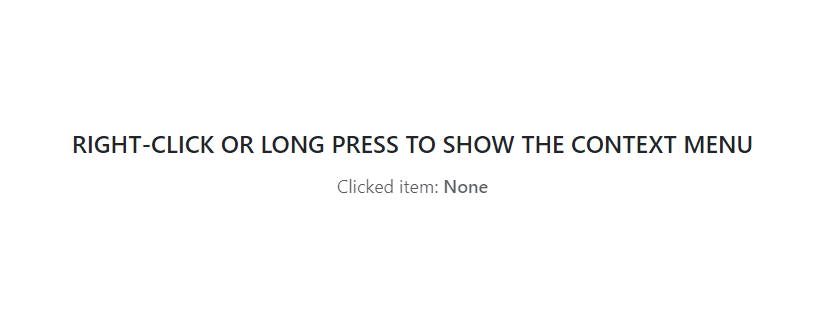
The following code snippet specifies a common click handler for all menu items. When an item is clicked in the menu, the item’s text is displayed in the header.
<div class="card-header">
    @if (ClickedItem != null) {
        <span>Clicked item: <b>@ClickedItem</b></span>
    }
    else {
        <span>Clicked item: None</span>
    }
</div>

<DxContextMenu ItemClick="@OnItemClick">
    <Items>
        <DxContextMenuItem Text="Sort By" IconUrl="images/Sort_by.svg">
            <Items>
                <DxContextMenuItem Text="Name"></DxContextMenuItem>
                <DxContextMenuItem Text="Size"></DxContextMenuItem>
                <DxContextMenuItem Text="Type"></DxContextMenuItem>
            </Items>
        </DxContextMenuItem>
        @* ... *@
    </Items>
</DxContextMenu>

@code {
    string ClickedItem { get; set; }

    void OnItemClick(ContextMenuItemClickEventArgs args) {
        ClickedItem = args.ItemInfo.Text;
    }
}

Show/Hide Context Menu
To display a context menu, handle an event (for example, contextMenu) and call one of the ShowAsync methods:
<div class="h-200"
     @oncontextmenu="((e) => ContextMenu.ShowAsync(e))"
     @oncontextmenu:preventDefault>
    <span class="fw-600">RIGHT-CLICK TO SHOW THE CONTEXT MENU</span>
</div>

<DxContextMenu @ref="@ContextMenu">
    <Items>
        <DxContextMenuItem Text="Copy" />
        <DxContextMenuItem Text="Cut" />
        <DxContextMenuItem Text="Remove" />
    </Items>
</DxContextMenu>

@code {
    DxContextMenu ContextMenu { get; set; }
}
You can specify the PositionTarget property to display a context menu at the edge of the target UI element. Refer to the property description for additional information.
The context menu closes when a user clicks outside its boundaries or clicks a menu item that does not have child items. Call the HideAsync() method to close the context menu in code. The following code example demonstrates an ItemClick event handler that closes the menu in response to a click on the SortBy root item:
<DxContextMenu @ref="@ContextMenu" ItemClick="@OnItemClick">
    <Items>
        <DxContextMenuItem Name="SortBy" Text="Sort By">
            <Items>
                <DxContextMenuItem Text="Name"></DxContextMenuItem>
                <DxContextMenuItem Text="Size"></DxContextMenuItem>
                <DxContextMenuItem Text="Type"></DxContextMenuItem>
            </Items>
        </DxContextMenuItem>
    </Items>
</DxContextMenu>

@code {
    DxContextMenu ContextMenu { get; set; }

    void OnItemClick(ContextMenuItemClickEventArgs args) {
        if(args.ItemInfo.Name == "SortBy") {
            ContextMenu.HideAsync();
        }
    }
}
Checked Items
Use the IconUrl or IconCssClass property to implement dynamically checked items.
<DxContextMenu ItemClick="@OnItemClick" >
    <Items>
        <DxContextMenuItem Text="Sort By" IconUrl="/images/sort.svg">
            <Items>
                <DxContextMenuItem Text="Name" IconUrl="@GetChecked("Name")" />
                <DxContextMenuItem Text="Size" IconUrl="@GetChecked("Size")" />
                <DxContextMenuItem Text="Type" IconUrl="@GetChecked("Type")" />
            </Items>
        </DxContextMenuItem>
        <DxContextMenuItem Text="Copy" IconUrl="/images/copy.svg" BeginGroup="true" />
        <DxContextMenuItem Text="Cut" IconUrl="/images/cut.svg" />
        <DxContextMenuItem Text="Remove" IconUrl="/images/clear.svg" />
        <DxContextMenuItem Text="Select All" BeginGroup="true" />
    </Items>
</DxContextMenu>

@code {
    string SortBy { get; set; }

    void OnItemClick(ContextMenuItemClickEventArgs args) {
        if (args.ItemInfo.Text == "Name" || args.ItemInfo.Text == "Size" || args.ItemInfo.Text == "Type")
            SortBy = args.ItemInfo.Text;
    }
    string GetChecked(string ItemText) {
        return (ItemText == SortBy) ? "/images/check.svg" : null;
    }
}

Keyboard Navigation
The DevExpress Blazor Context Menu component supports keyboard shortcuts that allow users to access every UI element and navigate through menu and submenu items. Keyboard navigation is implemented both on the client and server.
Note
Keyboard support allows users to interact with application content in cases they cannot use a mouse or they rely on assistive technologies (like screen readers or switch devices). Refer to the Accessibility help topic for information on other accessibility areas that we address.
The following shortcut keys are available:
| Shortcut Keys | Description |
|---|---|
| Shift + F10, Menu | Opens the context menu if the menu’s owner element has focus. |
| End | Moves focus to the last menu/submenu item. |
| Home | Moves focus to the first menu/submenu item. |
| Down Arrow | Focuses the first item of the main menu or moves focus to the next menu item. |
| Up Arrow | Focuses the last menu item of the main menu or moves focus to the previous menu item. |
| Right Arrow | For items with child items: Opens a submenu and moves focus to its first item. |
| Left Arrow | For main menu items with child items: Opens a submenu and moves focus to its last item. |
| Left Arrow, Esc | For submenu items: Closes the submenu and moves focus to the corresponding parent item. |
| Enter, Space | For items without child items: Invokes a click event handler for the focused menu item and closes the context menu. For items with child items: Invokes a click event handler for the focused menu item, opens a submenu, and moves focus to its first item. For templated items: Moves focus to the first focusable element within the template. |
| Esc | Closes the context menu and returns focus to the menu owner element. |
| Esc, Tab | For templates within menu items: Moves focus to the corresponding menu item. |
| Tab, Shift + Tab | Closes the context menu and moves focus to the next or previous focusable page element. |
Troubleshooting
If a Blazor application throws unexpected exceptions, refer to the following help topic: Troubleshooting.