DxRibbonToggleItem.Checked Property
Specifies whether the toggle item is selected.
Namespace: DevExpress.Blazor
Assembly: DevExpress.Blazor.v26.1.dll
Declaration
[DefaultValue(false)]
[Parameter]
public bool Checked { get; set; }
Property Value
| Type | Default | Description |
|---|---|---|
| Boolean | false |
|
Remarks
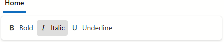
Set the Checked property to true to select the toggle item.
<DxRibbon>
    <DxRibbonTab Text="Home">
        <DxRibbonGroup>
            <DxRibbonToggleItem Text="Bold"
                                IconCssClass="dx-icon-bold" />
            <DxRibbonToggleItem Text="Italic"
                                IconCssClass="dx-icon-italic"
                                Checked="true" />
            <DxRibbonToggleItem Text="Underline"
                                IconCssClass="dx-icon-underline" />
        </DxRibbonGroup>
    </DxRibbonTab>
</DxRibbon>
If you enable the Checked property for multiple items in a toggle group, the component selects the first visible and active item.
Implements
See Also