DxRibbonItemBase.AdaptiveText Property
Specifies the item’s label displayed when the item is hidden in the adaptive drop-down menu.
Namespace: DevExpress.Blazor
Assembly: DevExpress.Blazor.v26.1.dll
Declaration
[DefaultValue(null)]
[Parameter]
public string AdaptiveText { get; set; }
Property Value
| Type | Default | Description |
|---|---|---|
| String | null | The text label shown for the item in an overflow (adaptive) drop-down menu. |
Remarks
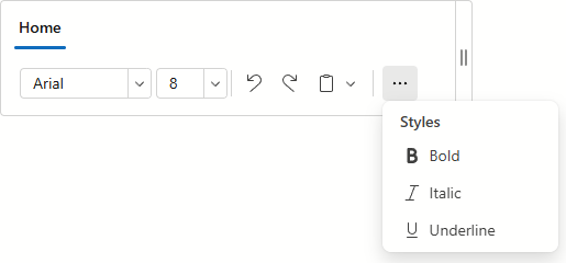
When the Ribbon’s width decreases, excess items are moved into overflow menus.
Use the AdaptiveText property to specify the text label for the item in the overflow menu.
Items in the overflow menu display the same text as specified in the Text property. Use the AdaptiveText property to specify a different text label for the item when it appears in the overflow menu.
<DxRibbon>
    <DxRibbonTab Text="Home">
        <DxRibbonGroup Text="Format">
            <DxRibbonItem IconCssClass="dx-icon-bold"
                          AdaptiveText="Bold" />
            <DxRibbonItem IconCssClass="dx-icon-italic"
                          AdaptiveText="Italic" />
            <DxRibbonItem IconCssClass="dx-icon-underline"
                          AdaptiveText="Underline" />
        </DxRibbonGroup>
    </DxRibbonTab>
</DxRibbon>
Tip
Use the AdaptiveText property to specify the label for items displayed as icons only in the Ribbon.
See Also