DxRibbon Class
A toolbar component that organizes command items into tabs.
Namespace: DevExpress.Blazor
Assembly: DevExpress.Blazor.v25.2.dll
NuGet Package: DevExpress.Blazor
Declaration
public class DxRibbon :
    DxRibbonNodeRoot,
    IRibbon,
    IRibbonNode,
    IRibbonTabs,
    IRibbonParameters,
    IRibbonAdaptivityParameters,
    IRibbonTabParameters,
    IRibbonStyleParameters,
    IRibbonSizeConstraints,
    IRibbonEvents,
    IRibbonBaseEvents,
    IRibbonEventSink,
    IRibbonStyles
Remarks
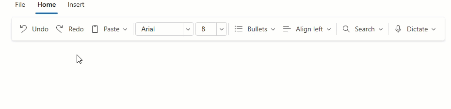
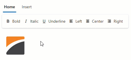
The DevExpress Ribbon component for Blazor (<DxRibbon>) implements a tabbed toolbar UI metaphor (organizes command items into tabs). This toolbar style simplifies user access to commands, helps you build compact page layouts, and improves overall user experience.

Add a Ribbon to a Project
Follow the steps below to add a Ribbon component to your application:
- Create a new Blazor Server or Blazor WebAssembly application. If you use a Microsoft project template or already have a Blazor project, configure your project to incorporate DevExpress Blazor components.
Add the following markup to a page or view:
<DxRibbon>
    <DxRibbonTab Text="Home">
        <DxRibbonGroup>
            <DxRibbonItem Text="Command" />
        </DxRibbonGroup>
    </DxRibbonTab>
</DxRibbon>
Handle Ribbon events to respond to user interactions with items and tabs.
Static Render Mode Specifics
Blazor Ribbon component does not support static render mode. Enable interactivity to use the component in your application. Refer to the following topic for more details: Enable Interactive Render Mode.
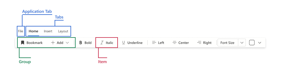
Ribbon Structure
The Ribbon arranges commands into a hierarchical structure that helps users to quickly locate related functions:
- Application tab – A structured menu for common tasks: file operations, configuration tasks, recent documents, and the like.
- Application tab items – Individual menu commands within the application tab.
- Tabs – Top-level categories that group related commands.
- Groups – Logical clusters within a tab (for example, Font, Paragraph, or Illustrations) that can collapse into an overflow menu when space is limited.
- Items – Actionable elements such as buttons, menus, spin editors, color palettes, combo boxes, and toggle groups.
- Groups – Logical clusters within a tab (for example, Font, Paragraph, or Illustrations) that can collapse into an overflow menu when space is limited.
Sections below describe each element in detail.
Application Tab
An optional first tab that opens a structured drop-down menu for common high-level tasks: file operations, configuration tasks, recent documents, and help. It centralizes frequently used commands and keeps other tabs focused on task‑specific tools. A Ribbon can contain one application tab.
A DxRibbonApplicationTab object implements an application tab. Use the Text property to specify the clickable caption.
You can disable or hide the application tab and handle the Click event to perform custom actions when a user clicks the tab.
The application tab is populated with DxRibbonApplicationTabItem components.
<DxRibbon>
    <DxRibbonApplicationTab Text="File">
        <DxRibbonApplicationTabItem Text="New" />
        <DxRibbonApplicationTabItem Text="Save as">
            <DxRibbonApplicationTabItem Text="Text file" />
            <DxRibbonApplicationTabItem Text="Microsoft Word Document" />
        </DxRibbonApplicationTabItem>
    </DxRibbonApplicationTab>
    <DxRibbonTab Text="Home">
        <!-- ... -->
    </DxRibbonTab>
</DxRibbon>
Application Tab Items
Application tab items are high-level commands (for example, Open or Save) displayed in the application tab menu. Nest items to create submenus.
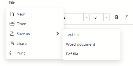
Declare DxRibbonApplicationTabItem objects to populate the application tab with items.
<DxRibbon>
    <DxRibbonApplicationTab Text="File">
        <DxRibbonApplicationTabItem Text="New" />
        <DxRibbonApplicationTabItem Text="Save as">
            <DxRibbonApplicationTabItem Text="Text file" />
            <DxRibbonApplicationTabItem Text="Microsoft Word Document" />
        </DxRibbonApplicationTabItem>
    </DxRibbonApplicationTab>
    <DxRibbonTab Text="Home">
        <!-- ... -->
    </DxRibbonTab>
</DxRibbon>
Tabs
Tabs group related commands at the top level of the Ribbon. Each tab focuses on a task domain (for example, Home for common formatting actions or Insert for structural elements such as tables and images). Define tabs with DxRibbonTab and set Text for the caption.
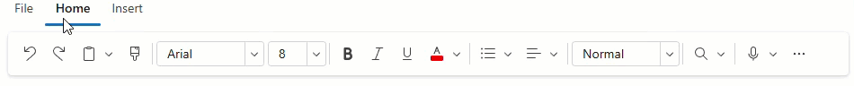
Tabs are populated with DxRibbonGroup objects.
<DxRibbon>
    <DxRibbonTab Text="Home">
        <DxRibbonGroup>
            <!-- ... -->
        </DxRibbonGroup>
        <DxRibbonGroup>
            <!-- ... -->
        </DxRibbonGroup>
        <!-- ... -->
    </DxRibbonTab>
    <DxRibbonTab Text="Insert">
        <!-- ... -->
    </DxRibbonTab>
</DxRibbon>
Contextual Tabs
A contextual tab appears only when a related element (image, table, heading) is selected. When the selection (context) is cleared, the tab is hidden to simplify the UI. Contextual tabs are highlighted and placed after standard tabs.
To create contextual tabs in the DevExpress Blazor Ribbon:
- Add a DxRibbonTab component and enable its Contextual property to apply contextual appearance and position.
- Toggle the tab’s Visible property in selection or focus events to show or hide the tab.
Note
Contextual only marks a tab as contextual. It does not automatically bind the tab to a context.
<DxRibbon>
    <DxRibbonTab Text="Home">
        <!-- ... -->
    </DxRibbonTab>
    <DxRibbonTab Text="Insert">
        <!-- ... -->
    </DxRibbonTab>
    <DxRibbonTab Text="Draw"
                 Contextual="true"
                 Visible="ShowDrawTab">
        <!-- ... -->
    </DxRibbonTab>
</DxRibbon>

<img src="images/devexpress.svg"
     tabindex="0"
     @onfocus="OnImageFocus"
     @onblur="OnImageBlur" />

@code {
    bool ShowDrawTab = false;

    void OnImageFocus(FocusEventArgs args) {
        ShowDrawTab = true;
    }

    void OnImageBlur(FocusEventArgs args) {
        ShowDrawTab = false;
    }
}
Groups
Groups cluster related commands within a tab into logical blocks (for example, Font or Paragraph). Groups help users find commands faster and complete tasks with fewer clicks.
To add a group, declare a DxRibbonGroup object in tab markup and populate it with Ribbon items.
<DxRibbon>
    <DxRibbonTab Text="Home">
        <DxRibbonGroup>
            <DxRibbonToggleItem Text="Bold"
                                IconCssClass="dx-icon-bold" />
            <DxRibbonToggleItem Text="Italic"
                                IconCssClass="dx-icon-italic" />
            <DxRibbonToggleItem Text="Underline"
                                IconCssClass="dx-icon-underline" />
        </DxRibbonGroup>
    </DxRibbonTab>
</DxRibbon>
When the Ribbon width decreases, excess items are moved into overflow menus and groups are presented as drop-down buttons with an icon and caption.
Items
Items are interactive UI elements that execute commands or collect user input. The Ribbon supports the following item types:
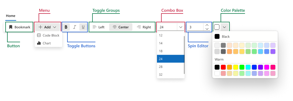
- Button
- Executes a command: insert, save, print, and so on.
- Menu
- Displays a drop-down menu with Ribbon items. Nest DxRibbonItem components to any depth to build hierarchical submenus. Enable the SplitDropDownButton property to split the button into two areas: the main action button and the drop-down arrow.
- Toggle Button
- A two-state button, which remains pressed while its option is active and returns to the default state when clicked again.
- Toggle Group
- Groups multiple toggle buttons and allows only one button to be selected at a time.
- Color Palette
- Selects a color from the palette.
- Combo Box
- Selects a value from a list. Enable the AllowUserInput property to allow users to enter a custom value.
- Spin Editor
- Adjusts a numeric value step by step (for example, to modify the zoom level, indent size, image width).
Note
Every Ribbon item must be placed in a group. Items outside groups are not rendered.
<DxRibbon>
    <DxRibbonApplicationTab></DxRibbonApplicationTab>
    <DxRibbonTab Text="Home">
        <DxRibbonGroup>
            <!-- Button -->
            <DxRibbonItem Text="Bookmark"
                          IconCssClass="dx-icon-bookmark" />
            <!-- Menu -->
            <DxRibbonItem Text="Add"
                          IconCssClass="dx-icon-add">
                <DxRibbonItem Text="Code Block"
                              IconCssClass="dx-icon-codeblock" />
                <DxRibbonItem Text="Chart"
                              IconCssClass="dx-icon-chart" />
            </DxRibbonItem>
        </DxRibbonGroup>
        <DxRibbonGroup>
            <!-- Toggle Buttons -->
            <DxRibbonToggleItem Tooltip="Bold"
                                IconCssClass="dx-icon-bold" />
            <DxRibbonToggleItem Tooltip="Italic"
                                IconCssClass="dx-icon-italic" />
            <DxRibbonToggleItem Tooltip="Underline"
                                IconCssClass="dx-icon-underline" />
        </DxRibbonGroup>
        <DxRibbonGroup>
            <!-- Toggle Group -->
            <DxRibbonToggleGroup>
                <DxRibbonToggleItem Text="Left"
                                    IconCssClass="dx-icon-alignleft" />
                <DxRibbonToggleItem Text="Center"
                                    IconCssClass="dx-icon-aligncenter" />
                <DxRibbonToggleItem Text="Right"
                                    IconCssClass="dx-icon-alignright" />
            </DxRibbonToggleGroup>
        </DxRibbonGroup>
        <DxRibbonGroup>
            <!-- Combo Box -->
            <DxRibbonComboBoxItem Data="FontSizes"
                                  Value="@CurrentFontSize"
                                  TextFieldName="@nameof(FontSizeInfo.Size)"
                                  Width="120px" />
        </DxRibbonGroup>
        <DxRibbonGroup>
            <!-- Spin Editor -->
            <DxRibbonSpinEditItem Value="@NumberOfRows"
                                  MinValue="2"
                                  MaxValue="32"
                                  Increment="1"
                                  Width="100px" />
            <!-- Color Palette -->
            <DxRibbonColorPaletteItem Text="Font Color">
                <DxRibbonColorGroup Header="Pastel"
                    Colors="@DxColorPalettePresets.GetPalette(ColorPalettePresetType.Pastel)" />
                <DxRibbonColorGroup Header="Warm"
                    Colors="@DxColorPalettePresets.GetPalette(ColorPalettePresetType.Warm)" />
            </DxRibbonColorPaletteItem>
        </DxRibbonGroup>
    </DxRibbonTab>
</DxRibbon>
Troubleshooting
If a Blazor application throws unexpected exceptions, refer to the following help topic: Troubleshooting.