DxLayoutBreakpoint.IsActive Property
Allows you to bind the breakpoint to a data source field. When the breakpoint is activated, the data field equals true.
Namespace: DevExpress.Blazor
Assembly: DevExpress.Blazor.v26.1.dll
Declaration
[DefaultValue(false)]
[Parameter]
public bool IsActive { get; set; }
Property Value
| Type | Default | Description |
|---|---|---|
| Boolean | false |
|
Remarks
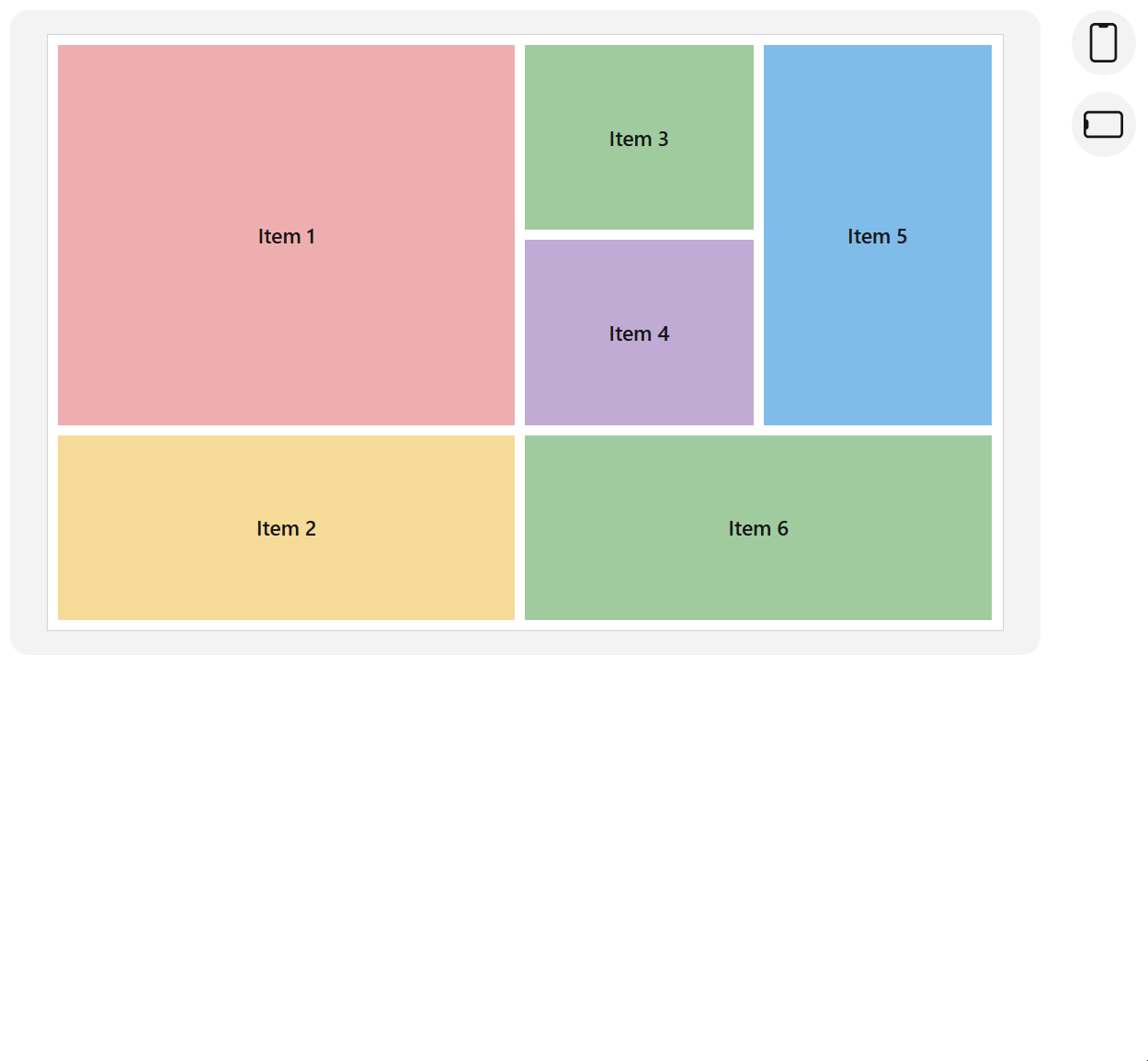
Use the IsActive property to bind the breakpoint to a boolean data field. When the device screen size equals the DeviceSize property value, the breakpoint is activated. The IsActive property and the bound data field equal true.
<DxLayoutBreakpoint DeviceSize="DeviceSize.XSmall" @bind-IsActive="@isXSmallScreen" />

<DxGridLayout CssClass="grid-layout" ColumnSpacing="8px" RowSpacing="8px">
    <Rows>
        @if(isXSmallScreen) {
            <DxGridLayoutRow Areas="item1" />
            <DxGridLayoutRow Areas="item2" />
            <DxGridLayoutRow Areas="item3" />
            <DxGridLayoutRow Areas="item4" />
            <DxGridLayoutRow Areas="item5" />
            <DxGridLayoutRow Areas="item6" />
        } else {
            <DxGridLayoutRow Areas="item1 item3 item5" />
            <DxGridLayoutRow Areas="item1 item4 item5"/>
            <DxGridLayoutRow Areas="item2 item6 item6"/>
        }
    </Rows>
    <Columns>
        <DxGridLayoutColumn Width="2fr" />
        @if(!isXSmallScreen) {
            <DxGridLayoutColumn />
            <DxGridLayoutColumn />
        }
    </Columns>
    <Items>
        <DxGridLayoutItem Area="item1">
            <Template>
                <div class="gridlayout-header gridlayout-item">
                    Item 1
                </div>
            </Template>
        </DxGridLayoutItem>
        <DxGridLayoutItem Area="item2">
            <Template>
                <div class="gridlayout-content gridlayout-item">
                    Item 2
                </div>
            </Template>
        </DxGridLayoutItem>
        <DxGridLayoutItem Area="item3">
            <Template>
                <div class="gridlayout-left-side-bar gridlayout-item">
                    Item 3
                </div>
            </Template>
        </DxGridLayoutItem>
        <DxGridLayoutItem Area="item4">
            <Template>
                <div class="gridlayout-right-side-bar gridlayout-item">
                    Item 4
                </div>
            </Template>
        </DxGridLayoutItem>
        <DxGridLayoutItem Area="item5">
            <Template>
                <div class="gridlayout-footer gridlayout-item">
                    Item 5
                </div>
            </Template>
        </DxGridLayoutItem>
        <DxGridLayoutItem Area="item6">
            <Template>
                <div class="gridlayout-left-side-bar gridlayout-item">
                    Item 6
                </div>
            </Template>
        </DxGridLayoutItem>
    </Items>
</DxGridLayout>

@code {
    bool isXSmallScreen;
}
See Also